The world of UI has many different visual approaches, including skeuomorphism, flat design, aero, and glass morphism to name a few. As designers respond to trends and styles with new approaches, the demands of user engagement can bring design to a whole new place. The most welcoming and friendly approach to visual user interaction (UI) design in recent years is a style called claymorphism.
In this article, we’ll talk about what claymorphism is and the history of how it came about. We’ll also talk about current use cases of claymorphism and show examples in modern apps.
Distinctively playful with softly rounded corners and an obvious tactility, claymorphism is on the horizon of 21st century design. It counts among the more compelling approaches to UI available to designers today.
Claymorphism is not simply a visually gentler, friendlier approach to UI — it may also hold very interesting possibilities as a new platform for user engagement to continue to develop and open their doors to more and more people.
Before we jump more into claymorphism, let’s discuss some UX history and how the world moved away from skeumorphism.
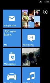
Let’s turn back the clock almost a decade and a half ago to 2010 with the release of Windows Phone 7. The application of the company’s then new Metro design language employed strongly gridded layouts, flat areas of color, and heavy use of typography.
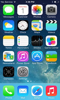
Soon after, Apple interfaces also moved away from the dimensionality of their ages-old skeuomorphic UI in favor of the straightforward crispness and minimalism of iOS 7. In the succeeding years, other companies would follow:
The importance of scalability reigned supreme. Across different device resolutions, and driven by urgent growth of the mobile sector during the mid 2000s, the two most popular computing platforms — Windows and Mac — would focus the great majority of their UX/UI research on the foundations of flat design. And, of course, as would nearly everyone else from then on.
Google, for example, would start to use flat design throughout their open source Material Design guidelines, tools and assets. It led to the massive widespread adoption of flat and minimalist approaches.
Today, flat design is the foundation for countless websites and all types of UX systems from desktop operating systems to gaming consoles to mobile phones. It is the most widespread and most popular of web designs. To this day, it reigns supreme over all web designs:
As skeuomorphic design lost its appeal, the transition away from dimensionality brought an overall increase in clarity across UX platforms. With it came usability. While much has been gained from skeuomorphism, some things have also been lost.
Meanwhile, flat UX and UI are just as problematic. They are hampered by precisely the characteristic that defines them: flatness. While elegant and easy to implement, the minimalism of flat design may come across as cold, generic, and characterless. It’s easy to imagine how this leads to a drop in user interest and engagement.
Of course, designers worth their salt built some needed flair on top of the foundations of flat design. Large platforms responded to the need to alleviate flat design’s too-straightforward coldness.
When macOS moved away from skeuomorphism and its Aqua aesthetic, designers at Apple began introducing the foundations of flat design. This was developed for iOS in their desktop platform. On the desktop, flat design found some needed panache, leading to fresh new doors opening out into greater usability:
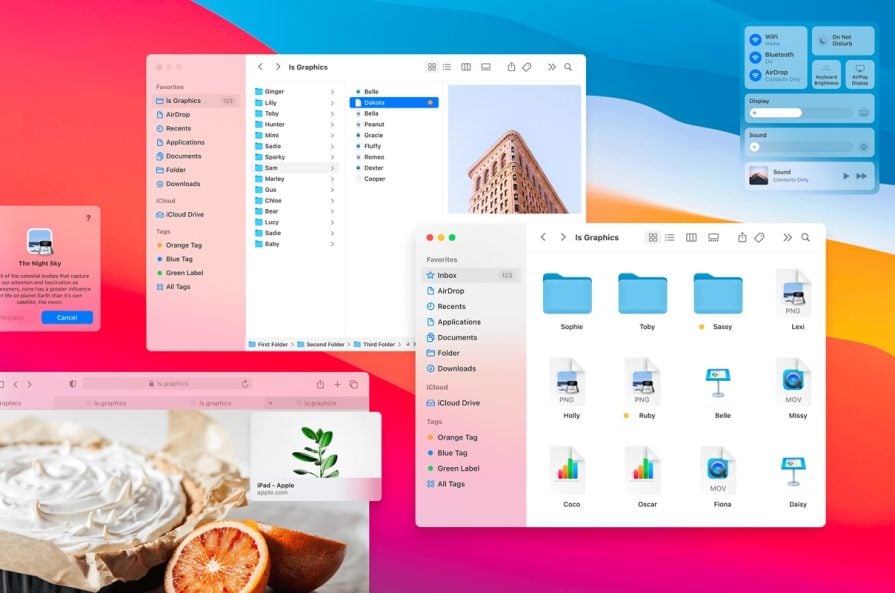
But are we tired of the ubiquity of flat design?
Outside of the Apple UI ecosystem, one well-hyped effort to address flat design’s shortcomings was neomorphism.
Coined by Michał Malewicz around four years ago, neomorphism quickly became all the rage; spawning numerous UI prototypes and kits on sites like Behance and Dribbble.
In a nutshell, neumorphism combines the visuals of flat design with soft extrusion (or sometimes indentation or debossing) of the UI along its edges. This is most seen in the UI’s cards and buttons but may extend to other elements as well. The result is a more tactile visual field, which hopes to prompt stronger use engagement.
Neomorphism, however, was not without its drawbacks. The aesthetics of the approach and its various implementations suffered from what can only be described as too much subtlety.
Its low contrast visuals and soft gradients raised strong accessibility concerns. Its lack of visually distinct boundaries posed challenges to user understanding and interaction.
Neomorphism was a useful look back towards skeuomorphism — drawing on the allure of the older approach’s aesthetics to give flat design a needed refresh for the visual landscape of today’s platforms.
The dimensionality of skeuomorphism carried over into neomorphism in a subtle but significant way. Neomorphism’s extrusions, shadows, and gradients invited user touch. However, because of the pitfalls mentioned above, the widespread adoption of neumorphism never really quite materialized.
Still, neomorphism pointed to the possibilities and promise of tactility built on top of flat design. Its lesson seems to be: even in the simplicity of flat design, touchability remains an important key to user engagement. It is this lesson that claymorphism, a kind of reimagined neomorphism, takes to the next level.
Which do you think your fingers would feel better on: a cold plane of glass or a fluffy pillow?
Claymorphism’s appeal — its tactility and touchability; and thus its potential for stronger user engagement — is undoubtedly related to its visual association with stuffed toys, clouds, balloons, pool toys, and, yes, claymation:

It’s easy to draw a direct line of inspiration from, the dearly-loved Wallace and Gromit stop-motion films to the claymorphic iterations of, for example, user avatars:
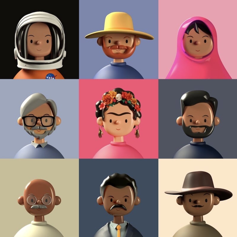
The playful figures above (NFTs by artist and designer Amrit Pal Singh), look like they just stepped out of a Gumby skit or a Chicken Run animated movie. Consistent with such an aesthetic, claymorphic approaches present layout elements such as cards, sheets, and buttons as molded planes of clay-like, even Play-Doh-like material.
Rather than indentations of the UI as in neumorphism, claymorphism differentiates different layout elements as discrete, molded 3D surfaces that are sometimes layered directly on top of each other.
The approach welcomes users to a UI space that’s more dimensional than flat design and its iterations. Chunky, softly sculpted cards hover next to each other over the working area; buttons appear as substantial blocks on top of dialogue layers; strong color cues direct the user’s eye; and claymation-style avatars and figurative elements help make everything come to life:
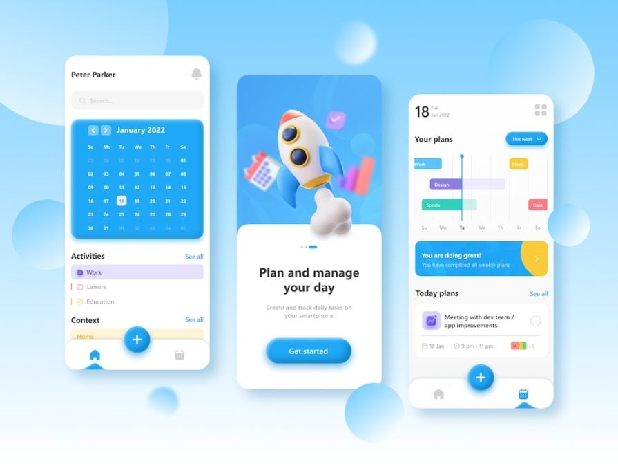
Let’s break down the claymorphic aesthetic.
The different areas in a claymorphic layout often look like discrete surfaces, each exhibiting distinctive dimensional concreteness — as if sculpted from clay. Such surfaces, like cards and dialogue windows, feature outer shadows that communicate clear separation from background areas and subtle inner shadows that help emphasize the appearance of thick planes with rounded edges:
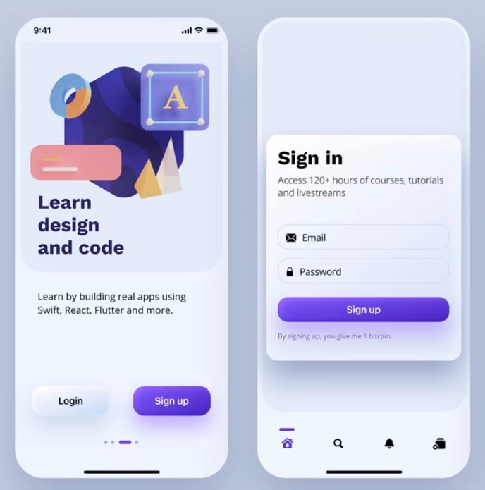
Buttons, toggles, and other other interactive elements are rendered in a sculpted manner similar to cards or dialogue sheets above, sometimes as if they were made from slightly thinner planes.
Shadow use renders these elements directly on top of other surfaces or very subtly hovering over them. The edges of such items remain distinct and clear to the user:
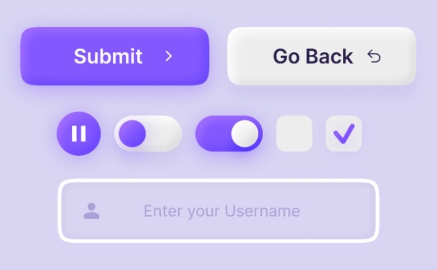
A full implementation of the claymorphic visual style involves the use of strong color cues in the overall layout. Often, interactive elements in the UI are brightly or vividly colored, contrasting in a helpful manner with more subtly colored backgrounds and containing frames:
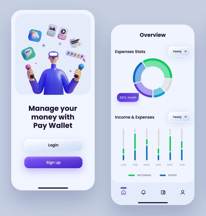
Claymorphism might sometimes come across as too whimsical. To alleviate this tendency, the restrained use of typography is often recommended. This also helps keep any claymorphic UI layout clear and understandable:
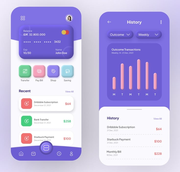
In a nod to its roots, claymorphic design freely makes use of figurative elements such as hands, objects, or other skeuomorphic illustrations to liven up the UI. All such elements follow the same sculpted-from-Play-Doh aesthetics as the layout:
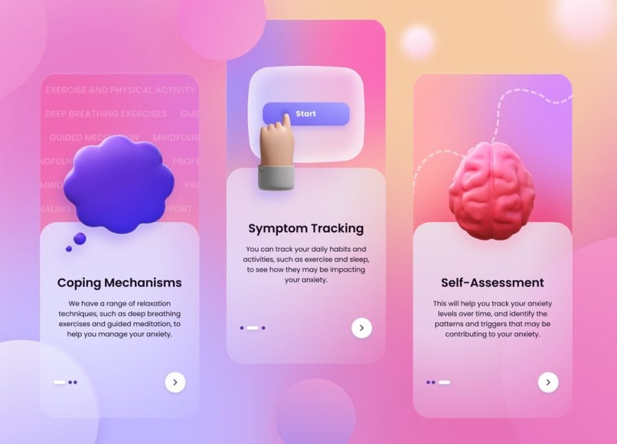
Despite its widespread appeal, a claymorphic approach isn’t a one-stop solution for all and every UI/UX need. It is not for every use case, but there are use cases where claymorphism can play a huge part:
So, while it’s not yet the most widespread design, claymorphism can really take off in the next few decades, as seen by its current use cases.
As designers start using more and more experimentation in their web design, and in accordance to the demands of their users, they are sure to go back or to forward elements of claymorphism. It is a design that’s yet perfected, and yet relevant, if we want to take leaps in web design.
While the history of flat design is rich, the 3D claymorphism is not yet fully realized. As designers start to plumb the web design history of what works and what doesn’t, and as users start to get tired of the all-encompassing flat design, there is still much to learn about claymorphism.
I hope you’ve learned a little of the history of claymorphism today — enough to use it in your own projects. Reach out to us if you need help in implementing claymorphism in your design.
LogRocket's Galileo AI watches sessions and understands user feedback for you, automating the most time-intensive parts of your job and giving you more time to focus on great design.
See how design choices, interactions, and issues affect your users — get a demo of LogRocket today.
A three-week mobile banking project taught me that the “proper” UX process is not always realistic. Sometimes, the better approach is to work with what you know, identify what you still need to learn, and make the strongest decision possible under real constraints.
A/B testing compares two versions of a design to see which performs better with real users. Here’s how UX teams can use it to test hypotheses, measure outcomes, and make smarter product decisions.
This case study shows how one ad experience redesign increased total ad exposure while lowering perceived friction, proving that timing and context can matter more than raw interruption.
As products evolve into ecosystems, navigation becomes a system-level challenge. This article explores how to align structure, context, and user journeys to create seamless movement across tools without confusion.