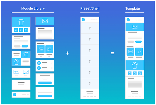
The over-reliance on pre-existing UI templates or design systems undermines innovation, misaligns with actual user journeys, or creates disjointed experiences. The UX gets diluted to UI cloning. Plus, templates optimize for speed, not always for context. And often, real customer needs fall outside the confines of a template.
That being said, I have seen start-ups use templates and achieve success for a couple of months, but successful ones reinvest the profit immediately after and alter the template to improve customer experience — a lesson many unsuccessful start-ups failed to grasp in time.
I have seen a lot of promising projects rise and fall, and what kept those I dealt with myself ahead is the constant work on improving customer experience, meaning if any template was used at first, it was altered significantly each day to a point where you could no longer even trace the initial template used as we had created something completely new in the end. The new design would always be tailored to our unique customers and work with a sole purpose to provide the best user experience possible.
It’s not that using templates is always bad. In fact, designing interfaces that are similar to others can make them seem more familiar and easier to use, even for first-time users. It’s also much easier to build on an existing template rather than creating something completely from scratch, saving a ton of time and effort.
However, templates don’t fit every situation, and using them without thinking strategically about whether they actually benefit the user can end up making the UX worse. Using templates everywhere can also result in your product looking just like every other product on the market, and that’s no way to grab a potential customer’s attention.
From my perspective, if you love the project you are working on, you will definitely want to create something unique and cool that no one has done before to stand out in the market. However, I would never say that I do not relate to the temptation of speeding up the project. Stakeholders might want results fast, and many people just concede in the face of a potentially smaller paycheck.
In day-to-day UX work, the template trap often appears when the pressure to ship quickly leads teams to rely on plug-and-play components, treating the project as just another task to complete for payment rather than a product to craft with care. Stakeholders, eager to see a return on investment, frequently ask, “Why reinvent the wheel?” — pushing for the fastest, cheapest path forward.
As a result, templates from design systems are often used without validating whether they truly fit the target audience. A design pattern that worked brilliantly for a logistics company might be blindly transplanted into a consulting business, with the assumption that users will behave the same way.
Spoiler: they won’t. Different audiences have different needs, and blindly reusing templates risks creating an experience that misses the mark entirely.
Common UX traps include misusing patterns simply because “they worked before,” without considering whether they suit the current context. Teams may ignore valuable user feedback under the assumption that a design is fine as long as it “looks standard.” In some cases, consistency is prioritized over clarity or usefulness, resulting in interfaces that may look uniform but fail to effectively serve the user’s needs.
In my experience, when professional UX designers use templates without making any meaningful changes, it’s usually to earn quick money, meet aggressive deadlines, close projects fast, or some combination. Newcomers, on the other hand, often use templates simply to learn or because they don’t know better.
No matter the motive, customers can often sense when the UX feels “off” — when a design seems like it cut corners, or was applied generically without regard to the context, or was put together hastily without truly keeping the experience and the customer’s best interests in mind. That “off” feeling can create a subtle distrust, even if the designer’s intent was innocent.
In contrast, I’ve found that breaking this template trap usually leads to the following:
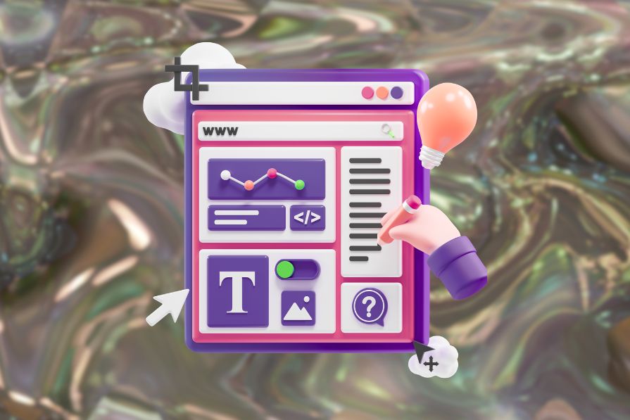
After going through the various templates available for you to use and selecting an option that best fits your needs, it’s time to ask yourself: Should I use this template?
If the answer is yes, you’ll still need to decide whether to use the template as-is or customize the design for your use case. Consider this decision tree:
If you can confidently answer “Yes” to all of the questions above, you can move forward knowing the template is a strong fit.
However, if you answer “No” to two or more questions, it’s a signal that you may need to take additional steps to test or customize the template. You may even want to reconsider using it at all and instead explore alternatives or design a new solution.
Ensuring both usability and brand consistency is crucial for your project.
Example:
One of the projects I supervised involved creating a website from scratch in an industry we had never worked in before. From my experience, this was the perfect opportunity to consider using templates as a starting point. Seeing how successful competitors in the industry illustrate their strengths lays the groundwork for adapting those templates to meet your customers’ needs.
To get started, we reviewed thousands of templates to understand what kind of design the team, stakeholders, and focus groups considered the best. After that, we had to review even more templates to agree on a layout of the main page and a couple of secondary pages on the website by closely analyzing our competitors and considering feedback from other departments focused on SEO, sales, and others.
Saving time with templates when creating a business depends heavily on the financial burden investors impose on the development team. As a result, many people fall into the trap of not altering those templates so they can quickly show progress to the stakeholders. In the case of this project, we had the opportunity to take the final step of discussing which design elements to adopt and rework, apply all the feedback from various departments, and consider feedback from customers in the future, if not immediately.
Balancing consistency with customization starts by rethinking how you reuse design elements. Instead of relying on full-page templates, focus on reusable micro-interactions and modular components that allow for subtle, targeted adjustments without creating chaos.
Many experts recommend an 80/20 approach — keeping 80 percent consistent and tailoring 20 percent for moments of high user friction or emotional impact. In my experience, however, a 5/95 split works even better, where only 5 percent comes from templates and 95 percent is fully customized to fit the specific context. I have found that tailoring your design fully to your users’ needs ultimately reduces the burden on other departments and generates more leads and sales.
The key is to customize for context, not for novelty; creativity alone isn’t enough. Modify designs when the user journey truly demands it, such as during error recovery or on conversion-critical screens, where the right adjustment can make a significant difference in outcomes. This approach reduces the burden on UX-related departments and saves money that can be reinvested in other project areas.
For example, ecommerce checkout flows often look the same. But a brand selling high-end goods might customize the flow to offer reassurance or concierge-style assistance.
In an ideal world, we designers would be able to customize every UI to work flawlessly for the user context and make the product really stand out and feel unique. However, the real world has real constraints that make it practically impossible to do this.
Let’s talk about three of the biggest constraints we face as designers and some practical, realistic solutions to help get you out of the template trap.
Time is one of the most limited resources we have as designers. When a problem arises, we are pressured to come up with a fast solution for it. Unfortunately, stakeholders might not understand that a fast solution could actually disrupt the brand image and overall user experience. The time bias usually imposes unnecessary pressure and makes designers feel devalued.
Solution: Create semi-templates that incorporate elements from other templates, while also clearly identifying areas that require immediate customization or can be addressed later, once the first profits are generated. This way, some minor problems can be fixed without reworking the whole design as a bonus.
Workflow tip — The more semi-templates you use, the more design elements you have that might be reworked independently, which increases the speed of fixing problems.
People often underestimate the impact of a chosen design on other departments like marketing, sales, customer support, and others. But even a simple edit to the main page text can significantly affect SEO, confuse potential buyers, and burden support representatives.
To alter any aspect of a design, you need a reason, and that reason should be heard and validated by others before doing anything. This also gives other teams the opportunity to offer feedback that ensures the final design serves a united purpose.
Solution: Use design tokens and documentation to clarify intent (e.g., “Use this card layout when comparing products, not for storytelling”). This way, other departments might also check them to understand the intent and provide more focused guidance and help when needed.
Workflow tip — I usually suggest having a short meeting with the representatives of all departments involved to check noticeable changes on the website and provide immediate feedback. This way, many problems can be prevented quickly with a third party speaking freely about changes.
Cooperating with departments that usually operate independently cannot be overlooked in both importance and difficulty. It can be a challenge to know how much to share, when, and how. Information one team considers critical might seem understated to another, and things that seem obvious to someone could easily be missed or misunderstood by another.
Solution: Collaborate early and communicate often. Designers should annotate why they’re diverging from standard templates. The developer and designer must maintain regular contact with each other, while the other departments and the supervisor should receive at least a brief update on the current status. The best way to understand what matters to each other is to talk about it before it becomes a problem.
Workflow tip — Maintain a “Template Divergence Log” where designers document where and why they customized. This keeps design rationale transparent and scalable.
When you decide to go custom, follow these principles:
Let’s consider a hypothetical example:
Imagine that a banking app wanted to redesign its account overview dashboard UI. During user interviews conducted in the research stage, many users agreed that the standard cards in most dashboard templates did not display the information they were looking for. They also reported wanting faster insights into spending trends.
So, the team added fast summaries of the most frequent user requests based on the data obtained within the app, as well as focus groups.
It appeared that most users enjoyed having a quick glance at their spending trends, even if they logged in to the app for a different purpose. The information on the last three transactions also received positive feedback, as it could fit on a small card. Some raw data was further displayed in expandable graphs, illustrating changes in the card’s usage patterns, including the areas where the most money was spent (clothes, food, car, taxi, charity, etc.).
Such changes required minimal space and layout adjustments, with even minor tweaks making a significant difference in user experience. The immediate result was that users spent more time on the app, exploring interesting graphs, and checking the app more frequently to view the latest transactions and spending patterns.
To sum it up, templates are useful for setting a groundwork for further product development, finding the best way to structure specific pages, and understanding how elements are integrated to accelerate new content creation and problem-solving. That’s essentially what templates are good for if you want to focus on customer experience.
Templates are tools, not solutions. Next time you’re about to drop in that reusable layout, pause. Ask: “Does this solve the real problem?” True UX isn’t about repeating what worked — it’s about evolving what works for your specific target audience.

LogRocket's Galileo AI watches sessions and understands user feedback for you, automating the most time-intensive parts of your job and giving you more time to focus on great design.
See how design choices, interactions, and issues affect your users — get a demo of LogRocket today.
Multimodal UX goes beyond designing for screens. Learn how context-aware systems, progressive modality, failover modes, and accessibility-first design create better digital product experiences.

Learn how context-aware mode prioritization and seamless transitions improve multimodal UX and reduce mode confusion.

Research is becoming more democratized, product cycles are accelerating, and AI is transforming synthesis and ResearchOps. Here are the three trends shaping UX research in 2026.

Voice support is not the same as multimodal UX. Here’s how to design systems with true mode continuity and context-aware interactions.


