Everything is evolving, including hardware components, devices, business processes, branding guidelines, and even UI/UX design principles. Designers occasionally redesign their digital product interfaces based on these evolving factors to stay competitive in the software industry and serve users better. Redesigning digital products is possible from small UI tweaks to whole product reinvention, and choosing the right UX redesign level is crucial.

Designers can plan five redesign levels, aligning with the well-known five UX layers from the surface layer to the strategy layer. The redesign effort, time, and cost drastically increase when we go deeper into the UX layers, but deeper-level redesigns eventually deliver well-refreshed, up-to-date, highly usable designs by pushing the next redesign need in years. How to select the right UX redesign level that optimizes cost but delivers good results?
Let’s explore five UX redesign levels and understand how to select the right redesign level!
Having the exact same product UI design without establishing a single redesign process till a company decides to end the product is technically possible, but why do every tech company decide to redesign products at least every two years?
Redesigning a product interface is a technique to refresh a product by adhering to evolving design trends/principles, and it is also a great opportunity to solve design debt by fixing usability issues.
Here is the summary of UX redesign benefits:
Any digital product design can be divided into five hierarchical layers, known as UX layers, so UX redesign levels can also be mapped with these layers, creating five total UX redesign levels, as depicted in the following diagram:
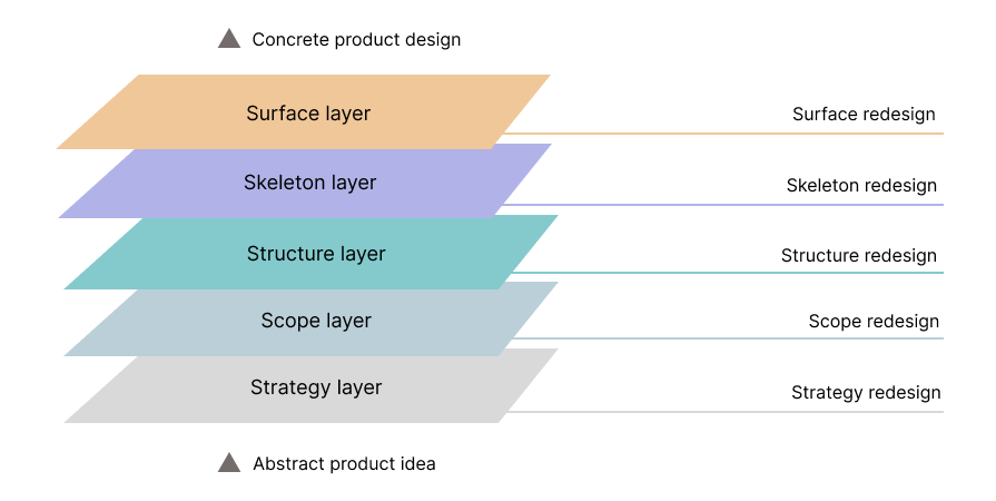
Let’s explore each UX redesign level in depth to learn how to plan a cost-effective redesign process that delivers better results:
Surface redesign happens only within the surface UX layer, which presents the final look of the digital product with colors, typography, imagery, and other visual aesthetics. Designers can use surface-level redesign to refresh the overall visual theme by adjusting only surface-level properties without changing the fundamental UI screen composition:
Medium often does visual enhancements and adjustments by keeping their core design principles stable. Here is how Medium’s design team refreshed the hero section of the homepage with a surface redesign by updating labels, some major styling details, and visual aesthetics:


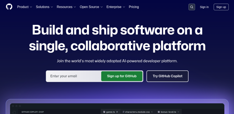
Here’s another example. GitHub updated its intro section design in 2025 to reduce clutter and highlight primary call-to-action buttons:

Some other surface redesign examples:
Surface-level redesign is usually mandatory after business rebranding to apply a new visual theme. Some product design teams do occasional surface redesigns to fix visual design debt (i.e., consistency issues), adapt to new UI design trends, or just to refresh the UI without a critical need
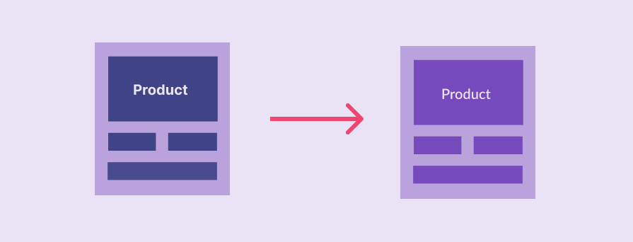
Skeleton redesign happens within the skeleton UX layer, which defines the basic appearance and user interaction points of the digital product’s screens. Designers can effectively improve the usability of a single screen, multiple screens, or a specific product state by modifying the presence of UI elements by adjusting the skeleton layer. This redesign also affects the surface UX layer:
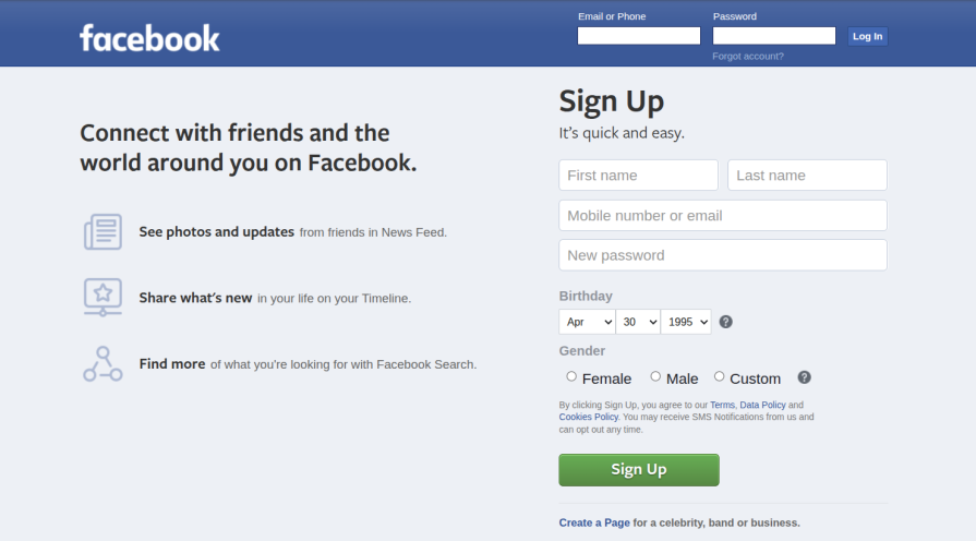
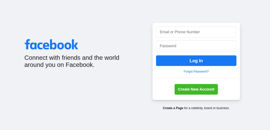
Meta did a major redesign of the whole Facebook platform in 2020. Here is how a skeleton redesign on its homepage simplified its UX:
Facebook homepage in 2021 (till now):
Some other skeleton redesign examples:
Designers can initiate skeleton-level redesigns to deliver identified usability enhancement requirements that don’t require product structure updates. Unlike surface redesigns, designers typically don’t do skeleton redesigns unless there is an identified user pain point in an existing user flow of a particular screen.
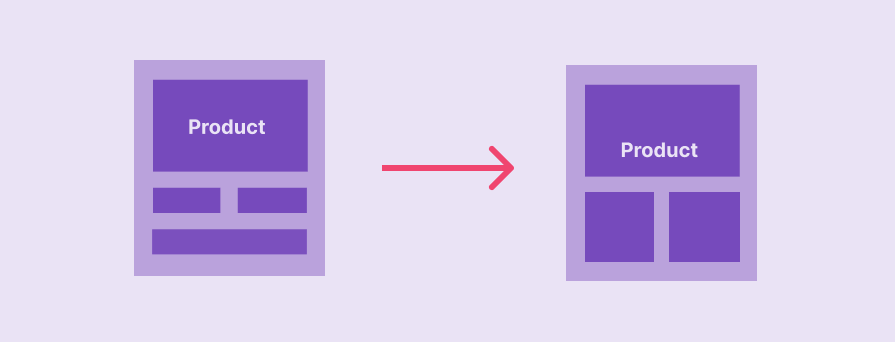
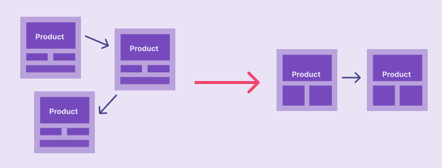
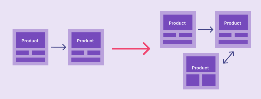
In structural redesign, designers improve the structure UX layer, which defines a blueprint of the whole product with interconnected screens, navigation, and overall information organization. Structural redesign involves improving the whole product structure or part of the product structure with different low-fidelity prototypes, so it gives designers full freedom to fix major usability issues in accumulated design debt. This redesign also affects the skeleton and surface UX layers:
This comprehensive article explains some structure redesign examples of popular helpdesk website designs.
Designers can initiate structure redesigns to implement major usability enhancements that require adjusting the whole product structure, introducing new screens, removing excessive screens, redefining navigation, and improving information distribution across screens.
Scope redesign modifies the scope UX layer of the digital product, which creates boundaries for the whole product’s strategy. Designers initiate scope redesigns to adjust the product scope by adding or removing new major features that go beyond the initial scope of the product:
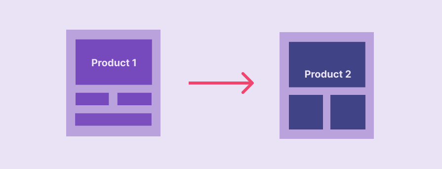
Updating the product scope can trigger updates for the existing product structure and other outer layers or introduce new isolated product extensions (e.g., a module in an ERP system) based on the modularity of the product and the nature of the scope layer modification.
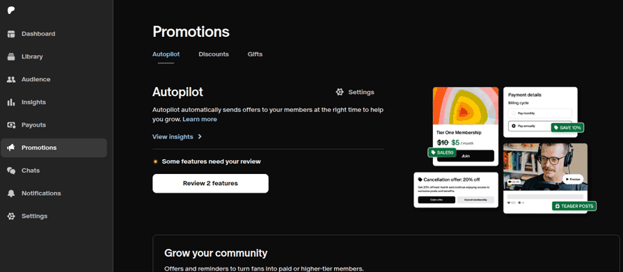
Patreon recently introduced a new redesign with a new promotions module that lets creators manage offers, discounts, and gifts under a scope redesign:
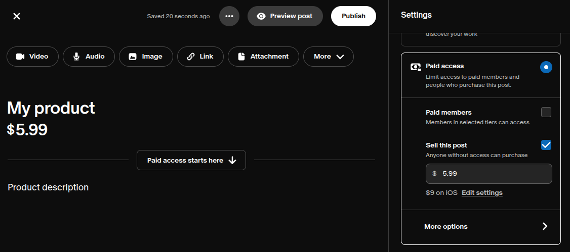
Moreover, Patreon also did a scope redesign in the post creation section by letting creators sell products using the same post creation area:
Some other scope redesign examples:
Product design teams can invest in scope redesigns if the new design requirements go beyond the current scope of the product, or when they identify feature overflows to reduce excessive features by prioritizing and grouping major ones.
The strategy UX layer is the topmost layer of every digital product, which puts the foundation for the entire product by defining primary goals:
Designers can do strategy redesigns by modifying the fundamental project idea and reinventing the digital product by literally creating a brand new product with a different UX for the same or a different user base. This redesign affects all top UX layers.
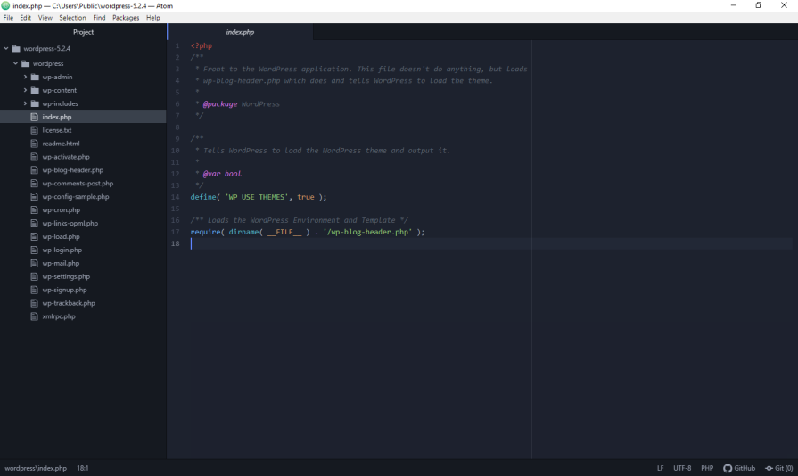
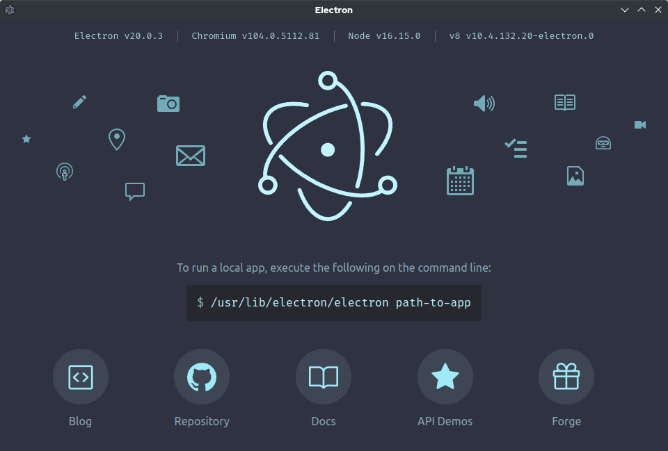
The Atom Shell project initially implemented fundamental features, including native UI segments, especially for the formerly popular Atom code editor. Earlier, the Atom shell was a fundamental component hiding behind the Atom code editor:
In 2015, the development team changed the Atom Shell project’s strategy by taking it out of the Atom editor, inventing the most popular cross-platform desktop app development framework, Electron:
Some other strategy redesign examples:
If the scope redesign fails or the product design team can forecast no significant ROI from the planned scope redesign, the product team can initiate a strategic redesign to save organizations from costly product failure incidents, usually replacing a dying product with a new one.
If you select the optimal redesign level, you can highly satisfy users and the organization’s expectations by optimally using the budget. Otherwise,
Based on the depth of the optimal redesign level, selecting the wrong redesign level either increases design debt or wastes resources. User frustrations, new design requirements, and rebranding needs should be solved at the right UX layer, ethically, optimally spending the product redesign budget, and effectively using resources.
Let’s understand further about the right and wrong UX redesign levels with practical redesign scenarios and the consequences of each redesign decision:
| Scenario | Optimal redesign | Suboptimal redesign |
|---|---|---|
| Designers attempt to fix usability issues that spread across many screens of a digital product, e.g, productivity issues in choosing, customizing, and ordering a food item in a food ordering app | Plan for a structural redesign that reduces the number of screen shifts by rearranging information differently across screens Result: Improved usability in the particular user flow |
Plan for a skeleton redesign to improve workflows within screens without changing the information distribution across screens Result: Accumulates design debt and fails to fully satisfy users |
| In a stable product that maintains a high usability score, designers need to represent the company’s new branding details, like the new logo, color scheme, etc. | Plan for a surface redesign with the new style guide, which was updated based on the recent rebranding details Result: A visual refresh for organizational rebranding under lesser redesign budget |
Plan for a skeleton redesign by using a new component library
Result: Selecting a deeper redesign level unnecessarily can overrun budgets and break product interface stability |
| An organization tries to save a dying product that has lost almost all users due to the lack of research in the initial UX process phases | The fundamental idea is failing, so plan for a strategy redesign
Result: A new reinvented product that can start fresh with a new marketing strategy for a new user base |
Planning a scope redesign to eliminate failed features and improve usable ones Result: Wastes resources for the scope redesign, and the majority of users abandon the product since the product image is already failed |
Selecting the right redesign level for a specific design requirement or idea can be challenging, but you can do so with the following tips:
In this article, we learned how to select the right redesign level that minimizes cost but highly satisfies user requirements and business needs (i.e., rebranding). The effort and cost increase when we go deeper down the UX layers, but deeper UX layer redesigns offer more design freedom and drastically improve usability. However, choosing a deeper design level for every usability enhancement requirement is not wise since unnecessary UX layer level modifications waste resources, makes product interfaces unstable, affecting the organization’s profits.
Choosing the right UX redesign level, focusing on usability, cost, and side effects, always delivers better results, satisfying users, organizational needs, refreshing products, and extending product lifespan.

LogRocket's Galileo AI watches sessions and understands user feedback for you, automating the most time-intensive parts of your job and giving you more time to focus on great design.
See how design choices, interactions, and issues affect your users — get a demo of LogRocket today.

AI tools can generate beautiful UI concepts in minutes, but most teams struggle to integrate those outputs into real design systems. This guide explores why AI drifts toward generic patterns and how to build governed workflows that keep speed without sacrificing brand consistency.

Adaptive interfaces personalize experiences using behavioral signals and machine learning. But when personalization becomes autonomous, systems can reinforce patterns, limit discovery, and shape user behavior in ways designers didn’t intend.

Security requirements shouldn’t come at the cost of usability. This guide outlines 10 practical heuristics to design 2FA flows that protect users while minimizing friction, confusion, and recovery failures.

2FA failures shouldn’t mean permanent lockout. This guide breaks down recovery methods, failure handling, progressive disclosure, and UX strategies to balance security with accessibility.


