Building a usable, user-friendly, and profitable digital product isn’t easy — designers often have to jump over numerous hurdles to create a successful product. Among day-to-day product design activities, decision-making is the most challenging activity for every UI/UX designer. A tiny wrong design choice can even lead to a huge, unrecoverable loss. Imagine losing more than 50% of potential leads of a massive email campaign because of an ineffective hero section CTA label. Fast but optimal decision-making is a key factor behind every successful digital product.
Adhering to established UI/UX design standards and collaborative internal design evaluations generally helps you make the right design choices quickly or prepare an optimal set of inputs for A/B or other UI/UX tests. Is there a way to increase the success rate of your design choices without spending time on more UX tests and even before creating designs? Yes, you can improve your design choices by learning from other designers’ real design choices. You can even create new UI/UX design standards by combining your and other designers’ design choice experiences.
Here are interesting and surprising lessons I learned from real design choices I made during my long UI/UX journey. Know them early, so you can easily increase the success rate of your day-to-day design choices.
UI/UX complexity increases the cognitive load, which slows down user interaction. Cognitive load silently increases in initial app screens, such as dashboards, home screens, and task onboarding screens. Uncontrolled complexity can grow and affect overall digital product productivity.
Some time back, I was working on an ecommerce store admin panel redesign process. The storefront website was simple; it had a basic filtering panel, product list, and simple checkout flow — the website was so productive for customers.
But the admin dashboard wasn’t so productive for the store’s owners — they had to ask employees for interpretation or request reports and couldn’t easily find information for even simple queries, but surprisingly, the dashboard could provide this information. These were the issues we noticed with the dashboard screen:
Before initiating the redesign process, some stakeholders discussed integrating an in-app guide and skipping the redesign. However, we redesigned the dashboard as follows, mostly based on design ideas from the Google AdSense dashboard:
The redesign was successful. So the lesson I learned was:
If a specific product isn’t so productive, it’s not always about slow or beginner-level users — we should fix uncontrolled cognitive load first before complaining about users’ abilities
Digital products that adhere to the multimodal UX design concept combine multiple interaction modes like voice, haptics, gestures, and vision with the traditional screen-based interaction. Multimodal-UX-enabled products are more efficient, productive, and accessible since users aren’t forced to use one specific interaction mode (usually traditional screen, keyboard, and mouse).
I experienced an interesting and unexpected advantage of using multimodal UX.
I was on a product design hackathon team. We created a food information app for users with visual impairments. Users could search for a food item by speaking, taking a photo, or typing (autocomplete enabled):
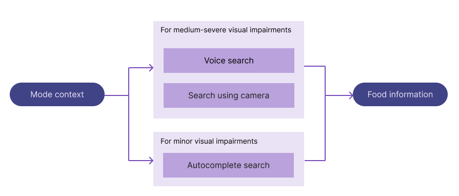
We released an alpha version of the product for internal testing. We agreed to log the interaction mode and food item to evaluate usage. Well, some team members took photos of their breakfasts as expected. Some members searched easy-to-type food names like pizza, sandwiches, and sausages with text autocompletion.
We were surprised by how one member managed to enter hard-to-type food item names like “Crème Brûlée” since the text autocompletion only used a simple food item list. A team member who was studying French entered complex French food names using the voice input mode. This situation is a great example that teaches us how effectively we can use multimodal UX to solve common input barriers.
The lesson I learned was:
Multimodal UX effectively solves user input barriers. A context-oriented primary input mechanism with ranked fallback modes creates an inclusive interaction design for all users for all usage scenarios (when hands are busy, have visual interpretation issues, the camera isn’t functioning, etc.) — multimodal UX lets users continue using a specific product even if one or more interaction modes fail or offer a weak interaction for a specific scenario
In most scenarios, minimalism works — designers can improve visual look and feel, interaction quality, and information architecture by simply adhering to the minimalistic design concept. Designers can get good results by creating minimal task management, multimedia, ecommerce, travel planning, and more consumer apps, but minimalism won’t work for every product design scenario.
UI/UX designers who worked with special-purpose digital products may know about this, but I learned this the hard way; I tried to use minimalism for an ERP solution and received negative feedback from all users.
Before going further, first look at how traditional enterprise system UIs look:

Several years ago, when I had just started my UI/UX journey, I worked for a small web development company that was selling ERP app instances. The ERP product had all the features that logistics companies need, but its UI was so complex compared to general consumer products.
Obsessed with minimal UI/UX design, I wanted to run an experiment by applying a minimalist approach to a small part of the ERP app. The new shipment creation UI was designed as follows and sent for user testing:
Nobody liked the new shipment creation UI — they all reported missing information, needing to click more, and keyboard tab navigation issues (tab navigation for the previous screen won’t work when a modal is open) — all side effects of minimalism.
The lesson I learned was:
Minimalism isn’t a universal digital product design solution — it especially fails with products that deal with more information visibility requirements, follow an exact complex business flow, and focus on fast task completion, i.e., enterprise software products
Every operating system comes with UI/UX design standards to offer users a consistent and high-quality UX regardless of the apps they use. Android recommends designers adhere to Android core and Material Design guidelines. iOS recommends adhering to Apple HIG (Human Interface Guidelines). Developing native apps is the best way to create apps with good UX since OS-specific UI components automatically adhere to OS-specific UX. For example, creating an app with Jetpack Compose (with Material) on Android creates a native Android app that adheres to core Android UX guidelines.
However, most developers nowadays tend to build cross-platform apps without managing multiple native app implementations, so OS-specific UX may break as follows:
| Cross-platform app development approach | How it affects OS-specific UX |
|---|---|
| Using Flutter-like cross-platform app frameworks | Usually comes with a platform-agnostic widget kit, which implements a consistent UX regardless of the platform; cross-platform UX may not include all platform-specific UX factors and may not sync with OS-specific UX changes |
| Using Ionic-like hybrid cross-platform app frameworks | The app performs poorly on low-end devices. Even though designers/developers can mimic native UI using HTML/CSS, poor performance and the lack of adherence to all platform-specific UX are noticeable to users |
| Rendering web UIs within native OS-specific interfaces | Native parts give optimal UX, but web-based regions bring unfamiliar UX, render content noticeably slower, and affect design consistency and overall quality |
Some time back, I created a Flutter-based app for a startup. The app was initially released for Android, and later the same app was released for iOS users without iOS-specific UX adjustments.
The app user base had some Apple brand loyalists. Their UI nitpicks made me rethink the importance of OS-specific UX. Their comments were similar to:
I answered these queries by using the Cupertino components for the iOS app version.
The lesson I learned was:
We’ll have to pay more attention to OS-specific UX guidelines when we use cross-platform app frameworks. Most users don’t care whether your app is native or not, but they notice missing OS-specific UI/UX guidelines
Almost all online digital products we use every day change their look and feel occasionally. They change icons, logos, fonts, color schemes, pages, user flows, or even refresh the whole product by updating everything.
Is redesigning products a waste of time? No — redesigning at the right level (surface, skeleton, structure, scope, and strategy) is undoubtedly an investment for the future. Occasional redesigning not only improves UX, but also prepares your product for the next UI/UX generation.
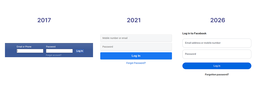
Here is how Facebook’s login form evolved through different UI/UX design eras:
Let me tell a story about how a redesign of a component made the particular component the primary, most-used region of a product.
We were maintaining a medium-scale HR management software. It had a task list widget with a simple tags-based filter as depicted below:

Our UI/UX design team decided to do a scope redesign for the task list widget with infinite scrolling, instant actions (assigning, editing, etc.), and quick task creation. The design and development process of the new component expanded over half a year— we were doubtful about the redesign’s ROI. Later, the new task list became the most-used widget—it even became a base component for some other components. It was also the reason for product owners to think of designing a mobile app.
The lesson I learned was:
Redesigning not only improves UX and prepares your product for the new UI/UX design era, but also opens doors for design innovation. Redesigning at the right level is an investment for the future
If your product is a one-time purchasable product or a non-profit product, you don’t have to worry about in-app advertising; you don’t have to advertise upgradable plans or display third-party advertisements. However, most products we build today are freemium, subscription-based, or products that generate revenue through third-party advertising. In-app advertising comes with a risk of annoying users, which leads to losing reputation.
I maintain a free and open-source cross-platform desktop app development framework called Neutralinojs, which generates advertising revenue from its official documentation via Google AdSense and EthicalAds. I seamlessly placed ads on the website as follows:

The current website version is about 5 years old now, and not a single user mentioned that ads are affecting their work, and Google Analytics studies didn’t show strong evidence of bounced users due to annoying ad placements, but the project still generates good ad revenue.
The lesson I learned was:
Prioritizing both user goals and business goals in a balanced way creates usable, sustainable products. If we start annoying users with in-app advertising or anything that affects usual user flows, the product starts losing reputation
Users aren’t solely responsible for user errors (slips and mistakes) — design issues can make digital product interfaces more error-prone. What if we make all key actions in product UIs reversible, usually with undo options? Then, users can recover from all common errors, right? Yes, prioritizing error recovery is important to let users continue using the product once they have already made a slip or mistake, but preventing errors is more important.
Some time back, I was working with an inventory-checking module of an inventory management app. The app ran on handheld devices. It had a log-out button in the first UI level since employees used shared handheld devices and required account switches during work shift changes. The app had a quick inventory availability checklist with swipe left and right actions.
Employees reported that they often accidentally tapped the logout button and unintentionally performed swipe actions during work.
The UI/UX design team solved user pain points as follows:
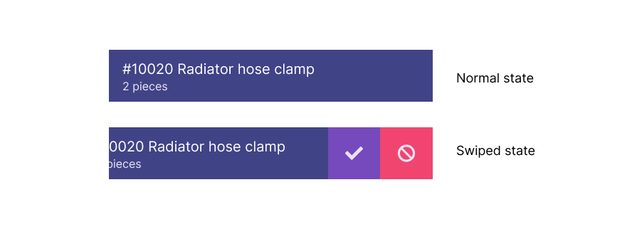
Users never mentioned the confirm dialog being annoying, or that the new swipe action is less productive.
The lesson I learned was:
Preventing user errors from happening them at the first place is more important than implementing user error recovery paths (usually implementing undo options)
What if we build a product using design principles from previous eras? A 90s-styled task management app or skeuomorphic social media app? Even though past UI/UX styles still work for enterprise product design, using outdated UI/UX styles for general consumer products won’t work well — the product either will be permanently classified as outdated or require a major redesign to compete with other products.
We use a GUI DevOps tool for customers to configure their server instances. It was initially created around 2014, so we used checkboxes, frame groups, and classic dropdowns. The classic UI controls looked similar to the following:
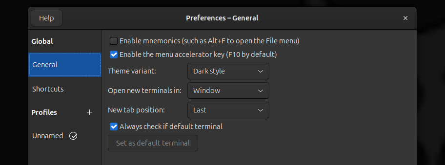
We didn’t update its UI for a long time since it’s just a part of a large DevOps solution and also did its job effectively, but a customer recently questioned the status of the whole DevOps solution since the GUI tool looked outdated.
We updated the UI of the tool using modern switch controls and other modern controls without updating anything in the backend, similar to the following example:
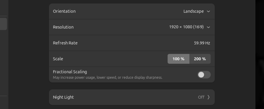
No customer has asked whether our DevOps solution is outdated again.
The lesson I learned was:
Users judge digital products by how they look and feel. If a product or even a small part of it uses outdated UI/UX styles, they’ll assume that the whole product is really outdated. Occasional product UI/UX redesigns increase the product’s lifetime
Familiarity creates good UX. A car door handle designed similarly to most cars creates a convenient experience for everyone — otherwise, they’ll have to learn a new skill, slowing down adoption.
In UI/UX design, the well-known Jakob’s law describes the importance of increasing familiarity in product interfaces as follows:
Users spend most of their time on other sites. This means that users prefer your site to work the same way as all the other sites they already know”
I experienced the importance of respecting Jakob’s law from a very interesting A/B test. Some time back, I was assigned to create a landing page for a tourism company. The task was to create a landing and direct booking page for a new travel package. The company sent several example websites, which included more websites with scroll snapping and artistic hero sections.
I designed two landing pages based on the company’s design preferences:


We agreed to run an A/B test for some selected customers to evaluate both designs. The second design had a higher conversion rate. From analytics, we concluded that the non-standard, complex hero section and disabled scrolling were reasons for the first version’s low performance.
The lesson I learned was:
Creating familiar and standard designs creates good UX. If you really want to be creative with non-standard designs, you’ll have to carefully blend your creativity while respecting core standards. Adhering to Jakob’s law increases adoption
Learn more about hero section design standards and browse best examples from this comprehensive article.
Every digital product nowadays integrates AI to improve user productivity. Google Search introduced AI mode, Google Maps added Ask Maps, and Figma introduced Figma AI — you can’t easily find a popular digital product without AI integrations. However, they still offer freedom for users to continue with classic workflows as usual. Forcing users to use AI can frustrate them.
Recently, I was consulting a startup project initiated by one of my friends. It is a DevOps version control product that offered a GUI for DevOps engineers to track deployment changes. My friend asked how to improve version control logs with AI. I suggested using generative AI to auto-generate version details, similar to what GitHub does:

The new AI integration mostly received positive user feedback, but a few users didn’t like it — they still wanted to type the version log manually — and they mentioned that the auto-generated message disrupted the usual workflow.
You may think that they can simply erase the AI-generated message and start typing, right?
Some users don’t like AI automations — they still like to continue with the manual, AI-free user flows they were used to. We made every user happy by creating a setting to toggle AI-generated version logs.
The lesson I learned was:
We shouldn’t force users to use AI features. Forced AI features create frustration since they break existing manual user flows that some users productively use; every AI integration should happen separately from established manual user flows or should come with a setting to opt out
Sometimes we make the right design choices and move on, but sometimes we learn unforgettable lessons from the wrong ones. As UI/UX designers, we’ll have to create various designs for diverse users with changing expectations, so we can’t guarantee that every design decision we make is absolutely right without a UX test. However, we can learn from other designers’ experiences and avoid most wrong design choices that we could unintentionally make.
Now you know the design choice lessons I learned in my UI/UX career. Ask your teammate about theirs and write down what you learned too — that’s how we prepare ourselves to make the right design choices without even doing a UX test.
LogRocket's Galileo AI watches sessions and understands user feedback for you, automating the most time-intensive parts of your job and giving you more time to focus on great design.
See how design choices, interactions, and issues affect your users — get a demo of LogRocket today.
Giving designers AI tools is the easy part. I share how our team used office hours, small experiments, hackathons, and shared failures to build better AI habits together.

Through this step-by-step guide, you can learn how to easily import files from Adobe Illustrator to Figma.

Growth design isn’t just about getting more users to convert. It’s about using research, experimentation, and data to improve activation, retention, and long-term user value without sacrificing trust or the quality of the experience.

Starting with proto-personas can be better than a blank page, but don’t forget — they’re assumption-driven placeholders for the real thing. Research is key to turning them into true personas.



 Learn more →