If you need a quick and simple explanation of Hick’s Law, it’s this: the more choices users have, the more time they need to make a decision.

Hick’s Law is crucial in UX because it simplifies the decision-making process, reduces cognitive overload, and improves user satisfaction. Let’s take a look at how we can apply Hick’s Law and simplify the decision-making process.
Hick’s Law, also known as the Hick-Hyman Law, is named after American psychologist Ray Hyman and his British colleague William Edmund Hick.
Hick and Hyman conducted an experiment in which ten lamps were lit randomly. Participants were to choose the lamp that was lit. The more lamps that were lit, the more time participants needed to make the right choice. Essentially, Hick’s Law highlights one’s ability to make decisions with different amounts of uncertainty, and several choices increase decision time logarithmically.
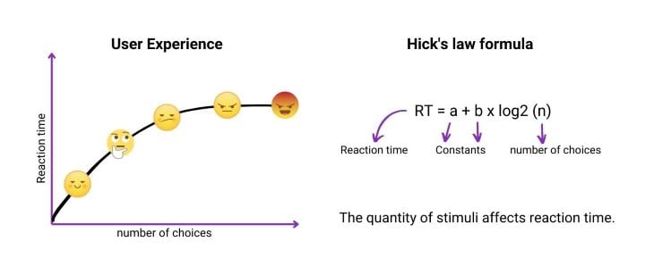
RT = a + b x log2 (n)
RT is a reaction time. It is the time between a stimulus first appearing and the start of the response. There are different types of reaction time: simple, which is relevant to simple possible responses, and choice reaction time, when there are several given stimuli but only one must be selected. Hick’s Law is applied to quick reactions and simple decisions.
a and b are constants in the formula. They depend on the particular task and the task response conditions.
n is the number of choices. By measuring the relationship between the number of stimuli and the user’s reaction to a given stimulus, you can measure the reaction time.
Hick’s Law can be used in almost any situation that requires users to make simple decisions. Applying Hick’s Law, UX designers can improve website navigation, simplify the login and checkout process, add categories, and leave only necessary options.
Hick’s Law can help users make their decisions more quickly and will improve their overall experience using your product. I suggest taking a look at the ways to improve UX with Hick’s Law.
Businesses often believe that offering as many options as possible will attract more users. Visitors faced with multiple choices tend to take a longer time to make a decision, and reducing the number of choices speeds up decision making.
Hick’s Law is based on human psychology. When people have several options, they try to process and evaluate each option to make the best choice. Overwhelming users with the number of options may lead to analysis paralysis. This is when a decision is delayed or never taken because of overthinking or overanalyzing given choices. Hick’s Law guides UX designers to limit the number of choices and help users to make quick decisions.
My favorite example of simplicity is the Google search engine homepage. Look how it has changed since its first launch in 1998. It is an amazing example of keeping things simple.

Compare the current page to the search engine homepage first launched in September 1998.

These three steps can help you to reduce the number of choices and create a user-friendly interface.
If you have a lot of menu items, group them into categories. Categories, even if you have plenty of them, help people to organize their thoughts. Let’s see how companies have been using Hick’s Law for years to make decisions easier on their users — you can draw inspiration from the pros.
Zappos, for example, grouped millions of items into simple categories so that you clearly understand where to search for the item you need.
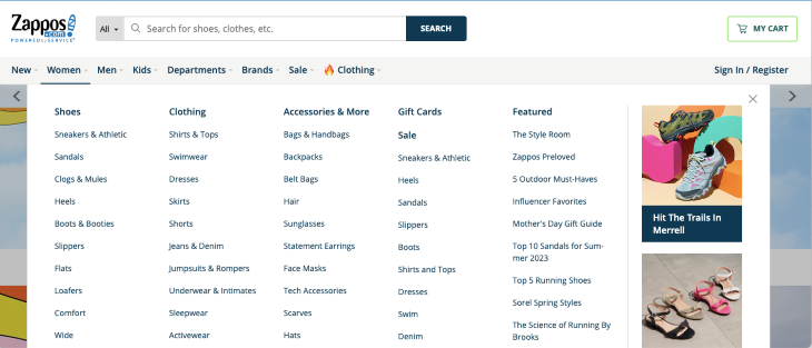
As a UX Designer, you have to find the functionalities your users need and lead them to the most expected options, helping them to make a decision.
For example, besides the standard menu with categories, Zappos offers “Popular categories on sale” to draw your attention and make the choice easier.

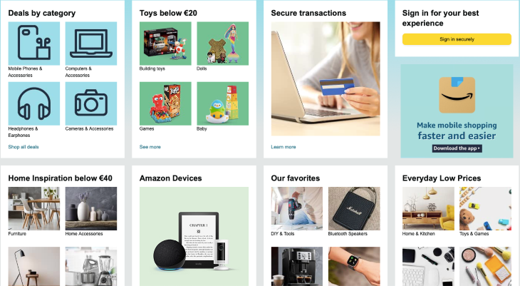
Amazon has an overwhelming number of categories and items. To avoid overloading users, they tailor their recommendations to the types of things you are interested in, categorizing the items you searched for or bought previously, and offering the most attractive and beneficial deals.
Another great example is from Coursera. After you’ve purchased a course on a certain topic, they offer you courses and certificates from the fields you are interested in.

Even though Netflix has a library of more than 5,000 movies and series, they understand how difficult it is for users to make a choice. Just look at the number of genres and imagine how much time and effort it would take to browse several of them.

To reduce the number of choices and help visitors make quick decisions, Netflix highlighted the category “Top 10 in your country.” They also generate categories tailored to their user based on watch history.

Take it one step at a time. Breaking down complicated tasks into smaller chunks will improve user experience.
The best example of this process is using several steps in the checkout for purchasing goods. Instead of creating a long checkout form, you can make a series of screens with a few options. In a boring checkout process, several steps can simplify the task, and visitors are more likely to complete their purchase.
This is what we call progressive disclosure. More on that below.
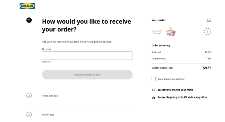
Look at how Ikea divided the checkout process into three simple steps:
The next example is the checkout form on the Apple website. The process is divided into clear steps. This great example shows that the way you implement complex tasks matters.
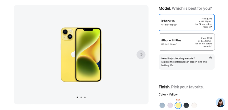
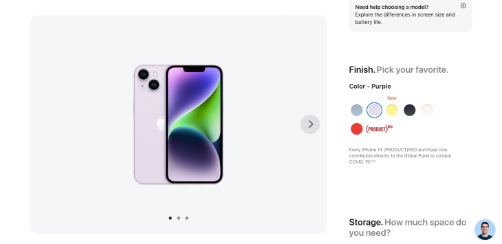
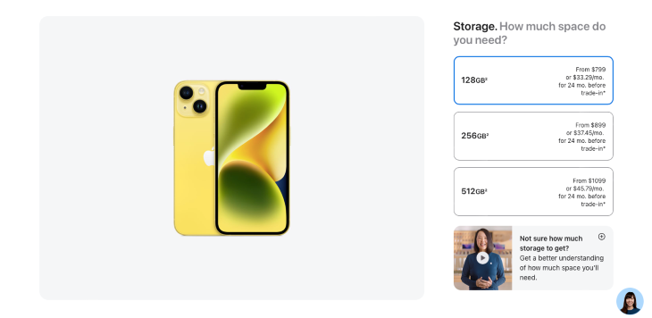

Progressive disclosure was first introduced by Jakob Nielsen, co-founder of the Nielsen Norman Group. This interaction design pattern made applications easier to learn and less error prone. Jakob Nielsen considered that, on the one hand, users want simple decisions, and on the other, they want enough options to meet all their needs. Both of these requirements can be satisfied with progressive disclosure.
A simple example of progressive disclosure is the “Learn more” button. Using progressive disclosure means that you provide the most important information or options, and further options are revealed in order of their labels with placeholder attributes in the input field.
Let’s go through examples and see where and how progressive disclosure can be implemented.
You don’t always need quick and simple decisions. For example, if you ask for feedback, it’s essential to know the user’s opinion or the details of the complaint. In this case, you can leave common options and add an “other” option to gather more information from the user.
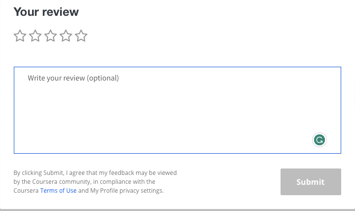
Coursera offers a straightforward form to rate their course in one click. Users just need to choose the number of stars. Optionally, they can write what they think.
Google uses progressive disclosure in the “People also ask” section. By clicking on the question, you receive more information on the topic.
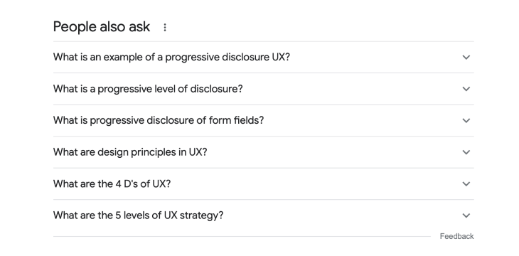
When you have a vast number of navigation options in the menu, it’s better to hide them so you don’t distract users with irrelevant content.
Apple’s website looks clean and simple.

But you can find all the necessary options if you tap the category you need.

Presenting products with carousels or sliders engages visitors and encourages them to interact with your products. You can help users discover new products or related goods. Amazon successfully uses this method.


Let’s discuss one of the most valuable parts of the user journey — forms. Forms collect user information. If you want to leave a good impression on your users, keep forms simple and accessible.
Reducing the number of possible choices is crucial in sign-in and checkout forms. We should avoid numerous time-consuming steps that can prevent a user from registering or buying. In the case of unclear, overwhelming sign-in forms, we lose potential users.
As for the purchase — the more steps, the more cart abandonment. To improve visitors’ experience using forms, leave only necessary options and provide simple steps.
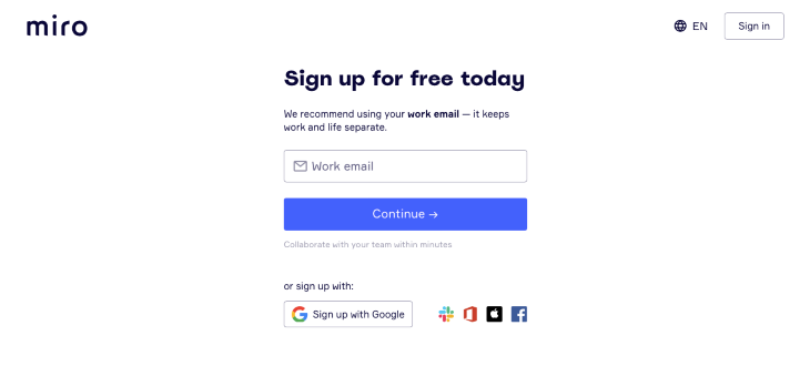
Canva uses social media to sign up to the platform, allowing users to register in one click.
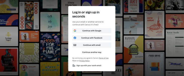
Clear and concise language can guide users to complete the goal and help them understand the information they should provide. You have to prevent users from guessing or being uncertain about what to enter. When you provide information logically, users better understand the tasks. Your questions should progress from easy to hard.
A form that meets the following criteria will likely receive more submissions and conversions:
Add as few fields as possible: Fewer choices — quicker decisions, remember?

The label is a small text that describes an input field, icon, or button. Even if it seems obvious to you, a user may not fully understand what to input, so it is better to add labels to form fields to make them accessible to everybody.
Do not substitute labels with placeholder attributes in the input field, although you can add them too.
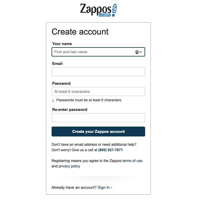
Place sections in separate fields if your form asks about two different topics. If they are related, put them inline.
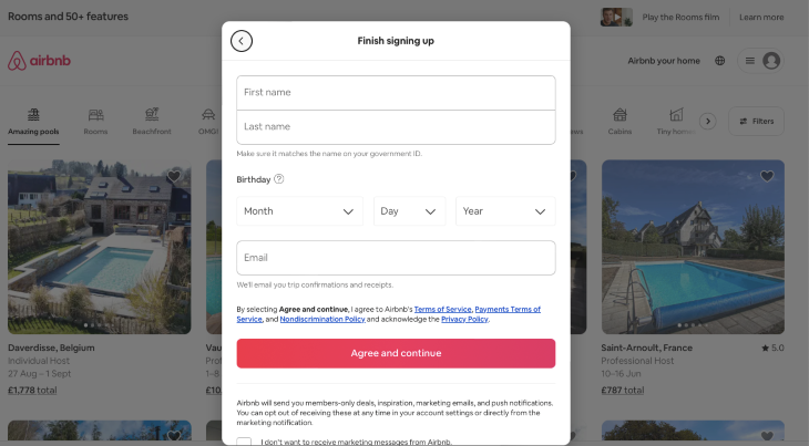
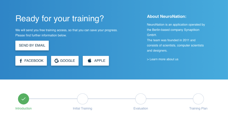
If your form has more than one step, it would be great to add a progress indicator to it.
A single-column form is typically more effective because it looks less complicated and helps users go smoothly and quickly through it without skipping any field.
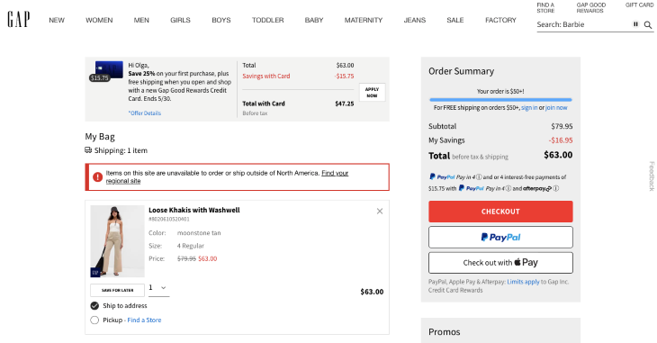
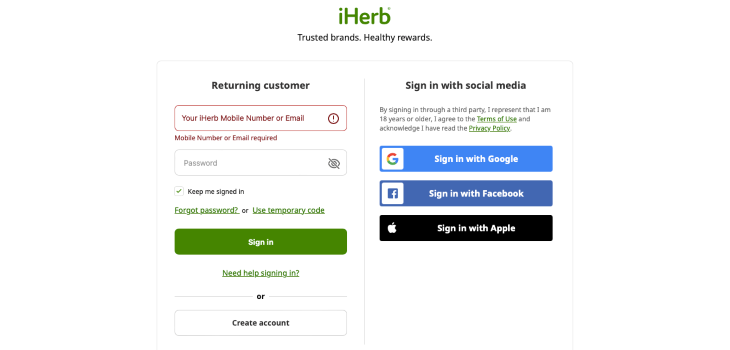
Add feedback that responds to the actions the user should take.
Feedback also helps to reduce errors and inform the user that the task is completed.
We hope you find the examples provided in this article helpful and inspiring. However, don’t forget to test and iterate your decisions. It’s always better to validate all your ideas with real users.
Testing will help you remain user-centric and provide you with unexpected insights. Create different prototypes for the same page and test, test, test. Observe users’ behavior and collect their feedback. Analyzing data will offer you ideas to iterate on your prototype.
Time matters, and reducing the number of choices can save users time. That’s what Hick’s Law is all about.
Finding the right balance between functionality and simplicity is the main task of a UX designer. User-friendly design involves an accessible navigation system, efficient forms, and a great experience using your product. That’s why Hick’s Law is fundamental in the UX field.
Header image source: IconScout
LogRocket's Galileo AI watches sessions and understands user feedback for you, automating the most time-intensive parts of your job and giving you more time to focus on great design.
See how design choices, interactions, and issues affect your users — get a demo of LogRocket today.

A three-week mobile banking project taught me that the “proper” UX process is not always realistic. Sometimes, the better approach is to work with what you know, identify what you still need to learn, and make the strongest decision possible under real constraints.
A/B testing compares two versions of a design to see which performs better with real users. Here’s how UX teams can use it to test hypotheses, measure outcomes, and make smarter product decisions.
This case study shows how one ad experience redesign increased total ad exposure while lowering perceived friction, proving that timing and context can matter more than raw interruption.

As products evolve into ecosystems, navigation becomes a system-level challenge. This article explores how to align structure, context, and user journeys to create seamless movement across tools without confusion.