The Zeigarnik effect is a psychological phenomenon where people remember unfinished tasks better than completed ones. This lingering awareness creates a mental tension that drives a desire for closure. As a result, it can boost motivation to return to and finish what’s incomplete.
The first time I encountered the Zeigarnik effect was when I first registered on Facebook decades ago. Meta was already using the concept back in those days that already feel like a previous life for me. I still remember those “fill the profile” nudges everywhere.
It was trying to create a social media platform with as much information about everyone as possible to make it interesting for the whole world. It almost felt like it had used the Zeigarnik effect by pure chance, simply trying to make the experience of all better.
So much has changed since then, and so has the mastery of applying the Zeigarnik effect. Nowadays, the most effective application of it lies in constantly refreshing quests that you must complete or else… The punishment always feels severe, and you feel as if stopping will cause the whole progress to be lost.
However, people usually don’t even realize that the feeling of progress is inherently fake, the punishment isn’t real, and the reinforcements are designed solely to maximize the product’s effectiveness. But it works!
As sinister as it sounds, the Zeigarnik effect works like a clock, boosting sales and engagement to the sky if done properly.
Many companies worldwide utilize the Zeigarnik effect in various ways. The concept has become so ingrained in our brains that many people use it without understanding.
However, the most successful companies know how to do it better than others. In my career, I’ve learned extensively about the success cases involving the Zeigarnik effect, and I believe it would be impossible to discuss my experience without first going through some of these success stories.
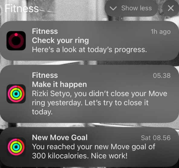
The “close your rings” feature is essentially the Zeigarnik effect in action — the psychological pull of unfinished tasks. When rings remain unclosed, they trigger subtle feelings of guilt, create mental hooks, and prompt notification nudges that keep the goal top of mind.
Research shows that Apple Watch users become 30 percent more consistent in their activity when using this feature, as the visual progress tracker encourages them to stay engaged. Over time, this constant monitoring and drive to complete the rings fuel frequent progress checks and boost overall engagement with the app:
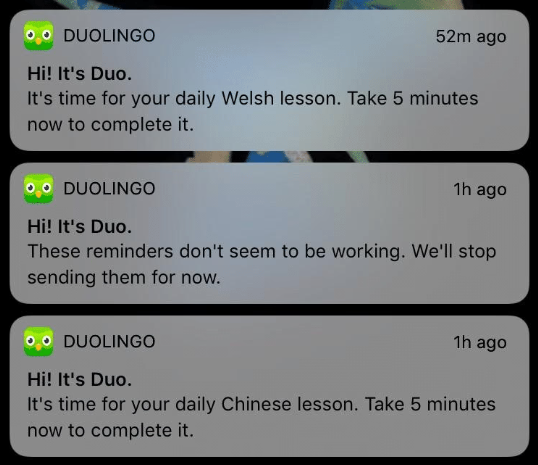
The platform uses daily streaks, incomplete XP goals, and partially filled skill trees to tap into the Zeigarnik effect, motivating users to return and “close the loop.” While frequent achievements and XP gains already provide a strong sense of progression, features like daily quests, XP bonuses for consecutive visits, and even refreshed quests for completed courses amplify this effect, keeping the sense of unfinished progress alive.
As a result, over 70 percent of active users return daily within their first 14 days:
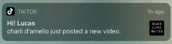
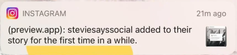
Notifications like “Someone posted a new story!” or reactions to a user’s post create the feeling of an unfinished loop of social attention. These prompts encourage users to return and re-engage, seeking closure on the feedback they’ve received or the updates they’ve missed.
As inherently social creatures, we’re driven by a natural curiosity to learn more about the people we know, making these loops especially compelling:
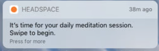
Users set a daily meditation goal, such as five minutes per day, and the app automatically generates corresponding meditation quests. If the day’s session remains incomplete, push notifications provide gentle nudges to encourage completion.
Streak tracking and personalized reminders further reinforce the habit, helping users stay consistent with their practice:
Considering all the case studies and aspects that made them success stories, here are some key UX considerations on how to use the Zeigarnik effect efficiently when creating an app or a website:
I once supervised the creation of a service from scratch, which involved developing a huge, customizable order form. Customers had to fill out numerous fields for the service delivery to run smoothly. Although the information we requested was necessary to satisfy the customer, they didn’t realize this and felt frustrated.
Many customers have left the form feeling overwhelmed, and our focus groups have reported similar frustrations, stating that the form is too long and confusing. The problem was that we couldn’t change the form due to the nature of the service and legal requirements.
We tried to double down on support to help them fill out those forms, but what worked best was the simple use of the Zeigarnik effect. So, we did this:
Our product was very different from the case studies I shared at the beginning of the article, but this just goes to show that you can apply the Zeigarnik effect to any industry. You just need to find a way to do so effectively.
The Zeigarnik effect, although an old psychological observation, has evolved into a precision tool for shaping user behavior. From fitness apps to language learning, social media, and wellness platforms, the same underlying principle — making progress feel incomplete — continues to drive engagement, habit formation, and loyalty.
My own project proved that these techniques aren’t just confined to billion-dollar companies or entertainment products; they can be adapted to almost any context where user action and completion matter. The key is to implement them with intention: balance the pull of incompleteness with a sense of reward, personalize the journey, and respect the user’s experience.
When applied thoughtfully, the Zeigarnik effect doesn’t just keep people coming back — it transforms passive visitors into active, invested participants.

LogRocket's Galileo AI watches sessions and understands user feedback for you, automating the most time-intensive parts of your job and giving you more time to focus on great design.
See how design choices, interactions, and issues affect your users — get a demo of LogRocket today.
Multimodal UX goes beyond designing for screens. Learn how context-aware systems, progressive modality, failover modes, and accessibility-first design create better digital product experiences.
Learn how context-aware mode prioritization and seamless transitions improve multimodal UX and reduce mode confusion.

Research is becoming more democratized, product cycles are accelerating, and AI is transforming synthesis and ResearchOps. Here are the three trends shaping UX research in 2026.
Voice support is not the same as multimodal UX. Here’s how to design systems with true mode continuity and context-aware interactions.


