Today, many companies have become more flexible with remote working arrangements, allowing teams to work where they feel most productive and comfortable, whether it’s the office or their personal workspace. In light of this movement, collaborative online tools have become essential to maintaining productivity and conducting activities that otherwise wouldn’t be possible with a remote team.

Miro stands out as a tool that brings teams together, whether they’re in the same office or scattered across the globe. Miro allows you to work with your team members in real time, giving teams a space to work and conduct collaborative activities, regardless of your location.
A strong use case for using Miro is for creating UX sitemaps. UX sitemaps help designers visualize the structure, flow, and navigation of a website or application. Think of a UX sitemap as a visual representation of the overall architecture of your digital product. It outlines the relationships between different pages, sections, and features, providing an overview of how users will navigate through your design.
Miro’s inbuilt features make the UX sitemap creation process simple. Using Miro can empower your design team to work together seamlessly, iterate on your UX sitemap, and effectively communicate with each other throughout the process. In this article, we’ll walk through the steps, as well as tips and tricks, to create a UX sitemap using Miro.
Miro is an excellent tool that offers a range of features and capabilities specifically designed to streamline the process of creating UX sitemaps collaboratively. Here’s how Miro can elevate your UX sitemap creation process.
The first step is to create a new Miro board. Think of a Miro board as your blank canvas to bring your ideas to life. To create an empty board, simply click on the New board button under Create a board.

To save time and kickstart your board, Miro offers a range of predesigned templates. These templates come in various styles and layouts, catering to a variety of different project needs and use cases.
You can select a template that closely aligns with your vision or modify it to suit your specific requirements. Miro has specifically created a sitemap template to get you started with your UX sitemap.
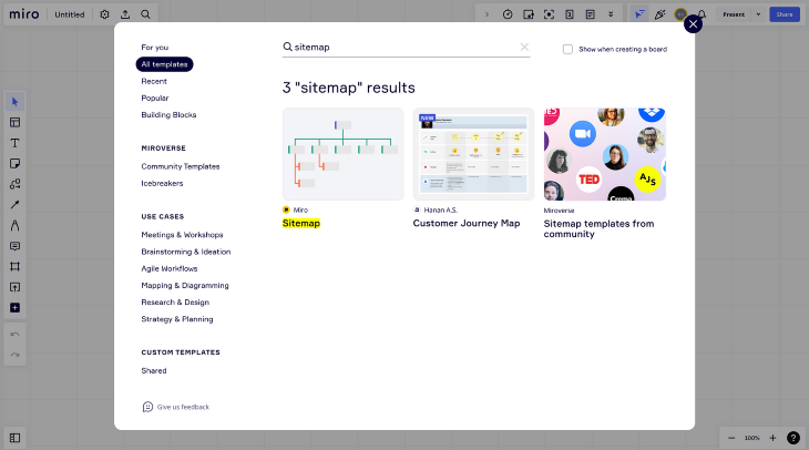
Once you have your board ready, it’s time to start adding pages and subpages to construct your UX sitemap. Using a combination of shapes, text, icons, and connection lines, you can start to create a hierarchical structure for your sitemap. To connect your pages together, select the shape you want to connect.
![]()
Then, click on any of the dots around it and drag your cursor to extend the connection line to another page. The connection line will snap in place, connecting both pages together.
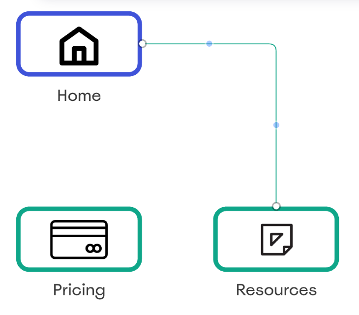
Organize your pages and subpages into a hierarchical structure to outline your UX sitemap. You can use different colors to represent each level of the sitemap. Once all your pages and subpages are connected, your sitemap is complete.
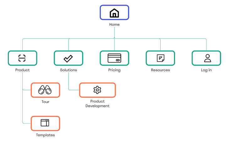
To take it a step further, Miro makes it simple to bring in more details to your sitemap using its Card app. Using cards allows color coding, tagging, adding notes within sitemap items, and assigning responsibilities to team members. This approach is particularly useful when you’re at the stage of building your design and need to provide context or delegate page design tasks to specific team members.

As you progress, you’ll find yourself creating multiple pages and subpages to represent the various sections and hierarchies of your website or application. Miro allows you to easily connect cards using connection lines, just like connecting any other object together.
To rearrange cards in your hierarchical structure, simply move the connection lines to attach them to a different card. This hierarchy allows you to represent the relationships between different pages and sections of your website or application.
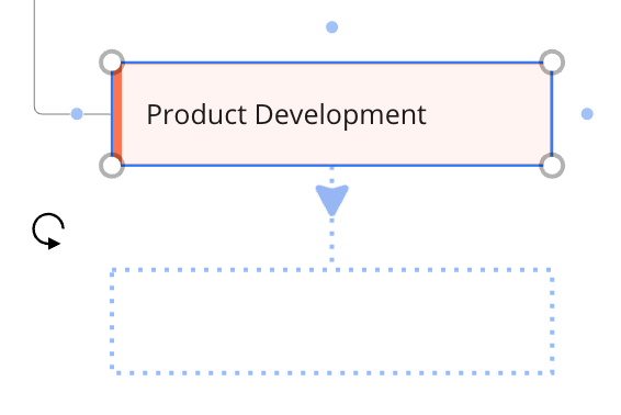
Miro’s flexibility enables you to experiment with different structures, iterate quickly, and find the perfect layout that aligns with your user experience goals.
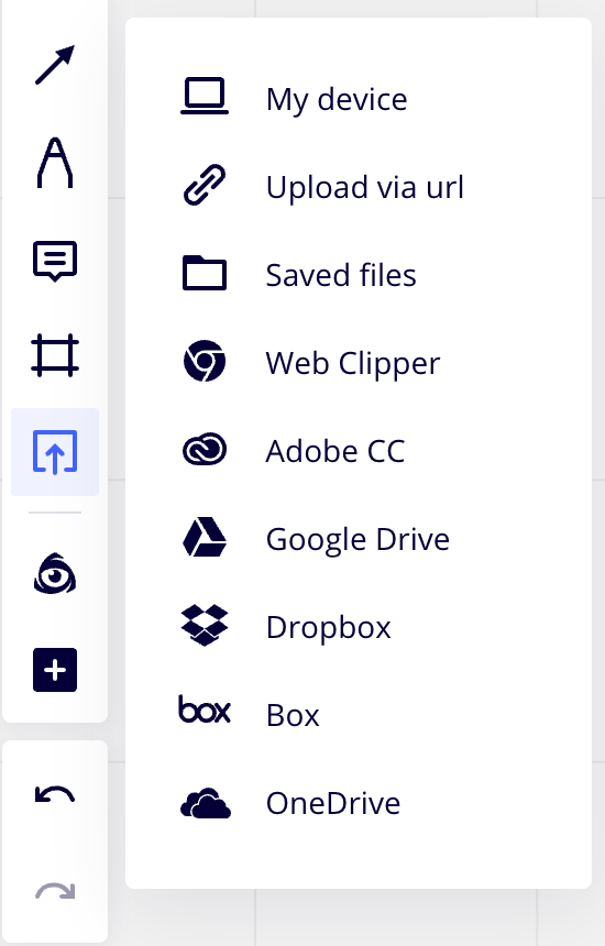
Visual elements breathe life into your sitemap and make it more engaging. Miro provides an extensive library of icons, images, and other visual elements to choose from via its inbuilt app IconFinder.
To add an icon, search for a relevant keyword in the icon library, select the one you like, and drag it onto your sitemap. You can resize and reposition it as needed.
![]()
With Miro, you can seamlessly add icons, images, and other visual elements to your sitemap. Whether it’s an icon representing a specific action or an image illustrating a particular page, Miro provides you with a rich library of visuals to choose from.
If you have specific images or icons you want to include, you can upload your own files to Miro. This way, you can maintain a consistent visual style and incorporate your brand elements seamlessly into the sitemap.
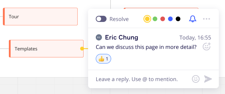
Miro allows you and your team members to work on the sitemap together in real time, regardless of geographical boundaries. No more waiting for feedback emails or juggling multiple versions of the sitemap.
Invite your team members to the board, and everyone can contribute simultaneously. You can leave comments, suggest changes, and have discussions right within the Miro interface. It’s like having a virtual design studio where everyone can bring their expertise to the table. This collaborative environment fosters creativity, improves communication, and leads to better outcomes.
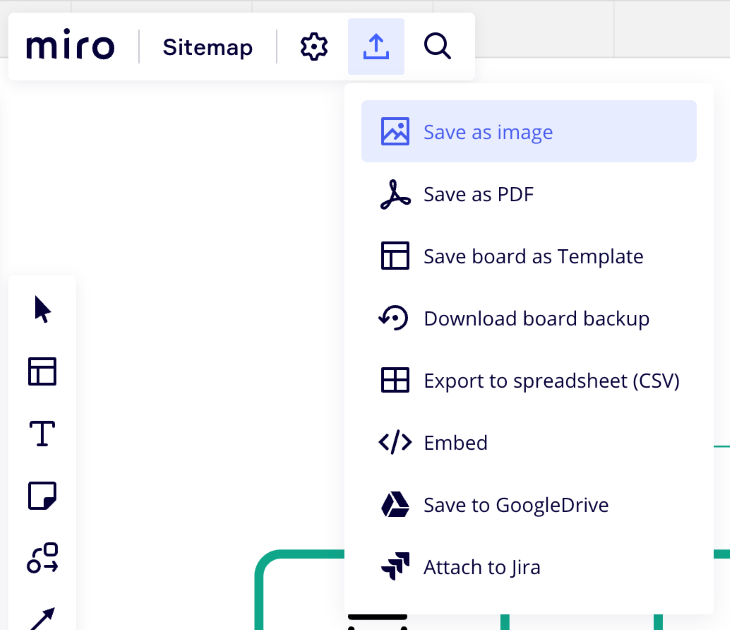
Once your UX sitemap is complete and you’re ready to share it with stakeholders or present it to clients, Miro offers a range of export options to suit your needs. You can export the sitemap as a PDF or PNG file, which preserves the visual fidelity and structure of your design.
If you prefer a more interactive approach, Miro also allows you to generate a shareable link. This link lets others view and interact with the sitemap directly in their web browser. They can navigate through the pages, zoom in to examine the details, and even leave comments or feedback.

With these export options, you can easily share your sitemap with stakeholders, clients, or team members who may not be directly involved in the Miro collaboration process. However, inviting contributors to collaborate directly in Miro can increase alignment with stakeholders and help create a UX sitemap that satisfies both user and business requirements.
By following these tips, you can design UX sitemaps that effectively communicate the structure and flow of your designs, making it easier for stakeholders, team members, and users to navigate and understand the user experience.
A sitemap should provide a clear and intuitive overview of the website or application’s structure. Consider using a hierarchical structure that reflects the logical flow of the user experience. Start with the main pages at the top level and group the related subpages underneath.
Avoid unnecessary complexity and aim for simplicity. You don’t want to overcrowd the sitemap with unnecessary details. Focus on capturing the core pages and sections that are essential for users to navigate and understand the overall structure. Remember, the goal is to make it easy for both stakeholders and users to grasp the overall flow and organization of the design.
When applying page labels to your UX sitemap, keep them short and descriptive to allow users to quickly understand the content and purpose of each page. Ensure that the labels align with users’ mental models and expectations. For example, labeling a website’s navigation menu as “Pathfinder” might confuse users who are unfamiliar with the term.
Keep the terminology consistent throughout your UX sitemap to maintain clarity and reduce confusion. Action-oriented labels help convey what users can do on a particular page, such as “Contact Us.” Again, avoiding technical jargon or industry-specific terms will help users feel familiar and gain a better understanding of your UX sitemap.
Colors are a great way to categorize pages in your UX sitemap. To add a splash of company branding, select a color scheme that complements your brand or design system. However, use color sparingly and purposefully to highlight important elements or indicate different sections.
Visual hierarchy is also essential for differentiating sections. You can implement visual hierarchy by using different font sizes or distinct visual styles for primary pages or sections. This helps guide users’ attention and emphasizes the most critical parts of the sitemap.
Ensure that the use of color and visual elements doesn’t compromise accessibility. Consider color contrast and provide alternative visual cues, such as icons or labels, for users who may have difficulty perceiving colors.
Recruit a diverse group of representative users who match your target audience and conduct usability testing sessions. Observe how users interact with the sitemap and gather their feedback on its clarity, navigation, and overall usability.
Conducting a card sorting activity with users can be an invaluable approach to creating a sitemap that resonates with their needs and expectations. Card sorting involves presenting users with a set of labeled cards representing different pages or sections of your website or application and asking them to organize these cards into meaningful groups or categories.
By involving users in the process of organizing the content, you gain insights into their mental models and how they perceive the relationships between different pages. This user-centered approach helps you create a sitemap that aligns with their thought process, making it easier for them to navigate and understand your design.
Pay attention to any confusion or difficulties users encounter while interpreting the sitemap. Note areas where users may struggle to understand the structure or find specific pages.
Finally, iteratively refine the sitemap based on the insights gained from user testing. Make necessary adjustments to improve clarity, simplify navigation, and address any usability issues that arise.
Miro offers a collaborative platform for creating UX sitemaps that can greatly benefit your design team’s process. By leveraging Miro’s intuitive interface, template library, and real-time collaboration features, you can streamline the creation of UX sitemaps and enhance teamwork across remote teams.
By keeping your UX sitemap simple, using clear labels, incorporating visual hierarchy, and testing them with real users, you can ensure their effectiveness in communicating the structure and flow of your website or application. Miro provides an ideal environment for implementing these best practices and refining your sitemaps iteratively.
So, if you’re looking for a practical and no-nonsense tool to create UX sitemaps, try using Miro. Its user-friendly interface, collaborative capabilities, and extensive feature set make it a great asset for any distributed design team.
LogRocket's Galileo AI watches sessions and understands user feedback for you, automating the most time-intensive parts of your job and giving you more time to focus on great design.
See how design choices, interactions, and issues affect your users — get a demo of LogRocket today.

As products evolve into ecosystems, navigation becomes a system-level challenge. This article explores how to align structure, context, and user journeys to create seamless movement across tools without confusion.

Figma’s AI features have exploded in 2026 — from text generation and image editing to full UI drafts and code handoff. But speed isn’t the same as quality. This guide breaks down every major feature, what it’s good at, and where human judgment still does the heavy lifting.

Zero UI works well for screenless, voice-first experiences, but most digital products still require visual interaction. Here’s why multimodal UX offers a more scalable foundation for the future of design.

Multimodal UX goes beyond designing for screens. Learn how context-aware systems, progressive modality, failover modes, and accessibility-first design create better digital product experiences.