Trust signals are the visible and invisible cues that reassure users when buying a digital product or service. They range from security icons to customer reviews, money-back guarantees, and the presence of well-known payment methods. In ecommerce and SaaS products, where hesitation at checkout is common, these signals often make the difference between abandonment and purchase.

From personal experience, when it comes to startups, trust signals have a tremendous impact on conversions. When no one knows your product or who you are as a company, trust signals act like a reference from a market leader — people are more likely to buy your product if they see familiar names. Unfortunately, since they do not recognize your brand, you must ensure that at least something on the screen is familiar to your customer. This is why trust signals are extremely useful for getting things started in the early stages.
In this piece, I’ll go through case studies of digital products like Airbnb, Shopify, and PayPal to see how even small tweaks in trust presentation can increase conversions for not just startups, but even mature companies, even further. Let’s examine the most impactful trust signals used in successful product designs and see how you can use them in your own work, too.
Users often hesitate to enter payment details or commit to subscriptions because of loss aversion (the fear that losing money or time outweighs potential benefits) and status quo bias (the tendency to stick with free trials or familiar options instead of switching). These biases are amplified by perceived risks such as security breaches, fraud, or unreliable services, which can easily trigger cart abandonment or stalled sign-ups.
From a behavioral science perspective, digital trust is not only about technical safeguards but also about shaping perception through proven principles. Social proof (reviews, testimonials), authority (endorsements, certifications), and reciprocity (free trials, guarantees) all reduce uncertainty at the moment of decision. Emotional design reinforces trust by minimizing cognitive load (streamlined, distraction-free checkouts), providing transparency (clear pricing, refund policies), and fostering unity (showing that others in the community also chose the same plan).
When businesses weave these psychological levers into their interface design, they don’t just reassure users — they actively counter hesitation biases, reduce abandonment, and make commitment feel safer, easier, and more rewarding. Even small changes, like displaying a recognizable payment logo or showing “Trusted by 10,000+ subscribers,” can transform hesitation into confidence at the point of conversion. Potential customers may view such a signal as social proof or authority verification, which they trust, thereby benefiting the business at any point in its life cycle.
Airbnb’s core challenge was psychological: overcoming loss aversion (fear of wasting money or risking safety) and status quo bias (hesitation to stay with strangers instead of booking a hotel). Their breakthrough was a two-way review system, where both hosts and guests leave feedback. This transparency tapped into Cialdini’s principle of social proof and created a sense of reciprocity and unity, making it easier for users to take the leap.
Crucially, Airbnb embedded reviews into its UI hierarchy in ways that reduce hesitation at decision-making moments:
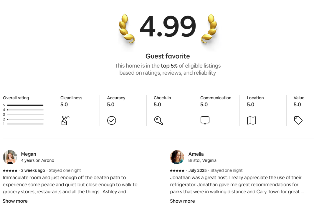
Ratings and review counts appear above the fold, carrying more visual weight than body text, and reviews are filterable and sortable to mitigate choice overload or negativity bias:

Microinteractions, like hover states highlighting keywords (“clean,” “friendly host”), lower cognitive load and increase perceived safety.
The same psychology applies across SaaS purchase flows. For example:
Over time, Airbnb’s review system became more than reassurance; it evolved into a long-term reputation architecture. Reviews motivate hosts to maintain consistent quality, and they serve as a discovery mechanism for guests searching by ratings. This mirrors how SaaS platforms use verified feedback loops (customer ratings, NPS scores, or case studies) to build durable trust and drive adoption.
Overall, Airbnb shows that verified, visible, and well-structured feedback systems can overcome hesitation biases. In SaaS, applying the same principles, especially at sensitive conversion points like checkout or subscription confirmation, turns trust into a design feature that reduces abandonment and accelerates confident decisions.
One of the most effective trust-building strategies in digital commerce is the use of visible security cues. Shopify recognized early that one of the biggest barriers to conversion was not the technical reality of security but the perception of risk during checkout.
To counter this, Shopify enforced SSL encryption across all stores and offered a marketplace of security apps and badges, such as McAfee Secure and TrustedSite:
Placement was deliberate — badges appear directly on product and checkout pages, aligning with the user’s natural F-pattern scan path (horizontal scanning at the top, shorter horizontal scan further down, and then a vertical scan down the left side of the page), so trust signals are encountered exactly where purchase decisions happen:
Badge color and high-contrast design leverage pre-attentive processing, meaning users can register “safety” in a fraction of a second without deep reading. Even subtle indicators, like the HTTPS lock icon in the browser bar, became mandatory for every Shopify store, creating a baseline reassurance before any user typed payment details.
This placement strategy matters just as much in SaaS flows. Security assurances like SOC 2 compliance seals, GDPR or HIPAA compliance icons, and “Encrypted with AES-256” microcopy serve the same psychological role as e-commerce trust badges. Positioned near login forms, subscription confirmations, or payment buttons, they reduce loss aversion and checkout hesitation by addressing risk perception at the very moment it arises.
Therefore, security reassurance needs to be visible, persistent, and strategically placed. It’s not enough to secure the backend — users must see and feel proof of safety in the exact micro-moments where hesitation peaks.
In the early days of e-commerce, one of the biggest barriers was loss aversion. Users feared losing money to fraud or exposing sensitive card data to unknown merchants. PayPal addressed this by acting as a trusted intermediary — letting people complete transactions without sharing credit card details directly. The brand itself carried weight, signaling authority and consumer protection, reassuring buyers they would be covered in case of disputes.
But PayPal’s impact wasn’t just about brand reputation. It was also about interface integration. Placement of the PayPal option near the primary checkout button made the safe choice immediately visible at the moment of hesitation. Using the recognizable blue-and-gold PayPal badge introduced familiar visual cues into unfamiliar merchant flows, borrowing not only brand trust but also design trust:
On mobile, PayPal’s streamlined login reduced cognitive load, offering a faster, safer path to completion.
For SaaS and subscription flows, these design choices are equally powerful. A PayPal button placed alongside credit card fields reduces checkout friction and gives risk-averse users an “escape hatch” at the commitment stage. Combined with reinforcing UI elements — such as secure iconography, consistent brand colors, and progress indicators in the checkout flow — PayPal’s integration helps counter status quo bias (“I’d rather not enter my card here”) and lowers abandonment rates.
So, trust isn’t just borrowed from third-party brands. It’s amplified by how those trust signals are placed, styled, and sequenced within the interaction flow. SaaS companies can learn from PayPal’s role in checkout design — position reassurance at the exact point of decision, make it visually prominent, and pair it with smooth microinteractions to turn hesitation into conversion.
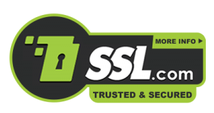
On mobile, friction is one of the biggest killers of conversions. Filling out forms on small screens is tedious, and any extra effort increases drop-off. Apple Pay and Google Pay address this by offering one-click checkout tied to biometric authentication. The ease of use is paired with an implicit trust signal: customers believe that if their bank and device manufacturer support the payment, it must be secure.
Google Pay, in particular, reduces friction further through progressive disclosure. Stored cards and payment methods remain hidden until the user actually needs to make a choice. This avoids overwhelming the interface while surfacing relevant options only at the decision point. Combined with material design guidelines (consistent spacing, elevation, shadows, and motion cues), the flow feels both familiar and trustworthy across devices, reinforcing user confidence:
Today, not seeing Apple Pay or Google Pay as an option often creates hesitation, since it signals that the site may not meet modern standards or bank approval. For merchants, adding these wallets is not just about faster checkout; it is about showing alignment with the trusted ecosystems of Apple and Google.
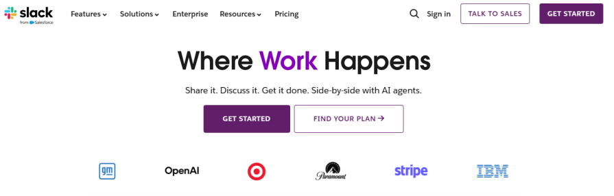
Slack uses customer and partner logos extensively on its homepage. By displaying companies like IBM, Target, and Stripe as active users, Slack signals authority and reliability. This approach leverages the principle of social proof, but at an enterprise level, if respected brands rely on Slack for business-critical communication, prospective buyers feel safer adopting it too.
This type of partner validation is especially powerful for SaaS, where buyers are wary of downtime, data security, or wasted investment. The placement of these logos near call-to-action buttons reinforces the decision-making process, helping users feel they are in good company:
The lesson is that partner and customer validation is not just aesthetic; it’s a conversion driver that transfers credibility from big names to your product.
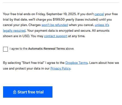
Dropbox reassures customers with clear guarantees and transparent privacy policies. Users signing up for Dropbox Plus or Business plans see language that explains billing, refund policies, and data protection standards. This transparency lowers the barrier for customers making longer-term commitments to digital subscriptions, since they know what to expect and how their information will be handled. Even simple guarantees like a “30-day money-back” option reduce hesitation, because they give buyers psychological safety that their purchase is reversible:
For SaaS providers, these policies also serve as signals of professionalism and reliability, proving that the company is confident in its service and respects the customer relationship. The takeaway is straightforward — clear guarantees and upfront policies reduce perceived risk and make customers more comfortable committing.
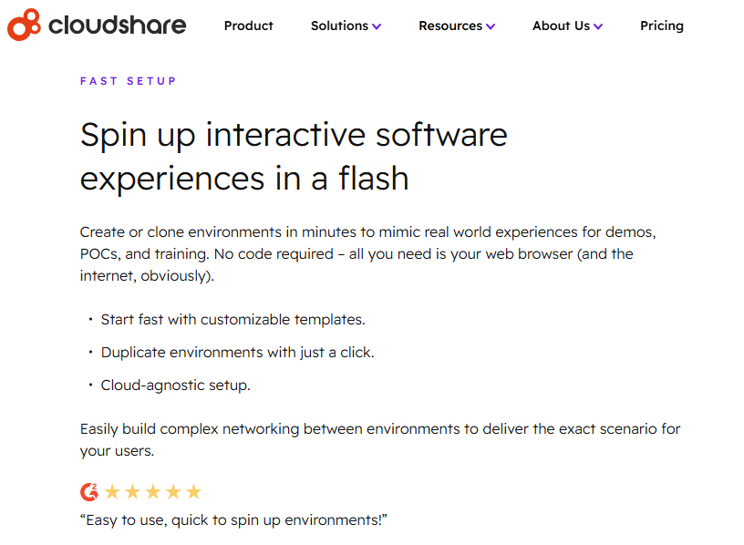
Companies like Scrum and CloudShare display badges and review ratings from Trustpilot or G2. These third-party reviews act as independent endorsements, confirming that the company’s claims are validated by real users. Unlike testimonials that businesses collect themselves, platforms such as Trustpilot and G2 verify authenticity through strict review processes, making them far harder to manipulate:

SaaS companies often highlight G2’s “Users Love Us” badge or Trustpilot’s star ratings on key conversion points like pricing pages, trial sign-up forms, or demo request flows. These visuals serve as shortcuts to credibility — prospects don’t have to take the vendor’s word for it; they can trust the impartial verification of a recognized authority. Even the logos of these platforms carry weight, since they are widely known in B2B purchasing circles as trusted review ecosystems:
For digital businesses, external validation complements internal testimonials and customer quotes by adding authority and neutrality. It signals that a company is not just self-promoting but has earned recognition through public feedback on a platform outside its control.
The key takeaway is that verified third-party reviews should be integrated directly into the buyer journey, where decisions are made. Placing Trustpilot stars near checkout, or G2 badges on pricing and demo pages, reassures prospects at critical moments and reduces friction caused by doubt or skepticism.
| User hesitation type | UX design approach | Example implementation |
| Security | Visually surface SSL badges, HTTPS lock icons, and refund assurances where users enter personal or payment data. | Shopify, Dropbox |
| Credibility | Use authentic social proof such as verified reviews, customer stories, or contextual testimonials near key decision points. | Airbnb, Trustpilot |
| Authority | Display recognizable partner or payment logos to reinforce legitimacy through association. | Slack, PayPal |
| Effort | Offer one-click payment options or simplified flows that minimize perceived effort. | Spotify, PayPal |
Across all the cases, one pattern is clear — trust is not built through a single signal but through a system of reinforcements that address different buyer fears:
Each trust signal works on a specific hesitation, and when layered together, they form a safety net that steadily removes friction across the funnel.
For digital businesses, the lesson is not to copy one company’s exact tactic, but to apply the underlying principle: meet hesitation with reassurance. That might mean adding visible SSL seals to checkout, embedding verified reviews on pricing pages, showing logos of credible partners, or streamlining mobile payments. The implementation framework (identify friction, match the right trust signal, place it where hesitation occurs, and test rigorously) ensures that trust isn’t left to chance but designed into the experience.
Personally, I realized that these trust signals are important for every business. However, one thing I realized after a while is that using Trustpilot is beneficial only in the early stages. Technical security measures like encryption, banks, and legal authorities now require various policies to be present on the website, and multiple payment options are always a “must have” because they directly concern business, customer convenience, and money.
But, when it comes to personal reviews and authority signals, I realized that sometimes some reviews, like the one I found on Instagram, might work against you:

Sometimes it is too much effort for customers to review all the negative comments and understand the problem deeply, as well as to check how the company responded. All they check is an average rating, and it might be misleading or directly lowered by competitors.
Additionally, when it comes to authority, logos of some brands that you think everyone should know might not be recognizable by newcomers, and that might actually drive them away. “I don’t know any of those, this feels scatchy” is another response that you might start seeing in those questionnaires you send to your target audience.
So, all in all, it is up to you to determine if you need to stop and when to do so because not all trust signals work for everyone in the long run, even if they drive sales in the early stages. Keep that in mind and continue researching your audience, as you might need to remove some trust signals later in your company’s life cycle.
Ultimately, conversions increase when users feel confident that their money, data, and time are respected. The companies studied here did not simply sell products; they engineered trust into every interaction. Digital businesses that follow the same path will not only see higher conversion rates but also build stronger long-term relationships with their customers.
Trust me, this is how UX really converts!

LogRocket's Galileo AI watches sessions and understands user feedback for you, automating the most time-intensive parts of your job and giving you more time to focus on great design.
See how design choices, interactions, and issues affect your users — get a demo of LogRocket today.

AI tools can generate beautiful UI concepts in minutes, but most teams struggle to integrate those outputs into real design systems. This guide explores why AI drifts toward generic patterns and how to build governed workflows that keep speed without sacrificing brand consistency.

Adaptive interfaces personalize experiences using behavioral signals and machine learning. But when personalization becomes autonomous, systems can reinforce patterns, limit discovery, and shape user behavior in ways designers didn’t intend.

Security requirements shouldn’t come at the cost of usability. This guide outlines 10 practical heuristics to design 2FA flows that protect users while minimizing friction, confusion, and recovery failures.

2FA failures shouldn’t mean permanent lockout. This guide breaks down recovery methods, failure handling, progressive disclosure, and UX strategies to balance security with accessibility.


