Editor’s note: This article was updated on 4 December 2024 by Edward Chechique to dive deeper into secondary navigation, provide updated examples and actionable guidance, answer common questions about secondary navigation menus, and more.

Efficient site navigation is a very important factor when we design a website or an application. Without clear navigation, users will get lost in all the information the website contains.
Building clear and efficient navigation helps the user easily and quickly find what they’re looking for. When users can’t find what they want, they move elsewhere.
Almost every website has a primary navigation menu that the user can use to navigate the website. This menu helps the user find the most important information. For example, a small ecommerce primary navigation will include products and contact details.
On websites with lots of information, secondary navigation menus are common. Primary navigation shows the most relevant stuff for users, while secondary navigation adds extra details without making the main menu too crowded. This helps users find what they need faster, especially on big websites where it’s easy to get confused.
In this article, we’ll focus on secondary navigation. We’ll see how to design it, what to include in it, when to use it, and the various types of secondary navigation (there’s more than one way to make them!).
Moreover, we’ll compare both types of navigation in a simple table so that you may quickly understand the differences.
Secondary navigation is an additional navigation option that complements primary navigation and is used on websites with large amounts of content. It organizes information simply with a clear hierarchy so users can dig deeper into the website and find what they need quickly.
For example, a simple website for a local hairdresser with just three categories like About Us, Contact, and Image Gallery may not need secondary navigation. However, for an ecommerce site for sports clothes with many categories like shorts, pants, shoes, and more, it’s a must.
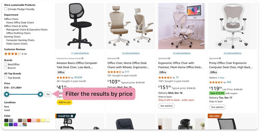
Secondary navigation also helps users filter information quickly. For example, on an ecommerce website for chairs, users can click on the primary navigation category Work Chairs to get all the chairs designed for working. Then they can use secondary navigation to filter the results by price, color, with or without wheels, with or without adjustable height, etc.:
Other than these two, you can also find secondary navigation in help centers, which always include lots of information.
Here is a short summary of what effective secondary navigation can improve for the user:
The secondary navigation menu is a basic component of many websites and applications, so there’s no need to reinvent the wheel. It’s not easy to organize a lot of information, so sticking to a few basic rules will guide you in designing it effectively.
Before you start working, conduct research on similar websites to understand how they organize information. It will help you to get a good sense of how to organize information.
For example, if you are designing a recipe website, explore some recipe websites to understand how they structure the different categories. (In this case, you may also find a tasty recipe for your lunch 😉)
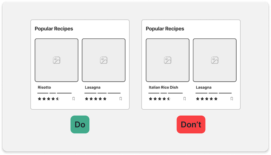
Ensure that every item on the menu is written simply, clearly, and without jargon. For example, on recipe websites for Italian cuisine, name the dish “Risotto” instead of something confusing like “Italian Rice Dish”, or “Pasta Carbonara” instead of “Italian Pasta with Guanciale”:
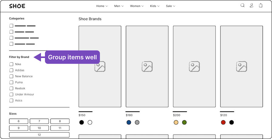
Build effective information architecture, creating clear categories to organize information logically. For example, on a shoe website, you can have a filter or category for shoe brands like Nike, Adidas, New Balance, etc.:
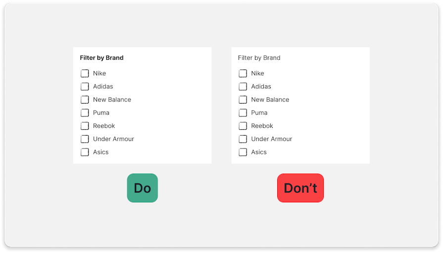
The menu’s visual hierarchy must be clear to differentiate the category titles and the items from the secondary labels. You can do this with a thin line, different typography weights, and colors:
Separate menus and combined menus are the two main types of secondary menus:
Each of them is suited to specific cases and depends on your specific needs. Let’s get into a few different subtypes of separate and combined secondary navigation menus.
Opens a short section of information when clicked or hovered over:
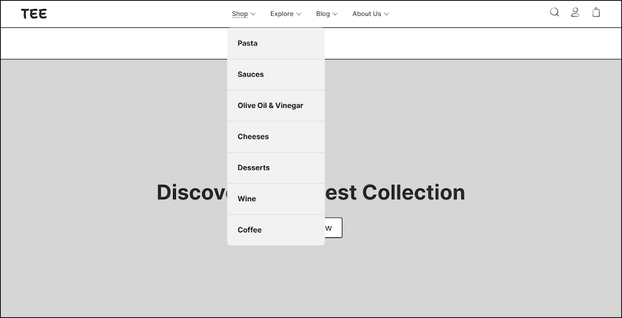
Opens a larger menu with more categories:
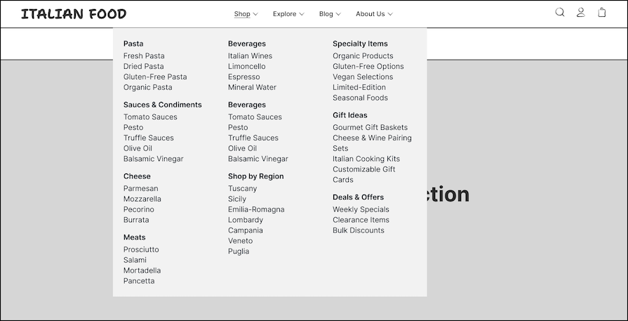
At the top of a website, you may find both the primary and secondary navigation menus, but in separate sections. In the example below, the user can select the language and other preferred settings in the top menu section. Below, there is another menu with different sections:
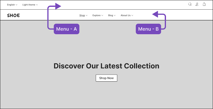
Placing a secondary navigation menu in the sidebar of a website allows you to organize a large amount of information vertically. In many cases, this menu opens and closes with a hamburger icon button or is used to filter information:
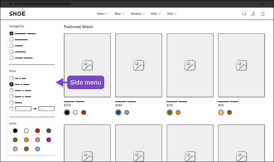
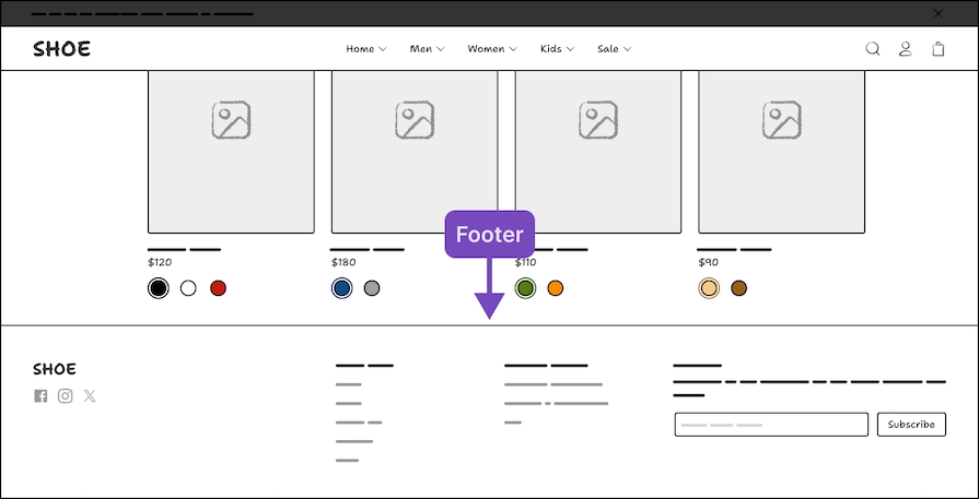
Some people won’t consider the website footer to qualify as a navigation menu, but for me, it’s an important secondary menu. It sits at the bottom of the page, where the user can find the most relevant links in one place:
In some cases, when you want to make an item stand out and be more visually attractive, you can also add an image near the text:
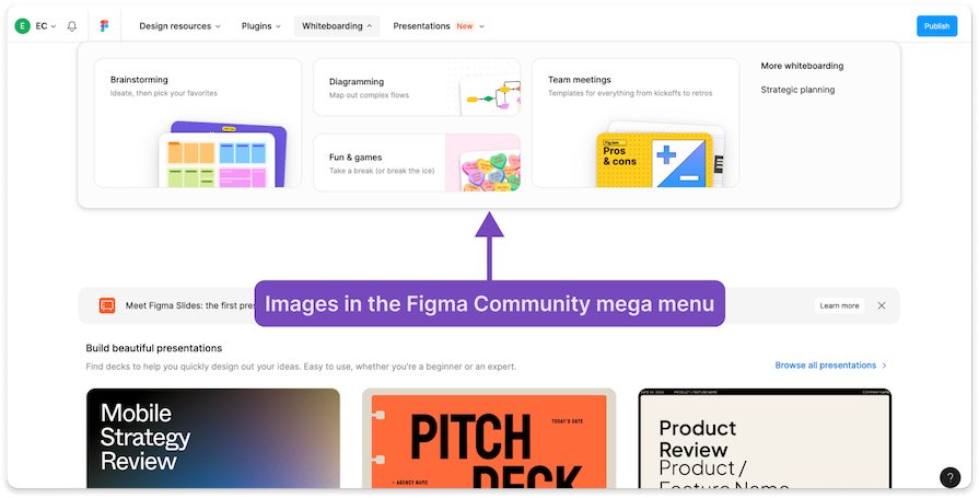
When used tastefully, images can not only improve the menu’s aesthetic, but also provide visual cues to users, which is especially helpful for users who are quickly skimming the content.
On desktop websites, you have more real estate on the screen, but on mobile, it’s a different story. This makes it necessary to redesign the menu for mobile devices.
In many cases, you will need side menus for mobile navigation. I recommend you look at how other websites do it. For example, compare the Zalando desktop website with the Zalando mobile website or app:
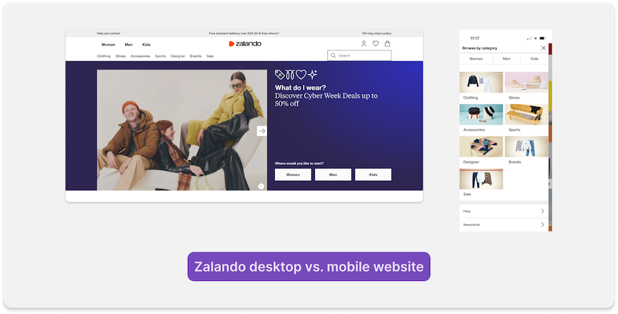
In addition, ensure collapsible menus are sized large enough to be clicked easily, generally larger than 48×48 px.
Enable keyboard navigation to make the secondary menu accessible and easy to use for users who rely on their keyboards. In this case, you will need to communicate this requirement clearly during developer handoff so your devs know to add this functionality to the product.
After finishing the design, perform usability testing and track important metrics. You can do this before or after releasing the product to users — in fact, you should probably do both.
Getting user feedback and analyzing data will help you improve the navigation and ensure it’s easy to use.
When designing your website’s navigation, leverage both information architecture and site mapping tools. These tools can help you lay out the elements on each page and organize information in a way that enables users to find what they’re looking for and achieve their goals as seamlessly as possible.
From content organization and hierarchy through to navigation design and content audits, here’s a list of some of my favorite tools for nailing navigation design:
Now that we’ve covered exactly how you can categorize your content and the tools that can help you do that, let’s see some practical examples of how secondary navigation is applied in the real world.
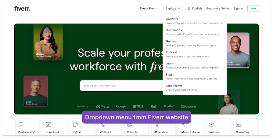
On the Fiverr website, you can see a combined menu with dropdown navigation. They combine simple titles with short subtitles for clear scanning of information. In addition, the visual design of the title and subtitle has a clear hierarchy:
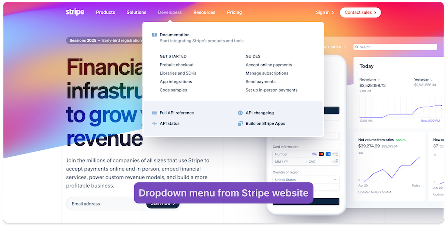
The Stripe website uses a secondary dropdown menu with a clear visual hierarchy in the dropdown section:
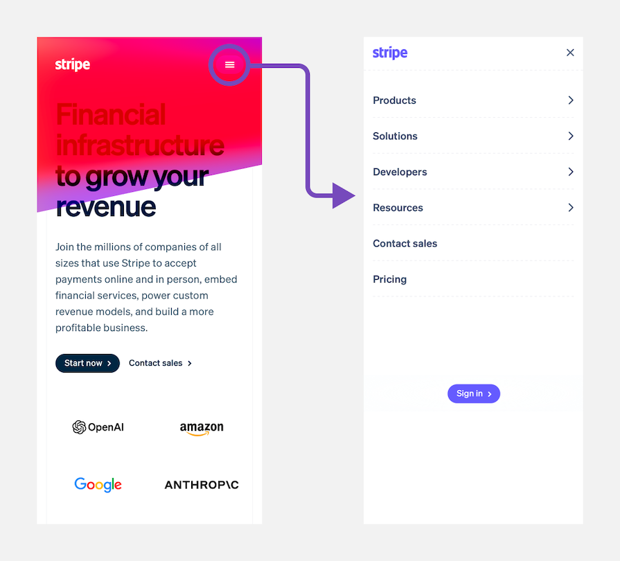
They adapted this menu design for mobile using accordion UI elements:
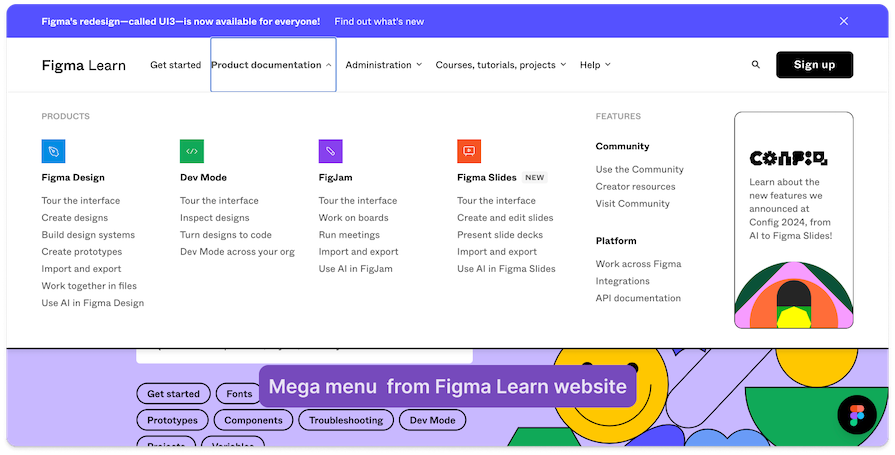
Here is an example of a mega menu. Notice how Figma added its tools’ icons to the mega menu. This makes it easier to scan the information and adds another visual layer to the UI:
Tesla’s mega menu shows photos to better showcase the company’s different car models. Additionally, on the right side of the menu, you will find a list of links users may need:
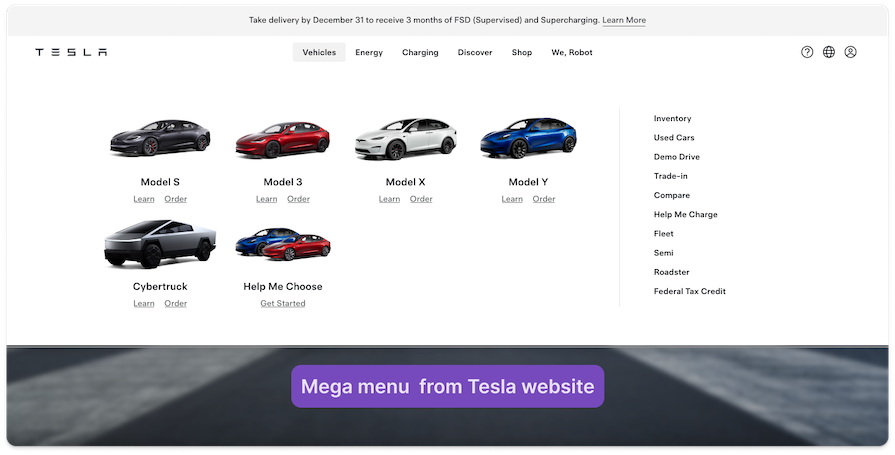
Here, you can see a clear hierarchy between the main topic in the secondary menu (the car images) and other content like the links on the right side.
Zalando’s website features a primary menu at the top, which includes the main clothes types (Women, Men, and Kids). Below, there’s a secondary menu listing the subcategories of clothing:
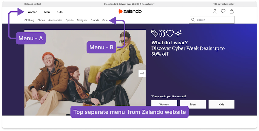
This is a clear example of a separate top menu. In addition, look at the hierarchy of the text where the first menu is written in bold typography, and below, a menu is regular.
Amazon has a separate side menu. As I explained above, a side menu is an excellent way to organize a website with a lot of information:
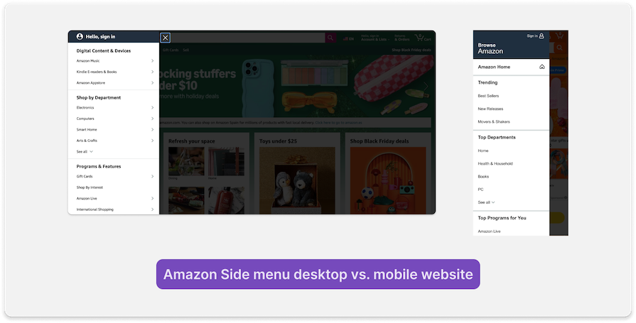
You can also see that the navigation works similarly on mobile, with sections that users click to open another section.
Stripe’s website contains a very large footer that essentially serves as a sitemap:
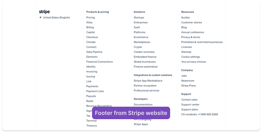
As I explained earlier, some people may not consider the footer secondary navigation. However, you can see how much information they provide in a very simple way so the user can find information easily.
The main difference between primary and secondary navigation is focus and hierarchy:
Take a look at the table below to scan and understand the differences between primary and secondary navigation menus easily:
| Primary navigation menu | Secondary navigation menu |
|---|---|
| Useful for high-level categories | Specific subcategories and deeper links |
| Leads users to core sections and main pages of the site, such as Home, Services, or About Us | Supporting or related content, like niche topics or deep categories like shoes on a clothes website |
| Usually located at the top of the page in a horizontal menu | Usually in the sidebar, dropdown, mega menu, or footer |
| Represents the primary actions the user need | Provides the user with additional options or context |
| Helps users understand what main sections are available | Detailed and contextual, offering further exploration once a user makes a choice |
| Often includes brand elements like the logo or home link | It’s usually used for specific tools or resources, like filters, account settings, or related content |
If you’re including a secondary navigation menu in your UI design, it’s important to get it right — but it’s easy to make mistakes that might confuse users or interfere with accessibility. Here are some common mistakes in secondary navigation design and how to avoid them:
Let’s put this information into action:
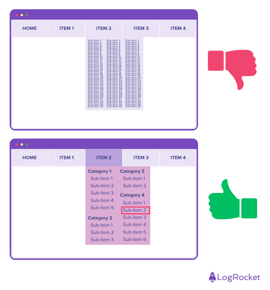
In the first example, the secondary menu is hard to see and navigate. The menu item text is small and squished-together, and nothing is categorized, forcing the user to read through every menu option.
The second example uses color strategically to make it visually clear which primary menu item is open and where the secondary menu is. The secondary menu is also organized into logical categories, and the text is large enough and spaced out for better readability. You can even see which menu item is highlighted when using the keyboard to navigate.
Secondary navigation is additional navigation for a website or application that complements the primary navigation menu to help the user find deeper or more specific content. For example, under the primary navigation category “User Preferences,” you might find secondary navigation menu items like “Profile Settings,” “Display Settings,” “Notification Settings,” and more.
The two levels of navigation are primary navigation, which controls the main structure of the interface, and secondary navigation, which helps users find more detailed information.
The main difference between primary and secondary navigation is the depth of information. Primary navigation provides more general information, while secondary navigation gets more specific or niche.
Secondary navigation is critical for users because it helps them find more specific information. In addition, it helps to organize websites with lots of information, allowing users to dive deeper and find what they need more easily and with less effort.
As with every component we design for the UI, it is necessary to adapt secondary navigation for mobile. In most cases, mobile secondary navigation converts to a dropdown menu. It is not mandatory to do it this way, but it is a common way to design it.
In addition, be aware that if some information is not necessary for mobile, you can exclude it. This will save time and effort for both you and the user.
In this article, we looked at secondary navigation in the user interface.
First, we explained that secondary navigation is an additional navigation component added to a website or application, complementing primary navigation to better support user navigation. We emphasized its importance in organizing information simply and clearly, making it easier for users to find the information they need quickly.
We then looked at the process for building secondary navigation. This included talking with users to understand their perspective on the information and using tools like card sorting to organize the information effectively. After that, with tools like Lucidchart or OmniGraffle and the insights we got from the users, we can organize the information clearly.
Our next step was to look at specific examples of secondary navigation. There are two main types: separate menu and combined menu.
We provided examples from different websites, such as combined menus using mega menus or dropdowns. We also provided separate menus like side menus or second horizontal menus at the top of the page.
Finally, we compared primary and secondary navigation and offered tips for effective design. These tips included creating a clear visual hierarchy, writing labels clearly, and ensuring mobile accessibility.
Header image source: IconScout
LogRocket's Galileo AI watches sessions and understands user feedback for you, automating the most time-intensive parts of your job and giving you more time to focus on great design.
See how design choices, interactions, and issues affect your users — get a demo of LogRocket today.
A three-week mobile banking project taught me that the “proper” UX process is not always realistic. Sometimes, the better approach is to work with what you know, identify what you still need to learn, and make the strongest decision possible under real constraints.
A/B testing compares two versions of a design to see which performs better with real users. Here’s how UX teams can use it to test hypotheses, measure outcomes, and make smarter product decisions.
This case study shows how one ad experience redesign increased total ad exposure while lowering perceived friction, proving that timing and context can matter more than raw interruption.

As products evolve into ecosystems, navigation becomes a system-level challenge. This article explores how to align structure, context, and user journeys to create seamless movement across tools without confusion.