Alright, you’ve done the discovery work. You’ve talked to potential customers, dug out some insights, and have some ideas on how to proceed. And whether you’re designing a new product from scratch or adding a feature to an existing one, the next steps will be the same — build a prototype to validate all your assumptions. And your goal isn’t perfection. It’s speed. You want something realistic enough to validate your core ideas, even if it’s rough around the edges. Don’t worry if it looks nothing like the final product. This stage is about learning, not impressing.

The ground is shifting fast, and nobody has it all figured out. Designing with GenUI tools like Vercel’s v0 or Lovable is still mostly trial and error. What works today might feel outdated in six months.
But that’s part of the opportunity. These tools invite us to rethink old workflows — particularly the outdated, artifact-heavy handoffs between design and development. Instead of pixel-pushing, we’re stepping into a role that’s more like system direction than traditional UI design.
In this piece, we break down what GenUI changes (and what it doesn’t), how to stay in control of AI-generated UI, and why designers are becoming more like systems thinkers than screen-makers.
The traditional design-to-dev handoff is a well-known point of failure. It’s a process heavy with static artefacts that attempts to translate dynamic interactions into a fixed medium. The result is a slow grind and a frustrating cycle of rework.
This is where tools like v0 come up, especially for designers. Built on familiar technologies like React and shadcn/ui, v0 speaks the same language as your developers. It creates real, usable code, reducing translation issues and aligning everyone on the same foundation.
For us designers, this opens up a ‘vibe coding’ approach to our work, making it more intuitive, allowing us to move beyond the traditional, static way of working and iterate faster. This doesn’t eliminate conventional forms of design, such as working with Figma or Axure, but it opens up more possibilities with the tools we use.
What GenUI tools do is to bridge this translation gap, mocking up an idea and also building it using the same technologies as the final product. This changes our game in some important ways:
Working with a GenUI tool requires a definite shift in thinking. You’re not drawing rectangles anymore; you’re directing a system. My work with these tools has been a process of discovery. A more efficient workflow is to instruct the AI to create a complete, self-contained, component-based application from the outset. This approach establishes a coherent foundation for layout, styles, and core patterns in a single step. It will make it easier to refine these files later for more advanced development if needed.
Here is a practical guide to this method:
Let’s start with a prompt example which has two distinct sections:
Paste the prompt below in your GenUI tool of choice. Remember to customize the ‘Application blueprint’ section to your needs:
************************* Start of prompt *************************
You are an expert AI assistant specializing in generating single-page applications. Your goal is to produce a well-structured, high-quality application based on the specific requirements I will provide.
Important note on modifications: When I provide you with existing code and ask for changes, you must only alter the specific elements or aspects I explicitly ask you to change. Do not refactor or modify any other part of the previously generated code that is not directly related to my current request. Your changes should be targeted and precise.
Please adhere to the following general principles in your generation:
##### Code structure and quality:
- Generate clean, readable, and logically organized code within a well-structured set of files appropriate for a react component based app. Split each view into an individual file.
- Use descriptive naming conventions for any generated CSS classes, such as kebab-case, or for HTML IDs, if not solely using utility classes from a framework. Prioritize conventions of common CSS frameworks or libraries.
##### UI and visual principles:
- Technology stack: Assume standard web technologies (HTML, CSS, JavaScript) unless specified otherwise. If a framework like React or a library like Tailwind CSS is requested, use its best practices.
- Visual hierarchy: Establish a clear visual hierarchy in the layout.
- Color: Use a clear and accessible color palette. Make sure there is high contrast for text against its background. If semantic colors for errors, success, or warnings are needed, they should be distinct and conventional.
- Typography: Use a readable, standard web font. All UI text you generate, including headings, labels, titles, and button text, must strictly use sentence case (e.g., “User profile settings,” “Enter your first name,” “Save changes”).
- Spacing and sizing: Employ consistent and adequate spacing, using padding and margins, to create a clean and readable layout.
- Interactivity: Interactive elements like buttons or inputs should be clearly identifiable and usable.
##### Content formatting:
- Sentence case: As a point of emphasis, all placeholder text, labels, titles, headings, and button text you generate must use sentence case.
- Conjunctions: Always spell out the word “and”; do not use ampersands (&) in any UI text.
- System messages: Any system-generated messages, such as placeholders for errors or success notifications, must be clear, concise, and helpful.
##### Animations and transitions:
- If animations or transitions are appropriate for interactive elements, they should be subtle, purposeful, and improve the user experience without being distracting.
##### Accessibility:
- Use semantic HTML elements appropriately.
- If generating form elements, make sure labels are correctly associated with their inputs.
- If images are part of the application, include alt attributes, and note if they are placeholders.
Now, based on these general principles, please generate the single-page application detailed in the application blueprint below.
#### Application blueprint:
The pitch: (Customize this prompt to your own needs) An intuitive tool for teachers to discover and organize lesson ideas, saving them time on curriculum planningThe problem: (Customize this prompt to your own needs) Teachers spend many hours searching for fragmented and unorganized lesson resources online. The issue we are trying to solve is the lack of a single, reliable platform where they can find, save, and manage quality educational ideas efficiently.
The user flow: (Customize this prompt to your own needs)
- The application should present a single, focused view for a new user.
- The user arrives on a clean landing page designed to guide them towards logging in.
- A persistent header at the top of the page contains the application’s logo for branding and a menu icon for future navigation.
- The central part of the page features a welcome message and a straightforward login form. This form should be simple, with fields for an email address and a password, leading to a primary action button to log in.
- A simple footer is present at the bottom for essential legal information.
Content and copy guidelines: (Customize this prompt to your own needs)
- The tone should be welcoming and professional.
- Labels and placeholder text should be clear and direct, such as ‘Email address’ and ‘Enter your password’.
- The main call-to-action button should read ‘Log in’.
- The footer should include placeholder text for copyright information, for example, ‘Copyright [Year] [Company Name]’.
************************* End of prompt *************************
Paste the combined text into the AI tool, submit, and iterate as needed. The AI’s first output is a powerful starting point. You will need to provide follow-up instructions to refine the generated application.
As you iterate on the AI’s initial output, you will enter the most critical phase of this workflow, making targeted adjustments. This is a big challenge that I have hit repeatedly with GenAI — its tendency to make ‘helpful’ but unwanted modifications outside the scope of a request.
Now this happens with all GenUI tools, not just v0, although I have found that v0 is getting better and less temperamental. You go a few prompts in and then realize, to your horror, that another screen has changed down the line. It is deeply frustrating, and I have typed some choice words at it. The “Important note on modifications” section in your base prompt serves as a guardrail against this, but you can also prevent it from happening by following these strategies:
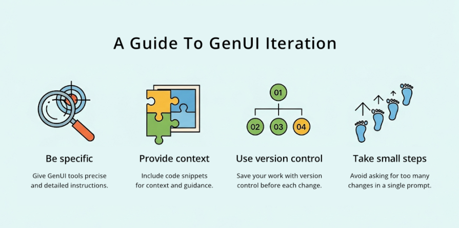
A vague request is the main reason an AI will alter the wrong part of your code. The more precise your request, the less room there is for misinterpretation.
Vague request — “Add a Forgot password link”
Specific request — “Below the password input field, but before the main ‘Log in’ button, add a link with the text ‘Forgot password?’ that points to ‘#’ for now”
This is the best strategy for clinical changes. Copy the small block of code you want to modify and instruct the AI to replace it with an updated version:
“Please update the form’s action buttons. Replace this HTML block:
<button class=”primary-button”>Log in</button>
With this new version that includes a secondary cancel button:
<div class=”form-actions”>
<button class=”secondary-button”>Cancel</button>
<button class=”primary-button”>Log in</button>
</div>”
This is a professional best practice in all spheres, but it is essential to an AI workflow. Before you request the AI, commit your current working version of the code using a system like Git. You can directly connect to GIt in v0. But for simplicity, I fork a version when I’m happy and append a version number to the name.
Avoid asking for too many unrelated changes in a single prompt. It is safer to make a series of small, incremental requests than a single large, complex one. This makes it easier to review each change and catch any errors immediately.
AI is a talented but overly eager junior developer. It requires clear and precise instructions to stay focused. By combining the foundation of your base prompt with these strategies, you can reliably build and refine your prototype with precision.
After I put this process into practice, a clear picture emerged:
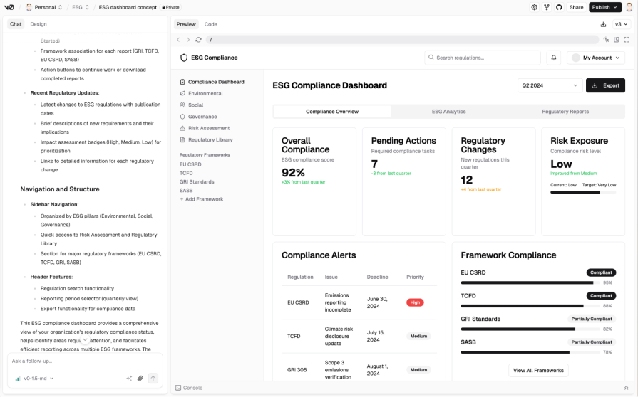
GenUI will not replace designers or developers for the foreseeable future, as the limits to what GenUI can do are clear. Developers will still need to refactor and review the code that is generated, and designers will need to scrutinize their designs with a critical eye and continually consider the end user’s perspective.
Once you have a functional prototype and gathered user feedback, you need to adjust your approach to working with AI. Now it’s about refining the experience. Here are two ways to guide that process:
Since we often use AI to build interfaces for AI-powered systems, it makes sense to guide refinements with principles for responsible AI design. You can feed these into the AI as a layer of context.
Here are some examples I have used:
******** Start of prompt ************
- Design for trust: Calibrate trust with explanations. In areas of uncertainty, explain how the AI arrived at a conclusion.
- Design for co-creation: Give control back to the user. When automation falls short, provide easy ways for the user to correct or refine the AI’s output.
- Design for imperfection: Offer ways to improve outputs and handle errors gracefully. Acknowledge that the AI will make mistakes.
******** End of prompt ************
Instead of just asking for a visual change, you can make more conceptual requests. For example: “Using the principle of Design for trust, modify the result cards to include a brief explanation of why each item was recommended.”
AI doesn’t have a designer’s critical eye. A checklist helps you audit the prototype and identify areas for improvement, particularly in terms of usability.
******** Start of prompt ************
- Check the microcopy: Is the language clear, concise, and helpful? Are error messages specific?
- Check for good patterns: Does the UI use conventional, predictable patterns? Is the information architecture logical?
- Check against user feedback: Have the most critical issues from the validation session been addressed?
- Check for good practices: How does it measure up against basic accessibility guidelines or usability heuristics?
******** End of prompt ************
After an audit, you can translate your findings into tasks. For instance, if you find the error messages are generic, your next prompt could be — “Refine the login form’s error messages to be more specific and helpful, following good UX microcopy practices.”
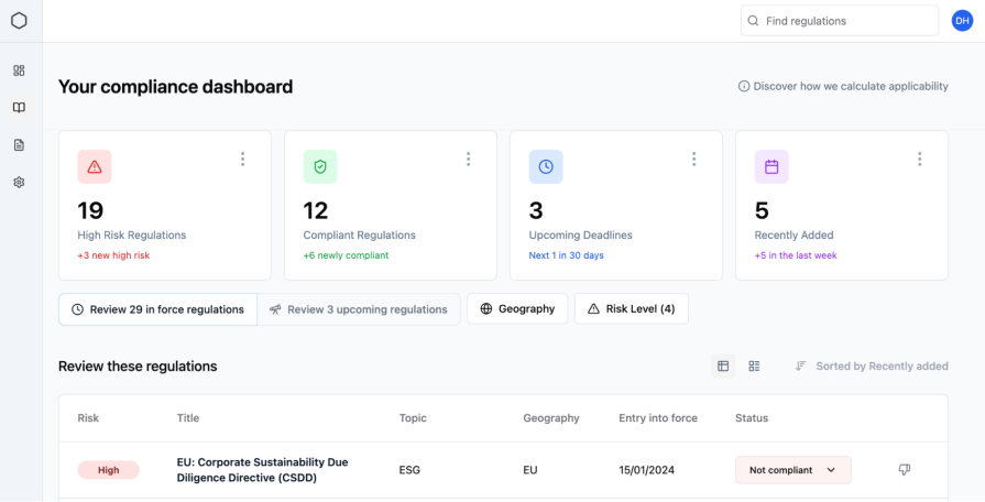
Once you are done with the validation stage, you can continue with refinement and experimentation to see how much you can improve the UI’s appearance. Ideally, this refinement would happen at the beginning of the process. However, there is a balance to consider, which is creating a design that is good enough for validation without any emotional investment, versus a more refined, pleasing design that you might want to keep at all costs:
******** Start of prompt ************
- Make this design feel like an award-winning designer crafted it. Ultra-modern, playful, highly usable, with smooth micro-interactions and delightful UX touches that elevate the entire experience.
- Use DM Sans with medium weight.
- Letter spacing: -2. Line height: 1.4.
- Primary color: Soft Purple #7A5FFF. Secondary: Teal #00D1B2 and Coral #FF6B6B.
- Prioritize a dark mode UI.
******** End of prompt ************
So, where does a tool like v0 fit? Currently, it is best suited for the early stages of conceptualization and rapid prototyping. Collaboration with engineering requires clear expectations; what they receive is a starting point, not a finished product.
All of this now signals a change in the designer’s role, moving it away from the ‘craft’ of creating artefacts and towards the act of directing large systems, away from focusing solely on the microstate to the macrostate. We are becoming the editors, managers, and collaborators. For those who want to adapt, it’s a change that makes our work more efficient and, arguably, more focused on solving problems for people.
LogRocket's Galileo AI watches sessions and understands user feedback for you, automating the most time-intensive parts of your job and giving you more time to focus on great design.
See how design choices, interactions, and issues affect your users — get a demo of LogRocket today.
Security requirements shouldn’t come at the cost of usability. This guide outlines 10 practical heuristics to design 2FA flows that protect users while minimizing friction, confusion, and recovery failures.

2FA failures shouldn’t mean permanent lockout. This guide breaks down recovery methods, failure handling, progressive disclosure, and UX strategies to balance security with accessibility.

Two-factor authentication should be secure, but it shouldn’t frustrate users. This guide explores standard 2FA user flow patterns for SMS, TOTP, and biometrics, along with edge cases, recovery strategies, and UX best practices.

2FA has evolved far beyond simple SMS codes. This guide explores authentication methods, UX flows, recovery strategies, and how to design secure, frictionless two-factor systems.