Using a design system brings new team dynamics, and it’s not always obvious what we can expect.

A design system is a great internal product to align work within teams and speed up processes. Our design system serves as the source of truth from a design perspective. Leveraging one is crucial to remaining nimble when conducting rebrands, and it sets the basics for consistent patterns across the UI.
With all these benefits, there also come restrictions: you will need to sacrifice certain things as a designer and as a developer for the greater good. Every design system will work differently depending on the agreements you make cross-functionally, so it is very important to understand that a design system is built collaboratively.
Prototypes are a useful tool for designers that can be used alongside a design system, making the process of prototyping faster and allowing them to test the UI with precision. But when prototyping using a design system, we also need to bear in mind the limitations.
Because we are using final styles, we might lean towards making it as true to reality as possible. But that might be counterproductive.
With that in mind, let’s dive a little deeper into how we can effectively prototype using a design system.
There are various types of prototypes that will come in handy at different stages of the product conception. Many UX experts have already written on the various types of prototyping methods and tools, so I will not be diving deep into that.
Instead, to understand where we stand when prototyping using a design system, I will quickly introduce the levels of fidelity a prototype can have to get any newcomers up to speed.
The objectives of a prototype are to put ideas to the test and validate them as well as present certain functionalities and behaviors. For testing purposes, prototypes are an essential tool for identifying and solving user pain points as well as learning about their mental models; and they are key to refuting or confirming hypotheses.
High-fidelity prototypes are great for putting more complex patterns to the test. They allow the user to really get immersed in the test to treat and judge the design almost as a final product. This provides the team with very useful behavioral and formal insights about the design.
Prototypes are tricky when working with a design system, because depending on how the system is built, it will facilitate certain workflows and complicate others.
For example, developers are going to want to mimic a design as well as possible, which means the design will need to be very thorough with the real developed functionality of the component. And here is when disagreements happen and the team needs to compromise.
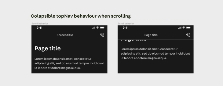
As an example, talking about top navigation, when you have a screen with a title that then scrolls into the top-bar, that is considered a collapsible top-bar from a developer’s perspective. Designing the element exactly as it looks from a dev perspective would compromise being able to scroll in a screen in prototypes similar to real-life interaction.
So, it depends on the agreements you make with the team if you design different components to allow prototyping or if you decide to follow a strict dev conception:

This means that when developing the design system there has to be an active and constant evaluation from a design perspective of how flexible it is for prototyping and determining what compromises want to be made to allow what interactions. And the key here is understanding the purpose of a prototype.
A prototype is a simulation of a final product that design teams use for testing before implementation and showcasing certain interactions. Understanding this is key.
When working with a design system, we will probably be generating high-level prototypes, but we need to keep in mind that the main product of the organization is the design system. We never compromise the design system for prototyping purposes, and we’ll go into further detail on this later.
Most likely, the design system will be built to facilitate faking certain interactions for prototyping purposes (e.g., when you click an input and you see the active state before starting to write).
And see how I say “fake,” because those interactions will never be identical to the natural interaction with an already implemented product with all its finalized microinteractions. Also, complex levels of animation do not add value to our prototypes nor help to get better insights in our user testings.
And there is a good reason why the design system should not support all use cases for prototyping and why a prototype should not mimic the exact dev interaction: it wouldn’t be cost-effective.
There are different ways of building a design system, but they will all consist of a series of components and their documentation to help teams understand and build full-scale applications. Design systems support and document the necessary interactions for devs to be able to develop effectively, but we don’t componentize all use cases.
Designing a “perfect” interaction from a prototype perspective would require too many components that are not useful on a daily basis but will need to be maintained.
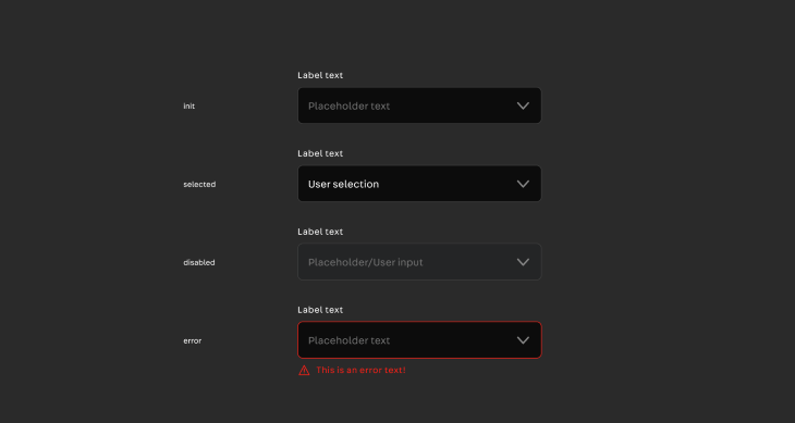
To have a better understanding, as an example, we can take a closer look at the input component. This particular component is complex, and depending on the agreements the teams on your project have made, it can be more or less intricate.
The basic states most systems componentize are: init, filled, disabled, error, and success. Then, depending on the type of input, some states might not be relevant, as in this case of the selector that has no character verification so the success state does not apply:

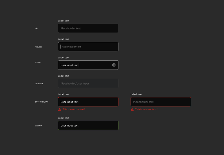
There will be more complex cases like the text input, where we might need to add a couple of extra use cases. In my project, we decided to add focused/active and empty-error. They were not strictly necessary but helped with documentation and prototyping purposes, so we decided to add them:

But the complex element of the input field could be infused with a lot more other use cases to try and mimic the microinteraction of the component itself. For example, we could add a focused error until the user starts deleting the incorrect text.
Adding this level of detail to the design system will be difficult for the designers working with it. The more components and variants, the bigger the list and the easier it is to make mistakes.
A design system serves mainly to generate consistency across teams, and the more complex it is, the easier it is to generate confusion. As a general rule with everything that has to do with design: keep it simple. Always prioritize simplicity. Ask yourself how it’s going to be used and how easy or difficult it is.
When working with prototypes, the question should be the same. Let’s not fall into the trap of trying to make prototypes “perfect” because they never will be, and there are better ways to showcase the animations performed on interactive elements.
It is also important to note that the more complex a prototype is, the more work it entails and for that, more time. When we need to make changes to prototypes because of a mistake or a shift in the test, usually we need to react fast. For example, if you are testing a flow, there will be no added value to your test if you miss the effect “on click” when you press on a toggle, but it will be very expensive if it makes you spend more time than needed.
At some point, you’ll be presenting your prototypes. There are two main users for our prototypes:
These two groups have different needs, but both need to understand that prototypes will never behave like the final product.
We might want to have testers think they are interacting with the final product or we might want to show developers the exact interaction with a certain component through our prototype. But that is not the point.
And when working with a design system that is used by many parties, we must know it should not be compromised by prototyping. That would be expensive. We can compromise the design for testing purposes if we consider that we will obtain added value, but never the other way around compromising the design system and introducing new design elements.
We need to understand the problem that we are trying to solve by making use of a prototype. Are we trying to show a flow, or to understand if the flow is serving its purpose correctly? Are we trying to understand if an icon is understood and correctly used? Then a prototype might be great. If we are trying to document microinteractions, a prototype might not be the best choice.
Test users need to be given context about the test they will be undergoing, and you will need to explain that they should not expect perfect behavior.
We need to bear in mind that the more high fidelity our prototype is, the more likely it is our testers will get frustrated when interacting with it and not receiving the expected input. That is why it’s important to set up clear expectations that it’s not the final product and limit actions to the functionalities that are being put to the test.
Developers can be provided with additional documentation in writing or a simulated version without the need to generate extra variants. Some teams use Storybook or similar products to document the exact behavior of developed components.
This documentation also comes in very handy for designers to check how the component is behaving at development level and learn about the behavior. They can also request changes in certain animations by seeing the documentation.
Designers are free to reference documentation as part of the designs to explain certain behaviors, but most of the time these microinteractions were already contemplated when developers worked on the component library, so it won’t be needed again at squad/SAT level.
If designers have a very specific need that the design system does not cover, you should discuss the prototype with the team to “fake” the design to allow more flexibility during prototyping.
POs and stakeholders will use prototypes to understand the flow process. It’s also important to make them understand that it is a prototype and that the interaction with it is limited. A good idea is to guide them through the process to clear possible questions that could arise.
As with most team efforts, communication is key when prototyping. Be sure to set clear expectations with your stakeholders and document everything. The developers and stakeholders you collaborate with will thank you.
As always thank you for reading this far, I hope you found this insightful.
LogRocket's Galileo AI watches sessions and understands user feedback for you, automating the most time-intensive parts of your job and giving you more time to focus on great design.
See how design choices, interactions, and issues affect your users — get a demo of LogRocket today.

Research is becoming more democratized, product cycles are accelerating, and AI is transforming synthesis and ResearchOps. Here are the three trends shaping UX research in 2026.

AI tools can generate beautiful UI concepts in minutes, but most teams struggle to integrate those outputs into real design systems. This guide explores why AI drifts toward generic patterns and how to build governed workflows that keep speed without sacrificing brand consistency.

Adaptive interfaces personalize experiences using behavioral signals and machine learning. But when personalization becomes autonomous, systems can reinforce patterns, limit discovery, and shape user behavior in ways designers didn’t intend.

Security requirements shouldn’t come at the cost of usability. This guide outlines 10 practical heuristics to design 2FA flows that protect users while minimizing friction, confusion, and recovery failures.