As UX designers, our job involves empathizing with users — understanding their thoughts and feelings in different contexts. And the psychology behind how people think can help explain why they behave a certain way when using a product. One key psychological concept that can greatly enhance UX design is priming.

Priming, in general, refers to how exposure to one stimulus influences a person’s response to a subsequent stimulus, often unconsciously. In the context of UX design, this translates to how design elements like colors, sounds, etc., can subtly shape user behavior without them realizing it, highlighting the powerful but often unseen influence we have as designers.
In this article, I’ll talk about the psychology behind priming, the types of priming, how it can be applied to UX design, and the ethical considerations required to maintain trust while bettering UX.
Priming, in psychology, describes how encountering a stimulus unconsciously influences our responses or behavior toward subsequent stimuli. This response occurs through automatic associations made with past experiences when we were previously exposed to that stimulus.
For example, we are primed to associate red with danger or negative outcomes and green with success or positive outcomes, such as in stock charts or traffic lights.
In a luxury goods store, a man dressed in a suit might be addressed with respect, while the same man in casual clothes may receive a less favorable response. This shows how people are often primed to associate a suit with wealth, power, or authority.
Even animals, such as dogs, can be primed. For instance, a dog may get excited when they see you standing by the front door, associating it with going for a walk based on repeated past experiences.
Priming taps into our implicit memory and automatic associations, allowing us to respond quickly to stimuli.
In psychology, long-term human memory stores information in the brain forever.
Implicit memory, a type of long-term memory, unconsciously affects our thoughts and behaviors based on past experiences. When we encounter a stimulus, such as a word, color, object, sound, or smell, we create implicit knowledge or memories that can be recalled by a subsequent stimulus later on. And repeated exposure strengthens these automatic associations.
For example, someone who frequently eats hot sauce may associate it with sensations of heat, spice, and sweating. Later, seeing a picture of hot sauce might cause them to feel warm or even salivate due to these implicit associations.
Implicit memories directly and unconsciously influence how we respond to similar stimuli in the future without us even realizing it.
Priming can also affect how quickly we recall a related memory or associated concept. For example, if someone hears the word “dog,” they might immediately recall memories involving pets or parks. This is because priming can activate associations across related concepts, significantly impacting how we perceive and respond to new information.
Priming can take many forms depending on the nature of the stimulus. Here are a few of the most common types of priming:
Priming can either speed up or slow down information processing.
Positive priming occurs when exposure to a stimulus speeds up the processing of related information, while negative priming occurs when a stimulus is ignored, slowing down subsequent responses.
This type of priming is based on the form of a stimulus, such as its shape, color, or word structure.
An example of perceptual priming is seen on the popular game show Wheel of Fortune, where contestants guess phrases based on incomplete words. The format triggers associations with similar phrases they’ve seen before.

Conceptual priming is based on the meaning of the stimulus rather than its format. This type of priming forms associations with concepts within the same category.
For instance, hearing the word “bread” can prime someone to think of related items like “bakery” or “butter” because they all belong to the same mental category of food. The word “bread” activates related concepts in the brain, making it easier to recall them when prompted.
When someone is repeatedly exposed to a stimulus, they experience repetition priming. This makes it easy to recognize and respond to future stimuli, as it is processed much more quickly.
A good example is fire drills. By regularly hearing the alarm and practicing the steps to exit a building, occupants are primed to respond quickly in an actual emergency. Repetition makes the process almost automatic.
Both perceptual and conceptual implicit memory rely on repetition priming to trigger associated information. Unlike short-term effects, like semantic priming, repetition priming can have long-lasting effects, helping people respond quickly even after extended periods.
Similar to conceptual priming, semantic priming is driven by meaning, but it focuses on the activation of words or concepts that are directly related in meaning. This type of priming works by spreading activation across related associations, making it easier to recall words that are closely linked.
For instance, hearing the word “doctor” might immediately prime someone to think of related words like “nurse” or “hospital” because they share a direct semantic relationship. In contrast, conceptual priming might activate broader, more abstract ideas, such as the healthcare system or personal health. Semantic priming typically leads to faster responses for words that are tightly connected in meaning.
Affective priming relates to how the emotional states or attitudes associated with a stimulus can influence our reactions. When someone encounters a stimulus with a positive or negative emotional tone, their emotional state is primed to respond as they have previously to similar stimuli with the same emotional tone.
For example, Coca-Cola ads often show people smiling, laughing, and celebrating happy moments. These positive emotions prime viewers to associate Coca-Cola with happiness and fun. When they see a Coca-Cola product in a store, they may unconsciously recall those positive feelings and be more inclined to purchase the product.

This occurs when a stimulus reminds someone of their goals, leading to unconscious behaviors aligned with achieving them. For example, if you’re saving money for a vacation, hearing about someone else’s trip may prime you to think about your financial goals.
As designers, we typically focus on helping users achieve a goal by going through a user journey, right? Well, priming can be used in UX design to influence how users behave and guide the decisions they make while using a product.
When users find a product intuitive to use, they are more likely to be engaged and want to continue using it. Intuitiveness can be achieved by minimizing the cognitive load on the user. The less users have to think, the quicker they can make decisions and the more they will engage with the product.
There are a few different ways that UX designers can leverage the psychology of priming in their design work:
Using visual cues in your design can help guide the users toward completing certain actions or making certain decisions. Visual cues capture users’ attention and can include elements like arrows, color, typography, icons, motion, or microanimations.
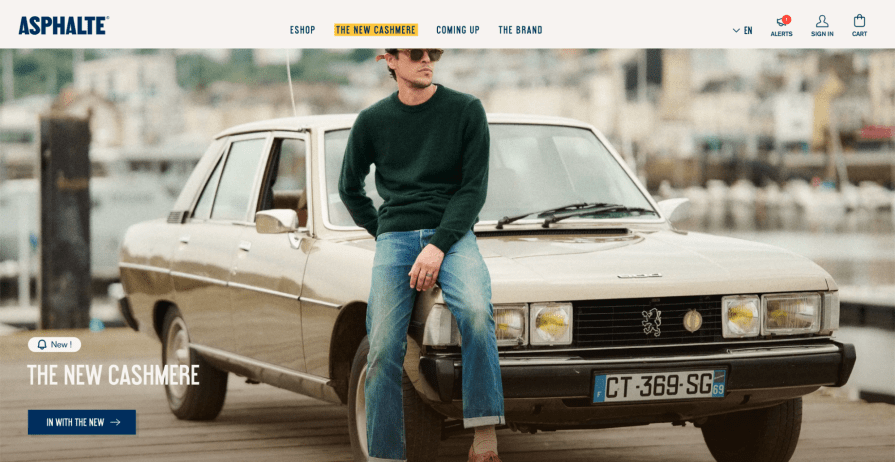
An example of a visual cue from Asphalte’s website is a prominent menu option highlighted in yellow to attract users’ attention. This visual cue can prime users to click on it, as it stands out from the other menu options:

The language that we use in our designs can alter users’ perceptions of different actions or decisions. Choose your words carefully by A/B testing alternatives for your headers and call-to-action (CTA) buttons.
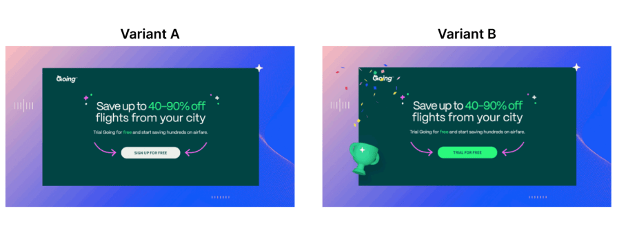
Here’s an example from a travel company that tested two variants of a CTA to increase their conversion rate.
The first version reads “Sign up for free,” which primes users to have to provide some information and create an account. This creates friction in the user journey and doesn’t encourage them to convert to paid subscribers.
The second version reads “Trial for free,” which highlights the value of their paid offering much more. The change in wording primes users to think about the immediate value they could get through a free trial while alluding to a premium subscription that they can upgrade to if they enjoy the trial.
This simple change in language doubled their monthly conversion rate for free trials, which positively impacted their paid conversion rate as well.

Familiarity through repetition can make users feel comfortable with a product, as they can associate familiar design patterns with positive past experiences.
As a designer, you should strive to achieve external consistency with industry design patterns, as users feel comfortable with what they already know.
Instagram, for example, leveraged the same scrolling timeline behavior as TikTok when they launched Reels, which made it relatively easy for users to onboard and start engaging with the feature. Users frequently spend hours repeatedly scrolling and engaging with TikTok posts, so adopting the same behaviors and actions on Instagram Reels is relatively easy.

Priming users’ emotions through design can influence their attitudes and feelings towards a product. Think about what emotional state you want your users to be in when using your app. Using imagery, color, language, animations, and other visual cues, you can evoke specific emotions from your users based on their perceived associations with those cues.
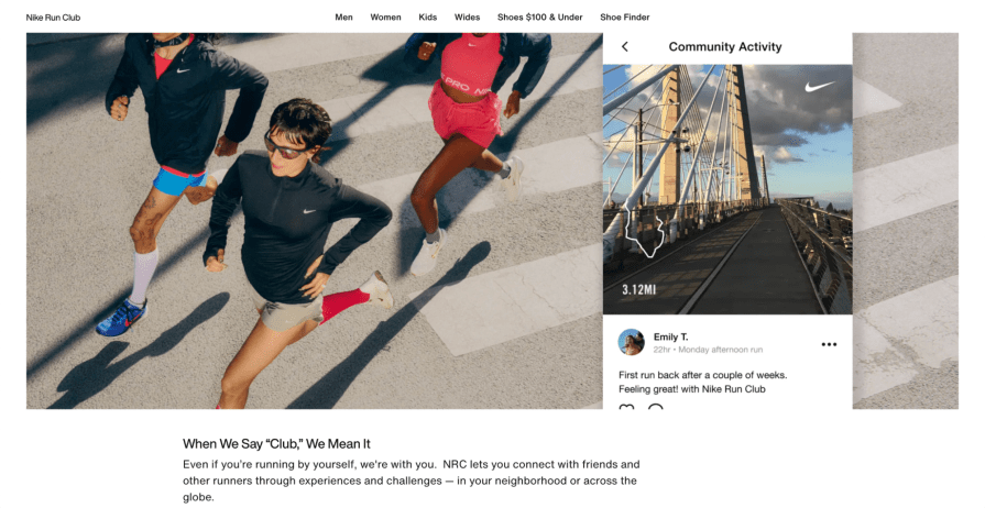
For example, the Nike Run Club uses a combination of motivational language and images of groups of people running to prime users to feel motivated and inspired to run:

Priming can help align users with their goals and keep them on track by subtly guiding them to complete tasks related to them.
For example, a user may need to complete five tasks during an app onboarding. After completing one, the app may show a progress indicator or checklist that primes them to think about finishing the rest of the onboarding flow.
Duolingo’s app icon features its green owl mascot, Duo, which changes to a rather grotesque facial expression if users aren’t keeping up with their usage streak. Users can customize the app icon to an orange mascot with flaming eyes if they keep up a streak for 30 days, thereby joining the exclusive Streak Society. This incentivizes users to continuously use the app and stay on track to reach their learning goals if they want to get rid of the ugly Duo icon from their home screen.

While priming can enhance user experiences, it can also be misused to manipulate users for business-driven purposes, leading to unethical outcomes. Dark patterns exploit users by creating unnecessary friction or withholding information.
To maintain trust, use priming responsibly by clearly communicating your intentions.
For example, if a user wants to unsubscribe, make the process simple while explaining what benefits they might lose. Avoid creating false urgency or fear with scarcity tactics like “Limited time offer” unless the urgency is real.
Priming should ultimately enhance user experiences and build long-term relationships based on trust.
User experience has a lot to do with human psychology. Priming is a great example of a psychological concept that UX designers can use to drive growth and engagement.
Understanding the way the human brain processes stimuli and activates associations with implicit memories can lead to more intuitive designs and better experiences.
Designers can subtly guide users toward completing tasks and achieving goals by incorporating elements like visual cues, language, and familiarity.
However, it’s important to maintain your users’ trust by avoiding manipulation for business gain. Always keep your user’s best interests in mind when using priming techniques. Being authentic will foster positive user interactions and lead to continuous engagement and long-term growth.
LogRocket's Galileo AI watches sessions and understands user feedback for you, automating the most time-intensive parts of your job and giving you more time to focus on great design.
See how design choices, interactions, and issues affect your users — get a demo of LogRocket today.

As products evolve into ecosystems, navigation becomes a system-level challenge. This article explores how to align structure, context, and user journeys to create seamless movement across tools without confusion.

Figma’s AI features have exploded in 2026 — from text generation and image editing to full UI drafts and code handoff. But speed isn’t the same as quality. This guide breaks down every major feature, what it’s good at, and where human judgment still does the heavy lifting.

Zero UI works well for screenless, voice-first experiences, but most digital products still require visual interaction. Here’s why multimodal UX offers a more scalable foundation for the future of design.

Multimodal UX goes beyond designing for screens. Learn how context-aware systems, progressive modality, failover modes, and accessibility-first design create better digital product experiences.