Are you curious to know more about one-tailed and two-tailed tests in UX design? Perhaps you’re unsure when to use one or the other, or you’d like to know the benefits of each.

If this sounds like you, then you’re in the right place to get some answers. In this post, we’ll be covering everything you need to know about one-tailed and two-tailed tests in UX design as well as when to use each one for best results.
We’ll be covering:
Ready to learn more? Then let’s get started.
In the field of UX design, a one-tailed test is when a statistical hypothesis test is concerned with assessing the effect or relationship in one particular direction. UX designers conduct one-tailed tests during the testing phase of the UX design process to ascertain whether a change or intervention has either a positive or negative effect on the overall user experience.

An example of a one-tailed test in UX design would be when a UX designer wants to find out if an optimized, redesigned, or adjusted interface boosts user engagement with that particular webpage or digital product.
In this instance, the one-tailed hypothesis would be that the new interface or design increases user engagement. The alternative hypothesis would state that the new interface does not bring about the desired increased engagement.
The one-tailed test is a method used by UX designers to determine if the changes made have had a positive (or the desired) effect on user interaction; they are not interested in examining any potential negative impact of the changes. The associated statistical analysis of one-tailed tests works to measure and assess the evidence given to back the desired direction of impact.
There are numerous reasons why UX design teams incorporate one-tailed tests into their practice.
First of all, this testing method can offer increased sensitivity because it focuses the statistical analysis on one particular direction of impact or effect. If an effect is already expected in one direction, this kind of testing is more likely than other types of testing (such as two-tailed testing) to uncover a significant impact.
Another benefit of one-tailed tests is the method’s increased statistical force when the impact or effect is expected in one direction; this is particularly true when compared to two-tailed tests.
Resource efficiency is another advantage found by teams who use the one-tailed test, with sample size groups for one-tailed tending to be on the small side. This is because the UX team is focusing on detecting impact in one direction and therefore assign more statistical power to that direction. The result of this is that smaller sample groups are required to uncover the impact.
One-tailed tests are also well-suited to testing expected outcomes such as a specific hypothesis regarding the direction of the impact. This type of testing and statistical analysis therefore aligns well with specific research questions and hypotheses.
Finally, one-tailed tests allow for a simplification of interpretation by researchers, as results clearly support the predicted impact. When results are this clear, researchers and teams can more easily get buy-in for decisions from external stakeholders as well as use the results to inform in-team decision making.
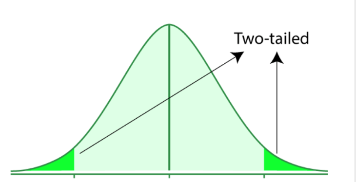
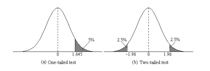
In contrast to a one-tailed test, a two-tailed test is a statistical hypothesis test that looks at the impact or effect in both directions. Irrespective of the direction, the test is designed to assess whether a change has a significant impact.

The null hypothesis of a two-tailed test assumes that there is no relationship, while the alternative hypothesis assumes there is an impact, but the direction of that impact is not specified. The statistical analysis used for two-tailed tests looks closely at the evidence for an impact taking place in either direction.
An example of a two-tailed test in UX design would be when a UX designer or UX design team wishes to test two versions of a webpage that produce different levels of user satisfaction. The null hypothesis in this case would suppose that the user satisfaction between the two versions has no difference, and the alternative hypothesis would declare that a difference in user satisfaction levels exists but it wouldn’t say whether that difference is higher levels of satisfaction or lower levels of satisfaction.
The value of the two-tailed test is that it allows the UX designer to see whether there is a significant impact, irrespective of whether this effect produces an enhanced or decreased level in user satisfaction. The associated statistical analysis for the two-tailed test shows impacts made in either direction.
Two-tailed tests offer their own unique benefits.
These types of tests allow for a more thorough analysis as they take into account the relationships in both directions, not just one. With two-tailed tests all avenues are covered, no potential impacts are missed and there is also less room for bias.
In addition to an overall more comprehensive analysis, two-tailed tests provide more flexibility to research teams as specific assumptions are not required in the alternative hypothesis.
Finally, two-tailed tests reduce Type I and Type II errors. This is done by the test taking all possibilities into account, and therefore making the chances of a false result much lower.
A good rule of thumb when choosing whether or not to conduct a one or two-tailed test is to look at the original parameters and wording in the claim you are investigating. While a one-tailed test is concerned with an increase or decrease in the parameter, a two-tailed test is concerned with any change in the parameter.
If you’re still not sure which test is applicable in your case, it’s best practice to use a two-tailed test. A one-tailed test is useful only in situations that provide a clear prediction about the direction of the difference and when the research group is not at all concerned that the opposite of this predicted result may occur. Your research goals will be a good indicator of whether or not there is any concern.

Let’s take a look at some real-world examples of one and two-tailed tests.
A car maker creates a new fuel additive that the company claims boosts fuel efficiency for car owners and drivers. To test the car maker’s claim, you could perform a one-tailed test.
The null hypothesis in this case would be that the fuel additive does not have either a positive or negative effect on fuel efficiency, while the alternative hypothesis would state that the fuel additive does indeed increase fuel efficiency, as the car maker claims. The test would set out to assess the data in order to ascertain whether or not there is enough proof to support the car maker’s claim that the additive does increase fuel efficiency.
A study into the impact of a new teaching method on student performance is undertaken by researchers. The null hypothesis for a two-tailed test in this scenario would state that the new teaching method has no effect on student performance at all. The alternative hypothesis, however, would state that the teaching method does indeed have either a positive impact or a negative impact on student performance.
The key thing here is that a two-tailed test would analyze the results of the study to see if any significant difference in student performance occurred, irrespective of whether the performance improved or worsened as a result of the new teaching method.
In order to ensure the results of your one and two-tailed tests are valid and that your conclusions are reliable, it’s worth getting to know some of the best practices used during hypothesis testing by research teams.
You’ll want to make sure that both your null and alternative hypotheses are clearly developed and mutually exclusive. Elements to consider include the expected relationships between different variables, your parameters, and the population.
Before the test begins, you need to be sure that your data meets the assumptions for the test type you’ve selected.
Before conducting the test, you’ll need to set the significance level. This is usually set to 0.05 or 0.01. The significance level is what determines the likelihood of the null hypothesis being rejected when true.
Using your selected test type as your starting point, calculate the test statistic and p-value. These tell you what the likelihood is of observing the data if the null hypothesis turns out to be correct.
Once you’ve got your test results, you’ll want to try to understand what they mean for your hypothesis. If the test shows that the null hypothesis has been rejected, this indicates that there is enough evidence to support the alternative hypothesis. However, if the null hypothesis has not been rejected, there is not enough conclusive evidence to prove the alternative hypothesis.
When interpreting your one and two-tailed test results, you’ll want to move cautiously as these kinds of tests can be limiting in terms of what they can prove or disprove conclusively. Although hypothesis testing can provide evidence which will either support or disprove your hypothesis, it unfortunately does not prove it decisively.
It’ll be important to remind yourself of the test’s limitations and that there may be a range of alternative explanations for your results. Limitations to watch out in hypothesis testing include the sample size and confounding variables, for example.
The use of visual presentations is an effective way to communicate test results and present your findings. Let’s take a look at the numerous methods you can use to present your results to stakeholders.
A bar chart is a diagram in which numerical values are represented by the height or length of lines or rectangles. A bar chart can be utilized to display data distribution relating to different groups and conditions.
A box plot (or boxplot) is used to visually represent data distribution and can be useful for data comparison between different groups.
Line graphs display information via a series of data points which are connected by line segments. They are typically used to display changes which have occurred over time or in different settings. Trends or patterns are commonly displayed using line graphs.
A heatmap represents data in a matrix format where values are depicted by color. They are particularly helpful when variables need to be compared across a variety of conditions.
A decision tree is a tree-like model that visually displays decisions and any potential outcomes, and consequences. They can be useful for demonstrating more complex analyses in which multiple variables and outcomes need to be shown.
A flowchart is a visual representation of a step-by-step process for solving a problem. For assisting stakeholders in understanding the flow of the testing process, a flowchart is a useful data visualization aid.
Remember: choosing the best presentation tool will depend on the type of data and message you want to get across to stakeholders, the complexity of the analysis, and the preferences of the stakeholders. It’ll be important to label your graphs and axes clearly, use color to highlight important points or differences, elaborate on the visuals with context, and to tailor your presentation to the stakeholder’s level of familiarity with both the data and the data visualization tool being used.
Although it’s true that hypothesis tests can provide UX teams with important insights, they are not always able to reflect the whole of the user experience. To provide a more rounded picture, and to support the results of hypothesis tests, additional evidence is often required to back up findings.
Qualitative and anecdotal data from user interviews provides valuable context, while usability testing — such as observational studies — is helpful for uncovering common usability issues. User feedback and surveys give users the opportunity to voice their opinions directly, and user journey maps provide a visual representation of the user’s experience from initial contact through to task completion. Heatmaps and click tracking are powerful tools for visualizing a user’s interaction with a product, and eye-tracking studies assist researchers in better understanding where users’ attention is most focused.
Analyzing customer support data, such as complaints or frequently asked questions, provides insights into user pain points, while a thoroughly executed competitor analysis helps a team compare the strengths and weaknesses found in the user experience provided to the experience offered by a direct competitor.
Finally, behavioral analytics, whereby user interactions are tracked to reveal usage patterns and trends, and emotional metrics, where emotional responses are assessed through observing facial expressions, can also be used to support the findings of hypothesis testing, and assist in the building of a more comprehensive case.
LogRocket's Galileo AI watches sessions and understands user feedback for you, automating the most time-intensive parts of your job and giving you more time to focus on great design.
See how design choices, interactions, and issues affect your users — get a demo of LogRocket today.

Discover how to craft UX-friendly hero sections with examples, design tips, and strategies that drive engagement and conversion.

While Apple’s Liquid Glass can’t yet be perfectly recreated with CSS or Figma, we can still think about how to adopt the effect thoughtfully in our designs.

Figma Make is here to automate your design-to-code workflow. I tested it. Let’s talk about the good, the bad, and the straight-up weird.

After designing AI search systems, I’ve seen what builds trust — and what kills it. Here’s my take on what really works.