It isn’t easy to design apps and websites that are simple to use. Too often, designers hyperfocus on the actions users perform on digital products — like tapping buttons or moving between screens — instead of focusing on the actual objects that make up the product.

Sophia Prater noticed this pattern so she came up with object-oriented UX (OOUX), a methodology that focuses on the main objects inside your system before jumping ahead to actions:

She believed the methodology would help designers design clear and organized products. In her view, if you tackle the objects first you then know the actions to give each object, which makes the experience more consistent — when users see an object, they already know what to do with it based on how similar objects worked on other pages.
This article takes a look at her methodology to see how OOUX helps make apps and websites clearer and easier to use.
Object-oriented UX (OOUX) is a design methodology that encourages designers to think about a system’s objects, their relationships, and their attributes before diving into user flows and interactions. The goal of this methodology is to align the digital experiences of the user more closely with their mental models by mirroring the way they naturally categorize and interact with information.
Humans naturally categorize the world around them based on objects. This cognitive tendency stems from how our brains process and organize information. Instead of thinking in terms of abstract actions, humans normally focus on tangible things (objects) and then understand what they can do with them.
For example, if anytime you enter a library, your brain doesn’t immediately process the experience as a series of actions like “I’ll search, I’ll borrow, I’ll return” (actions-first thinking).
Instead, your brain first recognizes the objects in the environment (the library). Your mind identifies object-based cues like books, bookshelves, a librarian, and a checkout counter.
Once you see those objects, the next steps make sense on their own.
The human brain naturally works this way, which is why starting with objects makes a lot of sense in UX design.
Object-oriented UX (OOUX) is a way to design digital products structured around real-world objects, making interfaces more intuitive and easier to navigate. Instead of jumping straight into screens, buttons, or user flows, OOUX starts by identifying the core objects that make up a system and defining how they interact.
This isn’t meant to replace traditional UX methods, but instead to work alongside them and make them better. OOUX fits well into existing workflows, especially in the early stages of research and planning the information structure.
OOUX works hand-in-hand with other UX research techniques like user interviews and card sorting, which help make sure the objects and relationships are in line with how users think. For example, card sorting can show how users naturally group things, while user interviews can give deeper insight into how users interact with these objects in real life.
One of the best ways to apply OOUX is through the ORCA method, which stands for objects, relationships, calls-to-action, and attributes. This method provides a structured approach to breaking down a digital experience before moving into UI design.
To understand ORCA in action, let’s consider an example of a hypothetical banking app.
Before designing any screens, you need to determine the fundamental objects that make up the system. In a banking app, the primary objects could be:
These objects are things that users interact with, not actions like “send money” or “pay bills.” Instead of designing screens around tasks, you build the system around objects first.
Once you have your objects, you define how they relate to each other. In your banking app:
Thinking about relationships early helps prevent confusion in the interface. For example, if a transaction always belongs to an account, it wouldn’t make sense for a user to see a transaction history without knowing which account it belongs to.
Calls-to-action (CTAs) are the actions users can perform on each object. This step helps determine what functionality is needed for each object. In your banking app:
By focusing on the actions tied to objects, you ensure that interactions feel natural. Instead of presenting users with generic actions like “make a payment” on the home screen, the app can guide them by showing transaction options within their selected account, making the experience more intuitive.
Attributes define the key pieces of information that each object needs to display. Attributes don’t perform actions but provide essential details about the object:
By structuring objects with well-defined attributes, the app’s interface becomes clear and predictable. For example, instead of forcing users to navigate deep menus to find their balance, it’s always displayed as an attribute of their account on the dashboard.
Now that you understand the basics, this section analyses Spotify, X (formerly Twitter) and YouTube using the ORCA framework (objects, relationships, calls-to-action, and attributes) to see how structuring digital experiences around objects makes them more intuitive.
Spotify structures its experience around objects such as songs, albums, artists, playlists, and users:

These objects serve as the foundation of the interface, allowing users to engage with familiar elements rather than focusing on isolated tasks. This object-oriented approach enhances navigation and makes the music streaming experience more intuitive.
Objects and their relationships:
Spotify’s ecosystem revolves around how these objects relate to one another:
These relationships ensure seamless exploration, allowing users to move effortlessly between artists, albums, and playlists.
Calls-to-action (CTAs):
Each object in Spotify’s system comes with specific interactions (CTAs):
By tying CTAs directly to objects, Spotify ensures that interactions are natural and intuitive, allowing users to perform actions in context without unnecessary friction.
Attributes of each object:
Each object is enriched with attributes that define it:
By structuring information around objects, relationships, CTAs, and attributes, Spotify ensures an intuitive, organized, and highly navigable music streaming experience.
X (formerly Twitter) is structured around core objects like tweets, users, threads, and media. Instead of focusing on isolated actions, the platform organizes social interactions around these objects, making it easy for users to engage with content and navigate seamlessly:
Tweets belong to users and can include media or be part of threads. Users engage with tweets through likes, replies, and reposts, creating dynamic conversations. This structured approach ensures content is easily discoverable and interactions remain fluid across the platform.
Objects and their relationships:
X’s social experience is defined by how its core objects relate to each other:
These relationships create a dynamic, interconnected platform where content is easily discoverable, and interactions remain fluid.
Calls-to-action (CTAs):
Each object supports specific interactions, allowing users to engage meaningfully:
By aligning CTAs with objects, X ensures users can act directly within their context, making interactions smooth and predictable.
Attributes of each object:
Objects are enriched with attributes that provide essential information:
Using this object-oriented structure makes social interactions on X more intuitive.
YouTube, the most popular video-sharing platform, structures its platform around core objects like videos, channels, playlists, and users. Instead of designing the experience around actions like “watch” or “upload,” YouTube prioritizes objects, making content discovery and engagement intuitive for users:
Videos are the foundation of YouTube. Each video belongs to a channel and can be organized into playlists. Users interact with videos through likes, comments, and shares.
Objects and their relationships:
YouTube’s functionality is built on the relationships between its core objects:
These relationships make the navigation easy for users to discover.
Calls-to-action (CTAs):
Each object comes with specific interactions to enhance user engagement:
As YouTube ties actions directly to objects, it makes sure that interactions are natural and intuitive for the users.
Attributes of each object:
Objects are enriched with key attributes that provide essential information:
This object-oriented structure allows YouTube to create an engaging, easy-to-navigate platform that users can seamlessly explore and interact with content.
OOUX comes with the following key benefits:
Even though OOUX offers you a structured way to design user-friendly digital experiences it still has its own set of challenges:
Object-oriented UX (OOUX) is a powerful approach to UX design that prioritizes structure, clarity, and scalability. By focusing on objects, their relationships, actions, and attributes, you can create intuitive and user-friendly experiences that align with users’ mental models.
The ORCA process provides a practical framework for implementing OOUX, making it easier to define digital systems before diving into UI design. While challenges exist, they can be addressed with proper research, visualization, and communication.
As digital products become more complex, OOUX offers a way to simplify the design process while ensuring usability and scalability. Whether designing ecommerce platforms, learning management systems, or enterprise applications, OOUX can help create more structured, efficient, and user-centric experiences.

LogRocket's Galileo AI watches sessions and understands user feedback for you, automating the most time-intensive parts of your job and giving you more time to focus on great design.
See how design choices, interactions, and issues affect your users — get a demo of LogRocket today.
Design engineering has always lived between design and code. But with AI tools turning prompts into interfaces and code into editable canvases, that bridge is becoming a new way of building.
A three-week mobile banking project taught me that the “proper” UX process is not always realistic. Sometimes, the better approach is to work with what you know, identify what you still need to learn, and make the strongest decision possible under real constraints.
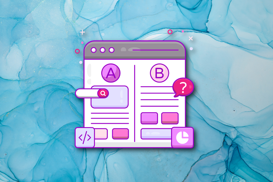
A/B testing compares two versions of a design to see which performs better with real users. Here’s how UX teams can use it to test hypotheses, measure outcomes, and make smarter product decisions.
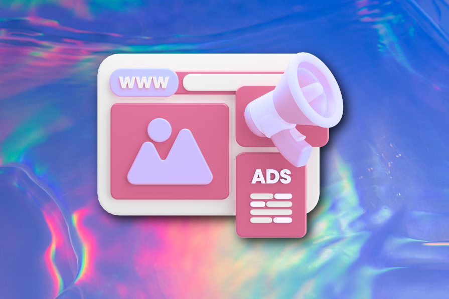
This case study shows how one ad experience redesign increased total ad exposure while lowering perceived friction, proving that timing and context can matter more than raw interruption.


