Figma has become the industry standard for collaborative designer tools, and one of the platform’s game-changing features is the concept of components. They are building blocks that designers can create and reuse in their designs. Components are essential to any design system, helping designers build consistency in their projects and efficiency in their process.

In this article, we’ll understand how components can be used effectively and dive into an advanced technique: nesting components. This technique can streamline design workflows by providing designers with the flexibility to swap instances of components.
We’ll walk through examples of creating a main component, nesting components within the main component, and altering those nested instances, all within Figma. For a video tutorial on Figma component nesting made easy, check out our YouTube channel:
Figma components are reusable design elements that can make designing a lot more efficient. It may take some effort to set them up initially, but it can have massive benefits when it comes to workflow efficiency and maintaining consistency across projects.
A component can be made from an element within Figma, such as shapes, text, buttons, layouts, or a combination.
The component is made up of a main component, which defines the properties, and instances, which are all the copies of the main component that you use in your designs. Any updates made to the main component will cascade down to the instances.
Setting up components early on can improve your workflow efficiency. It removes the need to create components that may be used somewhere else in the same or different project, and it also enables the quick creation of component variants instead of building each one from scratch.
By reusing components across a file and across projects, you can be certain that your designs will have consistency built into your styles and patterns. This huge benefit allows design teams to deliver consistent, intuitive creations to their users.
Nested components are often a bit more complex than a simple button or toggle component. Think of nested components as a hierarchy of elements.
At the top level, you have the main component, such as a panel or card. The main component contains instances of other components within it, such as buttons or form fields. It’s like putting small boxes inside of a bigger box.
However, a button can be turned into a nested component, depending on its complexity, by adding instances of icon components within it. Let’s create this button for our first example.
To start off, use the Frame tool in the top-left toolbar to create a frame. Add auto layout to the frame and give it a fixed height of 36px.
Then, set the horizontal resizing to Hug. Next, add some placeholder text into the frame using the Text tool in the top-left toolbar:

In the auto layout settings, set the frame to Align left so that the text is vertically centered. Then, set the horizontal gap between items to 8px and the horizontal padding to 12px. This will ensure that our button’s contents are neatly spaced out:

Before we turn this button into a component, let’s give it some styling. Set the frame’s corner radius to 8px, give it a fill background color of blue, a stroke with the same blue, and set the text color to white. This will be our primary button.
Let’s also make a secondary button, giving it a white background, blue stroke, and blue text:

To turn both frames into variants of the same component, select both frames and then select the Create component set button from the center top toolbar. This is a shortcut to creating multiple variants of a component:

Make sure to rename the component and each variant for clarity. Now, we have a main component for our button.

To add instances of an icon component into the main component, first, we need to create the icon component separately.
Start by creating or adding the icons that you want to include in the button. Then, use the Create component set button to turn them into variants of an icon component:

Now that we have both the main and nested components, we can add our icon to our button. But you can’t exactly put the icon main component into the button component. Only instances can be added to a main component.
Drag one of the icon variants while holding down Command ⌘ on Mac or Shift ⇧ on Windows and drop it into the button component. This will create an instance of the icon component. Alternatively, you can also copy and paste the icon instance into the button component:

Now you have a button component with an icon nested within it. Remember to label your layers to maintain organization.
Once your instance is nested in the main component, you’ll want to be able to alter it quickly and easily. You can apply a few techniques to your component to make it easier to alter nested instances.
With the icon nested in the button component, you can select the icon layer and change the variant to the icon that you want to display. However, this requires clicking multiple times to get to the layer.
An easier way to do this is by exposing properties from nested instances in the main component properties. Select the main button component and in the Properties section in the right panel, click Create component property. Select Expose properties from Nested instances in the dropdown:

A popup will appear that prompts you to select the nested instances from which you want to expose properties. In this case, the only nested instance is our icon component. Once selected, the icon instance will appear in the button properties under Nested instances:

Now, when you select an instance of the button component, the icon properties will appear in the button properties, allowing you to easily swap variants of the icon without having to select the layer.
![]()
You may also want to hide the icon from certain buttons that don’t require icons. In this case, let’s make it easier to toggle the visibility of the icon.
Select the main button component and in the Properties section in the right panel, click Create component property. Select Boolean under Create new property:

In the pop-up, rename the property to Show icon and set the value to True. After you create the property, it will show up under the button properties.
This is basically creating a property that will allow us to toggle the visibility of the icon instance, giving the flexibility to use buttons with or without icons:

You might notice that the warning icon next to the new property says Not used within component. In order for the toggle to appear, we have to apply the Boolean property to the icon instance.
Select the icon instances in all of the button variants. If you have several variants, a shortcut to select all instances is first to select the icon, then click on the target icon beneath to select all matching layers:

Once you have all the icon instances selected, in the Layer section in the right panel, click Apply Boolean property. Then, select the Show icon property from the dropdown:
![]()
Now, the Layer section has been updated with a tag that indicates the Show icon Boolean property has been applied:
![]()
To see the Show icon toggle in the button properties, select an instance of the button. You’ll now be able to toggle the visibility of the icon instance within the button component without selecting the icon layer:
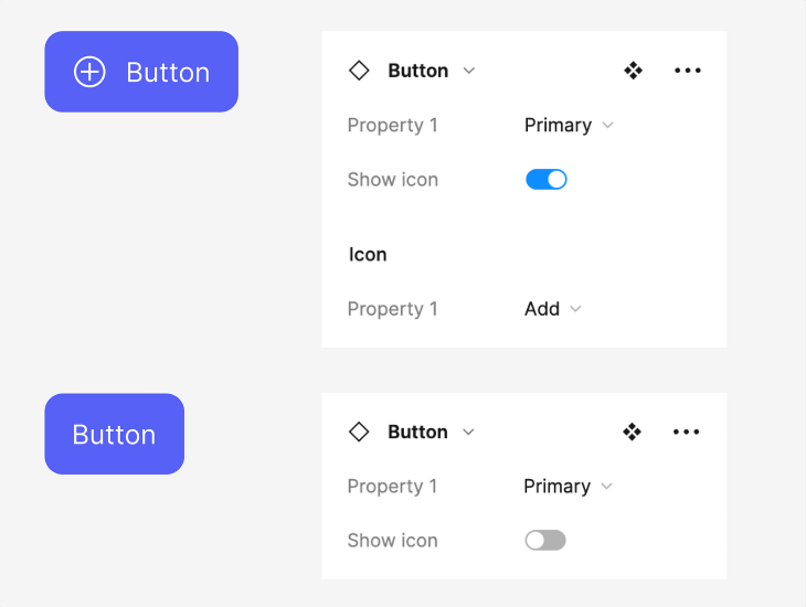
So far, we’ve been able to nest instances in our main component, as well as alter the nested instance. But a button is a fairly straightforward component that usually doesn’t require much complexity.
When dealing with a more complex component, such as a modal, panel, or card, you need the flexibility to customize the content shown within it. We can use slot components to provide you with that flexibility.
A slot component is basically a placeholder instance within a main component that gets replaced by custom content. This gives you the freedom to insert content without having to detach the instance from the main component.
For this example, let’s create a modal with a slot component. To create the slot component, add a frame filled in with a distinct color like pink and text in the center that tells designers that it is a placeholder that can be replaced. You can also add a dotted stroke around the frame.
Besides adding in custom content, a modal could just have plain text, so create a variant of the slot component that is a simple line of text. This gives designers the option of having text-only or a custom content modal. As always, name your layers for better organization and clarity:
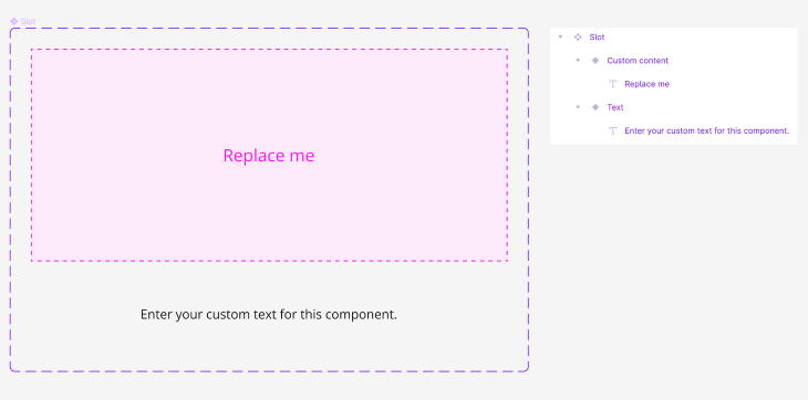
To create the modal component, add a frame with a title at the top, the slot instance in the middle, and two button instances at the bottom right. Use auto layout to space the elements out with a 24px vertical gap between items and 16px padding on all sides.
For styling purposes, you can play around with the stroke, corner radius, or drop shadow effects to suit your design needs:
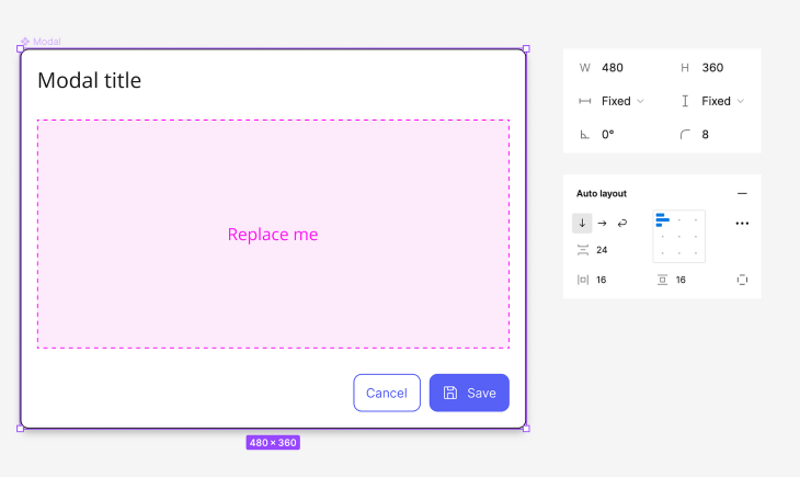
Make sure to set the horizontal and vertical resizing of the slot instance to Fill so that the content spans the width and height of the modal.
Lastly, we can create the custom content component that will be replaced with the slot instance. This component can contain anything that suits your design needs, such as images, text, or other component instances:
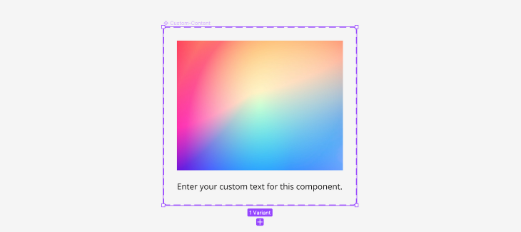
Next, let’s create an instance swap property that will appear in the properties panel when the modal is selected. This will make it easier to swap out the slot for a different component.
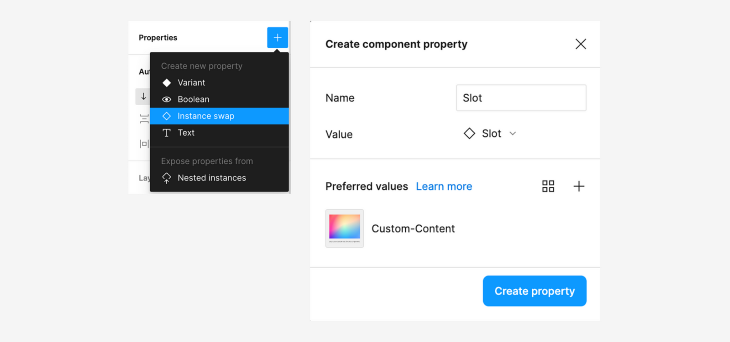
With the modal component selected, click Create component property in the Properties section in the right panel. Then, select Instance swap from the dropdown.
A popup will appear that prompts you to name the property and select a value, which will be the slot instance. You can optionally select preferred values, which you can set as suggested instances to swap. This can help designers quickly choose instances that are commonly used:
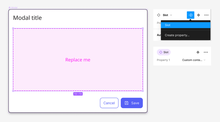
Now, we just have to apply the instance swap property by selecting the slot instance in our modal and choosing the Slot property in the properties panel:
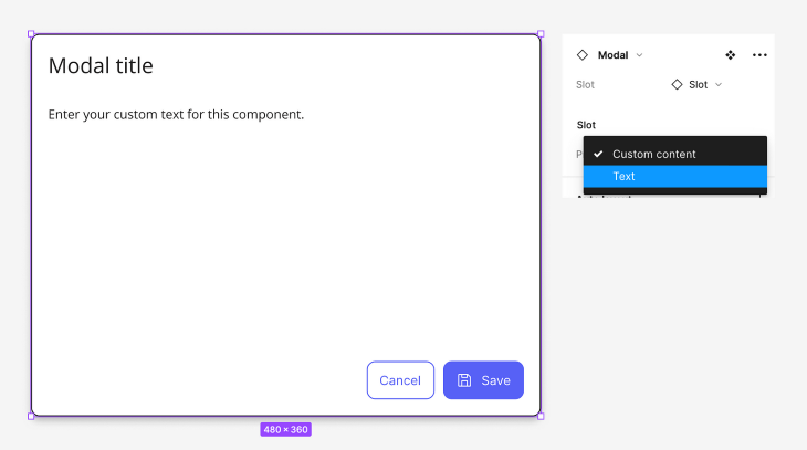
The modal is all set up and ready to be used. Select the modal instance and swap the variant of the slot instance in the properties panel to the text instance if you want a text-only modal:
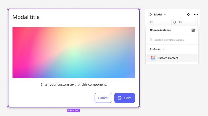
You can also swap the slot instance for the custom content using the instance swap property. Now your modal has custom content!
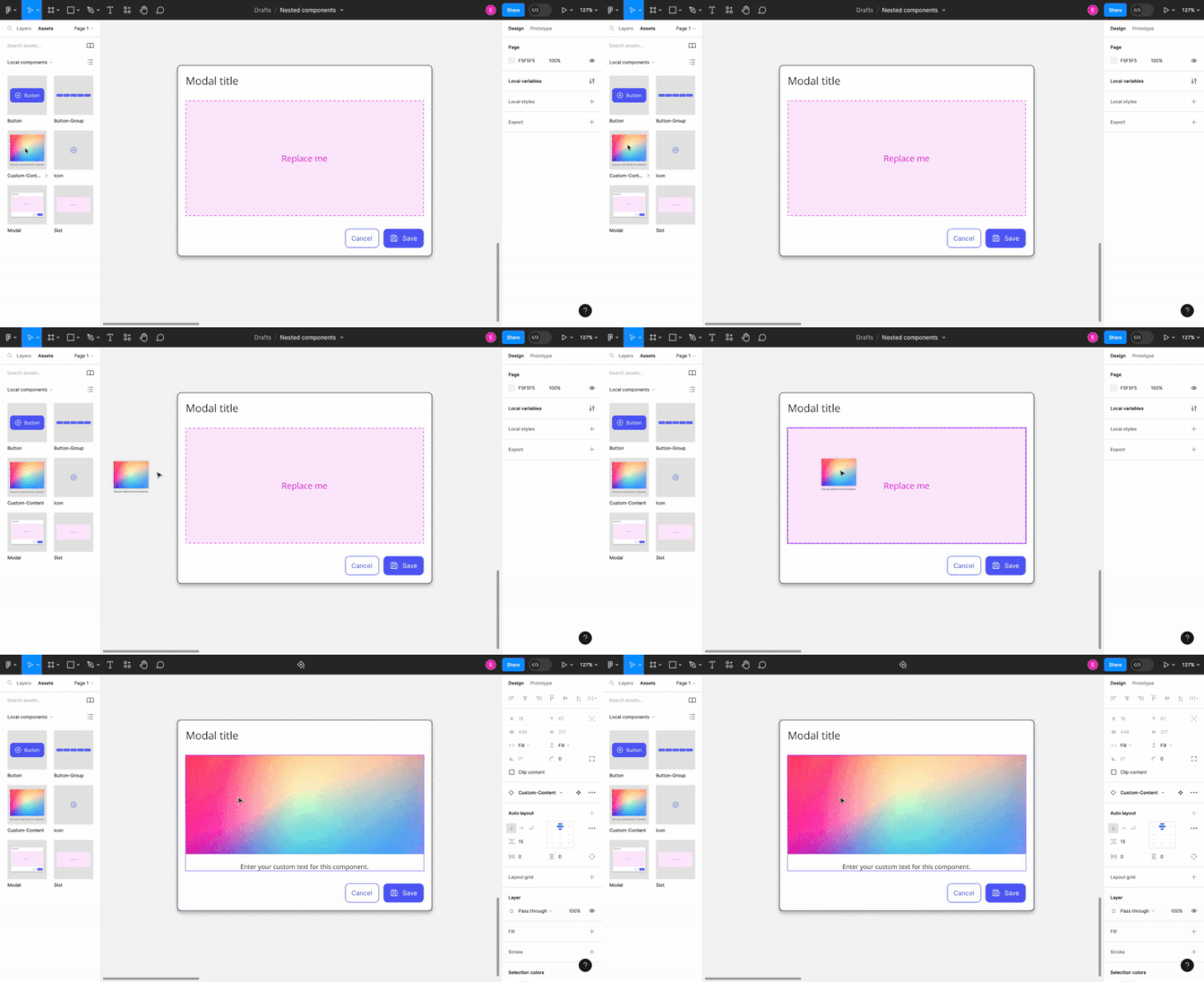
An alternative way to swap instances is by dragging and dropping the component from the Assets panel on the left side of the screen.
To swap instances with a main component, hold down ⌥ Option on Mac or Alt on Windows while dragging the component from the Assets panel. A purple stroke will appear when hovering over the main component, indicating the component that will be swapped:
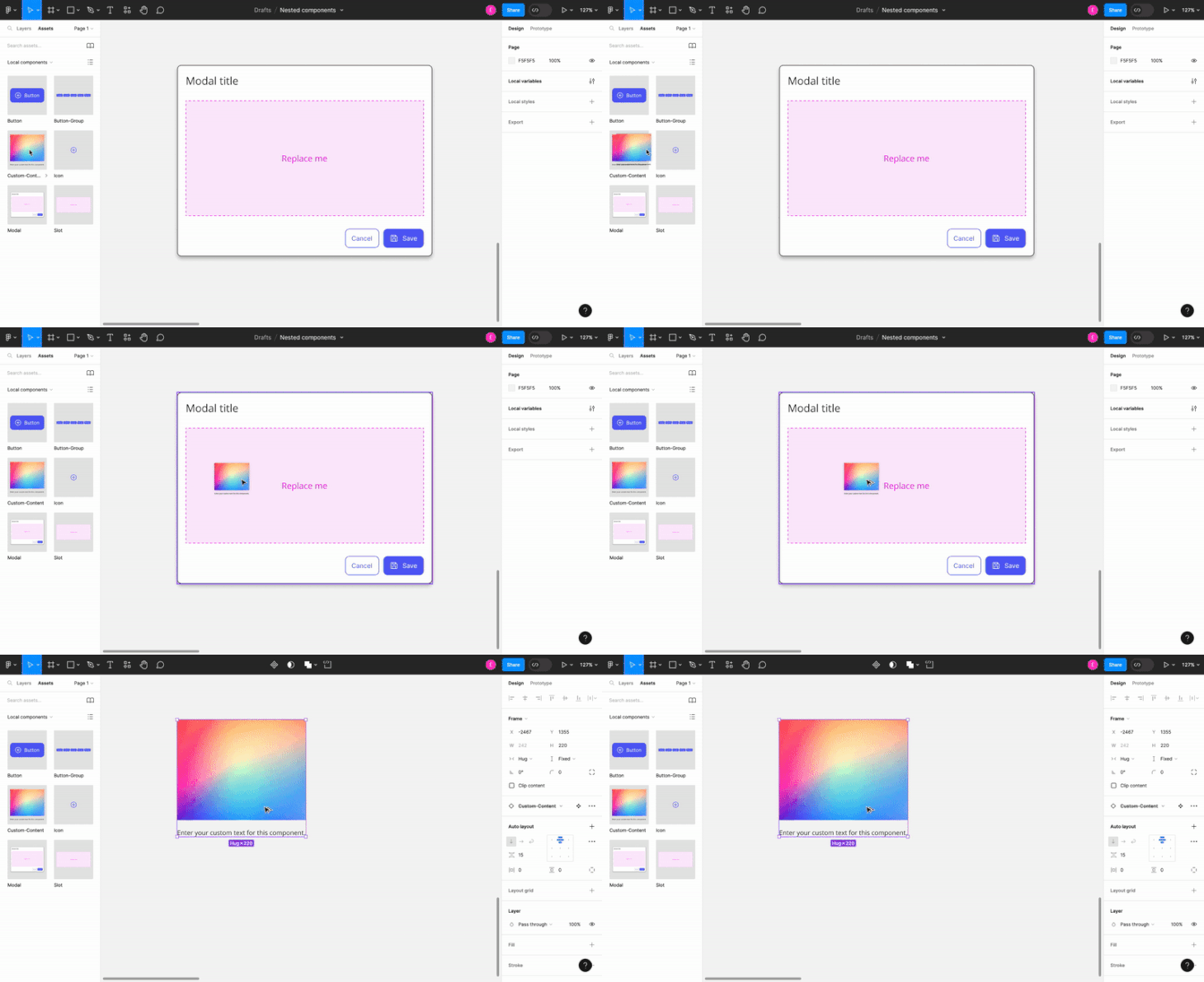
To swap a nested instance within a component, hold down ⌥ Option + ⌘ Command on Mac or Alt + Control on Windows while dragging the component from the Assets panel. You will be able to hover over nested instances and drop the component into place.
Figma components are the foundation of a robust design system. Components can become complex and require flexibility for various use cases. Thus, nesting instances within a main component can provide an effective solution.
Nesting allows you to create larger components using existing ones as building blocks. Using techniques such as slot components and instance swap properties makes it possible to swap components without having to detach an instance. Exposing properties from nested instances can improve designers’ workflow efficiency by enabling quick configuration.
At the end of the day, you’ll want to save time and effort by having a design system that caters to your needs. You should leverage nested components in Figma in order to build out a design system that improves your efficiency and ensures that your designs provide a consistent, intuitive experience to your users.
LogRocket's Galileo AI watches sessions and understands user feedback for you, automating the most time-intensive parts of your job and giving you more time to focus on great design.
See how design choices, interactions, and issues affect your users — get a demo of LogRocket today.

As products evolve into ecosystems, navigation becomes a system-level challenge. This article explores how to align structure, context, and user journeys to create seamless movement across tools without confusion.

Figma’s AI features have exploded in 2026 — from text generation and image editing to full UI drafts and code handoff. But speed isn’t the same as quality. This guide breaks down every major feature, what it’s good at, and where human judgment still does the heavy lifting.

Zero UI works well for screenless, voice-first experiences, but most digital products still require visual interaction. Here’s why multimodal UX offers a more scalable foundation for the future of design.

Multimodal UX goes beyond designing for screens. Learn how context-aware systems, progressive modality, failover modes, and accessibility-first design create better digital product experiences.