Linear design is a popular design trend, particularly for SaaS products. When I first wrote this article a little over a year ago, I predicted that although this trend had peaked already, what set it apart from other design trends is that it was more likely to evolve rather than fade into obscurity. Now, about a year later, I’d say that prediction has largely held true — and it’s definitely still worth learning about.
Let’s dive into a 2025 update about linear design. In this article, you’ll learn what linear design is, what its advantages are, the problem with linear design, and how the trend has changed — and stayed the same — over the last year. You’ll also read about how to use linear design effectively so your product doesn’t end up looking like every other digital design out there.
A linear design is a website design whose layout and content is straightforward and sequential, highlighting logical progression. Specifically, users are able to scan, read, and generally engage according to their native reading direction (for most western languages, top-to-bottom and left-to-right) in a natural way.
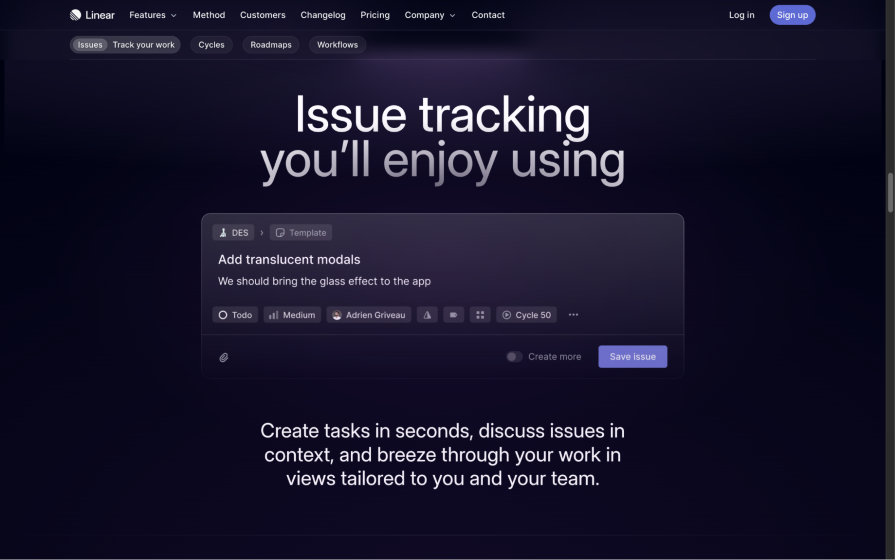
The linear design trend is named after and was popularized by the product planning tool Linear. Linear streamlines software development (or makes it more “linear,” if you will), but you’ll see this principle in the design of its website too. Here’s what the Linear website looked like back in 2024:
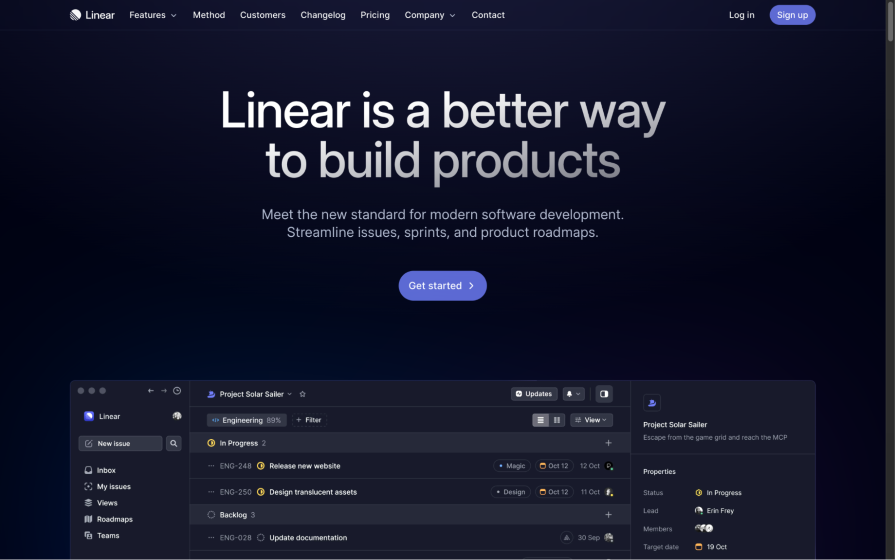
As you can see, it embraces this natural reading direction design principle, as well as many other design principles such as dark mode, bold typography, complex gradients, glassmorphism, monochrome colors, and high color contrast.
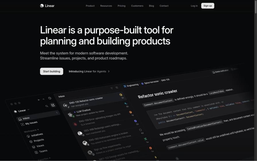
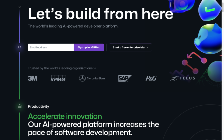
The core principle remains the same in its updated 2025 website. The biggest change is that its significantly cut back on the amount of color, swapping the dull, monochrome blue with
few bold colors for monochrome black/white with even fewer bold colors:
Linear design began with the minimalization of UI design. The flat design trend evolved to include some smaller trends such as soft shadows, dark mode, bold typography, complex gradients, glassmorphism, and so on, which made user interfaces more aesthetic but still minimal. Linear design adds — unsurprisingly — linearity to this, which means being direct and offering minimal choices.
Due to the simple visual effects and a reading direction that promotes logical progression, linear designs:
And yes, linear design is also visually appealing. However, the appeal is starting to wear off due to oversaturation, which we’ll go into now.
The problem with using design trends such as linear design is that if they become popular enough, all the products that follow the trend start to look monotonous and lack variety. As a result, the products collectively become less visually appealing (perhaps even boring), and as you can imagine, this makes them less enjoyable to use. The lack of a unique brand identity also makes them less memorable and less recognizable.
The trade-off of a lack of variety is better UX, because familiarity and consistency helps users to understand how a product works (even if they’ve never used it before) since they’re familiar with the UX patterns used (except for trends that are purely decorative, of course).
Naturally, there’s a sweet spot where people have become familiar with the design trend’s patterns and yet it continues to be interesting and visually appealing. However, that doesn’t appear to be the case with linear design, because people are starting to note that almost every SaaS website looks the same.
Does linear design continue to do well? Yes, but it wouldn’t be future-proof in its current form if you were to implement it today. Something else will inevitably become more popular, probably sooner rather than later.
2024 saw UX design trends like bold typography, complex gradients, glassmorphism, commoditization of UX, and accessibility — all qualities of linear design. Now, halfway through 2025, it feels like we’re seeing the natural evolution of linear design — linear design but bolder and with more individuality.
So how does that work, and what can you do to achieve the benefits of linear design without our designs ending up looking just like every other website or piece of software out there? Let’s take a look.
Over a year later, almost all of the websites showcased in this article look the same! As predicted, those that did change only changed incrementally, heavily suggesting that the linear design trend is here to stay, that it’ll continue to change incrementally, and that the practice of web design is beginning to mature. But did it improve, worsen, or just change for the sake of it?
Generally it has improved, but there’s room for further improvement. We’re not seeing any interesting typography or increase in light-mode designs, but there has been a small shift in how they’re using color.
Let’s take a look at the defining qualities of linear design and how various sites utilize them effectively, especially to avoid creating designs with little originality. You’ll also see how a couple of those sites have changed over the last year, for better or for worse.
Although the light mode versus dark mode debate still rages on, the most obvious thing about linear design is its focus on dark mode. There’s no real evidence to suggest that it’s better, but aesthetically it’s a fine choice to go with.
It’s commonly agreed upon that “100 percent black” is too black, but to be more specific I recommend using your brand color with one to ten percent lightness to create harmony within your color palette:
But like I said, it’s mostly an aesthetic choice. You can utilize any other color palette to avoid looking samey while still utilizing linear design’s best qualities:
Say what you mean — be bold, direct, and to avoid looking like a sheep in the herd, be creative with your typefaces. Bold typography is a staple of linear design and modern web design in general, but the same old sans-serif typefaces are starting to look a little stale.
Being bold and then going even bolder will enable you to keep one of linear design’s best qualities while creating a fresh visual aesthetic that hasn’t been done to death:
Gradients are a great way to add faux details and more dimensions to a design without actually doing so, so you end up with more impact but not more clutter. Gradients can be as simple or as complex as your design allows (more content should equal simpler gradients), and if you want to add animation to those gradients, why not?
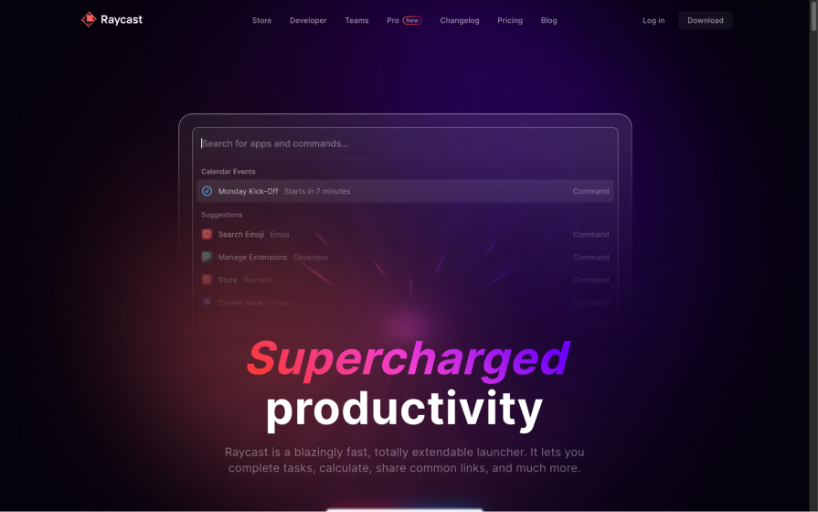
Back in 2024, Raycast used this linear design quality to draw the eye downward:
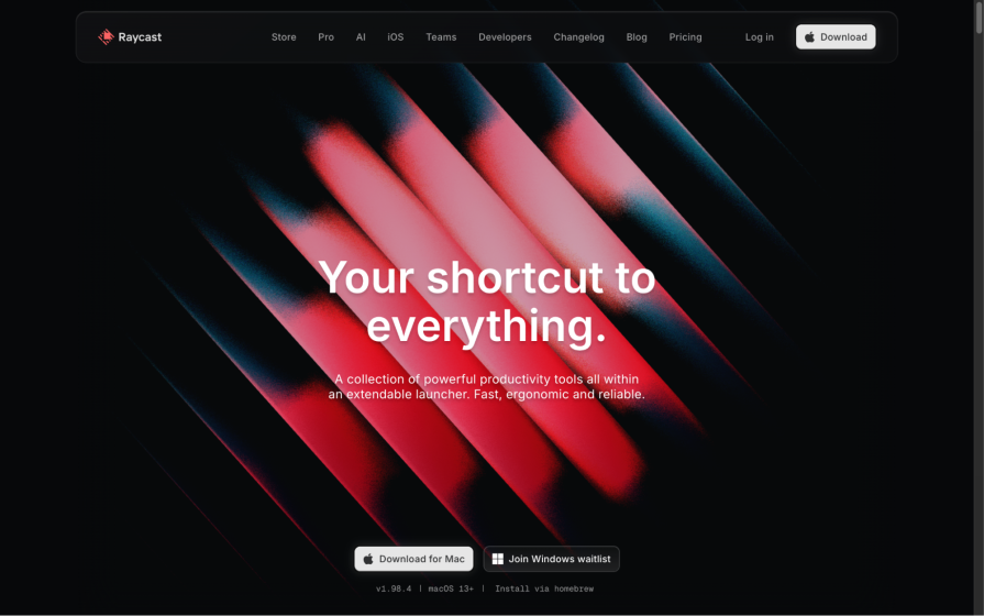
A year later, though, Raycast kept its colors but abandoned the gradient, focusing more on the bold red color while introducing some very interesting abstract visuals with noisy overlays. It shows off the best properties of the linear design trend, but also has its own visual identity now:
This sub-trend has been coming and going for years; however, modern advancements in web technologies might mean that we’ll be seeing glassmorphism, which is essentially a sleek glass effect, more consistently.
The effect works right out of the box in most UI design tools now for the same reason, and it’s a great way to infuse detail with readability, as shown in the image below:
However, glassmorphism is very difficult to do differently, so using this effect can make your designs lack originality.
In my opinion, the best part of linear design is its linearity, which can mean a couple different things:
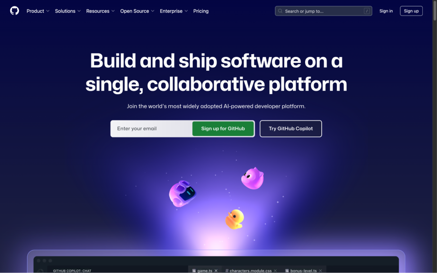
GitHub’s 2024 website executed these linear design principles really well:
Oddly though, while sites like Linear and Raycast have cut back on color, GitHub has opted to do the exact opposite and looks worse for it in 2025. It also leaned into the glassmorphism aspect of the linear design trend too much, which you might agree just doesn’t look great:
The State of UX lists the commoditization of UX as a design trend that we’ll see in 2025, but I think that UX design has been heading this way for a while now. They describe the commoditization of UX as the “focus on scalability and standardization over differentiation and delight”, which in a practical sense pretty much means going for whatever’s cheaper, faster, and has been proven to work over individuality and experience.
It’s a classic case of Pareto Principle (or “80 percent good” if you’re not familiar with the concept) and it makes perfect sense (pun not intended) from a business perspective. It’s not specifically a quality of linear design, but doing “whatever works” is definitely becoming a design trend in its own right and linear design is perhaps living proof of that.
That said, providing a fresh experience can keep customers/users engaged and award products with a competitive edge. Think about it — many SaaS products are used every day, so users become bored with them far quicker than they normally would with a product. It only takes one competitor to come along and build the exact same product functionally but with a better design.
So while there’s absolutely nothing wrong with “scalability and standardization” as UX Collective puts it, research on competitive advantage differentiators consistently shows that “differentiation and delight” can have a positive impact on product success.
Accessibility should be at the forefront of your design process. The good news is it’s a natural byproduct of linear design because simpler designs are easier to make accessible. If designed and developed mindfully, they might even be accessible right out of the box.
The Stark blog is a great place for designers and developers alike to learn about all aspects of accessibility, and it’s generally regarded as a crucial aspect of design anyway regardless of any design trends used.
The funny thing about design trends these days is that the trends themselves look similar. You could argue that, visually, linear design is just flat design with dark mode and gradients.
Perhaps design overall is just becoming so minimalist (which is a great thing, by the way) that there isn’t much room to be inventive, which isn’t a great thing but I think we can all agree that great UX is better than great aesthetics. Or maybe we don’t agree? Drop your thoughts into the comment section below!
Either way, I think that there’s room to take the best parts of linear design (or any design trend) and fuse them with new ideas. In my opinion, we should protect linear design (especially its linearity) rather than look towards something that’s completely different just for the cheap thrills of having something new and fresh for a short while.
On that note, I think that we’ve perhaps reached the conclusion of the design trends era. Going forward, I think web design and digital design in general will evolve more incrementally — we’ll continue to see quality of life updates to linear design (or whatever we end up calling future iterations of it) rather than wildly different design trends every year.
However, as for what I think the linear design trend will actually look like in another year from now, I think it’ll be the same amount of color and typography or less, except for in the ways that brands will try to create a visual identity. After all, a well-known problem with linear design is that websites that follow the trend end up looking very same-y, but greater exploration could change that.
Has linear design actually grown in popularity, though? I’d say yes — slowly, but steadily. Overall we’ve learned that there’s still room to improve the linear design trend (or in GitHub’s case, that there are ways to untune it in negative ways). We’ve also learned that it’s possible to craft a unique visual identity while still utilizing the best aspects of it.
My personal desires for linear design are the same as they were a year ago — that we see more color and bolder typography instead of dark mode and sans-serif fonts. They might be commonly used with linear design-inspired interfaces, but they aren’t what make linear design great. I’d also like to see more of what Raycast has done in the last year (craft a unique version of linear design).
Thanks for reading!

LogRocket's Galileo AI watches sessions and understands user feedback for you, automating the most time-intensive parts of your job and giving you more time to focus on great design.
See how design choices, interactions, and issues affect your users — get a demo of LogRocket today.

Explore the core principles of GUI design and learn how consistency, simplicity, feedback, accessibility, and user testing contribute to better digital experiences.

After five years in UX, I revisited the Daily UI challenge to reconnect with hands-on design. Along the way, I learned that great interfaces come from thoughtful briefs, sound judgment, and user feedback, not just better AI tools.

Learn what makes a great login screen through real-world examples and UX best practices for creating secure, accessible, and low-friction authentication flows.

Skeuomorphism helped define early digital interfaces by mimicking real-world objects to make technology more intuitive. Learn how it compares with flat design and neumorphism, why it declined, and where it still has a place in modern UX.


