Job descriptions are critical yet often underrated elements of a hiring process. A well-written UX designer job description helps us attract the best-fit candidates while filtering out those we don’t look for.
In the long run, a good job description will not only save time and resources spent on processing and interviewing ill-fit candidates but, most importantly, help us avoid the grim error of hiring an unsuitable candidate. This extra hour or two to tailor a good UX designer job description is nothing compared to the challenges a poorly written job description brings.
To help you nail your UX designer job description, I’ll walk you through three key steps to crafting one, with some extra tips and areas of focus depending on the seniority you are hiring for.
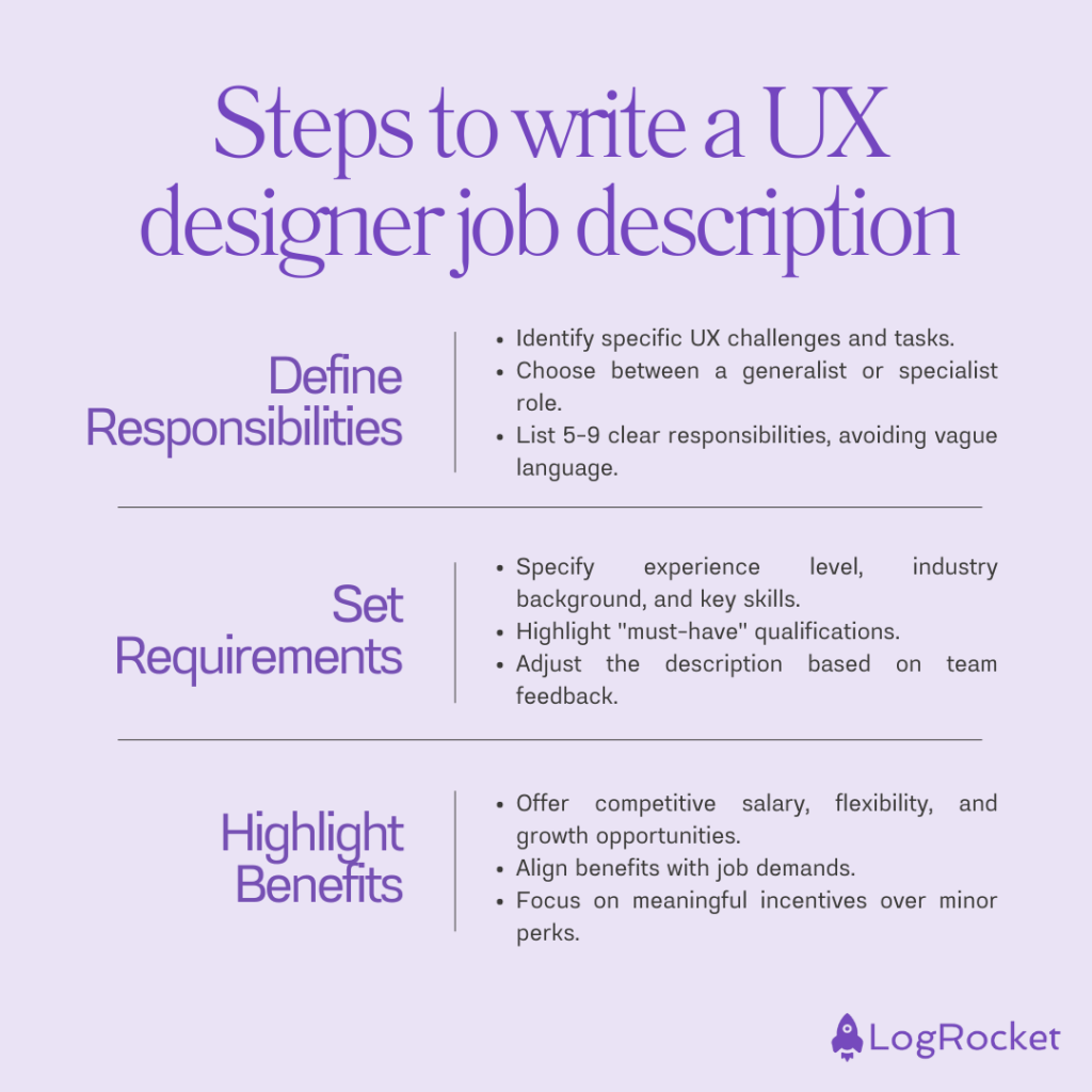
Crafting a great job description has three primary steps, and the order of operations is essential here.
You start by clearly defining who you are hiring and what jobs need to be done (responsibilities). Then, you figure out what’s needed to do the job well (requirements) and how you can incentivize people with that particular skill set to work with you (benefits).
Before all else, you must understand what you are hiring for and be super transparent with those expectations. After all, there are various UX design specializations, and it’s impossible to be an expert in everything.
Ask yourself the following questions:
If you need help gathering insights, you’re looking for a UX researcher/analyst who would interview users, create personas, and build continuous discovery habits within the organization.
If, on the other hand, your main problem is maintaining scalability and consistency, you might need someone who will dive deep into design systems, create components, and educate others on using them.
These are two completely different profiles. And the possibilities are endless. So, the most important thing is to be specific.
Don’t create bullet points like, “You will create a great user experience for users.” It doesn’t tell anything specific about the role. How will they be creating a great user experience? What is a great user experience? It can be achieved by:
Even if you are hiring your first UX designer and need a “do-it-all generalist,” it’s beneficial to think upfront about what type of tasks you expect this person to focus on during their first months to frame more explicit expectations.
So your UX designer job description should list out 5–9 bullet points about job responsibilities, with at least one bullet point covering:
Now that you know the responsibilities the new hire will shoulder, identify your ideal candidate profile.
An ideal candidate has the right experience and skillset to fulfill the responsibilities listed. A candidate with lesser skills and experience will underperform. And one with too much experience and skills for the role will most often be overly expensive, and the lack of growth might lead to lower motivation in the long run.
So, the typical requirements for an ideal UX designer job description will include:
For example, if your main challenge is polishing animations, someone with two years of experience in animation is likely a better fit than a generalist with five years of experience.
That would be it. Avoid listing things like knowledge of particular frameworks (e.g., opportunity solution trees), usage of specific tools (e.g., Figma), or working in specific setups. These are skills that can be quickly learned on the job. So they’re “nice to haves” at most.
I also recommend you mark “must have” requirements. The general rule for candidates is to apply if they meet around 70 percent of the requirements. So, if a job requirement is an absolute must-have, it’s good to list it explicitly to avoid getting applicants who fill most boxes but not the most critical ones.
Lastly, consult with your team, look at UX design specializations, and don’t be afraid to iterate on the job description as you go. Evaluate how your candidates perform in interviews and adjust the job description whenever needed — it’s not set in stone.
Now that you have clearly specified who you are looking for, what responsibilities they’ll have, and what skills they’ll need to bring on board, it’s time to get them excited about joining. List any benefits you’ll provide — salary, stock options, days off, remote work flexibility, additional budgets, or great learning opportunities (e.g., weekly mentoring calls).
Anything else is unnecessary. Sure, fruits in the office, access to Udemy, casual Fridays, and the newest MacBooks are also cool benefits. But I’m yet to find someone who changed jobs just to get a better computer or grab an avocado every Thursday. A few additional days off or an extra $500 to salary will go way further than a dozen micro-benefits.
The higher your requirements, the better benefits you should offer. If you can’t attract qualified candidates, you have to either increase your benefits or reduce your requirements, whichever makes the most sense.
If you are budget-savvy or not in a rush, start with smaller benefits and increase them if you see no good applications. If you need to hire as soon as possible or want to invest in employee retention, go big, but be ready to process thousands of applications.
Apart from the general framework I just outlined, there are a couple of specific considerations that depend on the seniority you are hiring for:
I consider an entry-level/junior UX designer anyone with less than ~a year of experience, although these definitions might differ.
Responsibilities
Responsibilities are the trickiest part of entry-level job descriptions. You can’t expect a fresh UX designer to deliver too much, but you also want to set long-term expectations to avoid disappointments. A neat solution is to split the responsibilities part into two sub-sections.
Addressing short-term and long-term expectations is critical when hiring people who need a lot of training.
Requirements
On one hand, you can’t expect much from entry-level applicants. On the other hand, you’ll get tons of applications. You need a way to filter them anyway. So, add minor requirements, such as:
Benefits
Let me be brutally honest. So many people want to break into UX design, and you’ll have a full pipeline of applicants, even for a free internship. Be fair and humane, but you don’t need to overdo it.
Mid-level designers usually have more than one but less than five to eight years of experience. The range is wide, but so is the skillset of applicants.
Responsibilities
Mid-level designers usually know what they want to specialize in in the long run. Be specific about how you envision the role growing over time and whether you want new hires to grow as generalists or move them to specializations over time.
Also, make sure to outline your company structure and design process. Mid-level designers already have some preferences in this aspect.
Requirements
Don’t focus on years of experience too much. A designer with two years of experience might outperform one with four years. Some minimums (such as two years+) are okay, but “four years+” requirements don’t make much sense. Instead of numbering out years, focus on:
Benefits
There is no science here. Basic principles apply. Fewer benefits lead to a smaller pipeline and lower quality of candidates, while more benefits lead to higher costs.
I recommend avoiding year ranges for seniors. A senior is an expert in their field — either having a highly developed and specific skillset (specialist) or a very broad range of experiences and skills (generalist).
Responsibilities
Seniors are picky, and since they are expensive, so should you be. Spend some extra time clarifying the role and expectations. You can even go beyond the eight-bullets rule.
If you can’t develop specific expectations and end up with basics such as “designing UI” and “creating user journeys, ” you probably don’t need a senior.
Requirements
There are two approaches for requirements for senior UX designers:
Benefits
If you want A-players, you need A-level benefits. Salary comes first; the more you can offer, the better. If you can’t afford it, consider giving more time off or stock options in the second order.
Consider tailor-made benefits if you seek a very niche and hard-to-fill role. Add a note to the job descriptions that the terms of cooperation and benefits can be improved while negotiating. The benefit of that is the ability to tailor benefits to specific candidates. After all, not everyone cares about stock options, etc.
A great UX designer job description starts by clarifying who you are looking for. Always define the responsibilities and day-to-day tasks first. Some people simply start writing job descriptions from the requirements section — but how can you define requirements if you don’t even know what type of results you expect from the new hire?
Benefits are your counter-weight for requirements. The higher the requirements, the more benefits you must offer. The scale of benefits heavily impacts both your costs and the quality of the pipeline, so play carefully and adjust ranges if needed.
Whether you are writing a job description for a junior, regular, or senior UX designer, specificity is the king. The more specific you’ll be with your expectations, the more qualified candidates you’ll get. If you can’t develop a specific job description, you’re probably not ready to onboard a new person.
Adjust your job descriptions for seniority:
Lastly, it’s okay to iterate on the job description, even after publishing it. Evaluate the application you’re receiving and adjust requirements, description of responsibilities, and the scale of benefits whenever needed. But, of course, changing the salary range every other day might be slightly “too agile”!
gd2md-html: xyzzy Mon Aug 19 2024
LogRocket's Galileo AI watches sessions and understands user feedback for you, automating the most time-intensive parts of your job and giving you more time to focus on great design.
See how design choices, interactions, and issues affect your users — get a demo of LogRocket today.
Learn how context-aware mode prioritization and seamless transitions improve multimodal UX and reduce mode confusion.

Research is becoming more democratized, product cycles are accelerating, and AI is transforming synthesis and ResearchOps. Here are the three trends shaping UX research in 2026.
Voice support is not the same as multimodal UX. Here’s how to design systems with true mode continuity and context-aware interactions.
AI tools can generate beautiful UI concepts in minutes, but most teams struggle to integrate those outputs into real design systems. This guide explores why AI drifts toward generic patterns and how to build governed workflows that keep speed without sacrificing brand consistency.