Unsure how to conduct your first content inventory? If that sounds like you, then you’re in the right place.

A content inventory helps a UX team keep track of the published content on a website or app in order to ensure that only high quality, relevant, and up-to-date video, image, and text content is reaching its audiences. In this article, we’re going to run through what a content inventory is and how you can plan and perform it successfully to improve the overall UX of your site.
Here’s what we’ll be covering in this tutorial:
Ready to get started? Then, read on!
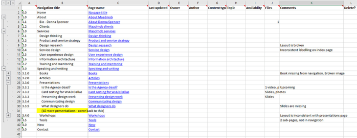
In UX design, a content inventory is a listed compilation of all the content currently visible to visitors on your website or app. This can include text, images, features, and applications, and should contain details about each piece. A content inventory will usually include categories such as “Title,” “URL,” “meta description,” “date published,” “tags,” and “author,” to enable content to be easily categorized, managed, tracked, and found.
The data gathering that takes place during the content inventory directly informs a content audit. A content audit is when each element or piece of content on a website is assessed in terms of its value and how it contributes to the site’s overall goals.
Although the terms are sometimes used interchangeably, they perform slightly different roles; while a content inventory is quantitative, a content audit is qualitative.
A content audit helps a UX designer gain a deeper understanding of how well located, high quality, and up to date each piece of content is, and whether some content needs to be removed, replaced, or improved.
Crucially, this raw data provides UX designers with the perfect stepping stone from which to assess the impact each piece of content has on the user experience. The UX team will look at each piece of content and ask questions such as, “How much value does this bring to users?” and “How does this help users reach their goals?”
Other benefits of a content inventory include:
Before you get started on your content inventory, you’ll need to do some planning. At this stage, it’s important to think about what you want to achieve with the content inventory, what resources you can commit to it, and which other team members could offer insights or valuable contributions to the process.
The first step in planning your UX content inventory is to define your goals. For example, is the purpose of the content inventory simply to organize and keep track of your content? Or are you planning on using this data to conduct a full-scale content audit to enhance the user experience?
Deciding this now will help ensure you collect the right information when performing the inventory. You’ll also want to consider the benefits of a content audit, and the results you’re hoping to achieve.
Once you know your goals, you can decide on the categories of your content inventory that best help you meet them.
If you’re hoping to use data to perform a content audit, you may want to consider including categories that reflect a piece of content’s popularity with users, such as “time on page,” “bounce rate,” “pageviews,” or “number of times shared.” If you’re just using your inventory to track and manage your content, however, then the following categories are good ones to start off with:
It’s important to bear in mind that your categories will need to reflect the type of content you are choosing to collect data on. Blog content will require different categories compared to downloadable or gated content, for example, which may require categories such as “file type” or “number of downloads.” If you’re collecting data about social media content, you might want to include “channels” or “number of likes” categories.
Additional categories to consider including are:
Before you begin your content inventory, you’ll want to pinpoint who needs to be part of the process, who can provide valuable input, and who is invested in the results.
These individuals might be content production team members who can give insights into why and when content was created; UX design team members who need to know the success or popularity of different content pieces with users; and marketing team members who will want to know where content gaps need to be filled by their writers.
Are you going to perform a content inventory of your whole website? Just the blog? Or just one particular section such as News, Press, or Resources?
You may want to just review product descriptions or landing pages, or track down all external guest posts you’ve created in collaboration with other sites. You may want to narrow it down by type of content such as video or PDFs, or separate your content based on which publishing platform you’ve used, such as social media channels.
Decide on the scope of your content inventory before you get started; it’ll help you keep track of both what you need to do and how much you’ve done, and prevent you from going down a seemingly endless rabbit hole of content.
With your plan in place, you’re ready to start the content inventory. Here’s a rundown of all the steps you need to perform a comprehensive UX content inventory.
You’ll want to start your UX content inventory by creating a spreadsheet you can use to record each piece of content and its related details. Google Sheets is a popular choice for this, though other tools such as Microsoft Excel, LibreOffice, Zoho Sheet, and OnlyOffice are also good options.
On the spreadsheet, input the categories you chose during the planning session. From here, you’ll need to go through each piece of content in the section or category you’ve chosen for the inventory and type in the details into the relevant spreadsheet sections.
N.B., don’t forget to include subpages. If a page has subpages, include them beneath the original page in the spreadsheet and repeat the same process of filling out all categories for each subpage, too.

Once you’ve collected the inventory data into your spreadsheet, you may want to use that information to conduct a content audit, which is an analysis of each piece of content, its purpose, its quality, its popularity, its impact, and its relevance within the context of the website and/or specific section. From this analysis, the UX team will seek to identify key insights which become the basis for improvements to the content on the site and any ongoing content strategy.
When conducting a content audit using the information you’ve collated in your content inventory, you’ll be looking out for content gaps, redundancies, and opportunities for improvement. Let’s dive a little deeper into each of these.
A content gap is a topic or subject that your users are interested in reading about that you haven’t yet covered on your website or blog. Gaps in your content are unfortunately an inevitable part of publishing relevant, up-to-date, user-focused content.
There are numerous reasons for content gaps, such as information becoming outdated, keywords changing, and consumer trends and interests shifting. Alternatively, it might simply be that you’ve not yet gotten around to covering every single topic that your users are interested in reading about.
When content gaps aren’t fixed, users are likely to hop over to the competition to find what they’re looking for. That’s why finding and rectifying gaps in your content will be crucial to staying competitive and relevant to your user base.
You can split up your content gaps into different types:
Here’s how to fix these content gaps:
Once you’ve taken these steps, compare your findings to your content inventory and see what’s missing. You can then work to create the content that’s needed to fill the gaps.
Redundancies, also known as redundant content, are when an organization has published more than one page on its site that addresses the same user query or addresses the same user intent. Although the content isn’t duplicated — the text on each page is unique — the pages perform the same function. Redundancies can occur when a company hires multiple writers and strategists over a period of time, or when an internal publishing calendar is simply too demanding.
Although redundant content might not seem like a major issue for content managers, it causes problems for a company’s SEO because the company is essentially competing with its own content for a user’s attention on search engine results pages.
Your content inventory will have helped in uncovering redundant content on your site. From there, you have a few options regarding how to deal with it. You could consolidate all that content into one authoritative page on the topic and redirect all merged pages to a single URL.
Another option is to de-index redundant pages, which hides them from Google but doesn’t delete them. This prevents the content from affecting your ranking on search engine results pages, but can still be shared via email or social media should you have a specific need for it.
The findings of your content inventory are able to inform content improvements and UX enhancements. You might uncover duplicate content, out-of-date information, unclear navigation, or messaging that no longer aligns with the brand. These are all opportunities to improve, refresh, and update the content on your site, which will provide a more valuable experience to users and help you better differentiate from competitors.
For your best results, a UX team should aim to conduct a content inventory and content audit on a yearly basis in order to stay on top of which content is on the site, what’s missing, and what improvements need to be made. A regularly updated editorial calendar will also make staying on top of what content is going live week to week much easier.
In this article, we’ve shown you what a content inventory is, how it differs from a content audit, and how the two practices work together. We’ve also given you concrete steps for planning and conducting your first content inventory and how to use the information you gather during the inventory to conduct a content audit; analyzing inventory data and identifying key insights that can be used to make significant improvements to your site’s body of content.
Header image source: IconScout
LogRocket's Galileo AI watches sessions and understands user feedback for you, automating the most time-intensive parts of your job and giving you more time to focus on great design.
See how design choices, interactions, and issues affect your users — get a demo of LogRocket today.

A three-week mobile banking project taught me that the “proper” UX process is not always realistic. Sometimes, the better approach is to work with what you know, identify what you still need to learn, and make the strongest decision possible under real constraints.

A/B testing compares two versions of a design to see which performs better with real users. Here’s how UX teams can use it to test hypotheses, measure outcomes, and make smarter product decisions.

This case study shows how one ad experience redesign increased total ad exposure while lowering perceived friction, proving that timing and context can matter more than raw interruption.

As products evolve into ecosystems, navigation becomes a system-level challenge. This article explores how to align structure, context, and user journeys to create seamless movement across tools without confusion.