Cancel buttons might seem simple, but they play a key role in some of the most stressful moments of your customers’ journey. As your users interact with your product, they need an easy way to stop a process, discard changes, delete content, or back out of an action entirely, so that they don’t become frustrated or lose trust in you. And since today’s users are more anxious and impatient than ever, the importance of cancel buttons has only grown.
To help you hone your craft, this article takes a look at cancel buttons, the sometimes destructive ramifications of interacting with them, and what you can do to ensure that users feel in control while canceling, deleting, clearing, returning to a previous state, and so on.
Editor’s note: This blog was updated 23 June 2025 by the author to expand on the original, explain the difference between cancel buttons and cancel links, and cover accessibility best-practices.
Cancel buttons enable users to trigger cancel actions (e.g., ending a subscription, deleting data, or clearing an input). Naturally, these actions are destructive, so if they’re not designed well, users might report having a negative experience. In most cases, these negative experiences are caused by the accidental loss of data, which in the worst of cases can’t be undone.
As you can imagine, these negative experiences can be so bad that they not only hurt business objectives but cause users to rage quit. If there was ever a way to make users feel angry, completely wasting their time by “letting” them cancel/delete all of their data would be the way to do it.
It might seem like cancel and close buttons do the same thing, however, they have some key differences.
Closed buttons hide things (e.g., they dismiss modals, toggle tabs, and so on), whereas cancel buttons delete things (e.g.,. data, input, etc.). Because of this, cancel buttons have severe consequences such as loss of function or data, unlike close buttons that just dismiss modals, popovers, banners, snackbars, and so on.
As a rule of thumb, close buttons are for hiding something and cancel buttons are for permanently getting rid of something.
When you start designing your cancel button, consider the following key factors:
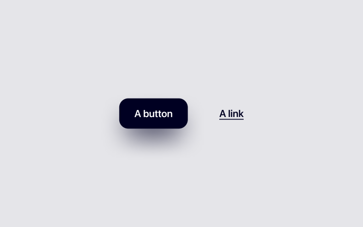
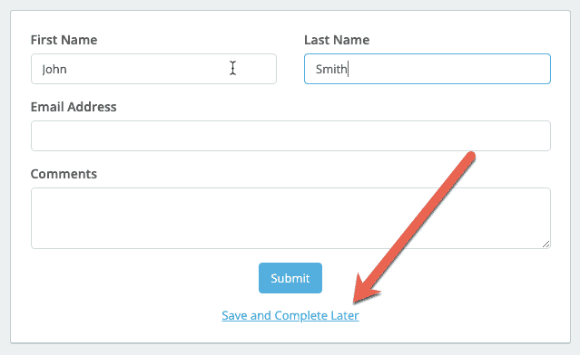
First off, you need to clarify: Do you want a cancel button or cancel link?
Users expect buttons to perform an action (cancel) and links to navigate them to a new page or screen (where they can cancel from), so choose the one that you think best aligns with your users’ expectations.
You don’t want users to click on a cancel link thinking that their decision isn’t set in stone only to find that it’s actually a destructive, finalized action.
Great buttons are:
The “three A’s,” as I like to call them.
I went into what makes a great button design in a lot more detail in a previous article, but to summarize:
Cancel buttons should be orange or red if interacting with them results in a somewhat significant destructive action (orange for an initial warning, red for the final warning).
That said, I hardly ever see orange used. I can’t even tell you how anxious I get looking at this red button because it feels so final:
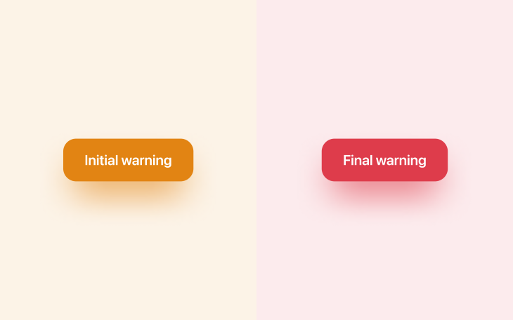
However, the majority of cancel buttons are only mildly destructive, and you’ll want to keep those ones looking fairly neutral (on the gray spectrum).
If you take a look at HTML’s native search element (<input type=”search”>), you’ll see when hovering over it that an “×” icon appears that helps users to cancel their input — it’s gray because it’s only mildly destructive (users lose perhaps one to three words). It’s also a small icon rather than a large button for the same reason.
Your brand color is (hopefully) a positive color, so it’ll have the complete opposite effect of making users stop and think about their actions. You’ll definitely want to avoid using that color.
Great design sometimes requires friction. Less friction allows users to accomplish their tasks quicker, but more friction can reduce the likelihood of them making mistakes. You have to sacrifice a little of one to get more of the other, so as you might’ve guessed, it’s all about finding the optimal balance.
Going back to the search input example — assuming that you’ve cleared a search input before, you would’ve noticed that there wasn’t any friction at all. This is because it’s hardly a destructive action (you’re only losing a few words that can be retyped easily).
However, if it were a long-form input or a form made up of multiple inputs, you’d want a cancel button to be accompanied by friction. Now, it’s difficult to recommend specific dos and don’ts because they depend on many factors, but consider any combination of the following approaches:
When it comes to deleting data and canceling subscriptions (which can include data deletion too), you need to tread a little more carefully.
Let’s start with data. Here are a few examples that you might be familiar with:
There are many interesting ways to deal with these scenarios, with pros and cons to each one.
Firstly, consider asking users to confirm their action via email. This is probably my favorite approach because it adds a layer of security too, and although it’s also the slowest approach, users don’t necessarily need to confirm their action right away. If the deletion is time-sensitive, asking users to confirm their password is a better approach.
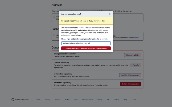
If security isn’t really an issue, consider asking users to recall something such as their email address or the name of what they’re trying to delete as GitHub does:
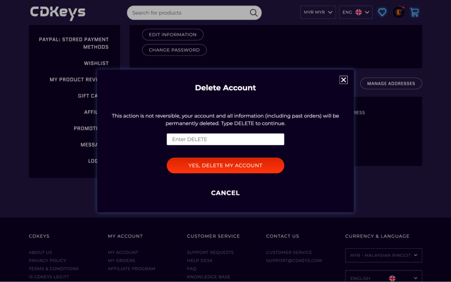
The bare minimum should be having a simple “Are you sure?” question (low friction), but there’s also the somewhere-in-the-middle “Type this word to confirm” approach, as shown on CD Keys site below (medium friction):
All of these approaches create friction, giving users an opportunity to reconsider their action before taking it. The approaches have varying degrees of security and convenience — it’s simply about choosing the one that feels most suitable.
Subscription cancellation comes with potential data loss, so the approaches are pretty much the same. However, subscription cancellation can also come with loss of payment authorization, a minor inconvenience for B2C products but a major inconvenience for B2B products where approval from somebody that’s “higher up” is usually required in order to reauthorize payments.
So in addition to leveraging the UX design tips mentioned already, make sure to cancel the payment authorization without deleting the payment information to make it easier for users to recover from accidental cancellation (unless they’ve asked for their data to be deleted).
That aside, I did come across an interesting approach to cancelation on Discord, although I suppose it isn’t that uncommon as I’ve most certainly seen this on many social media platforms. Discord provides the option to disable your account in addition to deleting it completely, giving users more control and upfront clarity:
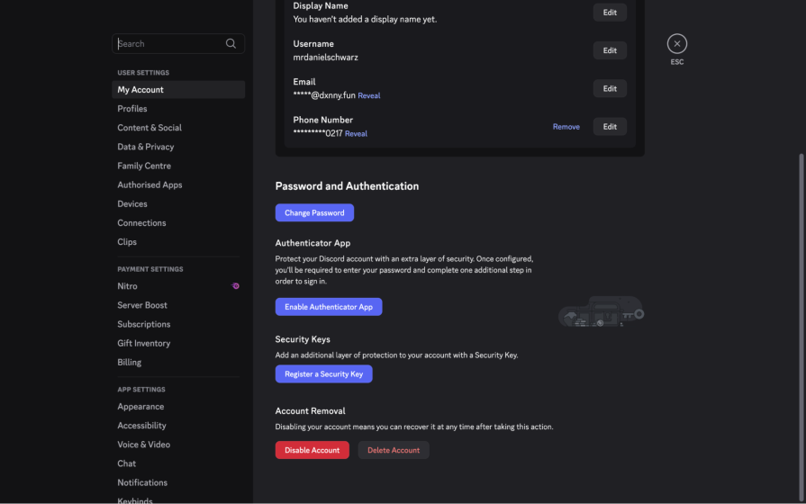
The visual design is really interesting because the least destructive option (“Disable Account”) is the reddest, and also, it might be the first time I’ve seen a design use a neutral background with “cancel red” text.
If I wanted to stop using Discord, I would certainly gravitate to the red button that stands out more instinctively, but I’m not sure if they’re doing this to increase friction or to trick users into not deleting their account entirely.
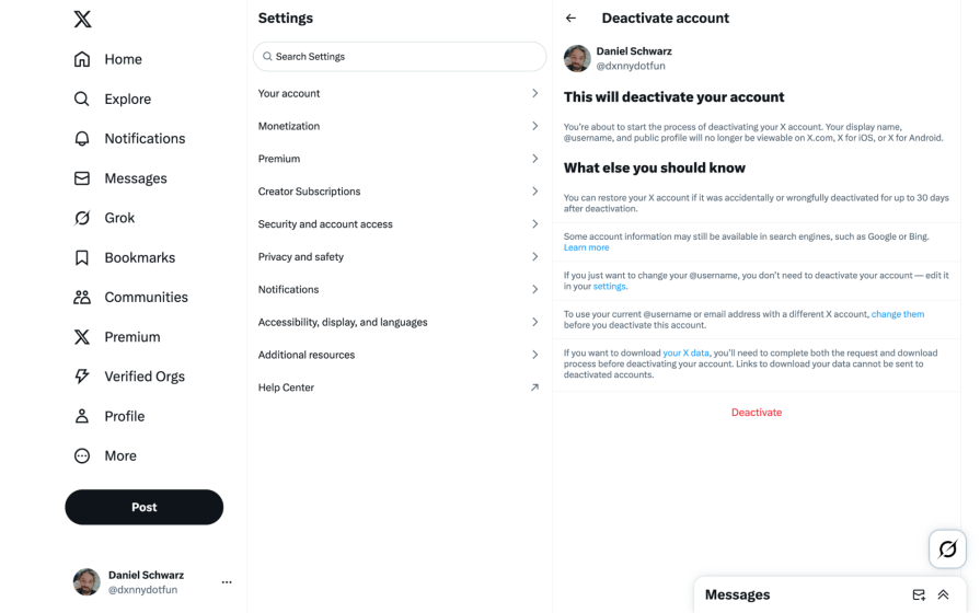
This sent me down a social media rabbit hole, where I discovered that to delete your X account, you must deactivate it and then not use it for 30 days. In this case, both the approach and “Deactivate” wording seems intentionally unhelpful, and it’s certainly too much friction:
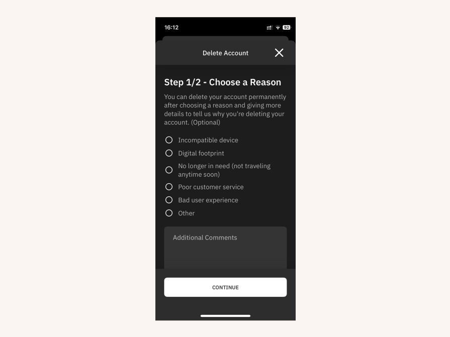
Another interesting UX pattern (a good one, I think) is asking users why they want to cancel. Although there’s obviously a product research angle to this pattern, it does add a layer of friction to the cancellation flow that forces users to really consider (or…reconsider?) their decision.
This example from Airalo makes it clear via the wording and the color that this step is optional, and for the moment, non-destructive:
Also, don’t insist that users call or email in order to cancel (but I’m sure you know that already!).
As a contingency (or alternative?), consider offering deactivation or implementing a grace period, where the data is locked rather than lost. Choosing one of these approaches should depend on how costly it is for you to house the data (with a grace period, the data is only stored for a limited amount of time).
If you’d like to shoot your shot at trying to retain customers or if more information is required regarding the ramifications of deleting/canceling, then you might want to direct users to another page/screen. As mentioned earlier, this is probably the only scenario where the (initial) cancel button is better off as a link (an orange warning link, specifically).
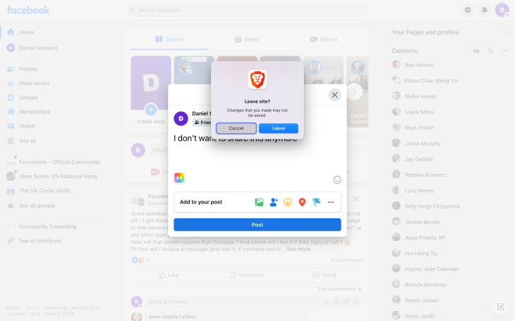
While the Web Content Accessibility Guidelines (WCAG), which sets the standard for accessibility that many countries enforce by law, doesn’t say anything about cancel buttons specifically, it does say that in regards to “error prevention” there should be a mechanism for reviewing/confirming user actions so that there’s no loss of data or functionality when canceling.
This helps those with motor disabilities who could interact with cancel buttons accidentally, and obviously wouldn’t want to lose their data or functionality by doing so, as well as those with cognitive disabilities who might misunderstand.
For the latter (all users, actually), it’s important to note that reviewing/confirming doesn’t simply mean confirming twice. Instead, the repercussions of canceling should be made crystal clear in simple wording (and formatting; for example, in bullet points) what canceling actually means.
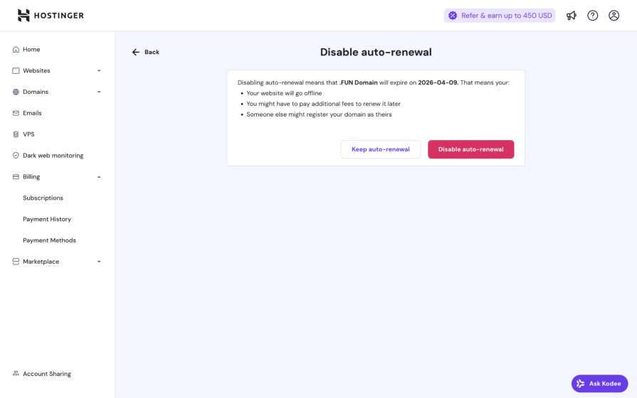
Here’s a great example from Hostinger that appears when turning off auto-renew, which can have serious consequences even though it’s a reversible action:
We’ve already discussed how to design non-destructive cancel buttons, but now you know that those UX best practices are protected by the WCAG too, and there are fines and other punishments for non-compliance depending on the country.
Cancellation flows are frustrating right off the bat because their outcomes aren’t and can never be rewarding. At best, users go from being in a predicament to neutral ground. On the upside, people love to complain about high-frustration scenarios like these ones, which makes your job as a designer easier. Users will waste no time complaining to you in great detail if you make it easy for them to do so (and probably even if you don’t, thanks to social media).
It’s good practice to get user feedback as often as possible. Your best bet is prompting users to complete feedback surveys. However, being accessible and available on live chat and social media is important too (especially if one of your goals is to run damage control).
Users are less likely to rave about smaller inconveniences such as a lost input or the inability to cancel an action and return to a previous state, making them harder for you to detect and improve. The trick is to use analytics to identify pages/screens with an abnormal number of refreshes. After that, use session replays to see if those refreshes are happening because users weren’t able to find stable ground (e.g., starting over by refreshing).
Collect feedback in a variety of ways and whenever you have the opportunity to do so. For minor gripes (including those that are so small that users might forget or feel too embarrassed to mention), quietly dig through your analytics and take peeks at your session replays to see what users are actually doing, play-by-play.
As designers, we tend to focus on ways to get users to do things we want them to do rather than ways to help them cancel those things (and rightfully so, it’s important to prioritize certain conversion flows/business objectives). However, making it difficult for users to cancel, delete, clear, unsubscribe, go back, and so on can be extremely frustrating to them and a lightning-quick way to ensure that they won’t want to stick around.
It’s important to not get lost in the primary business objectives and remember that all of the little things (including cancel actions) combined can actually wind up having a huge impact on business objectives in the grand scheme of things. To that end, cancel buttons should be clear despite leading to friction to prevent users from taking action accidentally, and not obscure or unpredictable in any way.
If there’s anything that you’d like to add, please drop a comment in the comment section below.
And as always, thanks for reading!
Featured image source: IconScout

LogRocket's Galileo AI watches sessions and understands user feedback for you, automating the most time-intensive parts of your job and giving you more time to focus on great design.
See how design choices, interactions, and issues affect your users — get a demo of LogRocket today.
Skeuomorphism helped define early digital interfaces by mimicking real-world objects to make technology more intuitive. Learn how it compares with flat design and neumorphism, why it declined, and where it still has a place in modern UX.
Memos don’t have to be complicated. Just keep them clear, concise, and focused on actionable items. More on that in this blog.

AI has made polished, confident content easy to generate, but that does not make it trustworthy. This article explains how UX teams can design stronger quality signals using source transparency, validation, confidence communication, and reputation.
Inclusive design is evolving beyond accessibility alone. This guide explains how UX designers can create more inclusive products through usability, accessibility, neurodiverse UX, adaptive personalization, multimodal design, and culturally aware product experiences.

 Learn more →
