Imagine yourself faced with the challenge of assembling a tricky puzzle but not knowing where to start. Elements such as logical reasoning and meticulous attention to detail become essential, requiring an approach that goes beyond the surface level to achieve effectiveness. When evaluating the user experience of an interface, it is no different.

In this article, we will cover the fundamental concepts of heuristic evaluation, how to properly perform a heuristic evaluation, and the positive effects it can bring to your UX design process. Let’s learn how you can solve challenges with heuristic evaluation.
The heuristic evaluation method’s main goal is to evaluate the usability quality of an interface based on a set of principles, based on UX best practices. From the identification of the problems, it is possible to provide practical recommendations and consequently improve the user experience.
So where did heuristic evaluation come from, and how do we use these principles? Read on.
Heuristic evaluation was created by Jakob Nielsen, recognized worldwide for his significant contributions to the field of UX. The method created by Nielsen is based on a set of heuristics from human-computer interaction (HCI) and psychology to inspect the usability of user interfaces.
Therefore, Nielsen’s 10 usability heuristics make up the principles of heuristic evaluation by establishing carefully established foundations. These foundations serve as a practical guide to cover the main usability problems of projects. These heuristics work as cognitive shortcuts used by the brain for efficient decision making, especially in redesign projects. Heuristics also help to complement the UX process when understanding user problems and supporting UX research and evaluation.
When you are getting ready to conduct a heuristic evaluation, the first step is to set clear goals. Then, during the evaluation, you should make notes on what you find considering usability issues, always based on the criteria. Once this is done, you can prepare a report that might include information on which issues to tackle first, which makes the evaluation even better. All these steps matter because they help make sure interfaces match what users want and expect, leading to better interactions overall.
As with the puzzle example in the intro, fully understanding the problem is critical to applying heuristic evaluation effectively. Thus, during the preparation phase, you need to establish the evaluation criteria, also defining how these criteria will be evaluated.
Select evaluators based on their experience. By involving a diverse set of evaluators, you can obtain different perspectives on the same challenge. Although an expert is able to point out most of the problems in a heuristic evaluation, collaboration is essential to generate more comprehensive recommendations.
Although it follows a set of heuristics, the evaluation is less formal and less expensive than a user test, making it faster and easier to conduct. Therefore, heuristic evaluation can be performed in the early stages of design and development when making changes is more cost effective.
Nielsen’s usability heuristics are like a tactical set for methodically making things work, providing valuable clues that designers and creators follow to piece together the usability puzzle. These heuristics act as master guides, helping us intelligently fit each piece of the puzzle together so that everything makes sense and is easy to understand to create amazing experiences in the products and websites we use.
Here are Nielsen’s 10 usability heuristics, each with its own relevance and purpose:
Continuously inform the user about what is happening.

Use words and concepts familiar to the user.

Allow users to undo actions and explore the system without fear of making mistakes.

Maintain a consistent design throughout the system, so users can apply what they learned in one part to the rest.
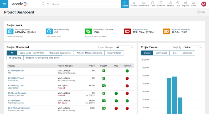
Design in a manner that prevents users from committing mistakes or provides means to easily correct wrong decisions.

Provide contextual hints and tips to help users accomplish tasks without needing to remember specific information.

Allow users to customize keyboard shortcuts or create custom profiles to streamline their interactions.

Keep the design clean and simple, focusing on the most relevant information to avoid overwhelming users using proper spacing, colors, and typography.
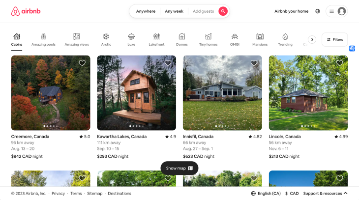
Provide helpful and accessible support in case users need extra guidance.
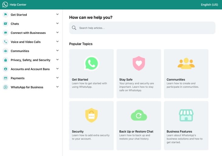
Give immediate feedback to users when they take an action.
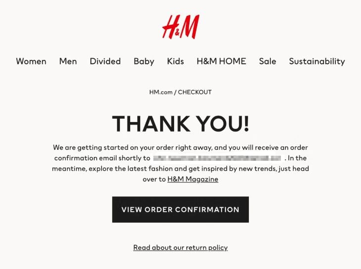
Together, these pieces of the usability heuristics puzzle help us build a complete picture of digital experiences. Thus, by following these guidelines, evaluators can identify problems and prioritize them for correction at the evaluation stage.
In the evaluation phase, evaluators should look at the product or system interface and document any usability issues based on heuristics. By using heuristics consistently across different parts of the interface, it is still possible to balance conflicting heuristics to find optimal design solutions.
There may be challenges during the evaluation phase, which is why it is important that evaluators suggest strategies to overcome them from the definition of priorities. Evaluators should therefore, in consensus, discuss how these heuristics can be applied to identify and address usability problems.
One of the interesting ways to do heuristic evaluation is through real-time collaboration tools like Miro. On the template below, you will be able to collaborate in real-time to conduct heuristic evaluations of your project with your team, evaluating the problems by criteria and dividing them by colors, based on the level of complexity to be solved.

You can download the Miro Heuristic Evaluation template for free.
After performing a heuristic assessment, evaluators should analyze the findings and prioritize usability issues, trying to identify the underlying causes of usability issues rather than just addressing surface symptoms.
Usability issues discovered during the assessment can be given severity ratings to prioritize fixes.
Below is an example of categorization by severity according to the challenge presented:
The classification will help the team to have greater clarity regarding what is most relevant to be faced considering the impact on the user experience. By prioritizing the most critical issues based on their impact on the user experience, it will be easier to effectively allocate them throughout the project.
Finally, during the reporting phase, evaluators should present their findings and recommendations to stakeholders and facilitate discussions on identified issues.
Evaluators typically conduct multiple iterations of the assessment to uncover different issues in subsequent rounds based on the need for the project and the issues identified.
Heuristic evaluation provides qualitative data, making it important to interpret the results with a deeper understanding of user behavior. When reporting and communicating the results of a heuristic assessment, assessors should follow best practices by presenting findings in visual representations that are easy to read and understand, and that highlight key findings, whether using interactive boards, tables or other visuals.
Problem descriptions should be clear and concise so they can be actionable. Instead of generating generic problems, for example, break the problems into distinct parts to be easier to deal with. If necessary, try to analyze the interface component and its details, thinking not only analytically in an abstract way but also understanding that that problem will be solved by a UX Designer, considering all its elements. In this scenario, a well-applied context makes all the difference.
It is also important to involve stakeholders and facilitate discussions around identified issues. As a popular saying goes: a problem communicated is a problem half solved.
The Dropbox team really nails it when it comes to giving users a smooth and user friendly experience. Let’s dive into a few ways they have put these heuristic evaluation principles to work in their platform:
Dropbox keeps things clear by using concise labels to show the status of your uploaded files. They also incorporate a convenient progress bar that provides a time estimate for the completion of the upload. This real-time feedback keeps you informed about the ongoing status of your uploads on the platform:

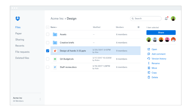
The ease of moving, deleting, and renaming files between different folders and sharing with other people means that Dropbox offers users control over fundamental actions, allowing them to work in a personalized way, increasing their sense of ownership:

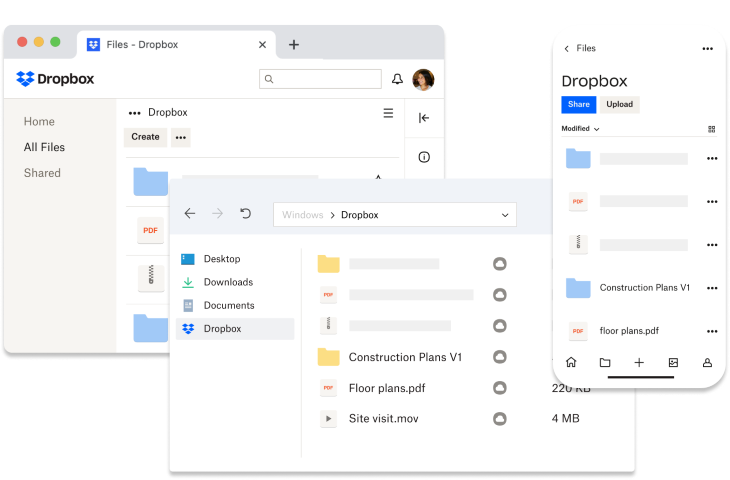
Making it a breeze for users to navigate no matter if they’re on a computer or a mobile device, Dropbox keeps things consistent in both: website and mobile app design:
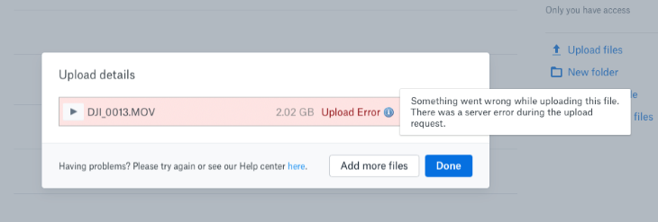
To prevent errors from happening, Dropbox has implemented an interesting feature. If a user attempts to upload a file that’s too large, Dropbox triggers an error message. This message is quite helpful, as it guides the user to select a smaller file and clearly explains the issue. It’s a nifty feature that ensures users know exactly which steps to take next:
Dropbox cleverly employs affordances to ensure that users can easily figure out how to navigate the app. Take, for instance, the blue button located at the top of the screen — it’s your go-to for creating new files and folders. This is a familiar and intuitive pattern that users can quickly grasp:

Consider now flexibility and efficiency. On Dropbox, the user can access their files from any gadget, and they can keep working even when they are offline without worrying about losing anything. It makes staying productive a breeze, no matter where the users finds themselves:

Dropbox has a clean and minimalist design that’s a breeze to use and get around in. Plus, it’s available in different languages, ensuring accessibility for people all around the world:
Dropbox goes the extra mile by using additional methods alongside heuristic evaluation, demonstrating a high positive impact on their services. All this dedication to applying the best heuristics on their products has made Dropbox one of the most popular storage services globally.
Heuristic evaluation fits into the broader UX design process and can be conducted iteratively throughout the design lifecycle, despite being commonly used early in the design process.
It provides valuable insights to inform design decisions and improvements and enables UX designers to effectively identify and address usability issues.
In this article, we have seen that heuristic evaluation is a systematic and valuable approach to identifying usability problems in systems and products. Through the use of general usability guidelines, it is possible to highlight gaps in the user experience, addressing areas such as clarity, consistency and control. This evaluation is conducted by a multidisciplinary team, and the problems identified are recorded in detail, allowing for further prioritization and refinement.
Much like a complex puzzle, improving usability and user experience requires identifying patterns and providing instructive feedback when working collaboratively.
Checking interfaces using heuristic evaluation can uncover many issues, but it’s not a replacement for what you learn from watching actual users. Think of it as an extra tool to understand users better.
Remember that heuristic evaluation not only reveals challenges but also empowers you as a UX professional to create more intuitive and impactful solutions.
When you mix in heuristic evaluation while making your designs, you can end up with products and systems that are more helpful and user-friendly without spending too much. This helps make your products or services even better by following good user experience tips.
So don’t hesitate: make the most of the potential of heuristic evaluation to push usability to the next level in your UX project.
LogRocket's Galileo AI watches sessions and understands user feedback for you, automating the most time-intensive parts of your job and giving you more time to focus on great design.
See how design choices, interactions, and issues affect your users — get a demo of LogRocket today.
A three-week mobile banking project taught me that the “proper” UX process is not always realistic. Sometimes, the better approach is to work with what you know, identify what you still need to learn, and make the strongest decision possible under real constraints.

A/B testing compares two versions of a design to see which performs better with real users. Here’s how UX teams can use it to test hypotheses, measure outcomes, and make smarter product decisions.

This case study shows how one ad experience redesign increased total ad exposure while lowering perceived friction, proving that timing and context can matter more than raw interruption.

As products evolve into ecosystems, navigation becomes a system-level challenge. This article explores how to align structure, context, and user journeys to create seamless movement across tools without confusion.