In recent years, finance and technology have come together to form a booming industry — Fintech. These tools have reshaped how we interact with money, making banking services more accessible and user-friendly. Thanks to the internet and emerging tech, financial institutions can now track transactions more efficiently, while users enjoy smoother experiences with fewer hurdles.
At the heart of this evolution is Fintech’s promise to simplify the complex world of traditional banking. And one of its biggest selling points? A customer-centric approach powered by innovation.
Fintech apps offer users personalized services, around-the-clock convenience, and seamless access to financial tools. But here’s the catch. Even with all these benefits, people still switch banks in search of better digital experiences. In fact, according to a 2023 Salesforce study, a poor digital experience was a top reason for users jumping ship.
As the Fintech space keeps growing — especially with AI entering the mix — great UX will only become more important. Designers are playing a key role in reducing usability friction and helping people navigate high-stakes decisions with confidence. After all, nobody wants to make a costly mistake just because they couldn’t figure out where the “confirm” button was.
Furthermore, some apps like Stripe and Wise have put an emphasis on accessibility, which can be seen through their high contrast colors and screen reader-friendly user flows, using systems like progressive disclosure to ensure that anyone and everyone can engage with their tools.
In this article, I’ll explore four standout Fintech companies — Revolut, Stripe, PayPal, and Wise — and take a closer look at how they approach onboarding, security, usability, and engagement. I’ll try to uncover what makes these user experiences so effective — and what designers can learn from them.
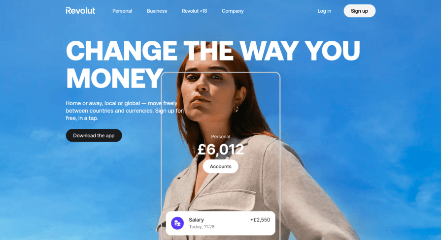
Unless you’ve been living under a rock, you probably know what Revolut is. Launched in 2015, it’s become one of the fastest-growing fintech startups and now ranks among the top mobile banking apps worldwide:
Much of this success comes down to its clean, intuitive user experience. I’ll break it down now:
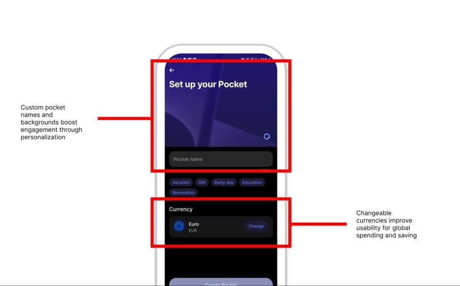
Revolut’s onboarding is built mobile-first. It uses a clean, efficient flow with minimal data entry, gradually introducing steps using progressive disclosure. This helps reduce cognitive load while still collecting essential information. Clear instructions, simple visuals, and helpful animations guide users through biometric verification and profiling with ease:

The end product is a seamless, confident start to managing money on the go.
The app uses many different features to ensure the security and trust of its users. The app includes end-to-end encryption, multi-factor authentication, and biometric login, all ensuring accounts stay protected. Real-time transaction alerts and contextual notifications — whether for payments, international travel, or budget updates — keep users informed and in control.
Revolut’s automated fraud detection system proactively flags suspicious activity, allowing users to freeze or unfreeze their cards instantly. This transparency and control build deep trust, reinforcing Revolut’s role as a secure platform for personal finance.
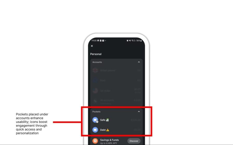
Revolut’s intuitive UI allows easy access to the app’s core features. Key actions like adding money, making payments, exchanging currency, and budgeting are just a click away.
Moreover, the app allows users to further customize their experience by adding, removing, and moving widgets as they see fit:
From widgets showing total monthly spending to upcoming payments and more, the app gives users a lot of control over their UI, which only enhances usability:
Furthermore, the app includes gamification elements, such as savings vaults (‘Pockets’) where users can establish savings challenges for themselves, as well as the newly established RevPoints, giving access to all sorts of cashback rewards:
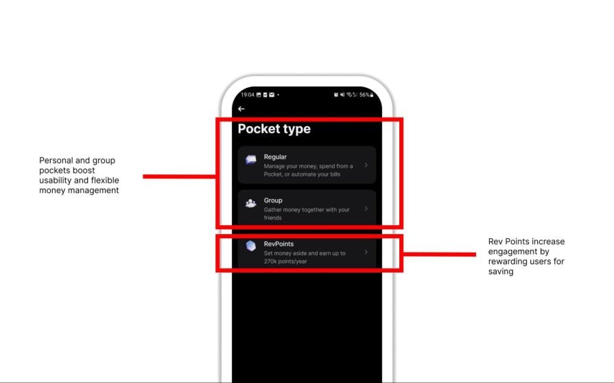
These various features ensure that users stay actively involved in their financial journey and have complete control over the various features provided by the app.
Stripe, the online payment processor for businesses, generated an estimated $3.8 billion in revenue in 2023:
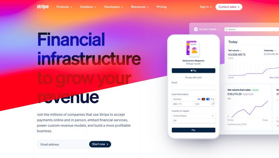
Stripe.com Homepage
And its success is largely due to a user-centered design approach that makes complex systems like payment processing accessible — especially for small businesses.
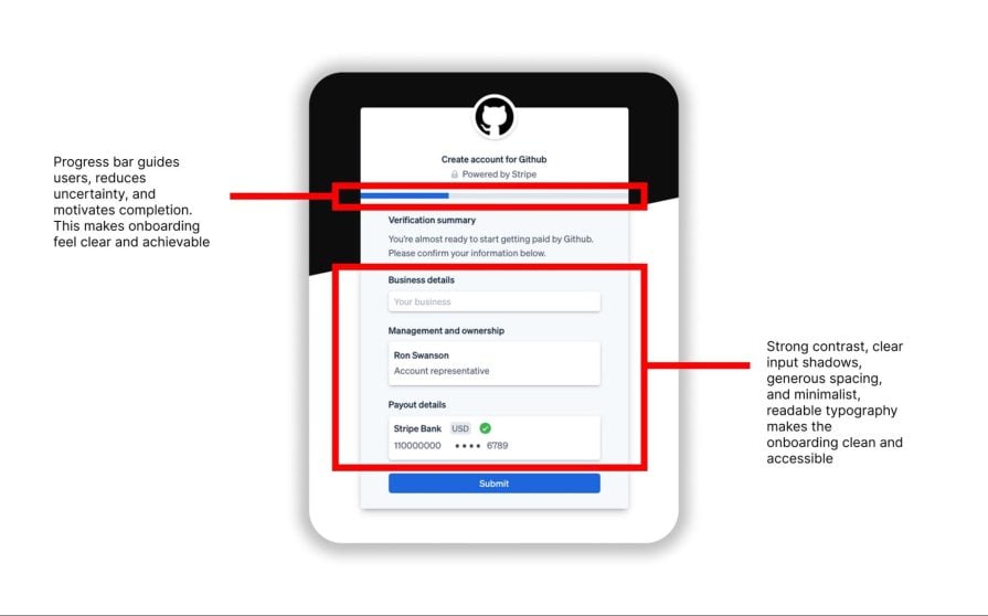
Stripe simplifies onboarding for both businesses and developers. Users can easily sign up, verify details, and start accepting payments. A clear progress tracker guides users through each step, setting expectations upfront:
For developers, Stripe offers world-class API documentation, prebuilt UI components, and a Sandbox for safe testing. Tooltips and contextual help make implementation seamless — even for those who aren’t deeply technical.
Handling payments means Stripe has to be at the top of its game security-wise — and it is. From PCI certification to advanced multi-factor authentication (SMS, TOTP, passkeys), Stripe offers strong defenses across the board.
Sensitive data is tokenized, and dashboards provide full transaction visibility. Businesses can also tailor security settings to meet specific needs. All of this creates a secure, transparent environment that users can trust.
At its core, Stripe focuses on keeping the platform as easy to use and customizable as possible:
Stripe’s dashboard is the central hub for managing payments, balances, reports, and integrations. Everything is presented in a clean, accessible way, making it easy to build on top of Stripe’s offerings.
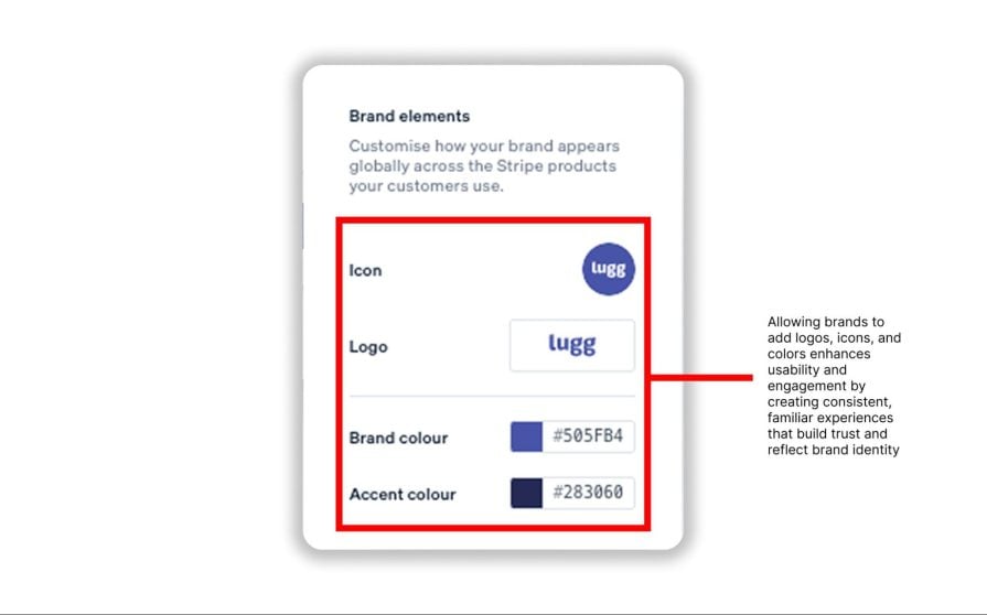
The platform supports multiple currencies and a customizable checkout, helping businesses fine-tune their user experience. This adaptability is what keeps developers engaged and Stripe powering some of the world’s biggest payment flows.
Founded in 1998, PayPal remains one of the top names in fintech. Its core mission — making online payments fast, safe, and simple — has resonated with users globally.
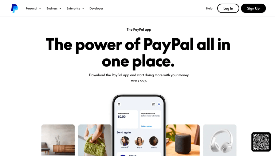
And it’s managed to stay relevant by constantly refining the user experience.
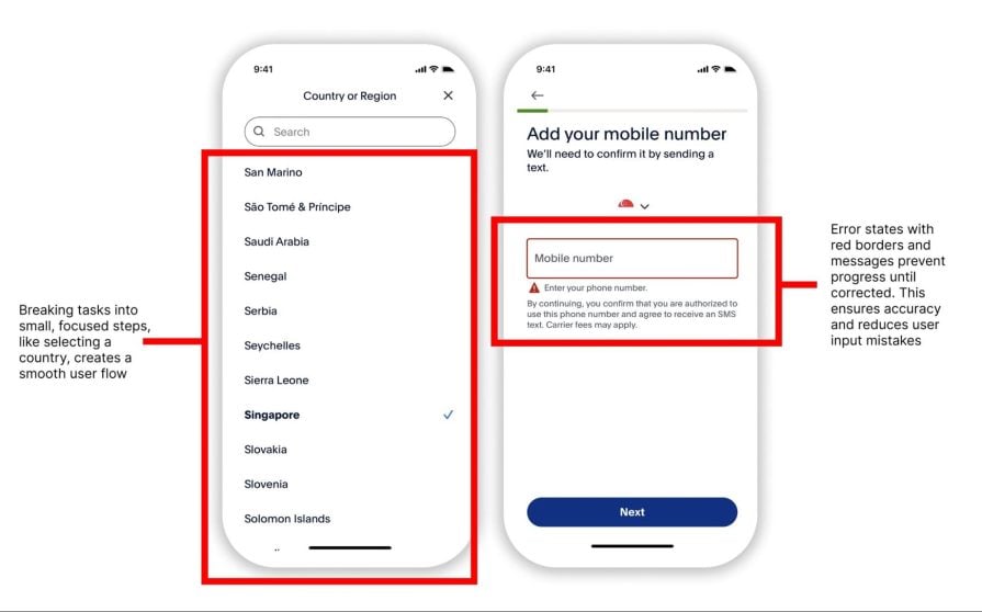
PayPal’s onboarding is clean and simple. This is done through progressive disclosure, a UX design strategy that reveals options or information step by step. This ensures that users aren’t too overwhelmed by an abundance of details, and instead prioritizes essential information:
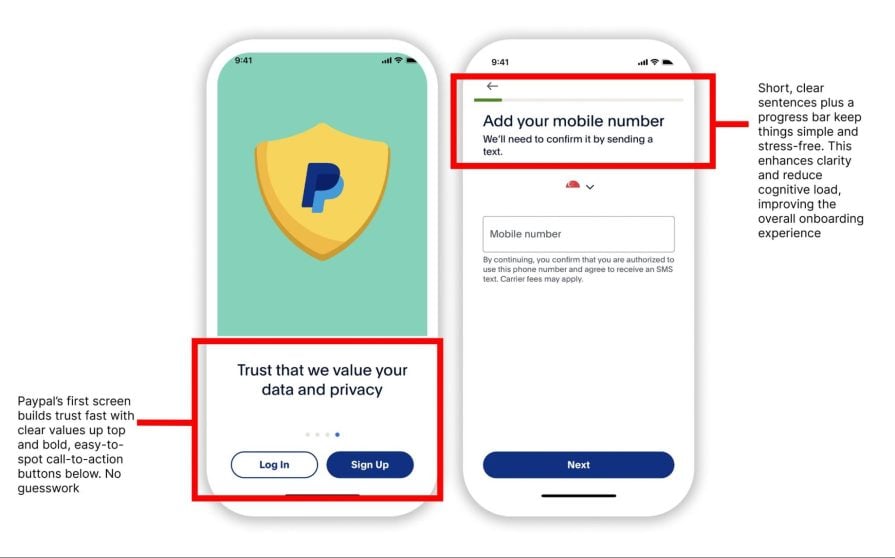
PayPal does this by keeping instructions direct and to the point. Each step of the process is concise, often having one or two actions per step, and the user is not allowed to proceed until that step is complete. This increases clarity and reduces cognitive load, making navigation intuitive, especially in complex systems or processes with multiple steps:
Coupled with minimal input fields, and clear prompts PayPal keeps the process fast and beginner-friendly. Users can register with basic contact info and start sending money almost immediately.
For businesses, PayPal offers extensive guides — complete with visuals — to help with payment and invoicing integrations. Whether you’re tech-savvy or not, the process is easy to follow.
Despite the simplicity, PayPal doesn’t cut corners on security. It uses strong encryption, 24/7 monitoring, and proactive fraud detection. Push notifications alert users to any suspicious activity, and sensitive transactions don’t require direct access to bank account numbers.
When disputes arise, funds are held until resolution, balancing user control with strong fraud protections. The result: a system that’s as secure as it is user-friendly.
PayPal ensures that the focus remains on making digital transactions as easily as possible, and the platform does this by keeping its UI simple. Its three-button menu makes it clear what the app’s priorities are:
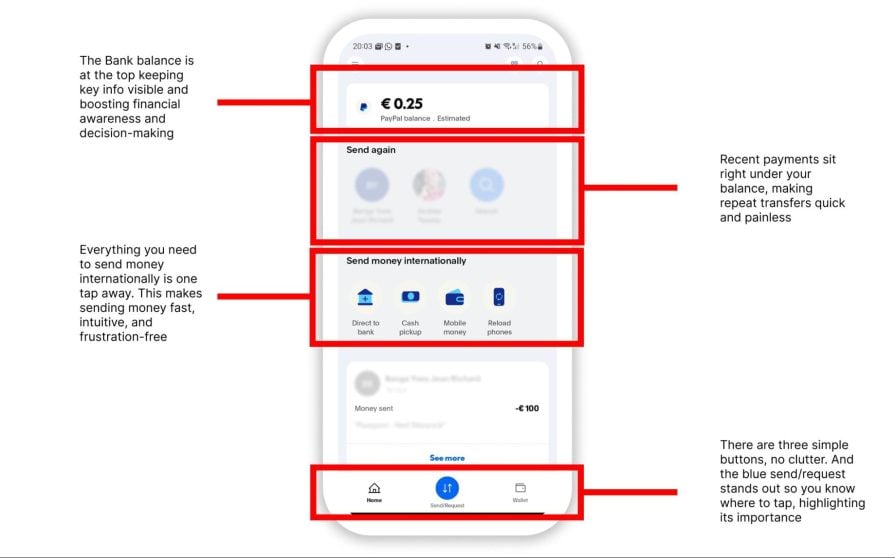
Furthermore, the app includes gamification elements such as cashback rewards to incentivize user engagement further. It’s a mix of efficiency, simplicity, and a few perks to keep users coming back.
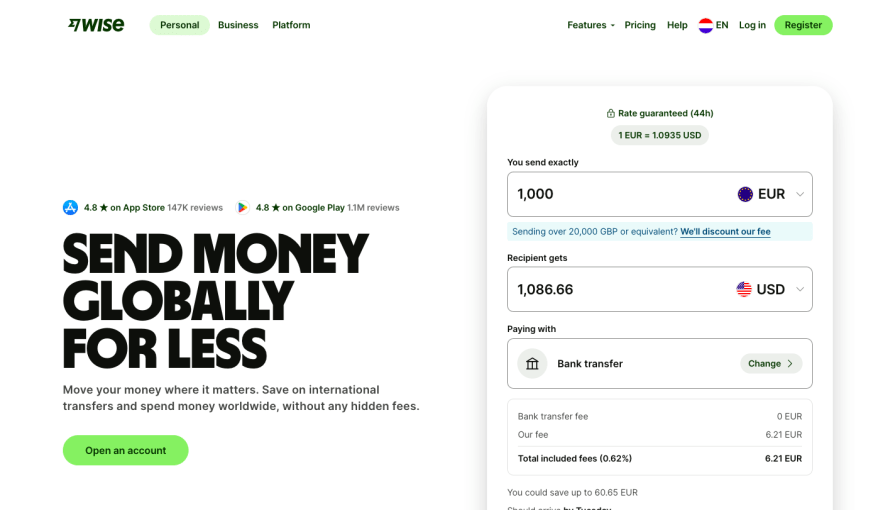
Wise (formerly TransferWise) is best known for international money transfers and multi-currency accounts. Its appeal lies in speed, low fees, and transparency:
But for designers, it also made waves by winning “Best Adoption” at the 2023 Design System Awards — a nod to its exceptional design consistency and usability.
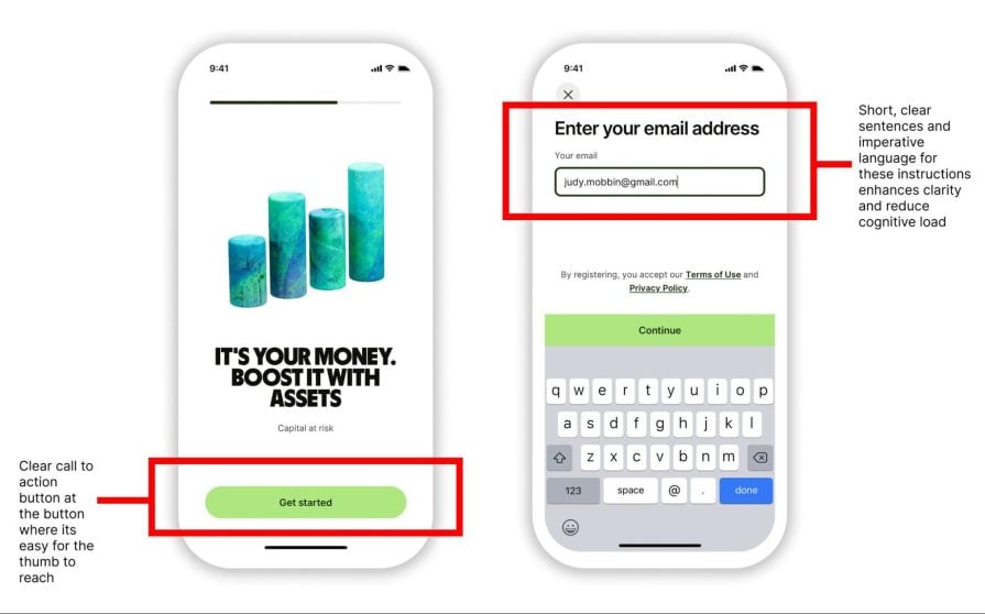
Wise’s onboarding ensures that users can create their account quickly with minimal input requirements. This is done through the classic progressive disclosure, but also by giving users multiple sign-up options, such as Google, Facebook, or Apple ID, to make the process as seamless as possible.
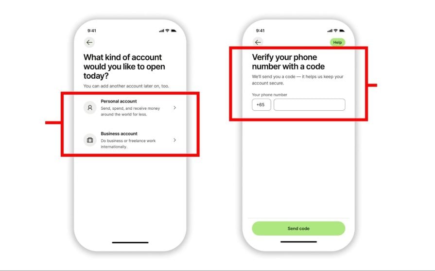
Users are then guided step-by-step to create their account, from inputting KYC identity verification to asking targeted questions on how the user intends to use the account. This allows the app to create a personalized experience for the user:
Wise’s ability to balance transparency in the onboarding processes with simplicity and personalization reinforces its reputation as a user-friendly platform:
International transfers demand high trust — and Wise delivers. It uses bank-grade encryption, two-factor authentication, and AI-driven fraud detection. Users receive alerts for suspicious activity and can freeze accounts instantly:
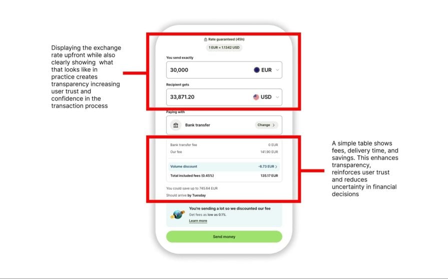
What really sets Wise apart is its transparency — users see real exchange rates, fee breakdowns, and regulatory info upfront. That clarity goes a long way in reducing stress and building confidence.
Wise is designed for clarity. Real-time tracking of transfers, estimated delivery times, and currency conversion charts make it easy to understand where your money is and what it’s worth.
The app also offers features like earning interest, investing, and a referral program to drive deeper engagement. These features support Wise’s mission: making international money movement simple and rewarding.
Revolut, PayPal, Stripe, and Wise show us what great fintech UX looks like. These platforms don’t just offer financial services — they craft digital experiences that reduce friction, foster trust, and put users in control.
Each one leans on intuitive design:
All four use progressive onboarding, transparent security measures, and engagement strategies (from gamification to personalized dashboards) that keep users informed and involved. These UX choices are not just nice-to-haves — they’re essential when dealing with something as sensitive and error-prone as money.
Strong fintech UX isn’t about making finance “fun.” It’s about clarity over confusion, guidance over guesswork, and user trust above all else. With digital financial services becoming the norm, every design decision carries weight. A missing tooltip or cluttered screen could mean a missed payment — or worse, a lost customer.
Moreover, what is equally important is how these platforms handle mistakes. PayPal, for example, highlights user input errors through messages and different input field states. Furthermore, the app prevents users from proceeding until the error has been fixed, preventing expensive mistakes and reducing confusion.
In short:
Clearly, great FinTech UX design means giving users confidence, not just convenience. And the more we design with that in mind, the more inclusive and effective digital finance becomes.

LogRocket's Galileo AI watches sessions and understands user feedback for you, automating the most time-intensive parts of your job and giving you more time to focus on great design.
See how design choices, interactions, and issues affect your users — get a demo of LogRocket today.

Explore the core principles of GUI design and learn how consistency, simplicity, feedback, accessibility, and user testing contribute to better digital experiences.

After five years in UX, I revisited the Daily UI challenge to reconnect with hands-on design. Along the way, I learned that great interfaces come from thoughtful briefs, sound judgment, and user feedback, not just better AI tools.

Learn what makes a great login screen through real-world examples and UX best practices for creating secure, accessible, and low-friction authentication flows.

Skeuomorphism helped define early digital interfaces by mimicking real-world objects to make technology more intuitive. Learn how it compares with flat design and neumorphism, why it declined, and where it still has a place in modern UX.


