Drag-and-drop is an intuitive way for users to interact with digital products because it mimics real-world actions, like moving a card. In this article, we’ll discuss how to design drag-and-drop interactions effectively in user interfaces and its use in different contexts, including Kanban boards in tools like Trello, list applications such as Apple Notes and Notion, and canvas tools like FigJam and Miro.

We’ll also cover various implementations, design considerations, accessibility, and implementation across platforms like mobile, desktop, and tablets. So let’s explore this feature in detail.
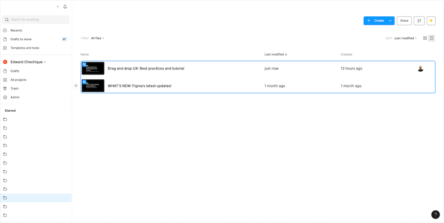
Editor’s note: This article was rewritten by Edward Chechique on 2 July 2025 to expand on insights from the original post, exploring why and when to use drag and drop, adding real-world examples, discussing platform-specific considerations, and providing accessibility implementation tips.
Drag and drop is one of those interactions that just makes sense. Whether you’re on a desktop using a mouse, or on mobile swiping with your fingers, the idea is simple. You grab something, move it, and drop it somewhere else. Just like in real life.
That’s what makes this interaction pattern so powerful. It brings that physical, intuitive feeling into digital interfaces. Pick something up, move it, let it go — and even better, the pattern is the same across desktop and mobile.
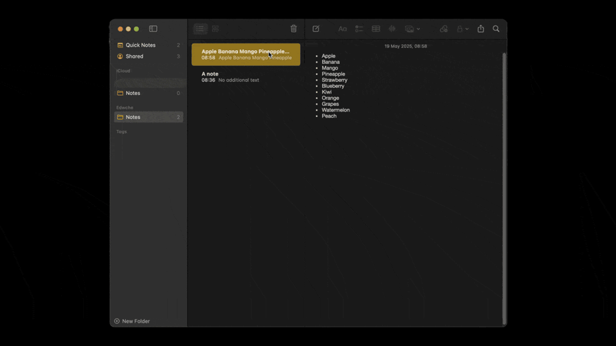
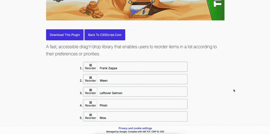
You’ve seen it in task tools like Trello or Jira, where you move tasks between columns. Or in note apps like Apple Notes, when you reorder items:
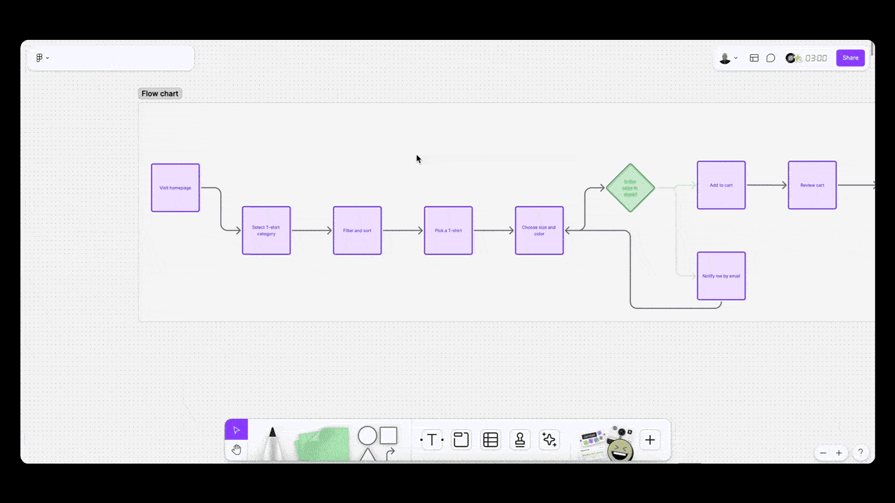
Canvas-based tools like FigJam or Miro take it even further. You move elements freely around the screen, arranging things however you want. It’s not classic drag and drop in the technical sense, but it feels very similar.
Maybe the most common case for this interaction is the file upload feature. Drag and drop is a common UI pattern that allows users to select an element, drag it to the upload zone, and then upload it to the software, something we see in almost every app.
In the end, this pattern works so well because it borrows from real-world behavior. It makes the screen feel more human, direct, and engaging.
Users are already super familiar with drag and drop. In some apps, especially task managers or anything with file handling, it’s not just a nice-to-have — it’s expected. People assume it’s there.
Think of it like buying a car. You don’t ask if it comes with air conditioning. You just expect it. Same with drag and drop. If your product deals with tasks, files, or rearranging content, your users will look for that interaction without thinking twice. It’s part of the standard now.
You should use drag and drop for:
Even so, there are some use cases where users don’t expect the drag and drop capability, or even where it might detract from the user experience. Avoid drag and drop in these situations:
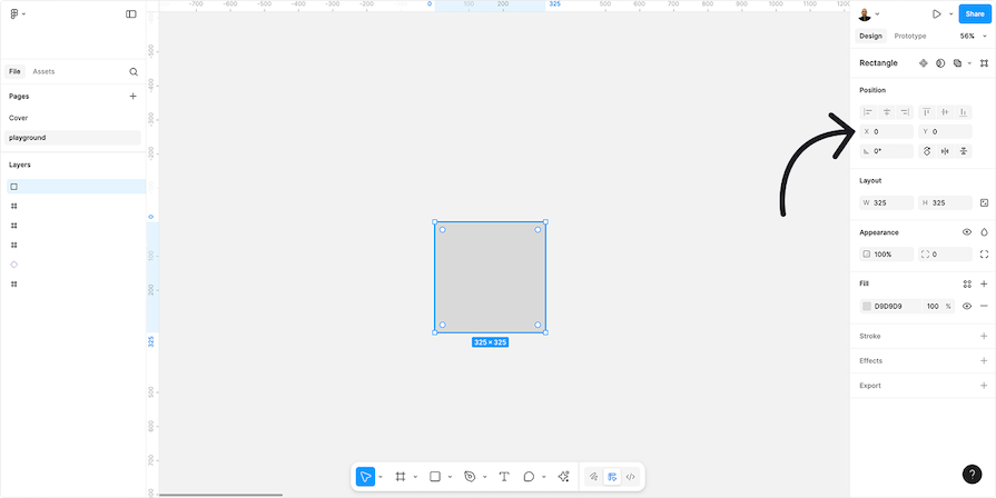
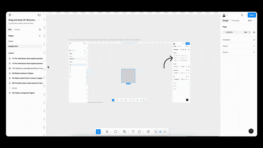
0,0 on a canvas is hard by hand. In these cases, always offer number inputs (X and Y, along with Z if it’s 3D) so users can place elements exactly where they need themIn situations where drag and drop isn’t the best option, here are some alternatives:
Let’s go over a few best practices that can help you make drag and drop feel smooth, intuitive, and actually useful for your users:
Accessibility guidelines can help make drag and drop interactions easier for everyone. This type of interaction can be challenging for people with disabilities, so it is important to ensure it is smooth and user-friendly.
Keyboard support for drag and drop isn’t just a nice-to-have. It’s essential for people who can’t use a mouse. Some users depend on the keyboard to get around, and if your product leaves them behind, that’s on you.
Here’s how an appropriate user flow with proper keyboard navigation support should look like:
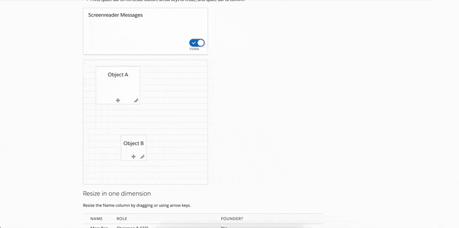
Tab key to move between elementsEnter key will select the focused itemEnter key againEscape key should exit drag and drop mode immediatelyIn the example below, you can see how I use the keyboard to move to an item in the list:
Tab key to navigate to the itemEnter keyThis is a simple example of how keyboard navigation works on a page. It uses a simple list, like those found in task or reminder apps:
Check out the example here and try it out for yourself.
To make drag and drop accessible for screen reader users, you need to implement ARIA attributes. This set of attributes helps assistive tech, like screen readers, understand what’s happening in the user interface. It adds the extra layer of meaning that standard HTML can’t always provide.
For example:
aria-grabbed="true" to show the element is selectedaria-dropeffect="move" to tell the computer that the space is valid to drop the itemIn the example below, you can see how, along with keyboard navigation, there is a simple box with text that explains what the user did on the screen. This text is what a device can read for people who use screen readers:
Interact with this example yourself to get a better understanding of how and why this helps with accessibility.
On different platforms, there are different ways to interact with drag-and-drop. Basically, the main points are the same, but because on a desktop we use a mouse, and on an iPad and tablet we use our fingers, there are some differences. Let’s take a look at them.
There are many areas in interfaces where designers can use the drag-and-drop pattern. Let’s look at some common examples:
When designing your design system, focus on creating reusable components for all applications. For instance, a common UX pattern incorporates drag-and-drop interactions, allowing developers and designers to reuse them consistently.
Whether using code or a Figma UI kit, keeping components like file upload interactions consistent across applications saves time, makes the UI more familiar to users, and boosts efficiency for both development and design teams.
Use clear and simple names for components to ensure everyone understands them, whether they are developers working with code or designers using a UI kit. For example, name a draggable item or drop target based on its function. If you’re unsure, use ChatGPT to help choose the best names by describing the component and its parts.
Accessibility is crucial when designing drag-and-drop components. These components can be challenging for some users, so it’s important to provide alternative ways to move elements on the interface.
Add keyboard navigation and clear AIRA rules to make the feature easier to use. Additionally, include an undo option, like pressing Ctrl+Z or using an Undo button, to help users correct mistakes easily.
Before adding drag-and-drop interactions, discuss with your developers the best technical approach for the system. This ensures the interface is user-friendly and aligns with the developers’ tools and frameworks, meeting all functional needs.
Here is a checklist to help you review the article before using drag-and-drop. It will make checking all the points easier:
Discoverability
Interaction design & feedback
Accessibility
Help users stay in control
Testing
Use cases & context-specific patterns
Let’s look at examples of using drag and drop in different applications.
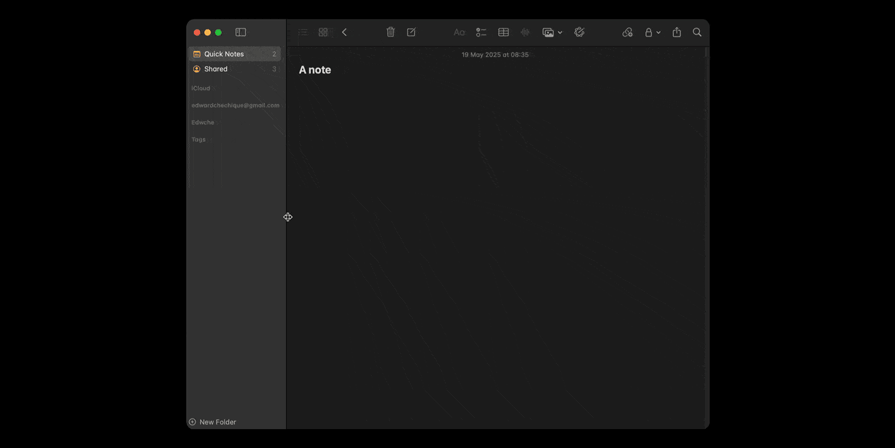
When using the Apple Notes app on laptops and desktop computers, you can click a button to open and close the main menu. The menu will open to a default size you can then drag to resize:
Why it works:
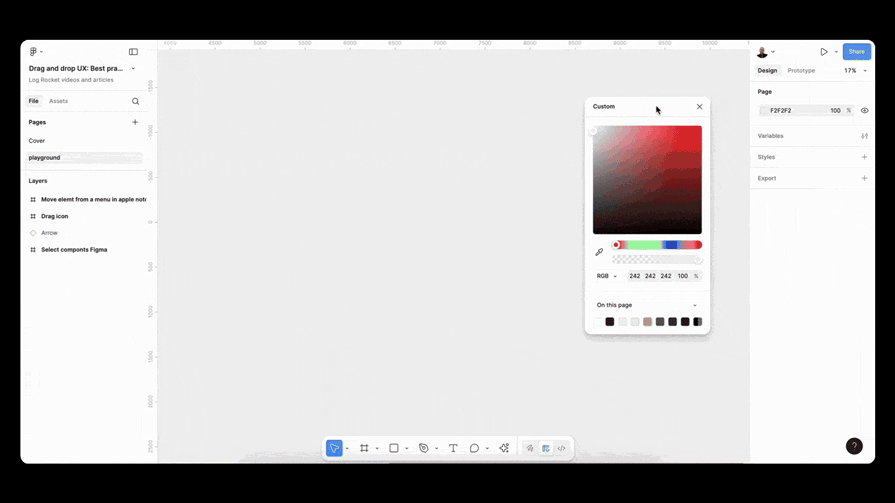
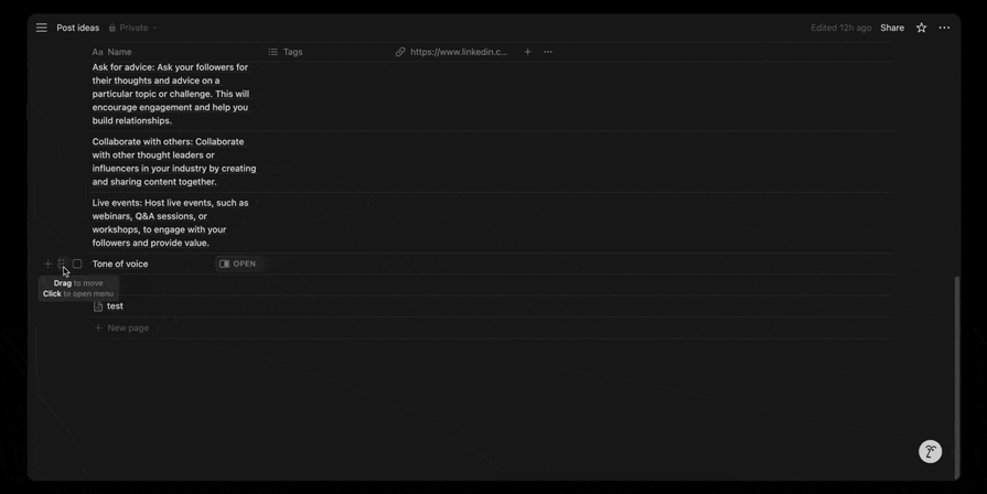
You can drag and drop different layers in Figma to reorder them according to your needs:
Why it works:
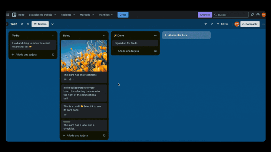
The drag-and-drop UI pattern simplifies task management in Trello by allowing you to move cards between labeled columns:

Why it works:
Drag-and-drop is a UI feature that lets users select an item, move it on the screen, and place it somewhere else. It mimics real-world actions. You can find it in functions like reordering lists, resizing images, or uploading files.
Drag-and-drop can be made accessible. However, it can be a challenging UI pattern because it may not be easy to use as-is for all users. For example, it can be difficult for people who primarily navigate using their keyboards to move elements in the interface with it. To make it accessible, designers can add options like keyboard navigation or menus to move files, instead of relying only on drag-and-drop.
You can add drag-and-drop on mobile, but it can be challenging for users to use. If you do add it, also give another way to do the same task. For example, let users choose to drag and drop or use a menu to move an element on the list. Don’t depend only on drag-and-drop for mobile.
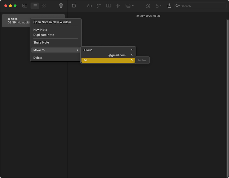
Drag and drop is a way to move an item easily, like in the real world. Move-to does the same action but uses menus. The user selects an item, clicks on a menu, and chooses where to move it. Both do the same task, but in different ways. Drag and drop feels more natural, while move-to is easier and more accessible for many users.
It is better to add an undo function for this action. If users get confused and move an item to the wrong place, the undo button or Ctrl+Z will help them go back and fix the mistake.
Yes, allowing users to select and drag multiple items at once is recommended, especially for apps that need to move many files, like Google Drive, Figma File Manager, or photo apps on mobile.
Yes, it is necessary to highlight the drop zone before the user drags the item. For example, if the user hovers over the zone, they can drag the file. It helps the user know where to drop the item.
In this article, we explored different aspects of drag-and-drop components in user interface design.
We started by explaining why the drag-and-drop pattern was useful for UI interfaces. It simulated real-world behavior on screens to make it easier for the user to complete a task in a more intuitive way.
Next, we discussed when and where to use this pattern, such as for task management, layout customization, and creating workflows. However, we noted that drag-and-drop might not be the only solution on mobile, and we needed to provide users with another way to finish the task.
We covered best practices for implementing drag-and-drop. To sum it up, here are a few key principles to keep in mind:
We saw that design considerations could vary across platforms. On desktops, drag-and-drop was easier with a mouse, while on mobile, elements needed to be at least 44 pixels for usability. Tablets required additional considerations, such as stylus use and hover states.
Finally, we explained how to implement drag-and-drop components in a system and organize them within a design system. At the end, we provided a checklist for review before implementation and answered some frequently asked questions.
Header image source: Move by Abdemouniam El gueriri on IconScout

LogRocket's Galileo AI watches sessions and understands user feedback for you, automating the most time-intensive parts of your job and giving you more time to focus on great design.
See how design choices, interactions, and issues affect your users — get a demo of LogRocket today.

Adaptive interfaces personalize experiences using behavioral signals and machine learning. But when personalization becomes autonomous, systems can reinforce patterns, limit discovery, and shape user behavior in ways designers didn’t intend.
Security requirements shouldn’t come at the cost of usability. This guide outlines 10 practical heuristics to design 2FA flows that protect users while minimizing friction, confusion, and recovery failures.

2FA failures shouldn’t mean permanent lockout. This guide breaks down recovery methods, failure handling, progressive disclosure, and UX strategies to balance security with accessibility.

Two-factor authentication should be secure, but it shouldn’t frustrate users. This guide explores standard 2FA user flow patterns for SMS, TOTP, and biometrics, along with edge cases, recovery strategies, and UX best practices.

 Learn more →
