Buttons are one of the most common components in user interface design. Every app and website uses buttons of various types to perform key actions, from submitting forms to navigation and more.
Buttons have different visual representations called states that communicate to the user whether the button is active, being hovered over with the mouse, or unavailable for interaction, among others. In this article, we will cover everything you need to know about designing the different button states to enhance UX.
Editor’s note: This article was updated on 16 April 2025 to improve clarity, structure, and depth. The author has expanded on best practices and platform-specific guidance, as well as provided a downloadable checklist to follow when designing button states. This newly updated piece is a more comprehensive and actionable guide aimed at helping developers apply their understanding of button states across different product contexts.
Button states are how an interface visually communicates information about the button to the user, such as whether the button is enabled or not. Basic button states, such as active, enabled, disabled, focused, and hovered, are essential in your app design. More advanced states, like loading indicators and success states, aren’t as crucial but can still improve UX, especially for advanced apps.
Here’s a quick summary of the different button states and when to use them:
| Type | Use case | Design principles |
|---|---|---|
| Enabled/default state | The main state of the button, showing that it is enabled and ready for interaction. | Use a clear label like Send or Pay and a distinct color to show the button is active. |
| Hover/highlighted state | Shows the button is ready to click when the user hovers above it (desktop only). | The visual design can differ from the enabled state by changing color, adding a stroke, or reducing opacity. |
| Focus state | Used when the user selects the button with the Tab key on the keyboard. | A stroke line is added to the button. By default, the browser applies a subtle shiny effect. |
| Disabled state | Used to communicate to the user that the button is not clickable. | The button is typically grayed out with reduced contrast between the button and the label inside. |
| Active/pressed state | Indicates the user is actively clicking the button. | Often designed with a darker shade or inset shadow to simulate being pressed. |
| Selected/toggle state | Indicates an option chosen from a group. A toggle button serves a similar purpose but is typically used for two options, such as on and off. | Use bold visual hints to indicate selection, such as full color for the selected option versus muted color for the unselected ones. |
| Loading state | Indicates that the system is working and action is in progress. | Change the label to a loading indicator or spinner, use animation to communicate work in progress. |
| Success state | Show the user the action is successful. | Change the label to a success message like Done and optionally add a green check mark. |
Let’s see some example designs for these various types of button states next.
Basic button states are those you can’t skip in your design. They communicate essential information to the user, such as whether or not they can interact with a button, what’s selected or selectable, and more.
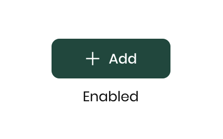
By default, a button’s state is enabled. In other words, the default button state should visually indicate to the user that the button is clickable and they can click on it to perform a task, such as submitting a form or paying for a product:
Once the mouse cursor hovers over a button, it enters a state known as the hover state. A change in the button’s appearance indicates this state to the user, which signifies that they can interact with it.
Typically, the button’s background color changes, though sometimes the border may change instead, depending on the button’s visual design:
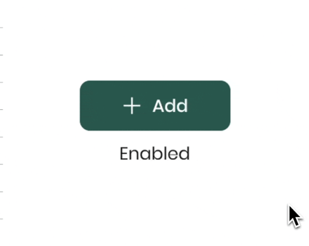
Focused indicates that the user is above a UI element in the interface. You can think of a focus state as a hover state triggered by a keyboard instead of the mouse cursor:
This state is triggered when the user uses their keyboard’s Tab key to navigate through the interface. This is a common method for users who work a lot with the keyboard because it helps them to work faster, as well as those who require keyboard navigation for accessibility reasons.
The focused interaction on the screen is when the user sees a border on the button that indicates that the element is in a focus state.
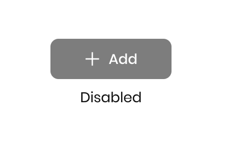
When a button is disabled, the user cannot interact with it. If they try to click on the button, nothing will happen.
This state is triggered when certain conditions are not met, such as when the user still needs to fill in all the required input fields of a form. Until the user has provided all the necessary information, the form’s submit button will be disabled.
Disabled buttons are usually represented with a gray color to indicate that they cannot be used:
Note that ghost buttons are sometimes confused with disabled buttons, but ghost buttons are a type of button, not a button state. Ghost buttons have no background or stroke and are used for less important actions that you want to have less visual emphasis. You can learn more about designing effective ghost buttons in this resource.
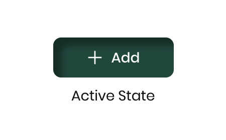
Active state, sometimes called pressed state, is a state that appears the moment the user clicks on the button. The button’s color changes at the moment of the click, or an effect on the button can appear.
Why indicate an active or pressed button? It lets users know their action had an effect. This subtle feedback can prevent rage clicks if your user doesn’t think their request went through.
For example, if your app uses skeuomorphic UI design, you can show the button pressed with a 3D effect:
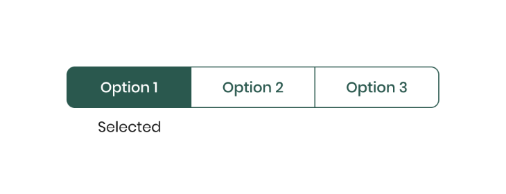
The selected state is a unique case for a button group component (also known as a toggle button) and is normally used only for that component.
A button group is a component that groups different options. When the user needs to choose from multiple options, this component allows them to select one option within a selected state.
The selected state represents the user’s selection within the grouping and is only applied when the user has selected:
Advanced button states are those that aren’t essential for UX, but still enhance it for certain use cases. Creating advanced button states might not be a high priority for small, lean teams or scrappy startups, but they’re worth creating if you have the time and resources to do so.
A button can also include a loading state, like a small spinner appearing on the button after clicking to explain to the user that their request is in progress:
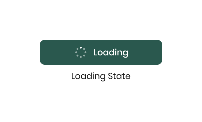
Users might get upset or impatient if they click a button and there’s no indication their request is being processed. Adding a loading state to your button can be a good idea to prevent user frustration, especially if their request is going to take some time.
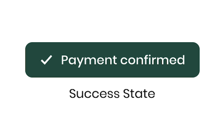
Using the success state, you can indicate the completion of a task, the successful submission of a form, or the successful purchase of a product.
Usually, a checkmark appears on a green button upon task completion, but the visual design can change — you could have confetti, a thumbs up, or something entirely different. This is good to pair with a microinteraction, or brief animation, so your user feels accomplished:
Designing button states is not complicated. Most UX designers can create a simple button quickly. However, there are several factors to take into account to make buttons better, as outlined below, and this is where the nuance of button design comes into play.
Ensure all buttons across the website or application have a consistent visual style. For example, the hover state should have the same design throughout the app or your website.
Consistency builds user confidence by showing that there is a system behind the interface, making the app feel more reliable and easier to use.
Ensure that button sizes are easy to use on each platform. For desktop apps, a minimum height of 32px works well, while for mobile, a minimum height of 44px is necessary. This is because we use our fingers to interact with the mobile screen.
Additionally, you can set a minimum button width of 120px to prevent buttons with short labels (e.g., “Pay”) from being too small to click on.
When multiple buttons in an interface have close interactions, it is critical to position them near each other. This helps the users understand that the buttons are part of the same interaction or decision-making process.
For example, placing Approve and Decline buttons together in a modal can help make it clear that the user must choose between them. This reduces cognitive load and speeds up decision-making.
When designing different types of transitions for various states, it’s critical to consider several key points.
When creating a button, it is always preferable to use text. But if you can’t add text because there is no space on the screen (for example, when the button is inside a table), you can use a button with only an icon.
To better communicate the information to the user about what the icon does, you can add a tooltip in the hover state that indicates what the icon does.
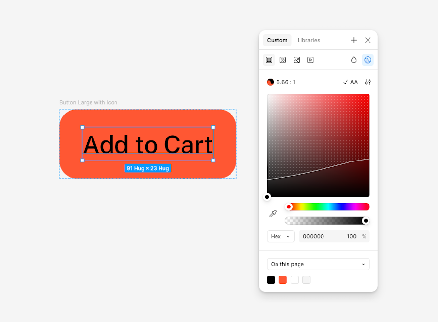
When you create your button system, always use a tool to check the contrast in the colors. This ensures the contrast meets accessibility guidelines, allowing users to easily read the label inside the button. Today, checking color contrast is faster than ever because Figma added this tool to the color picker, making it easy to test colors without needing another tool:
You should also make sure the button’s focus state is enabled and working properly so that users who navigate using their keyboards can access the button easily, as well as label buttons properly so all users know what action or request the button will initiate.
There is a debate about using the hover color for a button with a full background color; some think using a stronger or softer tone for the same color is better.
Another idea is to play with the opacity of the color, such as changing from 100 percent to 75 percent. I prefer to play with the color tone, not the opacity, because a color with opacity can merge with the color below the button. Hence, the designer has no control over the ultimate button color.
A button component is a component that has been used for many years in the UX industry; there is no need to reinvent the wheel here. Creating a simple design that effectively communicates with users who are familiar with this component is better.
For example, adding animations or transitions to the focus state or using multiple colors for the button is unnecessary. A simple design is best.
<
h2 id=designing-button-states-across-platforms”>Designing button states across platforms
When designing button states, we should differentiate between desktop and mobile platforms. Let’s go through some tips for designing button states on four platforms: desktop, tablet, mobile, and TV.
Mobile:
Desktop:
Tablet:
Large screens (TVs and remote-controlled devices):
After implementing buttons in your product or feature, verify that all their states function correctly across browsers and devices. Here is a simple checklist to ensure button states work as designed:
Button states are visual designs that indicate a button’s interaction status, such as enabled, hovered, focused, disabled, active, loading, or successful. They communicate the button’s interactive status to the user.
There are different button states to communicate the button status
Yes, buttons, like any other UI element, must be accessible so all users can easily use them.
The hover state indicates that the mouse is above the button, while the focus state shows it is selected via the keyboard. They both show that the button is marked before the user clicks on it.
It’s not mandatory, but if the system doesn’t respond immediately to an action, you can use it to tell the user the system’s working.
Mobile doesn’t need a hover state because users don’t use a mouse to interact with them.
Disabled buttons should be grayed out or have reduced opacity to clearly indicate that they are inactive.
Yes, you can animate button states in Figma. You can use animations to show changes in the status or to create animations for success and loading states.
In this article, we discussed everything you need to know about designing aesthetic, functional button states that enhance UX for your app or product across devices and platforms. For a quick checklist to refer to as you design your own button states, download this free resource.
There are some button states you’ll use in every app, universally. Others may only be needed when your app has gotten its feet off the ground. Either way, paying attention to button states is one of the many essential tasks for UX designers.
Optimizing your UI for clarity and accessibility will transform your app, so be sure to keep on top of the little things, even your buttons.
Header image source: IconScout

LogRocket's Galileo AI watches sessions and understands user feedback for you, automating the most time-intensive parts of your job and giving you more time to focus on great design.
See how design choices, interactions, and issues affect your users — get a demo of LogRocket today.
Skeuomorphism helped define early digital interfaces by mimicking real-world objects to make technology more intuitive. Learn how it compares with flat design and neumorphism, why it declined, and where it still has a place in modern UX.
Memos don’t have to be complicated. Just keep them clear, concise, and focused on actionable items. More on that in this blog.
AI has made polished, confident content easy to generate, but that does not make it trustworthy. This article explains how UX teams can design stronger quality signals using source transparency, validation, confidence communication, and reputation.
Inclusive design is evolving beyond accessibility alone. This guide explains how UX designers can create more inclusive products through usability, accessibility, neurodiverse UX, adaptive personalization, multimodal design, and culturally aware product experiences.

 Learn more →
