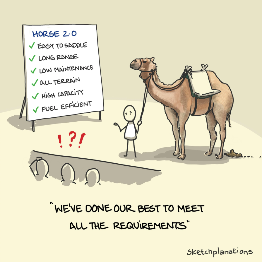
There’s a saying in the design world — “A camel is a horse designed by a committee.” A horse is elegant. Every part of their body has a purpose — built for speed, agility, and balance. A camel feels more like a compromise of decisions. While it’s suited for a different environment, it has awkward proportions, large humps, and is strange to the eye if you’re used to the sleekness of a horse. It’s functional, but not necessarily beautiful.
That’s what happens when too many voices, opinions, and priorities shape a UX design. You end up with something technically correct, but directionless. Functional, but uninspiring. It doesn’t move users forward — it leaves them confused or indifferent.
Let’s unpack why that happens, what it cost me as a designer, and how to protect your work before it turns into the UX equivalent of a camel:
The best UX designs start with a strong, focused idea. Being intentional with your design is what separates unique, innovative ideas from generic, recycled ones. Whether it’s a website homepage, a mobile app, or a product interface, every element on the screen, from the layout to the copy to the colors, should support a clear, central goal of serving your users’ needs effectively and thoughtfully.
But in a committee-driven process, that vision rarely makes it out alive. Stakeholders start adding “must-have” features. Product wants more visibility for functionality. Marketing wants a highlight reel. Legal wants five disclaimers. Someone brings up a competitor doing X, so we should probably do X too.
This process results in scope creep, which is when a project gradually expands beyond its original, agreed-upon objectives. The design gets bloated. You’re not solving the original problem anymore — you’re solving everyone’s side quests. And the user? They’re now stuck with a cluttered, confusing experience.
Designers thrive during the exploration phase. It’s the stage where designers sketch freely, imagine bold solutions, and chase a vision that may feel a little futuristic or unconventional. This kind of creative exploration requires freedom to take risks, break patterns, and reimagine what’s possible.
But when the process turns into a stakeholder approval gauntlet, creativity takes a backseat. Each stakeholder brings their own set of requirements, perspectives, and concerns. Every design decision is questioned, debated, and scrutinized. Designers quickly learn that to move forward, they must justify every pixel. As a result, they begin to pull back on their more ambitious ideas, knowing that anything too bold is less likely to get the green light.
Over time, this environment trains designers to prioritize approval over impact. Instead of designing the best solution for the user, they start thinking about what would get approved the quickest. There’s no longer a benefit to risky, innovative designs. Just move it forward. But “forward” isn’t the same as “better.”
And that’s how we end up with designs that technically check all the boxes — but feel completely forgettable.
In theory, cross-functional teams should make products better. Product managers bring user insights. Engineers bring feasibility. Marketing brings brand. Sales wants to close deals. Legal keeps things compliant.
All valid. All important.
But when everyone’s goals are treated as equally important, and no one is willing to make trade-offs, the design becomes a mix of compromises. Instead of choosing one direction and building toward it, teams try to satisfy every stakeholder. This often results in a design that’s cluttered, inconsistent, and hard to use. With numerous agendas at play, design meetings can often be characterized by a constant back-and-forth without a clear direction.
I’ve seen it firsthand.
I once worked on a new onboarding experience for our product with the goal of helping new users quickly get to value without overwhelming them. The original concept that I drafted was a short, guided flow with a couple of setup steps, followed by in-product tooltips. It was lightweight, fast, and got out of the user’s way.
Then came the feedback.
Each of these asks made sense on its own. But instead of prioritizing them, the team decided to include everything.
The next iteration had:
No room for personalization. No flexibility based on user needs. It looked like onboarding — but it didn’t feel like onboarding. It felt like a product demo in disguise.
Users noticed. Some said the flow felt made for someone else. Others felt overwhelmed. And worst of all, we failed to deliver on the original goal: helping users reach value quickly. The team was frustrated, too. We’d spent weeks designing something no one really believed in.
That’s the cost of design by committee.
When no one owns the final decision, feedback loops never end. Everyone keeps tweaking, suggesting, questioning — even if they don’t fully understand the problem.
To get your house in order, sit down with your team to clarify each stakeholder’s roles and responsibilities throughout the product development process. In most cases where projects are suffering from a committee-driven process, team members don’t have a clear shared understanding of each other’s roles and responsibilities.
One tool that has helped is the RACI matrix. It stands for:
It looks like this:
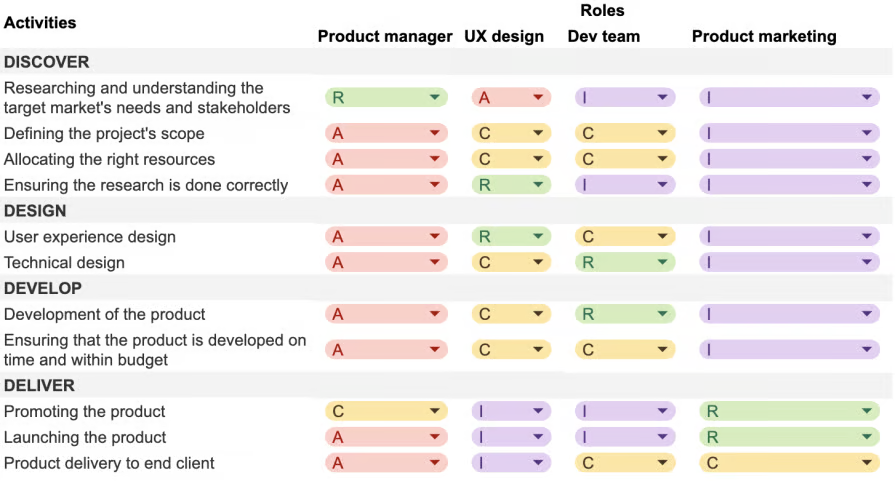
Here’s how we used it in later projects:
This gave us clarity. It didn’t shut people out — it just made sure everyone knew their role, and who had the final say.
If you’re struggling with the challenges that come with design by committee, here are some additional tips to help improve your team’s collaboration and protect your design process.
Design iterations can go on forever, as there can always be something to change or improve for the future. But when feedback is allowed at any stage, it invites scope creep and can sidetrack your design from its main objective at the moment. Rather, invite feedback during a defined review window. For example, one week after the prototype is shared, or by the end of the sprint. After that, it’s time to move forward. No retroactive requests.
If feedback is received after the window has closed, save it and prioritize it for the next iteration or release cycle. Not every suggestion or request may be suitable for the overall product or align with business goals, so it’s essential to make informed trade-offs. By thinking in terms of user impact, business value, and design consistency, if something doesn’t serve your users’ needs, it shouldn’t make the cut.
By following an agile development process, each sprint cycle opens up an opportunity to make constant improvements to your designs, as long as the project is still being prioritized. So, just because a suggestion isn’t incorporated during the current sprint, it doesn’t mean you won’t get to it sometime down the road.
The early phases of design are where the best ideas are born. But it can be risky to show rough sketches to stakeholders as it could open up the wrong discussions and fall down a rabbit hole before the creative direction has taken shape. Keep design explorations within your immediate cross-functional team and emphasize the type of feedback you are looking for, which is typically vision and direction over brand guidelines and design system usage.
Technical feasibility can come into play later on, as sometimes the best solutions are shot down too early due to concerns from engineering. Although innovative solutions can often be expensive, these are the types of designs that make a noticeable impact on users’ lives.
The problem with design by committee isn’t bad intentions. Rather, it fails from the lack of clear roles, defined feedback windows, and the pressure to please everyone. Good design should serve a clear purpose, which can’t be done if it’s full of compromises.
When everyone has an equal say, the design ends up lacking direction and missing the original intention behind it.
So fight for clarity. Push for purpose. Respect the process — but protect your vision.
Because if you try to design something that pleases everyone, you’ll end up building a camel.

LogRocket's Galileo AI watches sessions and understands user feedback for you, automating the most time-intensive parts of your job and giving you more time to focus on great design.
See how design choices, interactions, and issues affect your users — get a demo of LogRocket today.
Learn how context-aware mode prioritization and seamless transitions improve multimodal UX and reduce mode confusion.

Research is becoming more democratized, product cycles are accelerating, and AI is transforming synthesis and ResearchOps. Here are the three trends shaping UX research in 2026.
Voice support is not the same as multimodal UX. Here’s how to design systems with true mode continuity and context-aware interactions.

AI tools can generate beautiful UI concepts in minutes, but most teams struggle to integrate those outputs into real design systems. This guide explores why AI drifts toward generic patterns and how to build governed workflows that keep speed without sacrificing brand consistency.


