We all know that designers and developers sometimes have some hiccups during a project. However, we have a few guidelines to follow to avoid those roadblocks and improve communication across different teams.
Designers create it, developers make it work. Can you imagine an app designed by engineers or developed by designers? It would be the worst app in history.
As designers, we must have a surgical eye for all UI elements like colors, fonts, alignments, margins, etc. Everything from our side must be pixel-perfect.
On the other hand, developers do not have this trained eye, and they don’t have to. They need to be masters of the technology behind the scenes and ensure all functionalities are working well. Developers turn the designer’s dream into a reality, but during the transition, developers see the dream differently.
Because of that, the development phase for design sometimes becomes stressful for both parties due to countless meetings, especially a few days after the official design handoff. Chaotic design-to-code transitions can eventually delay the product shipment.
Let’s learn how to make design handoff smooth and enable fast product shipping by creating a better, developer-focused design spec before handing off your product prototype to the developers.
Editor’s note: This article was substantially updated in January 2026 by Shalitha Suranga to reflect real-world development workflows. The revision adds depth around states, system logic, platform realities, technical constraints, and realistic data — reframing design specs as tools for building, not just documenting designs.
UI/UX designers create and read product designs from the graphic design perspective. They typically work with colors, typography, visual layers, UI block arrangement, and care about how tiny pixels construct a product interface. That’s not how developers read designs before re-creating them in the real development environment.
Developers read designs from the real implementation feasibility perspective by observing:
Since developers prioritize the above factors, providing just a design prototype eventually creates a prototype-like functional product — not the same look and feel designers imagined through design. A design spec addresses this designer-developer design reading gap and enables developers to create the exact look and feel of the prototype at a pixel-perfect level.
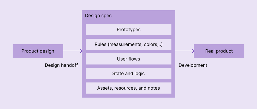
A design spec is a document or a set of documents where you should specify all UI aspects like colors, styles, margins, alignments, sizes, assets, and so on. In addition, it should include a map of functionalities like related strategies, user flows, pipelines, and every other document you’ve used to plan your design. The goal of the design spec is to provide a blueprint of the designed product to support developers in building the exact product as it is designed by UI/UX designers to satisfy all user and organization requirements.
It delivers exact visual and behavioural properties to the final product through the development process, when developers read the product design from a functionality-first mindset to build the real functional product:
The design spec is not only useful for designers and developers but also for product and quality analysis teams. They should have access to it, understand the flow and its requirements, and ensure the design meets business expectations.
When a design spec becomes more developer-focused, meaning when it delivers visual properties of the design in a way that developers can productively use for building the real product, the following benefits can be guaranteed:
As we said, a design spec is a file or a set of files with the design aspects, assets, flows, and prototypes that are relevant only for the project you are working on.
Meanwhile, a style guide is a set of rules and standards that help creatives maintain a consistent and professional brand identity across different media and platforms. It covers how to apply visual elements, such as logos, colors, fonts, and images, as well as how to write and edit content, such as tone, voice, grammar, and punctuation.
Lastly, a design system is a framework that guides designers and developers to create consistent products. Unlike style guides, which focus only on UI and writing, a design system includes technical aspects, such as pieces of code, components, and best practices.
Now that we know the term for design specs (and what it isn’t), let’s get into making one that makes the design handoff smooth and helps ship your product faster.
Here is a step-by-step approach for creating a better, developer-focused design spec:
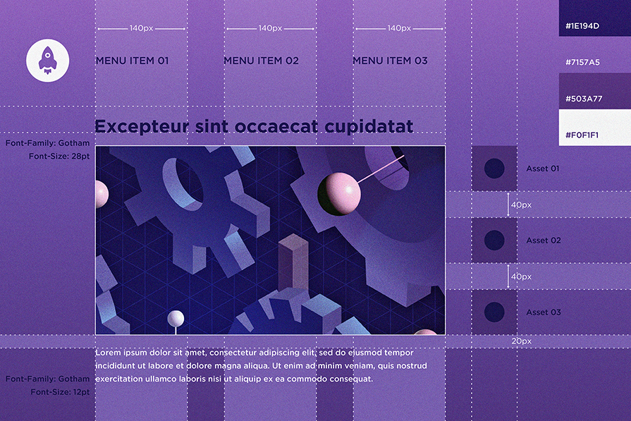
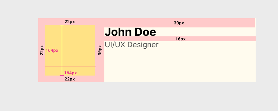
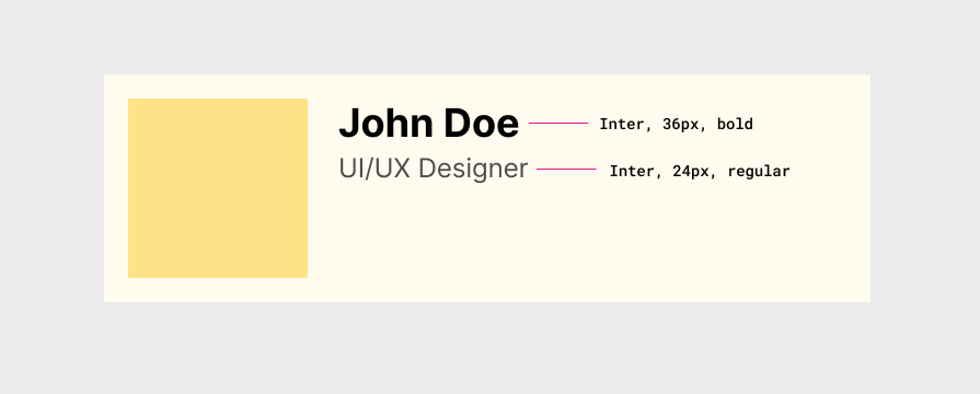
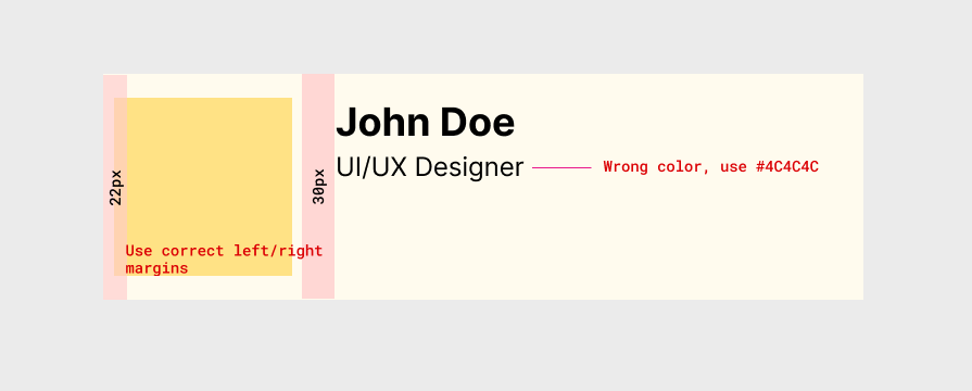
Once your designs are done, duplicate every single screen and start to add measurement details, including width, height, and space (margin). For example, look at the measurement details added to the following simple card element:
Make sure that these measurements are exact and have a suitable metric, like pixels, so developers can use them in the real product implementation without asking you to double-check metrics.
Colors are crucial elements on the UI, so you must ensure developers are adding exactly the shade you need. To do this, copy and paste the color code provided by your design tool into your design specs:
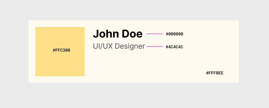
Add typography details for every different text element you use throughout the design. Typography details include font, size, weight, and styles. Once you add this, you no longer need to frequently nitpick typography bits in the real product. Here is an example of typography details in a simple card element:
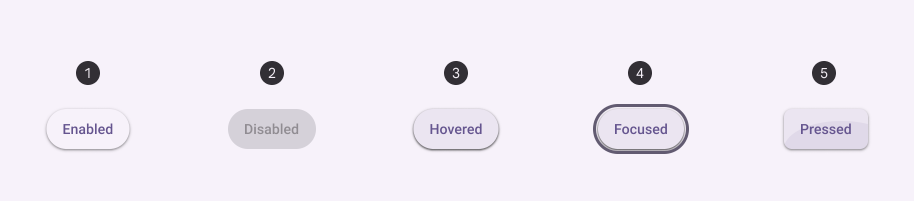
Add UI element status clearly with a description, so developers don’t invent new, confusing component states or ping you asking how a state of a specific component looks during your next UX meeting. Here is how the Material button design specification clearly lists all button states under the States section:
Thinking a bit from the technical aspect during design can save many developer hours and your time on design updates as well. For example, clearly including a loading state with a proper design (e.g., skeleton loading) in the design spec by identifying it at the design stage is better than handing over the design without a proper loading state and letting developers do guesswork or contact you.
Moreover, using better, realistic text instead of “lorem ipsum” placeholder text helps developers easily differentiate between states and implement the right state for the right place. For example, see how the above Material spec sample uses “Enabled”, “Disabled”, etc., instead of just random text.
Put all relevant assets into one folder and share it with everyone involved. An asset pack should include:
However, you might think, “Devs have access to Zeplin or Figma Dev Mode. Why should I waste my time doing it?”
It is definitely not a waste of time at all. By doing it, you will make sure they will not miss any part of your design and also avoid messages asking for it.
Let’s picture a scenario here: A developer needs an SVG to add an icon. This person sends you a message asking for it, but you are having lunch and will answer only after one hour. If you have saved all assets in the same place and shared them with everyone involved, this hour would not be wasted.
To find asset formats and dimensions that developers expect, you can contact developers before the handoff process.
Adding all user experience flow details is crucial for good communication among product, design, and development.
At this stage, the designer and the product manager should catch up and write down every single aspect, trying to make the language in the document easy for everyone involved to understand.
Depending on the company, this part could be written by the product manager. However, it doesn’t mean the designer should not help with this process. Both professionals should be on the same page to pitch the flow to the developers, avoiding possible flaws.
One tip is to write pretending you are the user, see the example below:
As a user, I want to click on the logo and go back to the home page.
I know it sounds repetitive and sometimes even silly, but we must ensure everyone understands it perfectly, so we need to write down the process with every single aspect explained in detail.
This textual user flow explanation works perfectly for simple flows, but you should present long, complex flows using flow diagrams you created during the UX process, so developers can easily understand the app behavior, and they will implement the whole product behavior as you decided. Also, make sure that the prototype’s user flows and user flow diagrams are synced.
Design spec isn’t always a single, isolated document — it’s a file that presents design instructions along with prototypes, design files, inspectable prototype links (e.g., Figma Dev Mode links), assets, user flows, and all design resources.
Gather all other design resources, including design notes, meeting highlights, and everything that helps developers build the exact product as designed. However, avoid adding verbose notes, incomplete design files, or any other early design material that doesn’t help development much — always provide final, concise, clear information that is related to the product spec.
8. Platform adaptiveness and limitations
As designers, we design various products, including web, desktop, and mobile. In some scenarios, we design a single app that adapts to multiple platforms. Developers will turn our final design into a real product that runs on various operating systems, web browsers, or custom app runtimes (e.g., Flutter), which comes with various limitations and UX recommendations.
Creating the design spec with platform adaptiveness and limitations in mind avoids costly workarounds that developers will have to implement in the future, and eventually helps the whole team ship the product faster.
Here are some examples of including platform-related details:
To understand platform-specific UX and limitations, you can read platform documentation collaboratively with developers even at the early stages of product design.
We have in the market tons of tools that help us organize our Agile environment, tools like Jira and Monday. Normally, scrum teams have their backlog on those tools, and the design spec will be one more (or many more) ticket(s) on their list.
It is a good idea to attach all the things we mentioned before to this ticket. Otherwise, we could miss an important piece of the puzzle.
The key idea is to present the design spec through a standard ticket or something you can track development progress and collaborate with developers.
Talking to developers is mandatory, but not only when handing off your work to them.
You should include their team early on in the design process, showcasing your research, ideas, and mostly the prototypes to avoid any roadblocks.
Here are some example early communication scenarios that eventually help finalize an effective, developer-focused design spec:
Once all the design spec files are ready and the tickets are written, now is the time to finally hand them off.
We normally have “refinement” sessions with the entire scrum team (including architects, engineers, a product manager, quality analysts, and, of course, the designer). At this stage, we go over the design spec ticket and make sure all aspects are clear to everyone involved. Normally, those meetings are led by the product manager, and the designer might interject whenever necessary.
As I said before, those calls are refinement meetings. They exist to refine what is written on the ticket, to ensure everybody gets the meaning of the flow, and sometimes even to rethink the designs. Back and forth could happen, and we should be prepared; however, eventually, these back-and-forth discussions and final tweaks make the design spec clear, more developer-focused, and realistic for building the real product.
Recording this meeting for later reference is also a good idea.
The manually composed design spec with the above elements is enough to build the product, but using modern handoff tools adds extra productivity and collaboration features for both designers and developers, including design version control, better user flow visualization, inspectable designs, etc. So, during the handoff, using a dedicated design handoff tool like Zeplin or using built-in handoff features like Figma Dev mode is a good idea:
Regardless of using a design handoff tool, be certain that the original design spec document is very well organized and contains all mandatory elements we discussed above. However, you can decide on using design spec rules (measurements, typography details, colors, etc.) vs. inspectable design mode in handoff tools by discussing with developers; some development teams may prefer traditional spec rules, but some teams would love to use modern inspectable designs.
You had a few refinement meetings, where you discussed all design aspects and the developers “sized” them using Agile methods. So, now your work is done? I’m sorry to inform you, but no.
After development, a design review is mandatory because even with those countless meetings and documents you shared, you could miss some pieces of the puzzle. Again, developers do not have the trained eye you have to see small details, and we all know small details matter a lot because they have a huge impact on the user experience.
The review will be another simple document. It could be a Word document, an Excel sheet, or an extra ticket with all the small fixes the developers need to make. The idea is to list all the tiny UI/UX-related differences between the real implementation and the product prototype, so developers can eventually make the product and design identical at the pixel-perfect level.
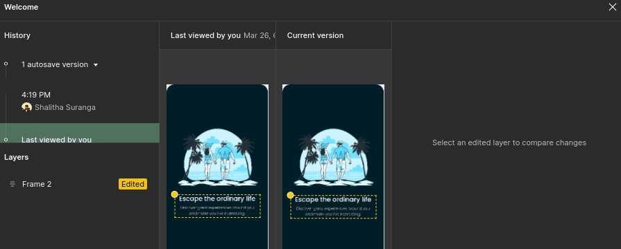
Once this document is ready, maybe an extra screenshot with the missing details could help you to explain issues to them better:
To conclude, the steps to create an effective, developer-focused design spec to enable fast product shipping are:
Once you get used to it, you will see how handy a design spec is and how natural it will become to you when you are working on your designs and delivering them to the development team.
Creating an effective, developer-focused design spec not only helps developers build the real product as you imagined through prototypes, but also makes the design handoff smoother and enables fast product shipping, while maintaining quality standards.

LogRocket's Galileo AI watches sessions and understands user feedback for you, automating the most time-intensive parts of your job and giving you more time to focus on great design.
See how design choices, interactions, and issues affect your users — get a demo of LogRocket today.

AI has accelerated design execution, but speed can come at the expense of intentionality. Learn how UX teams can preserve product thinking and judgment.

UX testing is not limited to layouts, copy, and visual design. Full-stack and server-side experiments help teams evaluate how backend logic, APIs, algorithms, and product flows affect the overall user experience.
In A/B, A/B/n, or multivariate testing scenarios, using p-value with traditional null-hypothesis-based statistical analysis is so common, and most designers […]
Traditional A/B testing splits traffic evenly, but multi-armed bandits dynamically send more users to the better-performing version. Here’s how the method works, where it helps, and when UX teams should use it over classic A/B testing.

 Learn more →
