Menus are everywhere in product design because they are an essential element for designing any app or website. You are probably familiar with navigation menus that help users find their way around a product. But in this article, we’re going to be talking about the menus that appear typically when you right-click on something, which are known as context menus.

Designed to appear upon user interaction, context menus provide users with actions that are relevant to what they are interacting with at the moment. Context menus are commonly used in apps to provide relevant features without cluttering up the interface.
In this article, we’ll understand the purpose (or rather, context) of a context menu, the elements that make a context menu, some best practices for creating them, and explore examples within different apps of their context menus.
A context menu is a pop-up or toolbar menu that provides users with relevant actions. They are triggered by interacting with an object, such as right-clicking or long-pressing:

Its purpose is to provide additional features that are relevant to the trigger object without cluttering the interface. Users typically don’t need the actions within a context menu unless they’re interacting with the menu’s trigger object, which can be anything from a file, a bookmarked item, a cell in a spreadsheet, or text on a page:
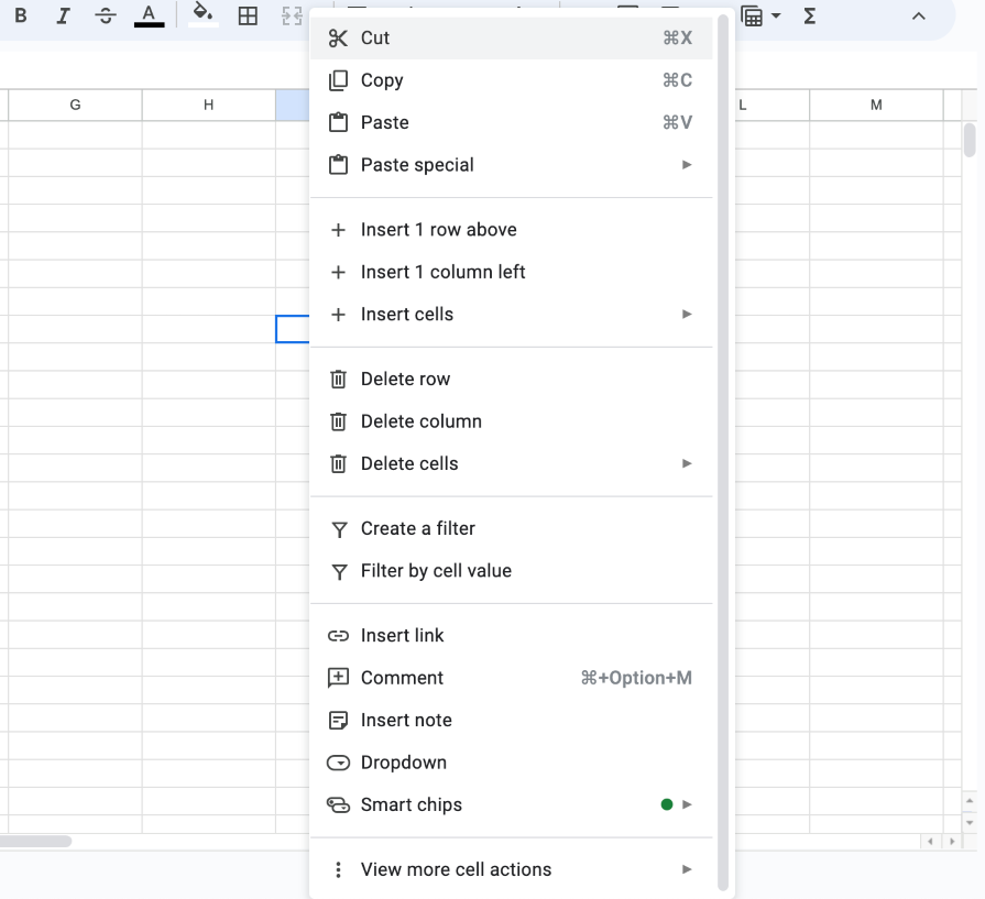
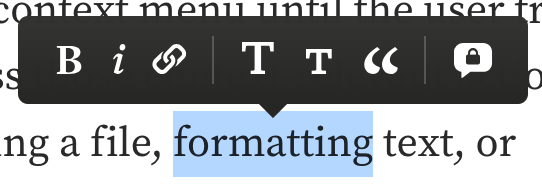
The action items are hidden within the context menu until the user triggers it, meaning that they would like to access those context-relevant actions. Some examples of actions include deleting a file, formatting text, or copying and pasting content. This allows apps to maintain a clean and simple interface while providing extensive functionality that is easy and quick to access:
Now that we understand the purpose of a context menu, let’s take a look at which elements create one so we can build better context menus. These elements include the trigger, iconography and labels, hierarchical structure, dividers, and placement.
To open a context menu, users have to trigger it somehow by interacting with an object. Often, you trigger a context menu by right-clicking on an object on desktop apps, or long-pressing on mobile apps. Other interactions that can trigger a context menu include highlighting text for text-based apps, hovering over an object, or selecting a menu icon:

The number of actions you display in a context menu can put a cognitive load on the user, who just wants to find the action they need. Using recognizable icons and simple labels not only makes it easier for users to quickly find the action they want to perform, but it also helps them understand the purpose of each action so that they can feel confident in selecting the right one:

In some cases, context menus can be label-only, either to save space or for simplicity. Icon-only context menus should provide tooltips with labels that appear on hover or long-press so that the user can be assured of each icon’s purpose:

Context menus can be organized into a hierarchical structure, such that some menu items are grouped into categories. Selecting or hovering over a category item can open a subcontext menu, leading to multiple levels of context menus:
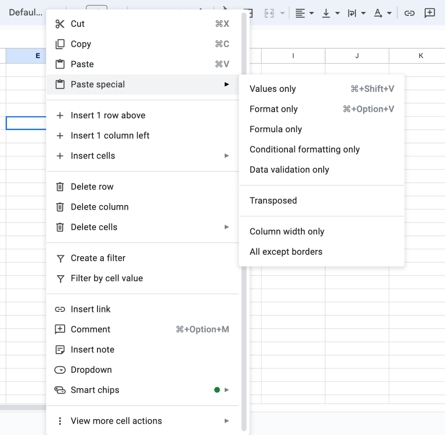
However, context menus are most effective when the options are limited. This helps users make a decision faster rather than wasting time going through all the options. If possible, try to reduce the number of options in your context menu and avoid using multiple levels of menus.
Dividers are useful because they can save your users time and get them to results quicker. If your context menu has options that you can group, consider using dividers to visually separate them. This can help users easily scan the context menu, find what they’re looking for, and make a selection:

Context menus often appear as pop-up menus. They are anchored to the location where the user triggers the menu. Context menus should appear without covering up any important content. Make sure that the triggered item is still visible when the context menu is open so that the user remembers what object they are acting upon:
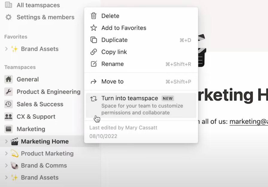
Depending on the app and how the user is interacting with it, the context menu can also be shown as a toolbar. This behavior is common on mobile apps, where screen space is limited, but can also be used in desktop apps where the content that triggers the context menu shouldn’t be covered up. If your app has a main toolbar, triggering a context menu can replace it with a contextual toolbar menu.
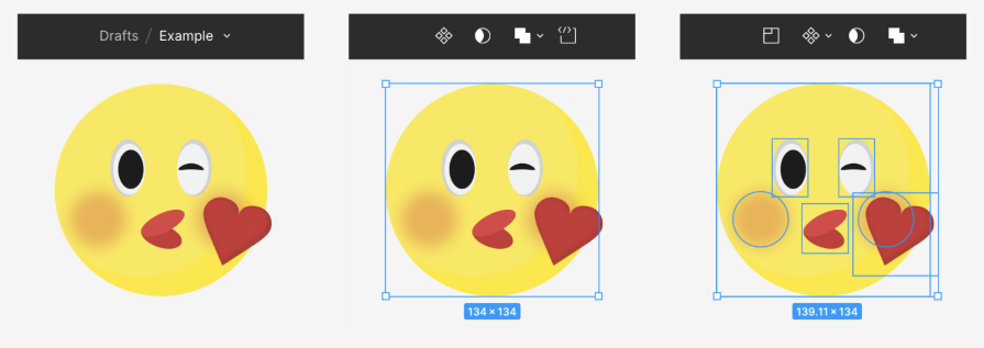
Figma’s top header displays the file name and folder. When a user selects an element, the header is replaced by a context menu, allowing users to continue designing uninterrupted with a floating menu.
Notice that the context menu options change depending on which layers are selected. This is a great example that shows how context menus adapt to the context of the selected object and provide relevant options to the user:
When creating context menus for your app, follow these best practices to ensure that your design considers usability and responsiveness. You should still conduct usability testing and research to gather feedback and iterate on your designs as needed.
If your app is made for cross-platform use, such as desktop, mobile, or tablet, make sure that you maintain consistency when designing your context menu. Although the trigger interactions may differ due to the medium, users will expect similar experiences when they use your app on different devices.
For example, a user might right-click a trigger point on a desktop and long-press the same trigger on mobile, but the visual elements of the context menu and the options should remain consistent. If space is limited, consider removing icons from your context menu and displaying a label-only menu on mobile.
To optimize for space on Android apps, you can consider using a contextual action mode, which replaces the top header with the context menu. This visual change alerts the user that they are now viewing contextual actions and that the options in the menu apply to the object selected. It also keeps the screen clear for more room to interact with and view the content:

When designing your context menu, order the options based on frequency of use. If you’re unsure which options your users commonly use, conduct usability tests and user research to understand what actions your users expect to perform when invoking the context menu. The insights you’ve gathered from your research can inform you if commonly used options are difficult to find:

Standard options like Undo, Redo, Cut, Copy, or Paste can usually be found near the top of a context menu because they are frequently used actions, depending on the type of app. Others are listed below them, separated by a divider. This allows users to quickly find and access the actions they most likely will use.
Generally, keep your context menu concise without including too many options. Users can experience the burden of cognitive load when there are many options to choose from. To help users scan the context menu easily, separate the options by dividing them into groups and adding visual dividers between them:
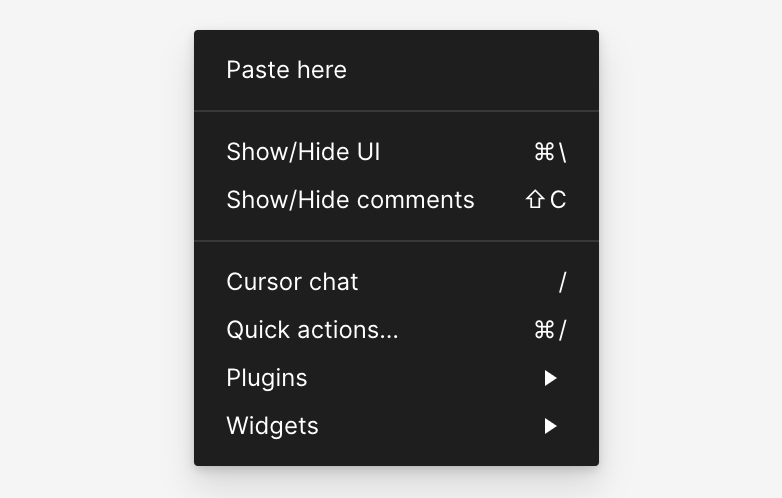
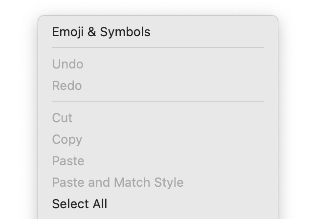
Another tip to reduce cognitive load is to hide disabled actions instead of displaying them as disabled. Users often become confused when encountering disabled actions because they’re unsure about why they are disabled and how to enable them.
By removing actions that are forbidden or unavailable, users don’t have to process that information and instead, they can focus on the options available to them. The exceptions to this are the options for Undo, Redo, Cut, Copy, or Paste because these are standard context menu actions and users generally understand how to enable these commands:
Visual indicators make information easier to process, and context menus that use a combination of clear labels and intuitive iconography can help users not only scan it more quickly but also better understand the purpose of each action.
For users who aren’t familiar with the app’s language, universally recognizable icons help them feel in control of the app. Overall, using intuitive icons ensures that users are confident in selecting an action because they have a good idea of what to expect as a result:

Following best practices is a great starting point when designing your context menu. However, user-centered design revolves around gathering feedback from users and using their insights to improve the design.
Here are some tips for conducting usability testing with your context menus to make sure you’re focused on the right areas.
First, start by asking users to point out objects in your app that they would associate with having a context menu. This might include objects that users would likely interact with frequently. The feedback will inform what types of features your users expect to be able to perform within your app.
Based on a trigger object, ask the participants to communicate the types of actions they would expect to be able to take on that object after triggering the context menu. This will give you an idea of what is missing from your context menu.
Ask users to complete common tasks within your app that require taking actions within the context menu. If actions can be performed outside of the context menu, instruct them to use the menu for the test.
Tell the users to speak aloud their thoughts as they go through the exercise. Observe how long it takes them to complete the task or any frustrations or challenges they encounter if they are unable to complete it. This will give you insight into the organization of your context menu and the intuitiveness of the labels and icons.
To ensure that your context menus provide a consistent experience across platforms, make sure to conduct usability tests using different devices, such as a desktop, mobile phone, or tablet. This will highlight platform-specific issues or inconsistencies and inform you of any usability issues related to each device.
When making your context menus, don’t forget to follow best practices like ordering options based on the frequency of use, grouping similar options using dividers, hiding disabled actions, and using intuitive iconography and clear labels.
If your app is available on multiple platforms, ensure that your context menus provide a consistent experience across different devices. By conducting usability testing, you can gather user feedback and gain valuable insights into how you can improve the usability of your context menu.
Header image source: IconScout
LogRocket's Galileo AI watches sessions and understands user feedback for you, automating the most time-intensive parts of your job and giving you more time to focus on great design.
See how design choices, interactions, and issues affect your users — get a demo of LogRocket today.
A three-week mobile banking project taught me that the “proper” UX process is not always realistic. Sometimes, the better approach is to work with what you know, identify what you still need to learn, and make the strongest decision possible under real constraints.
A/B testing compares two versions of a design to see which performs better with real users. Here’s how UX teams can use it to test hypotheses, measure outcomes, and make smarter product decisions.

This case study shows how one ad experience redesign increased total ad exposure while lowering perceived friction, proving that timing and context can matter more than raw interruption.

As products evolve into ecosystems, navigation becomes a system-level challenge. This article explores how to align structure, context, and user journeys to create seamless movement across tools without confusion.