
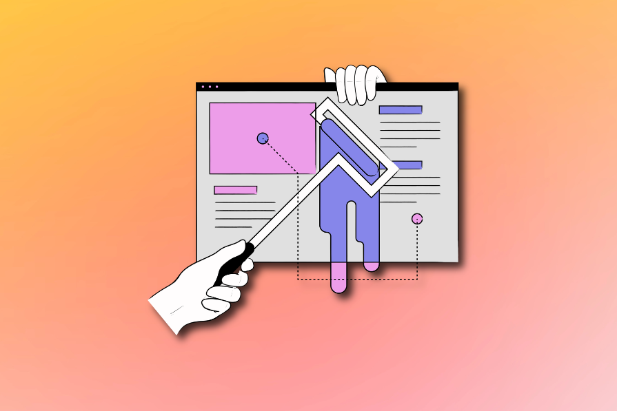
Form design is a highly underappreciated area of UX design.
What’s so hard about it? You just create a few input fields with labels and a button, and that’s it. Easy-peasy, right?
Well, in practice, there’s way more to it. And the impact of an amazingly-designed form can be game-changing for the product and the business.
Let’s take a deeper look at form design as a practice and a few crucial principles that, if you follow, will help you double up on your form design game.
Forms are often parts of the user journey with the highest dropoff rates. That’s unsurprising; after all, they require some conscious action from our users.
Not only do they have high dropoff rates, but they are almost everywhere — newsletter forms, sign-up forms, payment forms, and so on.
Now imagine what would happen if every single one of those forms performed just one or two percent better. The impact adds up quickly.
If you think I’m exaggerating, read this case study from Expedia. Long story short, an additional field in their form once cost them $12 million!
And it shouldn’t be a shocker — some big companies and agencies hire and train dedicated form designers. Small changes to forms can lead to multi-million dollar impact.
I want to introduce you to one key principle. Living by this principle alone will transform your form design approach.
Most forms are, in reality, small landing pages. It’s basically a landing page within a landing page.
Let’s just take a look at one decent form:
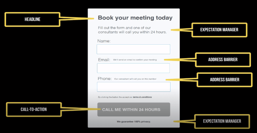
It starts with a headline — just like a landing page. It manages expectations and clearly informs what the value behind taking the next steps is while addressing various anxieties and barriers along the way. And, of course, it ends with a clear CTA.
The structure doesn’t differ much from your typical landing page.
Given that, the first step to designing a great form is simply following the principles of proper landing page design.
Most notably:
If you follow the landing page approach to form design, you have already upped your form design game. But, if you wish to take it even further, here are six crucial, high-leverage principles for you to follow:
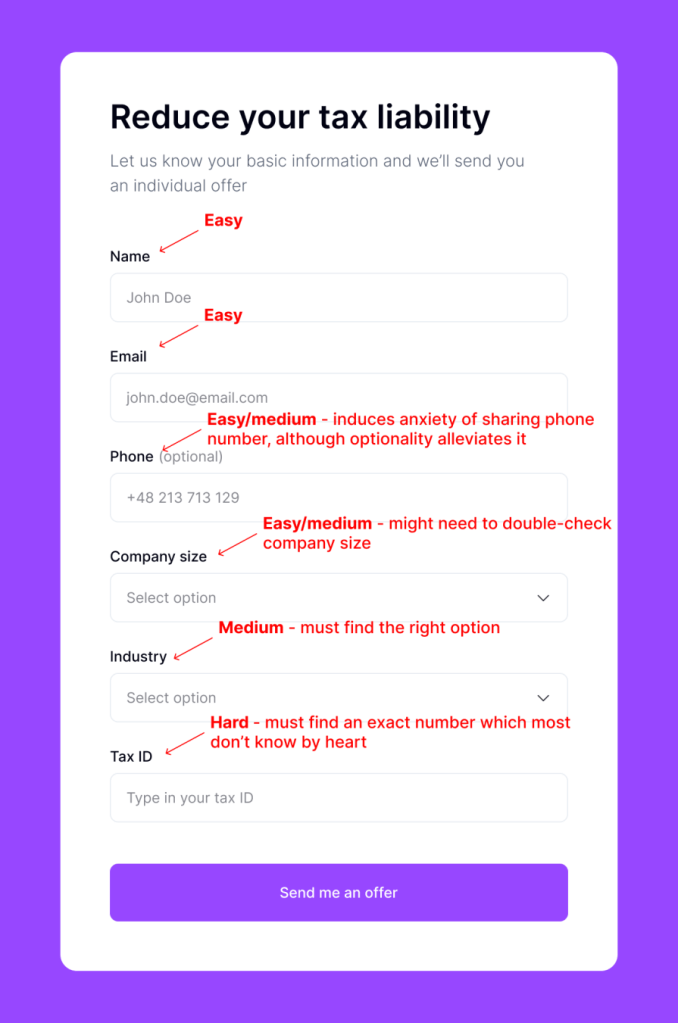
Make every single field in your form fight for their life. Focus on one thing — each new field has to decrease the dropout rate:
I imagine that each field costs me 5% of all conversions. Then, with every field, I ask myself, “Is this question worth sacrificing 5% of the conversion?” If not, I remove it altogether.
There’s one exception to the as-few-fields-as-possible rule — screening and qualifying leads.
Say you are offering tax consulting for corporations but operate only within some industries. Instead of wasting time contacting leads who are not the right fit anyway, you can already qualify them with an additional survey question.
It will still cost you conversions, but the time saved with further qualifying will be well worth it.
Although it’s typical to mark must-have fields with an asterisk (*) and leave optional fields unmarked, it’s not ideal.
People have already gotten used to omnipresent asterisks and filtering them out.
Instead, try to be more vocal about what fields are optional:

It’s a subtle change, but after numerous A/B tests on various forms, it’s an unsaid rule that:
Remember that regardless of how well you mark your optional fields, they’ll decrease your conversions as the perceived difficulty of the survey increases, so these also should fight for their life.
In theory, it’s a basic, well-known principle. In practice, I still occasionally meet forms that break it.
The difficulty of your form questions should flow from easiest to hardest:
Hard questions are those that are most time-consuming, for example:
If you ask a hard question when a user fills 80% of the survey, there’s a higher chance they’ll finish that last one or two fields than if you asked them these at the beginning.
There’s nothing more frustrating in filling out forms than getting a format error, such as:
It’s even worse if it’s not clear enough for the user. I once dropped out because I couldn’t understand what format the form expected:
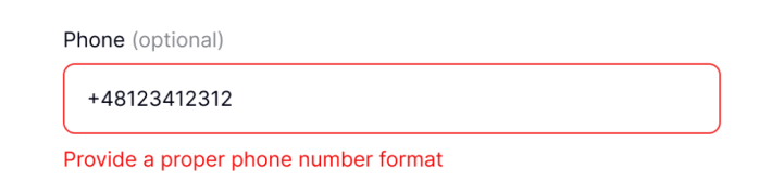
I know there are many reasons for these rules, but most of the most common formatting errors can be fixed on your side, on the backend.
For example, if your database accepts only XXXXX zip codes, you should still accept XX-XXX zip codes on the form and just get rid of the hyphen on the database level.
Talk with your developers and try to limit the number of front-end rules as much as possible. In longer forms, that can give you a few extra percent of conversions.
You want to ensure that your users clearly understand why you ask about particular data and what you will do with it.
Ideally, the copywriting around the form and overall context should do the trick, but in some cases, you might need an extra explanation. Tooltips will do just fine:
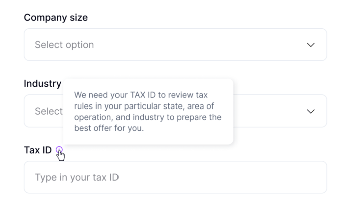
Users who are not worried will probably ignore it, so it doesn’t introduce much extra clutter. However, for those with particular objections and worries, these tooltips might be game-changers between converting and dropping off.
Form design is slowly beginning to become a UX specialization. And I’m not surprised.
Creating a perfect form requires a specific skill set, a lot of work, and numerous experiments. But it’s almost always worth it. These small improvements add up quickly.
Next time you design a form, remember the key principle — a form is a small landing page. Design it as if it were a landing page. Create a clear header, address anxieties, manage expectations, and provide an exciting call to action.
Then:
You, and business stakeholders, will see the results pretty soon.
gd2md-html: xyzzy Thu Jul 18 2024

LogRocket's Galileo AI watches sessions and understands user feedback for you, automating the most time-intensive parts of your job and giving you more time to focus on great design.
See how design choices, interactions, and issues affect your users — get a demo of LogRocket today.

Skeuomorphism helped define early digital interfaces by mimicking real-world objects to make technology more intuitive. Learn how it compares with flat design and neumorphism, why it declined, and where it still has a place in modern UX.

AI has made polished, confident content easy to generate, but that does not make it trustworthy. This article explains how UX teams can design stronger quality signals using source transparency, validation, confidence communication, and reputation.
Inclusive design is evolving beyond accessibility alone. This guide explains how UX designers can create more inclusive products through usability, accessibility, neurodiverse UX, adaptive personalization, multimodal design, and culturally aware product experiences.

I was working with an intern on a UX research project, and before we even started, we both had private […]


