UX principles can seem divorced from the day-to-day concerns of design. Your professors may have mentioned gestalt principles in school, but you may not have thought about them since.

However, designing with gestalt principles in mind can help us intentionally guide user behavior. By keeping these principles in mind, you can improve a design and justify your decisions.
As the young Czech-born psychologist Max Wertheimer was traveling by train bound for Frankfurt, he looked out of the window and noticed flashing in an alternating pattern.
Something clicked in his mind as he watched this. He realized that if the lights were spaced apart with the right timings for turning on and off, his brain perceived the two separate light sources as one, creating an illusion of a single continuous light that moved back and forth.
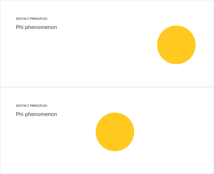
He didn’t realize how profound the implications of this single moment were, but it already piqued his curiosity. Max had discovered the illusion of movement, or what he named the Phi phenomenon, an optical illusion using our perceptual bias to fill in the blanks. It is the apparent motion of two stimuli that are presented to a viewer in rapid succession.
The Phi phenomenon is the basis of how movies work, a rapid sequence of discrete images. You will also have seen this phenomenon in the form of the ubiquitous loading spinner.

His insight was revolutionary and controversial, changing our understanding of perception and how our minds process the world around us. Arguably, it kick-started the gestalt movement.
Psychology in the early twentieth century was shaped by structuralism, which viewed mental activities as lower-level sensations that were related to each other. It suggests that everything in the world, including matter and substances, can be broken down into these tiny, indivisible particles called atoms. Understanding atoms helps us understand larger objects and substances. Yet, the Gestalt school opposed the “atomistic” view, believing it would not help explain the psychology of perception.

In 1911, together with his colleagues Wolfgang Köhler and Kurt Koffka, Max founded the gestalt movement and proposed that, in terms of human perception, “the whole is different than the sum of its parts,” which is often misquoted as “the whole is greater than the sum of its parts.”
When designers are asked what they do, the answer is normally that they create websites, logos, work with typography and color. However, what we are actually doing is using perceptual bias to create images and user interfaces, manipulating space and form to craft creations that capture the eye and imagination.
And yes, many of these principles feel so obvious as to need no explanation. But as with everything, it is instructive to keep them fresh in our mind. When you know gestalt principles, you can design with purpose.
Before we get to some principles, we must talk about the law of Prägnanz, a German word that commonly translates to “ordinariness,” and is an overarching concept that encompasses the principles. It argues that our minds naturally gravitate towards order when viewing things. Rather than perceiving individual elements, we perceive a unified whole.
For example, when we look at a dog, our initial perception is not focused on individual legs or the head. Instead, we instantaneously perceive the complete image of the dog.
These principles and laws are commonly grouped and organized in different ways, with some variations in terms:
Although I find all these principles fascinating, I prefer to focus on a few of the most practical principles, ones we use daily as designers:
When objects are located close to each other or in proximity, we perceive them as belonging to the same group or category.
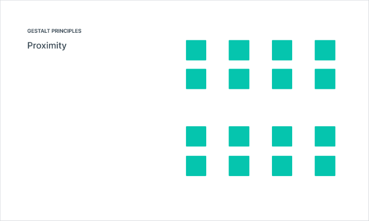
Proximity explains how people perceive grouping based on how close or distant they are to each other. It is not only the placement of grouped items that shapes our perception, but also their distance from other groups or solitary items.
When grouped elements are close together, they create a sense of unity that can be interpreted as a single entity and distinct from other groups.
The example below illustrates the value of placing objects near one another. The information appears right beneath its corresponding image, with a small gap between them. By creating an orderly and well-structured layout, users don’t have to spend a lot of effort while looking for details and making decisions.
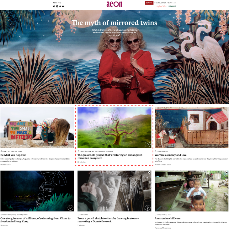
The further away the relevant information from each other, the more cognitive load develops in the user’s mind. On the other hand, it is important to ensure that items that don’t have any connection with one another are put at a distance, preventing unintentional association between them.
We perceive similar elements within a design as a unified whole, even when these elements are physically separated or distinct from each other.
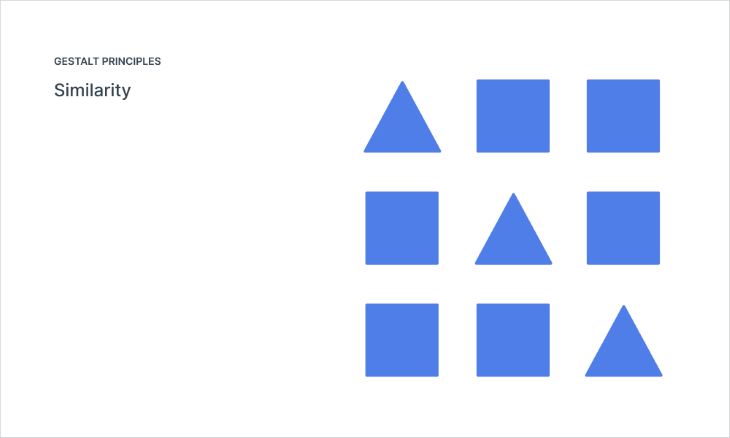
Similarity explains how objects which share visual characteristics tend to be perceived as a unified group. In our brain, we group similar elements, such as colors, sizes, shapes and orientations, and this helps us identify patterns in our environment more efficiently. When we look at a painting that contains multiple circles, squares, and triangles, even if arranged randomly, our eyes will pick out the circles first and group them together before moving on to the other shapes.
We can use it to create visual grouping and convey hierarchy. Exploit this perceptual bias by increasing the similarity of items to convey hierarchy.
In this example of an admin page, the table has status tags. They have a similar shape, similar label style, yet have differing colors. But since they have the same treatment, they are seen as one grouping of elements, making it easy to scan them as similar at a glance.
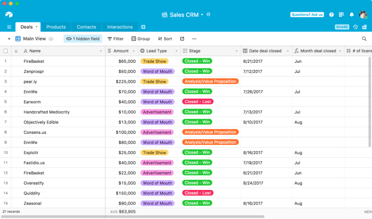
Maintaining a consistent design across the whole user interface enables users to see at a glance that items still perform the same function even though they are carrying out a different task.
We distinguish objects or shape (figure) from its surrounding background (ground).
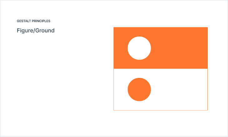
Figure/ground explains how we interpret images by creating a distinction between the figure and the ground. This helps us differentiate between what is important and what is secondary information. When looking at a person’s face against a busy background, our minds distinguish between the two by making the face “pop out” more than the rest of the picture. This allows us to identify the subject without being distracted by what’s going on around it.
Jan Tschichold said that, “white space is to be regarded as an active element, not a passive background.” You can think of it as using contrast to achieve an effect.
Different sections of a webpage can be distinguished using figure/ground, such as modals or overlays. Designers can use contrasting colors or background treatments to separate layers of information. This helps users understand the structure and hierarchy of the information presented.
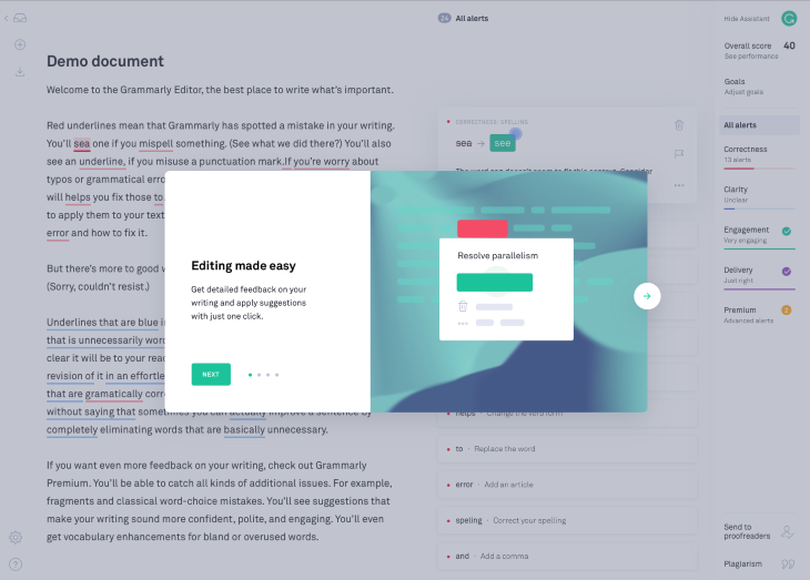
Here we see two examples of figure ground. First, the gray layer beneath the modal brings it forward and highlights this. The white panel behind looks more prominent and important, with its position highlighted by contrast to the modal content. Second, the text in the white cards is further separated from the image beneath.
We perceive elements that move or share a common direction as being connected and belonging together.
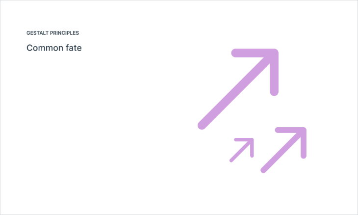
In design, things that move together are perceived as being more related than if they were to move separately. We perceive a large group of people all walking in the same direction as one crowd rather than several individual groups.
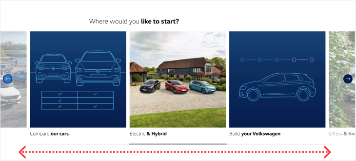
To create a pattern, an element moves while the other elements around it remain still, creating an association between the two objects. This connects them and helps drive focus onto the element in motion. We also use common fate when showing a set of images (such as those in carousels) to tell quickly which item is selected at any given time.
An easy way to think of this in design is with image carousels, where the user chooses the following item by clicking on the next arrow. We perceive that items are related because of their adjacent proximity.
We interpret elements that are visually connected as more closely related than elements that lack any connection.
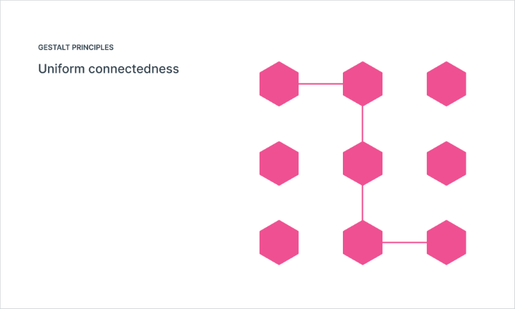
This principle is interesting, as it was not originally included among the original principles. In the 1990s, psychologists Stephen Palmer, Irvin Rock, and Diane Beck conducted extensive research on human perception and the role of connectedness. They noticed a perceptual bias related to connectedness was not addressed and introduced a new principle called the “Law of Element Connectedness” to fill this gap, no pun intended.
Uniform connectedness refers to our tendency to perceive elements that share a common visual attribute as being connected or grouped together. According to this principle, when elements within a visual scene have the same color, texture, shape, or other visual characteristics, we perceive them as belonging to a whole.
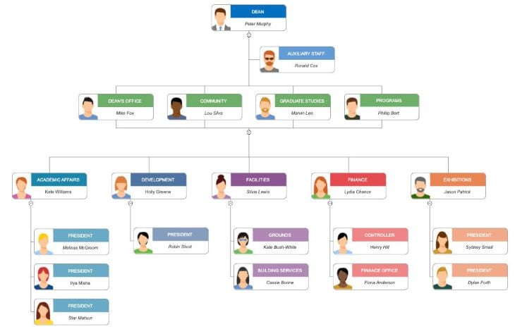
Now we can use any visual trick to connect elements such as borders, lines, or even putting elements in a linear arrangement such as in a dropdown menu. In the example below of a classic org chart, each grouping is connected by lines, making it easy to scan and find your way through the chart.
These perceptual organization principles are pure gold for designers. They give us a peek into how people experience things, helping us make user experiences better, get our message across, and create designs that really catch the eye. When we understand how our brains process visuals, we can use these principles to grab attention, make things easier to understand, and create designs that stick with people.
When we grasp how our minds process and make sense of visual stimuli, we gain the power to captivate attention. By strategically applying these principles, we can grab hold of users’ focus and keep them engaged. Whether it’s through clever use of proximity to create a sense of unity, or leveraging similarity to establish visual patterns and hierarchy, we can draw users in and make them want to explore more.
Header image source: IconScout
LogRocket's Galileo AI watches sessions and understands user feedback for you, automating the most time-intensive parts of your job and giving you more time to focus on great design.
See how design choices, interactions, and issues affect your users — get a demo of LogRocket today.
A three-week mobile banking project taught me that the “proper” UX process is not always realistic. Sometimes, the better approach is to work with what you know, identify what you still need to learn, and make the strongest decision possible under real constraints.
A/B testing compares two versions of a design to see which performs better with real users. Here’s how UX teams can use it to test hypotheses, measure outcomes, and make smarter product decisions.

This case study shows how one ad experience redesign increased total ad exposure while lowering perceived friction, proving that timing and context can matter more than raw interruption.

As products evolve into ecosystems, navigation becomes a system-level challenge. This article explores how to align structure, context, and user journeys to create seamless movement across tools without confusion.