Figma is a powerful design tool for creating web and mobile interfaces, and Figma constraints are an essential feature of this software. Constraints allow designers to control the position and size of any layer, across multiple screen sizes, relative to its parent frame.
Constraints can be particularly helpful when creating responsive layouts because they allow you to dictate how a layer should behave on the x- and y-axes when its parent frame is resized. This allows you to determine how an element should scale or resize in response to changes in screen size.
Additionally, constraints can be applied to individual layers within a frame or groups of frames (known as nested constraints), which simplifies the creation of complex layouts to respond correctly across different devices and screen sizes.
In this post, we’ll explore the different types of constraints, learn how to use them, and see some tips and advanced techniques for working better with constraints.
There are two types of constraints in Figma — horizontal and vertical — that control the x- and y-axis, respectively:
The properties of the horizontal constraint include the following:
The properties of the vertical constraint include:
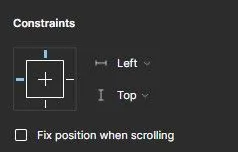
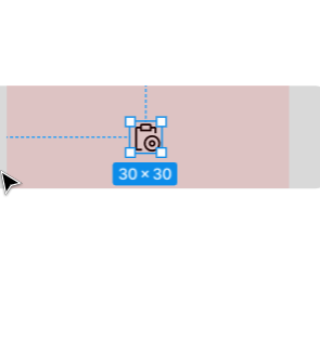
When you create a frame in a Figma file and add a layer inside the frame, Figma will give the constraint a default layout: Left on the x-axis and Top on the y-axis. You can observe this by clicking on the layer and observing the dashed blue lines surrounding it:
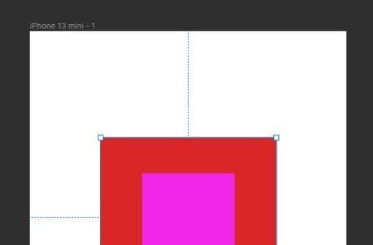
You can also choose to create nested constraints — a frame within another frame — to create more complex layouts. To create a nested constraint, hit the F key to select the frame tool and create two frames, with the second inside the first:
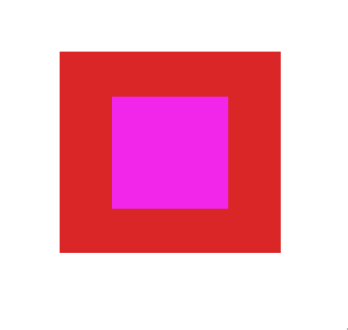
You will notice that the constraints of the inner frame (in pink) are applied relative to its parent frame (in red).
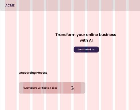
Now, we’ll move on to a practical example and see how to create a responsive layout by applying constraints to UI elements. I’ve prepared a Figma file that you can duplicate and follow along with. In the end, you will have created the layout below:
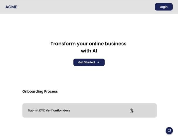
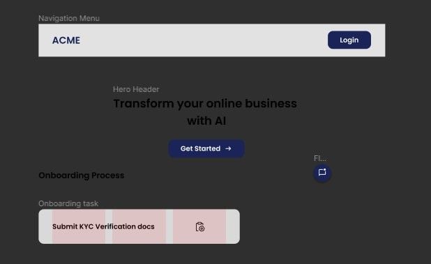
Our design file above consists of the following UI elements:
The file also contains a desktop frame with a preset grid layout for you to place the above elements. Because the Type of layout grid here isn’t Stretch, any element placed within the frame will have its constraints set relative to the desktop frame and not the grid columns — more on this momentarily.
Now let’s start designing!
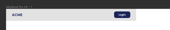
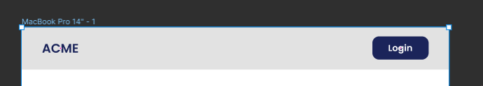
Pull the navigation menu into the desktop frame and align it to the left edge. If you try stretching the menu from the right, you will notice that the Login button doesn’t behave how we want it to — stick to the right side of the menu:
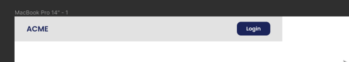
To fix this, select the Login button and set the horizontal constraint to Right. This should now pin it to the right side of the menu.
But the menu isn’t fully responsive yet. If you stretch the menu to the end of the frame, then select the desktop frame and resize it, you will see that the with of the menu doesn’t sync with its parent frame.
You can resolve this by selecting the menu and setting its horizontal constraint to Left and Right. Now the menu will resize with the width of the desktop:
Bring the hero section into the desktop frame and align it along the vertical center of the frame. We expect this section to always stays at the center of the frame even when the frame is reduced — but, unsurprisingly, this doesn’t happen.
To achieve this, set the horizontal constraint of the hero section to Center and leave the vertical constraint at Top.
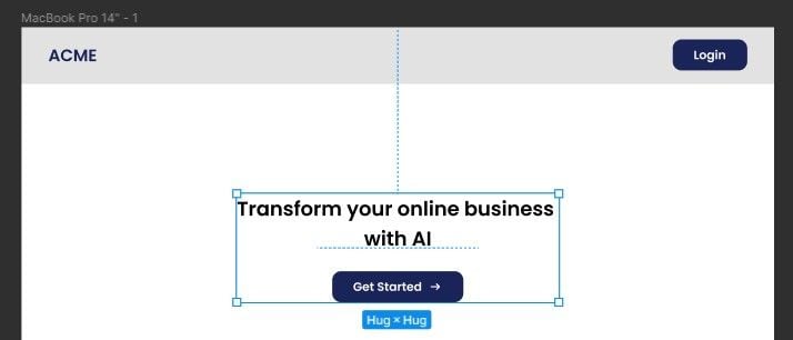
Now the hero section will always stay at the center when you resize the parent frame.
This type of button is often located at the bottom right of the screen. Pull the button into the desktop frame and position it at the bottom right of the screen. Now set the horizontal constraint to Right and the vertical constraint to Bottom, like so:
These constraints will keep the button pinned to the bottom right corner as the parent frame is resized.
The last section of our layout contains UI elements for an onboarding process. The onboarding task element uses a layout grid to control the constraints of its child elements. Before we proceed, let’s closely examine how layout grids affect constraints in Figma.
The Type of layout grid applied to a frame in your design will directly affect the constraint behavior of elements within that frame.
For example, if you create a layout grid and set its Type to Stretch, the constraints of the elements inside that grid will be determined based on the bounds of the column or row in which the element is located:
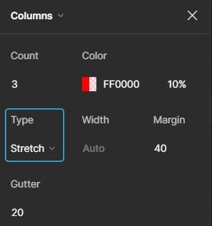
Whereas, using any of the other types (Left, Right, Center) will set the constraints of elements within the frame to be relative to the bounds of the frame itself.
Now let’s continue. Import the section’s label and the layout grid element (onboarding task) into the desktop frame, then align them to its second column:
Tip: Use
Cmd + ;(Mac) orCtrl + Shift + 4(Windows) to toggle the visibility of all grids in your artboard
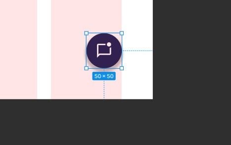
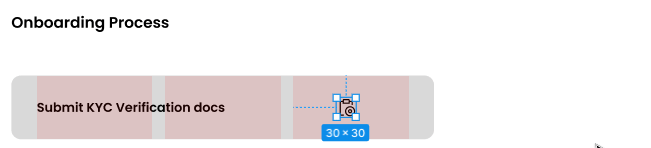
The onboarding task element has a layout grid applied to it that consists of three columns. Apply a grid to any Figma element by clicking the + icon next to the Layout Grid option in the right panel. For this element, we’ll set the Type property to Stretch.
This will cause the icon’s constraints to be relative to the boundaries of the last column:
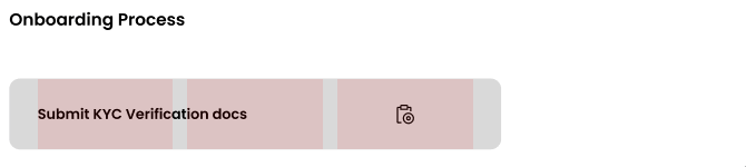
You will notice that on stretching this element, the icon doesn’t stay centered in its column. You can solve this by setting both the horizontal and vertical constraints of the icon to Center. This will ensure the icon stays centered across different sizes:
Now, one last thing: stretch this element to the end of the penultimate column of the desktop frame, then, set the horizontal constraint of this element to Left and Right so that it becomes responsive to the size of the parent frame.
And now you should have a fully responsive layout made using only Figma constraints!

Figma constraints are a powerful tool for designers to create consistent layouts that respond to changes in container size, and ensure that the layout remains consistent and visually appealing.
As a developer, I liken this feature to CSS positioning where the absolute and relative options in CSS allow for precise control over element positioning within a web layout. The parent element has a relative position, while the child element has an absolute position and uses the top, bottom, left, and right options to position itself in relation to the parent element.

LogRocket's Galileo AI watches sessions and understands user feedback for you, automating the most time-intensive parts of your job and giving you more time to focus on great design.
See how design choices, interactions, and issues affect your users — get a demo of LogRocket today.

After designing AI search systems, I’ve seen what builds trust — and what kills it. Here’s my take on what really works.
I used to think ‘clean’ design meant hiding things. Turns out, less isn’t always better. This blog walks through lessons from my own overdesign moments.
This blog outlines how poor feedback, unclear roles, and low UX maturity quietly burn out even great designers — and what to do instead.
Design cancel buttons that feel safe, not frustrating. Learn how to build clear, accessible flows that protect users and their data.

 Learn more →
