Words wield immense influence, especially in the world of UX writing.
Words guide users through interfaces, evoke emotions, and shape brand perception. Good copy should lead users to their goals, while bad copy can have the opposite effect. Busy people don’t want to waste time on ineffective copy, and they probably won’t, meaning it’s important to get it right from the outset.
But what is UX writing?
UX writing is all about creating clear, concise, and user-friendly text within digital products like apps and websites. It can bring balance to complicated interfaces, provide instructions, and enhance overall user experience. It focuses on usability, accessibility, and ensuring users understand and interact smoothly with the interface.
Think of the user interface in an app or website as the streets, sidewalks, and buildings, and UX writing as the street signs to help people navigate.
Crafting impeccable UX copy is no easy feat, however. And while it’s not entirely an exact science, some would argue that we’re getting closer to that reality. Several tools exist now to help us in our creation of effective copy. AI-powered tools act like digital scribes, politely making suggestions and streamlining our content creation process.
This is a particularly good time for folks who maybe aren’t as confident with their command of writing or grammar, as AI can help deliver better, more effective, and ironically more human UX writing. AI can comprehend and execute tasks such as rewording, tone shifting, and prompt generation, and produce high-quality outcomes based on these instructions.
It’s getting fierce in the world of AI tools for UX writing, and competition is rife. However, some tools are more effective than others. In this exploration, we’ll delve into three tiers of AI tools for UX writing: Good, Better, and Best. Let’s navigate three noteworthy tools, uncovering the strengths, quirks, and price tags of each tool.
Jasper is probably one of the more popular AI writing tools available today and was one of the earliest ones that caught people’s attention.
What is it? Well, If you are looking for an AI platform that can help you create more UX writing faster and easier, then Jasper will fit that use case. It can handle all the usual types of content, such as blogs, social media, sales emails, web copy, and more.
In UX writing, tone of voice and consistency are particularly significant. Jasper’s capacity to uphold your brand’s voice, regardless of the team member creating content, is probably the most significant reason to choose this over other AIs that can help with UX content.
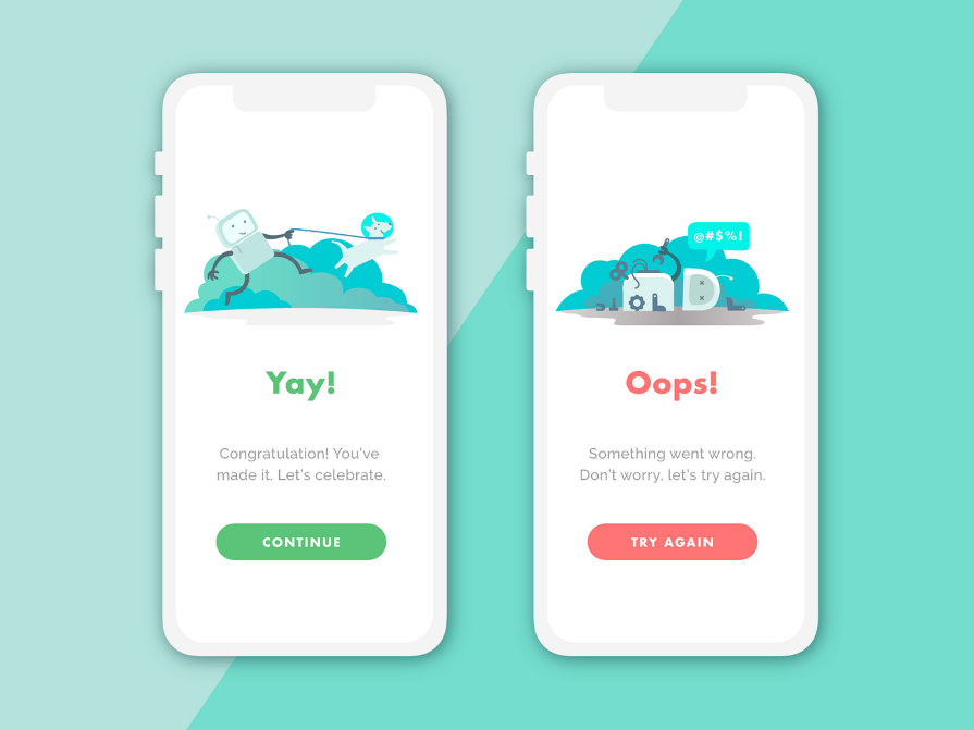
Whether your brand tone is informative, playful, or casual, Jasper always sticks to it. You’ll notice this in UX writing all the time: it’s in page titles, buttons, setup tips, loading messages, alerts, and other small text meant to lead users along:
Jasper is a fantastic platform for cutting down on the ideation section of a project as well.
Not sure where to start? Start with a list of potential topics. Need to rewrite some content based on SEO keywords? Need to simplify some detailed documentation for the online help section? Jasper can do this.
Once you’ve told Jasper what you need for your article, you’ll work collaboratively with it. You do a bit, then Jasper does a bit, and so on. The more information you feed it, the better its output will be, but It’s a bit like using a tandem bike, and when you want Jasper to take over, you simply ask it to.
The platform is simple, user friendly, and quick to set up. It offers a wide range of templates that guide you effectively through any project you’re working on. An impressive start if you’re dipping your toe in the world of AI generative content, and recommended to give it a trial.
Starting at $49 for Creator, $69 for Pro. You need to contact Jasper directly to learn more about their Business package.
If you’ve ever used Grammarly, you’ll be familiar with some of the features provided in Wordtune.
When you’re writing, and you’re anything like me, you’ll know that writing without distraction is key. You want to keep going without pausing to correct spelling or grammar mistakes. I aim to dive into a writing flow state where I can capture my thoughts and ideas swiftly, and then come back and fix any mistakes:
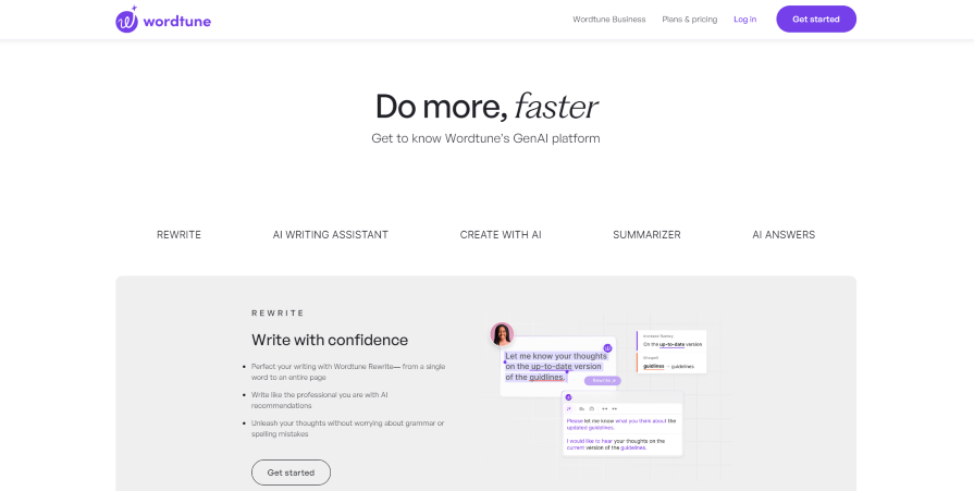
Known as “freewriting,” this method allows individuals to focus less on the technicalities of writing and more on effectively communicating their thoughts. How does this apply to Wordtune?
Well, according to their website, you can “perfect your writing, write like a professional with AI suggestions, and unleash your writing without worrying about spelling or grammar mistakes.” Perfect if you’re more concerned about the bigger picture and you’re happy for Wordtune to take over in that respect.
While Jasper has its advantages, Wordtune goes beyond, serving as your personal writing mentor.
Free, Plus, and Unlimited from $0, $24.99, and $37.50.
Frontitude is like having an AI sidekick for your design crew.
Fortitude helps designers craft captivating and consistent UX content with ease. The best thing about Frontitude? All of UX content writing happens within Figma, whereas the other tools help and create content outside of the realms of Figma. If you’re a designer spending most of your time in Figma, and you want to create great copy to help users, then this is a no-brainer.
Frontitude is driven by a Large Language Model (LLM) from OpenAI, serving as its backbone. They’ve infused it with a “special touch”, meaning it’s been tailored specifically for UX writing by studying content styles from top-tier products worldwide.
No other AI writing tool can boast that:
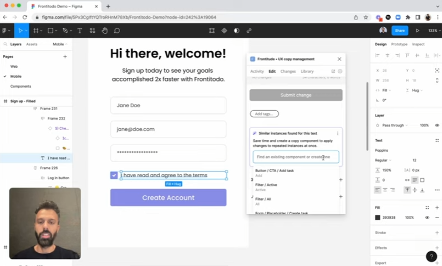
As a designer, one of the things I want to do — unsurprisingly — is design. When I’m in Figma, I’m thinking in artboards, grids and colour palettes, but copy is just as important as all those things. As said at the top of this article, words wield immense influence.
Without AI tools such as Frontitude, you rely solely on your own resources when crafting designs and integrating suitable copy, potentially leading to internal conflicts within the design process. This is unless you have a dedicated copywriter you can work with, but from my experience, this is often a luxury.
If you’re presenting ideas to stakeholders, you’ll know they want to see not just the design but the content within the designs. They want to see it as close to the finished article as they possibly can, and creating copy that’s merely been thrown into designs can place you in an awkward position:
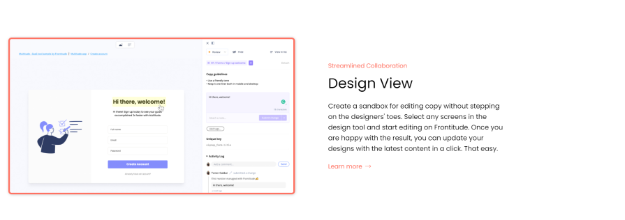
Frontitude helps designers figure out the best content and, more importantly, stops any confusion because my copy doesn’t match the expectations of stakeholders. In fact, it’s possible for stakeholders to access a sandbox for editing copy without interfering with the designers’ work.
They can select any of the uploaded screens and edit without affecting the original designs. Once satisfied with the result, they can update their designs with the latest content with just one click.
0$ to $149 a month if paid yearly. An organizational tier is available too.
As UX writers, we navigate unfamiliar territory.
Jasper, Wordtune, and Frontitude serve as our guides. Select the right one for your journey — whether you’re crafting a basic design or embarking on an ambitious project. Remember, AI complements human creativity; it doesn’t replace it. So, let’s harness its power, fellow designers, and create together.
LogRocket's Galileo AI watches sessions and understands user feedback for you, automating the most time-intensive parts of your job and giving you more time to focus on great design.
See how design choices, interactions, and issues affect your users — get a demo of LogRocket today.

Design engineering has always lived between design and code. But with AI tools turning prompts into interfaces and code into editable canvases, that bridge is becoming a new way of building.
A three-week mobile banking project taught me that the “proper” UX process is not always realistic. Sometimes, the better approach is to work with what you know, identify what you still need to learn, and make the strongest decision possible under real constraints.
A/B testing compares two versions of a design to see which performs better with real users. Here’s how UX teams can use it to test hypotheses, measure outcomes, and make smarter product decisions.
This case study shows how one ad experience redesign increased total ad exposure while lowering perceived friction, proving that timing and context can matter more than raw interruption.