AI image generation tools like Midjourney, DALLE, and Stable Diffusion are revolutionizing app and web design, and every day, there is more AI news that shows the latest tools and techniques.
In this tutorial, I will show you how to use Adobe Firefly, a tool by Adobe that allows you to create images for your website to accelerate your creation and creative process.
I will start by explaining the tool, and then we will see some tests I did with it, so let’s jump right into the process that can revolutionize your design workflow and give you some ideas of what Firefly can do.
Adobe Firefly is a product developed by Adobe that uses generative AI and machine learning models to create and edit images. Currently, the software is in a beta version, and you can access it by creating an Adobe account.
The free account provides 25 generative credits for making images every month, and you can also buy a license that gives you more credits if needed:
So far, it sounds like every other image generation AI, right? But combined with the Adobe Suite, Firefly has some unique features. Here are the six main ones:
This is the most straightforward one: the feature generates images from text. You type the prompt and then get an image based on it.
In addition to that, it includes some great options to continue work on the image and make it more precise to your needs. These include:
The detailed parameters set it apart from some other AI tools. As for its performance, we’ll test that out soon.
Generative fill is a great feature that allows you to eliminate objects from the image or add things to the image. It is called generative fill but has the same function as “Inpainting” that other generative image products use.
The text effects feature helps you to create an image of text with an embedded image or various textures inside the text to improve the visual style.
You enter the desired text and customize its visual appearance. It’s a straightforward process and can produce impressive results.
This option allows you to change and play with the color of a vector image based on the different options. It is an excellent option for people who want to search for a tone of color for their images; with one click, you get many color options.
Text-to-template allows you to generate graphic design templates for various content types, such as Instagram posts, flyers, posters, and YouTube thumbnails.
This option works on the Adobe Express app, and when you click on this option, it opens Adobe Express and gives you their library of templates to play with.
With this option, you can generate SVGs from text. This option works on the Adobe Illustrator software:
While trying the tool, I wanted to test its limits and experiment with how I could benefit from it. Hopefully, this will give you a better idea of how to use Adobe Firefly yourself.
To go in the same direction as all the tests, I tried to create UI design and visual elements for an invented Italian restaurant called Mama Pasta. This will create some consistency.
Here are the five tests that I conducted and their results. See for yourself the feature set of Firefly!
I used two tools for this test: the Text to Image and the Generative Fill.
I started with the prompt: A homepage for Italian pasta restaurants named Mama Pasta. The design should be based on white, red, and green colors and can incorporate illustrations of a mother who makes pasta.
And I got this image:
It created only an image of pasta, nothing like a homepage. Then, I changed the prompt, added the word “website,” and changed the aspect ratio to 3:4 so it would be taller: A homepage for an Italian pasta restaurant website named Mama Pasta. The design should be based on white, red, and green colors and can incorporate illustrations of a mother who makes pasta.
But still, it looked like something other than a website’s homepage.
Then, I changed the prompt to this: An image of an app for Italian pasta restaurants named Mama Pasta. The app design should be based on white, red, and green colors. The image must include a footer with 3 icons: home, menu, and reservation.
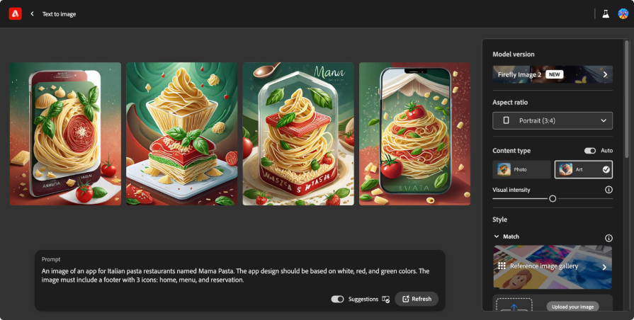
I got images of a mobile phone with an image of pasta. I was unhappy with the results, so I used the Generative Fill feature and edited a specific zone in the image to be more precise.
I chose one image, marked the bottom of it, and added this prompt: A menu with 3 icons: home, menu, and reservation.
![]()
I thought that way, I would get better results. However, the AI did not give a good result and put some visual elements on the bottom of the app, but not something that looks like a bottom menu:
The next step was to test a simple prompt to see how it affected the image creation.
I marked the mobile phone’s bottom again and added the prompt: An app's bottom menu.
Neither did this give a good result, as you can see in the image:
My conclusion is that the app cannot create a homepage image and cannot easily understand what I need to generate if it’s related to a complex UI.
If you needed a quick image akin to a stock photo to throw into your design, Firefly could help with that. However, be wary and vet the image to be sure the text is readable and all people have ten fingers! AI is notorious for generating otherwise. Let’s see how FIrefly handles a hero image.
Hero images are images placed on websites to attract users’ attention. In most cases, these images are eye-catching and positioned on the top of the website, and I felt I could make one.
Let’s use the same example and try to generate an image for a hero section for the Mama Pasta website.
Here is the prompt I added to the text-to-image feature: An illustration for a homepage for an Italian pasta restaurant named Mama Pasta. In the image's center is a plate of fresh pasta with tomato sauce.
These are the images I got:
I used a geometric style and changed the aspect ratio to 16:9 to give it a more modern appearance. Its results were pretty impressive! Here’s what it gave me:
I wanted to test another style to see the effect, so I chose the watercolor style, a very distant style from geometric:
The results were great, and I thought I wanted to have the plate in white, so I moved to the generative fill and tried it there. I selected one of the images and played with the generative fill feature.
You can do it directly from the image; on the top, there is a menu to select to edit the image on the generative fill feature.
I eliminated the plate and added the prompt: The pasta is inside a white plate.
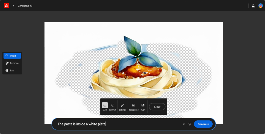
The result was not good, so I changed the prompt to simply a white plate, but this did not work.
I thought it was because the background was white, so it was difficult for the AI to add white on white. So I did the same but asked for a black plate.
The result was better; the color was a mix of black and blue, but it gave the effect.
Another thing that is possible to do at that moment is to change the dish on the plate and ask to add more tomato sauce or change the pasta to another style.
In that case, making the image, especially an illustration, is something we can do with the app and get excellent results. It is a great way to play with different images for the hero section.
I thought an interesting approach could be to use the “From text to a template” option. It has the same process, but we do it in Adobe Express instead of Adobe Firefly.
Adobe Express creates templates that are more than just images. I wanted to see if creating a homepage for an Italian restaurant is possible, so I used the same prompt as in the first test: A homepage for Italian pasta restaurants named Mama Pasta. The design should be based on white, red, and green colors and can incorporate illustrations of a mother who makes pasta.
Although the results were not a homepage, it was notable that it considered some parameters and was not only an image. I got interesting results that do definitely read like website pages, though most of them ignored my request to include Mama Pasta herself:
In addition, I tested some variations of the first outcome:
In the end, it doesn’t give the image of a website anymore, but you can get some inspiration for your style, especially if you look at the first four images it generated.
The good thing about Adobe Express is that you can edit the template in the Adobe Express editor. But, in the end, you need to work and design the page, which I wanted to see if the app can do by itself:
To achieve text effects, I obviously used the Text Effect feature. With that feature, you can add text on one side and style on the other. When I started, I asked the AI to generate the text based on this prompt: "Mama Pasta" with the style "Text from pasta."
Here’s what I got:
The results could have been better because the short pasta did not contribute to what I felt was a good outcome. So, I changed the style to spaghetti pasta, and the results were much better; the effect of long pasta made it feel more emotional and possibly less grotesque:
Apart from running the prompt, you can change the typography type, add a background, and play with the color. In this way, you can make something more precise.
I see this feature more for content creation than a UI, but in some cases, it will be possible to use it on a website as a visual element.
In this test, I wanted to see how I could change the color of an icon with the generative recolor tool.
From my tests, generating an image with the text-to-image feature and changing the colors on the generative recolor tool is impossible. This may be because the generative recolor tool needs vectors, while text-to-image generates pixel images.
First, I uploaded the SVG file of the icon of a farfalle pasta to the interface and asked it to generate the icon with soft pastel tones:
It gave me some options:
After that, I selected Dark blue midnight from the interface, which gave me some more options:
The Harmony selector has more parameters, and I wanted to test them, so I chose Complementary. Although I wasn’t sure what would happen, the colors it generated worked well together. Success!:
Then, I tested another harmony filter and I chose Triad. I didn’t notice a big difference since triadic colors on a two-color palette would be hard to do, but it was interesting to see how it worked:
I used a simple icon in this test, but you can try it with a more complex vector image to see its power.
One notable thing from the first moment I logged in is that the interface is easy to use and includes more than just text input. It also includes other inputs that make the process easier to work with, like the aspect ratio and style options I mentioned.
The combination of writing prompts and parameters means the work was easier than with other tools, and I’ve spent my fair share of time in image gen tools like Midjourney.
I hope that more companies will use this interface type with inbuilt modification options because the ease of use is significantly better than rewriting a whole prompt, pleading for a better aspect ratio or color palette, and hoping for the best.
When making the tests and creating images with the tool, I noticed the same thing that I saw in Midjourney.
On the one hand, the AI tool can give you some inspiration for a website, but it still doesn’t give knockout results to copy and paste. On the other hand, it can create excellent images, AI art, and other visual assets for your website. We may be able to create a complete user interface with the tool in the future, not only images or icons.
However, the primary use for this tool today is making images and visual assets rather than replacing a whole designer or design team. And as always, it’s still up in the air whether you have any rights to AI images, so we can’t use this for branding cornerstones like icons or mascots or significant website visuals.
LogRocket's Galileo AI watches sessions and understands user feedback for you, automating the most time-intensive parts of your job and giving you more time to focus on great design.
See how design choices, interactions, and issues affect your users — get a demo of LogRocket today.

As products evolve into ecosystems, navigation becomes a system-level challenge. This article explores how to align structure, context, and user journeys to create seamless movement across tools without confusion.
Figma’s AI features have exploded in 2026 — from text generation and image editing to full UI drafts and code handoff. But speed isn’t the same as quality. This guide breaks down every major feature, what it’s good at, and where human judgment still does the heavy lifting.

Zero UI works well for screenless, voice-first experiences, but most digital products still require visual interaction. Here’s why multimodal UX offers a more scalable foundation for the future of design.

Multimodal UX goes beyond designing for screens. Learn how context-aware systems, progressive modality, failover modes, and accessibility-first design create better digital product experiences.