Figma’s core functions are streamlined so that even the most advanced user can easily carry out tasks self-sufficiently without needing further add-ons and third-party functionality. This is further solidified by the fact that Figma is refining and pushing out new features frequently — an excellent example of this is the auto layout functionality. The auto layout functionality is so simple yet flexible that it makes Figma a compelling solution for day-to-day design tasks.

Figma’s community is as rich and organized as the Google and Apple app stores. The monetization framework is still in the early stages because free compelling functionality can be quite rare. However, this article will introduce you to mostly free plugins that are worth having; if you haven’t already been perusing community plugins, you’re missing out on some gems.
Extending Figma with prebuilt assets is one of the key ways to save time and get more done. If you’re constantly conducting UX research — in addition to designing UI — you’ll need wireframes and mockups to present our solutions. Prebuilt assets can help designers move from the exploration stage to a polished design fairly quickly.
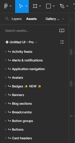
Untitled UI is not really a plugin but rather a design library. However, it serves the purpose of a plugin, as you can guess by the name “Untitled.” The components in the design file basically serve as a vanilla version of common components one might need in day-to-day designs. Need a notification component? Just search for it from the assets panel and then tweak it to your needs.
The key advantage of using a library like this is that all the details are preconfigured (from the font hierarchies to the elaborate, harmonious color sets). So, when you customize using Untitled’s components, our designs reach a polished state with less effort, particularly when you’re designing rapidly at scale.
The subtitle text on their website states, “Kickstart any project, save thousands of hours, and level up as a designer.” That’s exactly the value proposition, that every project doesn’t need to start from scratch.
This design library is so popular that it’s been adopted by well-known names in the design industry. The library is so rich, that they were able to put out a compelling free version. I’d go further to state that the paid version is better than getting a design marketplace subscription where you can download resources (which lack depth but seem to fit niche use cases):
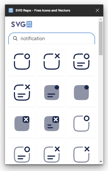
Most design projects need custom icons to fit niche use cases, and options like FlatIcon were compelling when they had more lenient free usage limits, but it’s impossible to resort to FlatIcon without a paid subscription these days. The other option is to source from various icon libraries, but then there’s the issue of not being able to match icon styling from multiple libraries.
SVGRepo is like an amalgamation of various libraries, but you can view them at a glance and make a decision of which one fits our needs versus individually searching each library. Best of all is that all icons are open licensed. SVGRepo fits most icon needs, but for rare scenarios where an icon you have in mind is more futuristic and uncommon, you can take inspiration from existing icons, combine icons, and customize the vector ourselves:
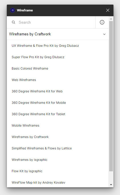
Wireframe is the best wireframing plugin out there because it compiles countless wireframe libraries into one. The other wireframe plugins are quite limited in comparison. This plugin is popular, with 479k users already using it:
Familiar Names is a delightful tool for replacing text with random people’s names from familiar 80’s shows. This is particularly helpful if you are bored of populating content constantly using the free limited version of the Content Reel plugin.
Next, we have plugins that help you generate your own custom assets. The aesthetics are largely the same for each generated asset because they cater to developing a certain look and feel, but the ability to customize these assets can allow you to achieve a unique look that’s different from other generated assets using the same tool.
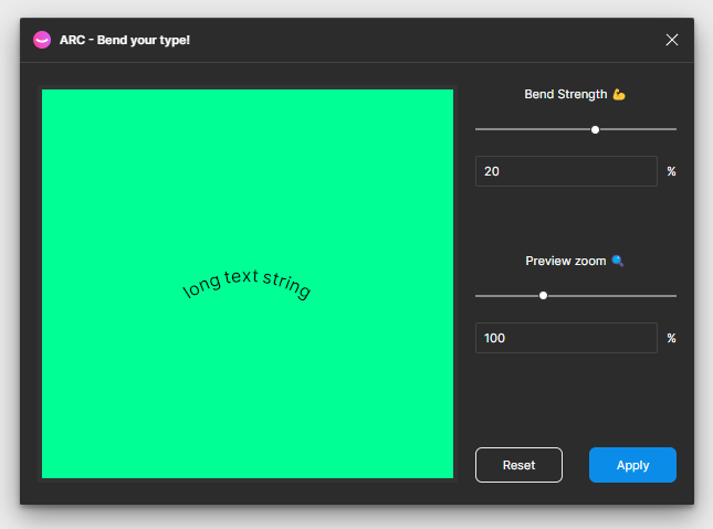
Arc is a niche tool to apply a curve to text layers in Figma. This is useful for achieving creative UI designs without having to resort to another design tool:
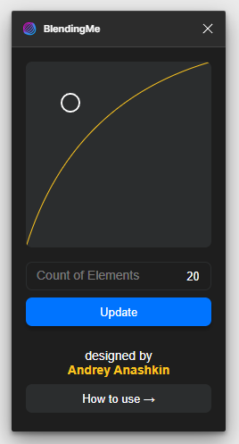
BlendingMe is a tool commonly used for creating background patterns. You simply create two objects of the same type and the plugin combines those objects into a single blended shape. Another alternative for creating custom backgrounds is PhotoRoom:
Noise & Texture can be considered a trendy plugin. Adding noise to containers or components is nothing new, but it achieves a certain look that sets the interface apart from other purely minimal designs and makes it feel more like a piece of art.
Generating noise is an inbuilt functionality in many age-old image and vector editors, but such functionality is not inbuilt in Figma. The scope in which noise and texture are used in UI design is still quite limited if we compare it to how it used to be used in other editors to add detail to image manipulations:
![]()
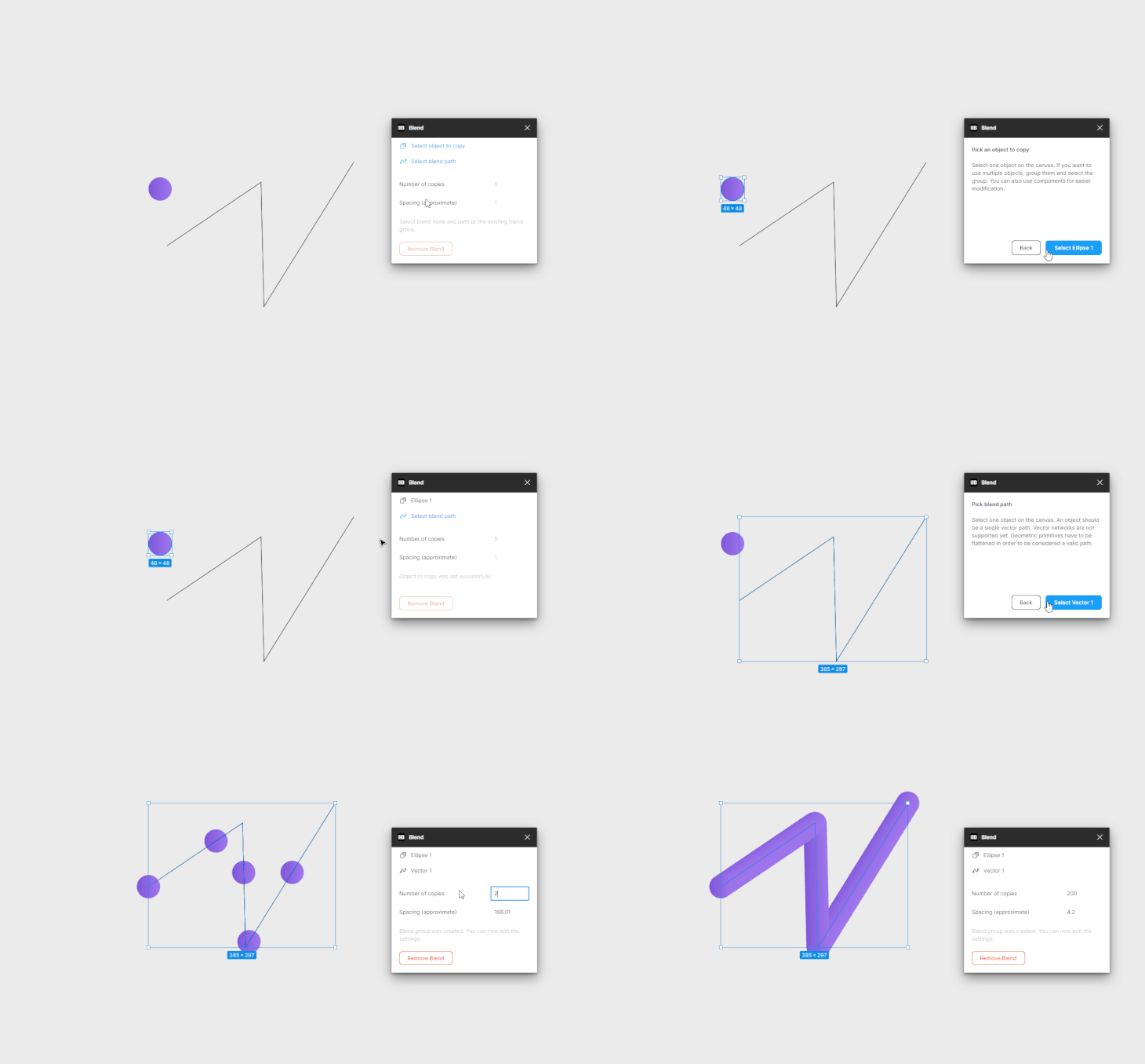
Blend is less popular but a true gem in the Figma community. With it, you can create custom 3D-style assets. We simply create a circle object with a gradient fill and select a path to repeat the circle fill to.
The resulting output is a 3D-looking asset. It’s not really a 3D model that we can customize after the fact, rather it requires some creative foresight or experimentation to achieve an artificial 3D look:
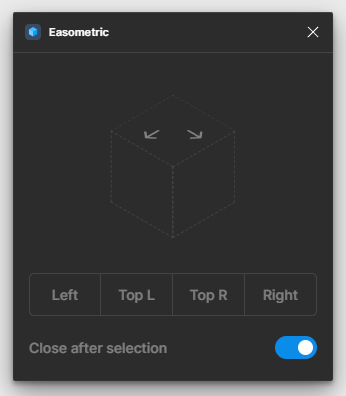
Easometric helps convert design elements into an isometric perspective of the original state. This is useful for achieving a 3D look or mocking up design presentations within Figma:
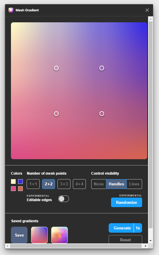
Mesh Gradient is a must-have tool for more advanced gradient functionality within Figma. The previous workflow for importing mesh gradients into Figma was to generate a mesh gradient on a third-party website, export it as a large high-quality image, and then import it into Figma.
The output of the Mesh Gradient plugin is the same non-editable image, but the generation of the gradient itself is within Figma and the interface of the plugin is quite user friendly:
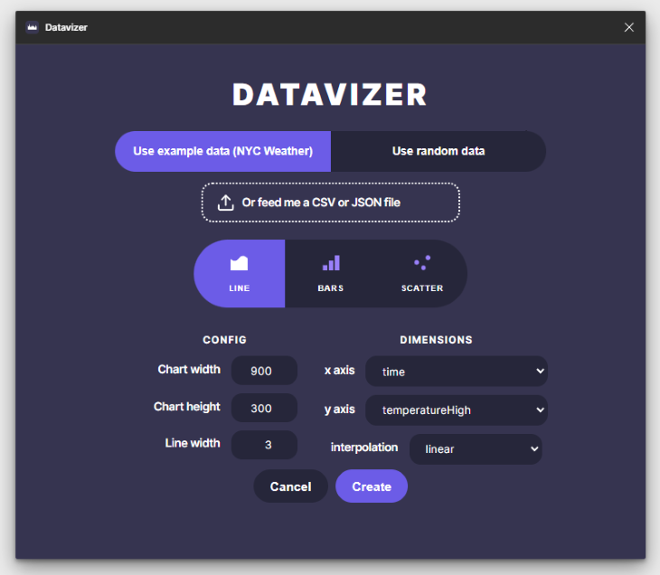
Datavizer is a straightforward graph generation tool. It has a limited number of options, but it’s handy when we need to do some light visualizations to get our design process started for data analytical UI elements. The graphs you generate can be further stylized easily. That’s the most beautiful aspect of the plugin, because it generates the graph without much decoration:
Copywriting can be quite an overlooked process in the UX design process. However, we have some plugins to facilitate some quick improvements to our otherwise ignored UX copy.
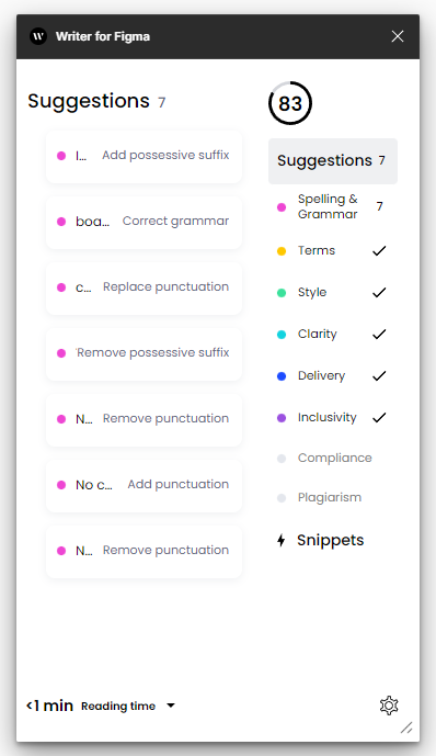
Writer for Figma is a Grammarly of sorts for Figma files. It checks for advanced aspects such as style, clarity, and inclusivity in the language used:
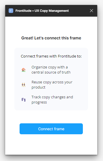
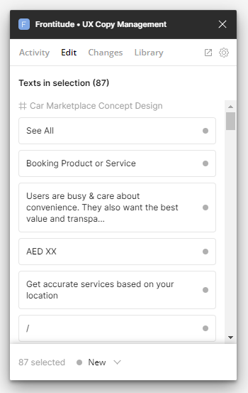
Frontitude is a UX copy management plugin. Simply selecting a frame that has the copy that we want to use consistently throughout the file, makes the copy available to us from within the plugin.
This plugin can be then paired with resources such as Microcopy to really up our microcopy game:
The productivity-focused plugins are the most sought-after and often gain in popularity quite easily if they provide sufficient value. We introduce you to some compelling ones below.
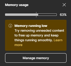
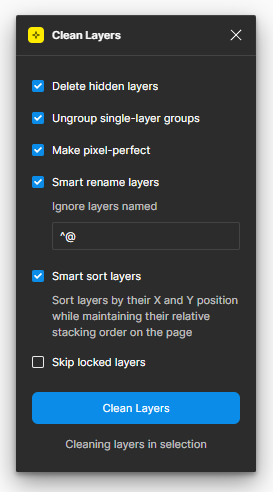
Clean Document is the ultimate tool for designers who run into the problem of large design files that go beyond the limitations of Figma’s active tab memory. The only downside is that you have to run the tool each time frame by frame, there is no way to apply the tool for the entire document in one go:
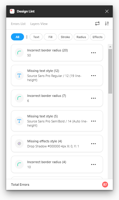
Design Lint finds properties in layers that don’t have any styles attached to them. This is useful for correcting errors in design files, to ensure consistency of styling throughout the file:
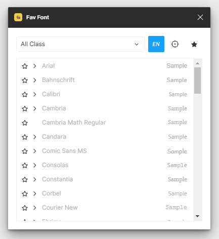
Fav Font allows us to favorite fonts that you like so you don’t have to recall from memory which fonts you discovered before as our preferences for certain fonts grow over time.
This really enables us to grow our design output over time as you gather resources that help us achieve our unique outcomes:
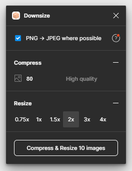
Downsize is a handy tool for compressing and resizing images from within Figma. This is helpful to ensure that design assets are developer-ready:
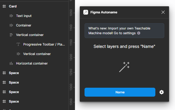
Figma Autoname is a free and open source AI-powered layer-naming tool. The plugin has all the adjectives to attract users in droves and I would be happy to recommend this plugin to anyone.
However, it is important to set expectations. The plugin really doesn’t read the contents within elements to use in the naming process. Instead, it names layers on the basis of what it represents, such as “vertical container,” “horizontal container,” and such:
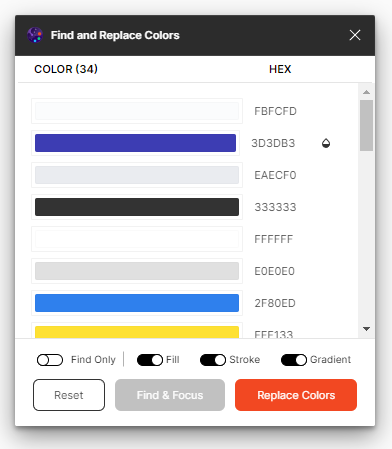
Find and Replace Colors helps us quickly replace colors in bulk. However, you have to select the frames you want to run the plugin on and then open the plugin, otherwise, it won’t show any results. It would’ve been wise of the developer to include that disclaimer to select a frame first before running the plugin on the empty screen:
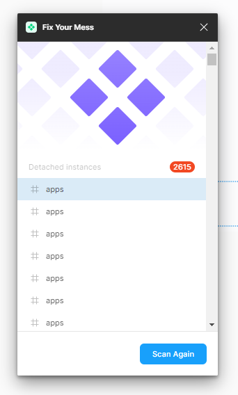
Fix Your Mess is the perfect tool for meticulous designers who like to manage a spotless file. The plugin scans the entire document to find detached instances in one go and then you can sort through the list of detached components and make amendments as needed. This tool is only helpful if you are actively maintaining a component library:
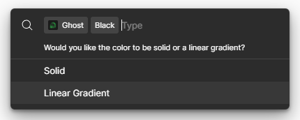
Ghost generates a skeleton wireframe of designs. This is useful for mocking up what skeleton loaders of designs would look like. However, the generated wireframe is not always aesthetic in my experience:
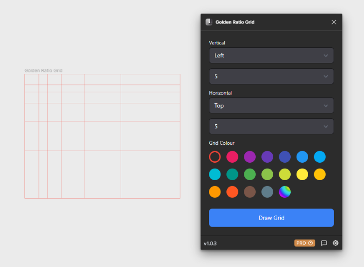
Golden Ratio Grid helps us quickly generate a grid using the principles of the golden ratio. This is particularly helpful in ensuring symmetry in our UI, si it’s proportionate and aesthetic:
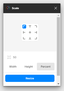
Scale is probably the best plugin on this list because this pain point is universal. Let’s say you have a component with editable vectors and objects inside; Figma doesn’t resize everything proportionately if you resize the parent component.
In order for Figma to rize everything proportionately, all child elements typically have to be turned into outlines or SVG, which is when they don’t retain their edit properties within Figma. Scale removes this pain point. You simply select the component and define the resize dimensions in the plugin.
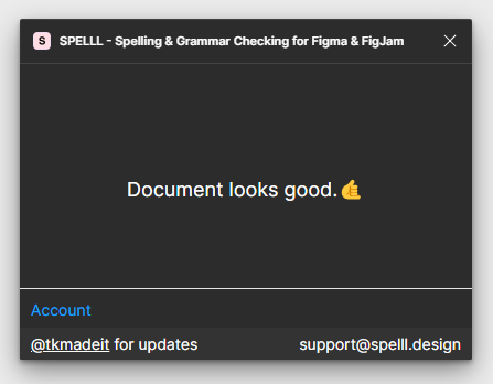
Spell helps us check spelling within Figma. Typing mistakes are bound to happen and Figmaa doesn’t have any inbuilt functionality to check spelling. Hence, a spell checker really helps ensure our work comes off as meticulous, professional, and well-revised:
Most designers care about documentation deeply since it helps communicate the value proposition to stakeholders and also ensures the design is implemented correctly. Here are some plugins to make that process smoother.
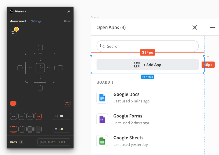
Measure is a must-have tool for anyone who wants to create design documentation. Simply select a layer you want to display measurements for and select the measurement attribute that you want to add.
This can redundant for developer handoff though, since Figma’s Dev Mode is quite handy and only getting better:
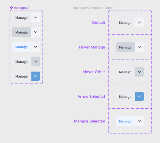
Propstar is useful for creating design system documentation for components. It creates a tabular format of all possible instances of a component:
Some of us designers need to start newer projects more frequently, which requires defining color palettes, typography, and other design library resources from scratch. There are plugins that can speed up this initial setup process:
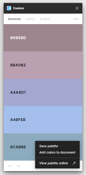
Coolors gained popularity as a color palette generation website, but this Figma plugin brings that power into Figma files. You can quickly generate a palette and add it to our file at the click of a button:
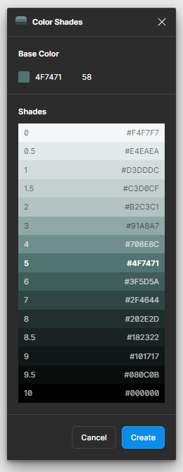
Color Shades complements the Coolors plugin above. Once you have a palette that you like, the color shades plugin helps you generate shades of that palette to use in various contexts:
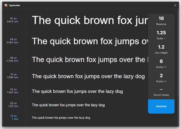
Typescales is a great plugin to quickly define font hierarchies for your design project. We simply have to define the base size and some other attributes and it generates the hierarchy based on our inputs. An alternative to this plugin is Font Scale:
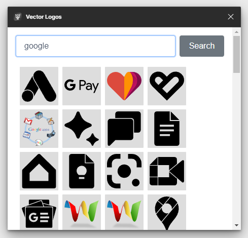
Vector Logos is a handy tool for quickly inserting SVG of popular logos. The great part about this plugin is the breadth of logos that this library covers. No more searching Google for an SVG logo and manually importing that into Figma:
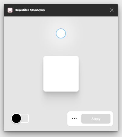
Beautiful Shadows helps us design shadows in a more visual manner rather than tweaking the settings from Figma properties. The plugin has a circle that we move around to define the shadow of the selected component:
Ensuring our designs are inclusive of all users is often an afterthought. These plugins can help facilitate accessibility as an ongoing part of the design process.
Contrast checker is the first tool that comes to mind to ensure your designs are visible across all device types of varying resolutions. This plugin generates a contrast report in bulk, which is helpful to get an idea at a glance. There are other popular alternatives that work slightly differently (they don’t check everything in bulk) such as this one and this one.
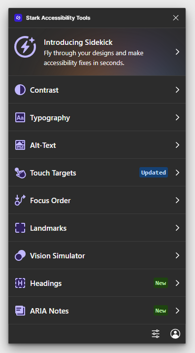
Stark Accessibility Tools is a more pro-grade plugin in that it includes more than just a contrast checker. It will help you make accessibility fixes for advanced issues such as touch targets:
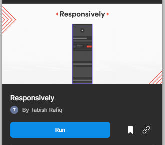
Responsively is a free alternative to the popular Breakpoints plugin. Similar to how Breakpoints works, you can create different sizes of your designs with auto layout applied to internal components. Then you select the various sizes and run the plugin. The resulting outcome is a master component that resizes responsively:
More important than any tool is the creativity of the designer. However, good things can sometimes result from aimless experimentation. Hopefully, these plugins will save time in crafting performant and delightful designs that are a joy to work with and maintain.
LogRocket's Galileo AI watches sessions and understands user feedback for you, automating the most time-intensive parts of your job and giving you more time to focus on great design.
See how design choices, interactions, and issues affect your users — get a demo of LogRocket today.

A three-week mobile banking project taught me that the “proper” UX process is not always realistic. Sometimes, the better approach is to work with what you know, identify what you still need to learn, and make the strongest decision possible under real constraints.

A/B testing compares two versions of a design to see which performs better with real users. Here’s how UX teams can use it to test hypotheses, measure outcomes, and make smarter product decisions.

This case study shows how one ad experience redesign increased total ad exposure while lowering perceived friction, proving that timing and context can matter more than raw interruption.

As products evolve into ecosystems, navigation becomes a system-level challenge. This article explores how to align structure, context, and user journeys to create seamless movement across tools without confusion.