Maybe you’ve been in this situation: Mariya is a fresh graduate who joins an electronics company as a UX researcher and designer, and she’s eager to receive her first assignment and demonstrate what she can bring to the table. She is invited to an early project kick-off meeting. These early conversations involve key stakeholders seeking to choreograph the path forward for product exploration and development, including assigning roles and responsibilities.
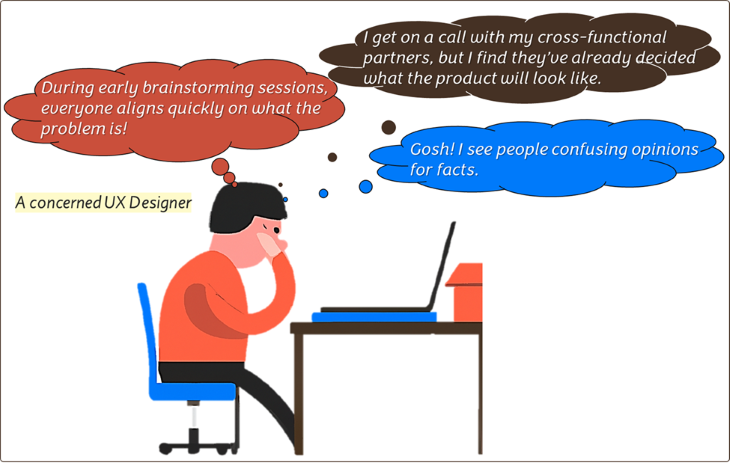
Twenty minutes into the meeting, another technical manager joins the call, and the next thing you know, the encounter derails into a debate about the superiority of technological solutions, what the product would look like, and its use cases. Mariya keeps quiet, listening to the big thinkers argue about things way above her pay grade.
This article teaches you how to troubleshoot UX design problems you may encounter during your practice. Think of it as a Hitchhiker’s Guide to UX Design. It aims to share a comprehensive, systemic assessment of critical problems and stumbling blocks hindering the delivery of useful, user-centered products.
With augmented awareness of these issues, I believe UX designers can better spot subtle red flags and symptoms of dysfunction and proactively counteract them. As you know, changing course and fixing issues further downstream may prove prohibitively expensive.
As an astute UX practitioner and observer, here are two good questions you may ask:
Think of early warning signs of dysfunction, but do not confuse those with behaviors integral to a healthy UX process. Characteristically, UX processes are not necessarily clean, highly defined, circumscribed, and sequenced as though they were run in a chemistry lab. UX design is a different beast; if you do not hear or see indices of chaos, lack of structure, serendipity, and improvisation, you’re right to be concerned that the process is less than healthy.
Now, let’s talk about some symptoms of dysfunction:
To visualize the problems attendant upon UX design, let me briefly introduce the Double Diamond Innovation Framework (DDIF). DDIF splits the innovation process into two consecutive and iterative spaces:
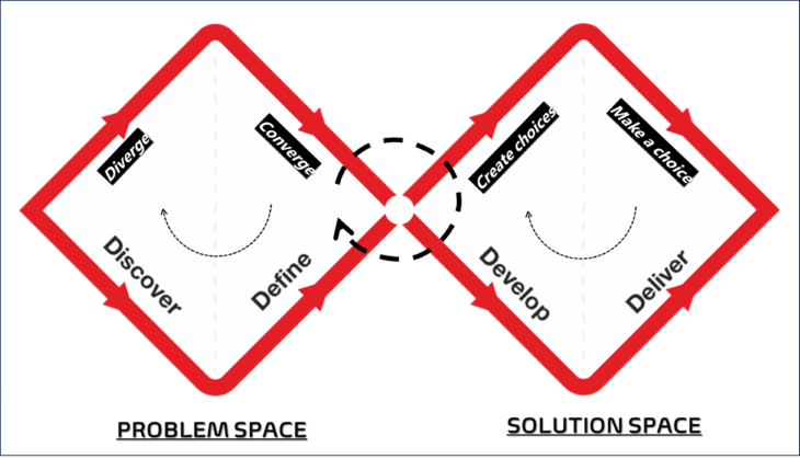
Two types of issues come to the spotlight:
Here, we’re going to catalog issues based on where in the process they are likely to occur, with user centricity as a core value. As you review the columns below, remember that some issues might apply to both the problem and solution spaces.
| Issues in the problem space | Issues in the solution space |
| Product teams do not follow a proper process for idea maturation due to a lack of awareness of adequate design processes | UX team surrounded by weak product leadership. Teams lack clear goals, milestones, vision, and strategy |
| “Budget, time, and resources limitations” squeeze the discovery process | Teams, including UX, move forward based on major, unproven, or invalidated assumptions |
| UX team overburdened by various teams’ expectations from the very start | Product teams do not view UX team input as critical throughout the development process |
| Technical teams decide on a path to a product in the absence of UX involvement | Product teams or individuals shut down new and novel ideas or solutions for fear of being confronted with the unexpected |
| UX team not well integrated into the product/team workflows | UX process and deliverables not mapped onto the product/software delivery roadmaps |
| Issues in the problem space | Issues in the solution space |
| Groupthink and conflict avoidance dampen divergent thinking by prioritizing social cohesion over accuracy | Lack of empirical research to validate assumptions; insufficient prototyping, testing, and iteration |
| UX team involves many functional partners; the process becomes chaotic and incoherent | UX team develops ideal solutions in isolation from other teams; no buy-in from key teams |
| Paralysis by analysis, indecision, fear of uncertainty, and failure | Idea fixation, delusional thinking, and personal biases |
| UX team efforts lack focus and prioritization | Feedback collected only from a few users |
So far, we’ve talked about symptoms of dysfunction and singled out issues arising at the problem and solutions spaces of the design process. As we seek to upgrade the UX designer’s toolbox, we must think in terms of first principles as they relate to UX design and apply them to the two central spaces: the problem and the solution:
“Don’t mistake movement for achievement. It’s easy to get faked out by being busy. The question is: busy doing what?” – Jim Rohn
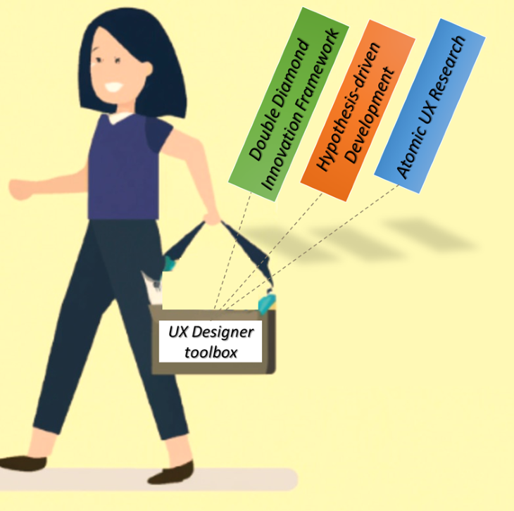
You might have heard of the movie titled The Hitchhiker’s Guide to the Galaxy. I have used this movie as a metaphor to suggest that navigating UX design feels like a grand adventure into a complex stratosphere.
The gist of this journey is that different types of challenges and hurdles can derail a project. With the arsenal laid out in this troubleshooter’s guide to UX Design comprising the problem space and solution space, we are in a position to identify these hurdles and address them head-on. In doing so, our first principle is and will remain user centricity.
The symptoms of dysfunction I have explored constitute early warning signals, prompting us to reconsider our designs and strategies. As we adopt a systematic overview of the underlying issues, we can pinpoint which project management challenges stand in the way of successful UX experiences. Likewise, UX team dynamics underscore the value of managing expectations, agreeing on priorities, being clear about roles and responsibilities, building consensus, and ensuring relevant voices are heard, not dismissed.

In the grand scheme of things, the issues we surmount and the solutions we implement nudge us toward creating better experiences for users and a more agreeable ecosystem for individuals and teams working within and across the organization. It is reasonable to suggest that future approaches to UX design should continue to centralize the human user but should not lose sight of the experiences of those designing the experience.
LogRocket's Galileo AI watches sessions and understands user feedback for you, automating the most time-intensive parts of your job and giving you more time to focus on great design.
See how design choices, interactions, and issues affect your users — get a demo of LogRocket today.
A three-week mobile banking project taught me that the “proper” UX process is not always realistic. Sometimes, the better approach is to work with what you know, identify what you still need to learn, and make the strongest decision possible under real constraints.
A/B testing compares two versions of a design to see which performs better with real users. Here’s how UX teams can use it to test hypotheses, measure outcomes, and make smarter product decisions.
This case study shows how one ad experience redesign increased total ad exposure while lowering perceived friction, proving that timing and context can matter more than raw interruption.

As products evolve into ecosystems, navigation becomes a system-level challenge. This article explores how to align structure, context, and user journeys to create seamless movement across tools without confusion.