border-radius to make shapes
We, as web-developers, spend a lot of time working with CSS and styling.

Whether it’s a simple website or a complex application, we need a good grasp of CSS to make it truly exceptional.
It’s not always as simple as it seems at first glance, and some tasks are quite complex.
However, if you have the right skills, you can come up with solutions to these problems relatively easily.
Practice is the best way to gain these skills, and that’s what we’re going to do today.
We’ll build a flower that may be a good decoration for your website, and we’ll also allow you to learn more about positioning elements, CSS variables, animation, and tightening it all up together.
Click here to check out CodePen.
For this tutorial, we’ll only need two files: index.html to hold our flower structure, and style.css to style it accordingly.
Let’s get going and create a flower structure.
It’ll have a head with eyes and a nose (our flower will be a bit unusual), a stem, two leaves coming from both sides, and a pot.
Let’s add it:
<div class="flower">

  <div class="flower__head">
    <div class="flower__eye left">
      <span></span>
    </div>
    <div class="flower__nose"></div>
    <div class="flower__eye right">
      <span></span>
    </div>
  </div>

  <div class="flower__leaf"></div>
  <div class="flower__leaf--shadow">
  </div>
  <div class="flower__leaf oposite"></div>
  <div class="flower__leaf--shadow oposite"></div>

  <div class="flower__stem"></div>

  <div class="flower__pot">
    <div class="flower__pot--shadow"></div>
    <div class="flower__pot--bottom"></div>
  </div>
</div>
As you can see, the structure is pretty straightforward and readable because we gave descriptive class names to our elements. Later, it will be really easy to style them.
That’s it for our structure, so let’s move on to the best part: making a flower from the bunch of divs we’ve got here.
We’re going to have 6 main colors that we’ll use in our flower. Best practice is to create variables for each of them. This will allow us to use them easily.

The Replay is a weekly newsletter for dev and engineering leaders.
Delivered once a week, it's your curated guide to the most important conversations around frontend dev, emerging AI tools, and the state of modern software.
 Learn more →
To do so, we’ll use CSS variables. We will declare them at the root of our document, so place this on top of your CSS file.
We will also name them according to the corresponding parts of our flower:
:root {
  --main-flower: #517bd6;
  --nose: #ffc0cb;
  --stem: #51d691;
  --pot: #FF7043;
  --pot-shadow: #d66f51;
}
Of course, feel free to customize the colors any way you want.
Now, let’s start with the flower itself. It will have position: relative, so later we can position our elements relative to it.
You’ll see it soon.
.flower {
  position: relative;
}
The next step is to create a flower head.
First we’ll create the main part of it, and then, using pseudo-elements, we’ll repeat the same styles and change the position of the pseudo-elements by rotating them:
.flower__head {
  width: 120px;
  height: 40px;
  border-radius: 20px;
  background: var(--main-flower);
  margin-top: 50px;
}

.flower__head::after, .flower__head::before {
  content: '';
  position: absolute;
  background: var(--main-flower);
  border-radius: 20px;
  width: 120px;
  height: 40px;
  transform: rotate(60deg);
}

.flower__head::before {
  transform: rotate(-60deg);
}

Take a look at how we used our variables here — a perfect use case. We don’t have to write a color each time, and if you decide to change it in the future, you’ll only need to do it in place.
As you can see, the logic is pretty straightforward. We just go from top to bottom and create elements one after the other, position them, and we’re good to go.
Add this code to create the eyes:
.flower__eye {
  position: absolute;
  width: 20px;
  height: 20px;
  z-index: 1;
  background: #fff;
  border-radius: 50%;
}
.flower__eye.left {
  left: 30%;
}
.flower__eye.right {
  left: 55%;
}
.flower__eye span {
  position: absolute;
  width: 10px;
  height: 10px;
  margin-left: 5px;
  margin-top: 5px;
  background: black;
  border-radius: 50%;
}

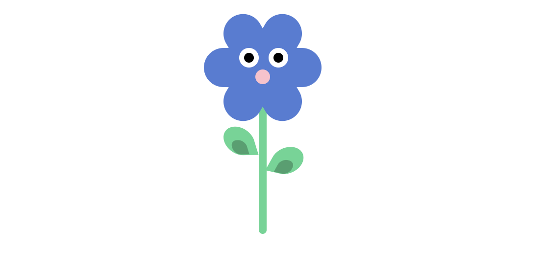
Just look at this cutie!
There’s nothing complicated here. We set width, height, and z-index so our eyes are on top. We also round the corners and add a white background. Then, we positioned each of the eyes and did a similar thing with the eyeballs. Nice and easy.
Same thing with the nose. The styling looks very similar to our eyes:
.flower__nose {
  position: absolute;
  left: 50%;
  transform: translateX(-50%);
  top: 80%;
  width: 15px;
  height: 15px;
  z-index: 1;
  background: var(--nose);
  border-radius: 50%;
}
There is a cool coding trick here for how to center elements if you have them positioned absolutely:
left: 50%;
transform: translateX(-50%);
It will move the element to the left by 50 percent. However, it won’t consider the width of the element itself. To move it back by its width, we’ll use transform(translateX(-50%)).
That will do the trick. You can also do the same with top property: just remember to change translate property to translateY.

The styling for the stem looks like this:
.flower__stem {
  position: absolute;
  height: 150px;
  width: 8px;
  background: var(--stem);
  border-radius: 4px;
  left: 50%;
  transform: translateX(-50%);
  z-index: -1;
}
We also do the trick to center the stem. Here, we set z-index to -1 because we want the top of the stem to be covered by the flower head.
Now, let’s get to the leaves.
First, we need to create the shape of our leaves. To do this, we’ll need some transformation to happen. We will use them for both the leaves themselves and for their shadows, so I moved them to variables:
--transform-leaves-left: rotate(-283deg) skewX(-12deg)  skewY(-4deg);
--transform-leaves-right: rotate(-163deg) skewX(-12deg) skewY(-4deg);
Here is a great article about all transform properties. There is no magic here at all.
However, there is one interesting thing to note: the transform functions are multiplied in order from left to right, meaning that composite transforms are effectively applied in order from right to left.
The next step is to add styling to the leaves and their shadows:
.flower__leaf {
  width: 30px;
  height: 30px;
  background: var(--stem);
  position: absolute;
  top: 130px;
  left: 21px;
  border-radius: 50px;
  border-top-right-radius: 0;
  transform: var(--transform-leaves-left);
}
.flower__leaf--shadow {
  position: absolute;
  background: rgba(0, 0, 0, 0.25);
  height: 15px;
  width: 15px;
  top: 144px;
  left: 29px;
  border-radius: 50px;
  border-top-right-radius: 0;
  transform: var(--transform-leaves-left);
}
.flower__leaf--shadow.oposite {
  top: 164px;
  left: 75px;
  transform: var(--transform-leaves-right);
}
.flower__leaf.oposite {
  top: 150px;
  left: 70px;
  transform: var(--transform-leaves-right);
}
The only thing that might seem unusual here is that we’ve set border-top-right-radius.
To recreate a flower shape, we’ll use this property to set the top right radius, as its name says. You can set the radius for each corner separately.
So far so good, but the flower should be stored somewhere, so let’s build a pot for it.
The pot will consist of three layers: the top layer, the shadow layer, and the bottom layer. Let’s write the code for each of them:
.flower__pot {
  width: 100px;
  height: 20px;
  background-color: var(--pot);
  position: absolute;
  top: 190px;
  left: 50%;
  transform: translateX(-50%);
}
Next, we’ll add the shadow layer underneath it:
.flower__pot--shadow {
      width: 72px;
      position: absolute;
      border-left: 5px solid transparent;
      border-right: 5px solid transparent;
      border-top: 10px solid var(--pot-shadow);
      top: 20px;
      left: 50%;
      transform: translateX(-50%);
    }
Our shadow layer is set inside the pot div, so we set its position relative to it. That’s why top: 20px
works well for us.
Also, to make the pot shape, we can use the trick with setting left and right borders to transparent, so we can have kind of cut corners.
The last thing to add is the bottom part of the pot:
.flower__pot--bottom {
  width: 50px;
  height: 0px;
  position: absolute;
  border-left: 15px solid transparent;
  border-right: 15px solid transparent;
  border-top: 50px solid var(--pot);
  top: 20px;
  z-index: -1;
  left: 50%;
  transform: translateX(-50%);
}
This one should be pretty straightforward, since it uses all the tricks we used before. Let’s see what we’ve got:
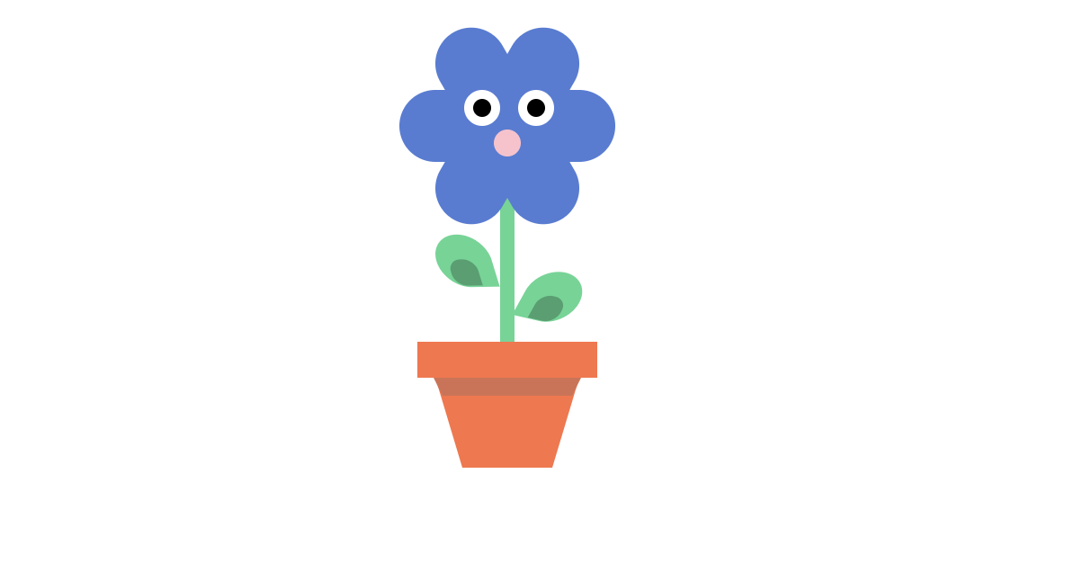
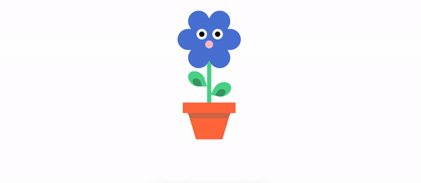
Here we go: our funny flower in a pot is ready.
Let’s make our flower look more alive. To do so, we’ll make it blink.
Let’s add the keyframes and set the animation, which I called blink:
@keyframes blink {
  0%, 100% {
    transform: scale(1, 0.05);
  }
  5%, 95% {
    transform: scale(1, 1);
  }
}
As you can see, we only change the scale property, and that’s it.
Now you just need to add it to our eyes div and enjoy the result:
.flower__eye {
  position: absolute;
  width: 20px;
  height: 20px;
  z-index: 1;
  background: #fff;
  border-radius: 50%;
  animation: blink 3s infinite; // animation added
}
If you look at all the code at once, it might seem pretty complex. However, when you break it down into smaller parts, you can see it’s all very simple.
Try to recreate one yourself and see how you get better in fundamentals by doing simple things.
Play around with it, change the colors, change the shapes, and post your flowers in the comments.
As web frontends get increasingly complex, resource-greedy features demand more and more from the browser. If you’re interested in monitoring and tracking client-side CPU usage, memory usage, and more for all of your users in production, try LogRocket.

LogRocket lets you replay user sessions, eliminating guesswork around why bugs happen by showing exactly what users experienced. It captures console logs, errors, network requests, and pixel-perfect DOM recordings — compatible with all frameworks.
LogRocket's Galileo AI watches sessions for you, instantly identifying and explaining user struggles with automated monitoring of your entire product experience.
Modernize how you debug web and mobile apps — start monitoring for free.

Build dynamic LLM routing in Next.js with OpenRouter, TanStack AI, task classification, model fallbacks, and cost-aware routing.

TSRX adds first-class control flow, conditional hooks, and scoped styles to React via a TypeScript compiler extension — no new framework required.

Learn how to build a full React Native auth system using Better Auth and Expo — with email/password login, Google OAuth, session persistence, and protected routes.

Compare the top AI development tools and models of June 2026. View updated rankings, feature breakdowns, and find the best fit for you.
Would you be interested in joining LogRocket's developer community?
Join LogRocket’s Content Advisory Board. You’ll help inform the type of content we create and get access to exclusive meetups, social accreditation, and swag.
Sign up now

