
Ionic Framework is an open source UI toolkit for building performant, high-quality mobile and desktop apps using web technologies (HTML, CSS, JavaScript). It can be used with vanilla JavaScript and it has integrations for popular frameworks, including Angular and React, with Vue support on the way.
Ionic components adapt their look and behavior based on the platform the app is running on. This allows developers to build apps that use the same codebase for multiple platforms, while still looking “native” to those particular platforms. Although the components are built to match their native counterparts, the default styles can be easily customized and themed since the framework is built with CSS.
In this tutorial, we’ll go over how to theme an Ionic Framework app to match a specific color scheme and customize the styling on individual components.
If you’d like to follow along with the finished project, the source code is available here.
The Replay is a weekly newsletter for dev and engineering leaders.
Delivered once a week, it's your curated guide to the most important conversations around frontend dev, emerging AI tools, and the state of modern software.
In order to follow this tutorial, you will need:
Starting a new Ionic Framework app can be done entirely by the Ionic CLI or by using the Start Wizard with the CLI, but an account is required for the latter.
For this tutorial we’ll be using only the Ionic CLI. To install it, open a terminal and run the following command:
npm install -g @ionic/cli
If you have previously installed an older version or run into permission errors, take a look at the CLI installation to resolve them.
The Ionic CLI has several commands that make starting and previewing an app quick and easy. To create an Ionic app, we’ll run the CLI’s start command in the terminal.
I created a starter project using Angular for this tutorial that we will be using as the template instead of one of the Ionic starters. This project was created using the Ionic tabs starter and modified to include more components in order to keep the focus on theming in this tutorial. Start by navigating to the directory you want the app to be located, and then run the following command:
ionic start "Custom Theming" https://github.com/brandyscarney/log-rocket-theming
If you were to run
ionic startwithout any arguments it would prompt you to enter in an app name, choose a framework, and pick a starter template (tabs,sidemenu,blank, etc.). We’re bypassing this prompt by passing in arguments, but you can see all of the available options in the Ionic start documentation.
Once the start command has finished, we can navigate into the app directory by running the following command:
cd ./custom-theming
To preview the app in a browser, run the following:
ionic serve --lab
A window should open in your preferred browser at the URL http://localhost:8200 displaying two device previews side by side: iOS and Android.
If you’d prefer to only see one at a time, the
servecommand can be run without the--labflag, or you can navigate to http://localhost:8100/.Doing so would require you to enable responsive device mode to easily switch between the different modes in a browser.
The app consists of three tab pages. Tab 1 contains some cards and a button in the upper right to display an alert. Tab 2 consists of multiple lists with different components inside of each item. Tab 3 includes many text examples showing off the different Ionic colors.
Ionic Framework is built using Web Components and can be styled using CSS. In addition to using CSS, many components can be styled using CSS Custom Properties (Variables) and CSS Shadow Parts.
CSS Custom Properties allow a value to be stored in one place, then referenced in multiple other places. They also make it possible to change CSS dynamically at runtime which comes in handy when providing dynamic themes in an app. In Ionic Framework, CSS Custom Properties are provided at the component-level for customizing individual components and globally in order to quickly theme an entire app.
Ionic Framework provides a Guide to CSS Custom Properties for additional information.
CSS shadow parts allow developers to style CSS properties on an element inside of a shadow tree. A part is added to an element inside of a shadow tree and then it can be styled using CSS. It’s important to note that shadow parts are only exposed on components which are Shadow DOM components.
We’ll go over more on the different components Ionic Framework has a bit later.
For more information, check out the CSS shadow parts guide by Ionic Framework.
Ionic Framework is built to be customized to fit your theme or brand. In order to achieve this there are global CSS Custom Properties that can be used to change the application colors and default Ionic colors.
We’ll start by applying a custom theme to our app. The Ionic documentation has a Stepped Color Generator that I’ll be using to generate the variables for the background and text color of the app. I am using #1e2b33 for the background color and #ffffff for the text color.
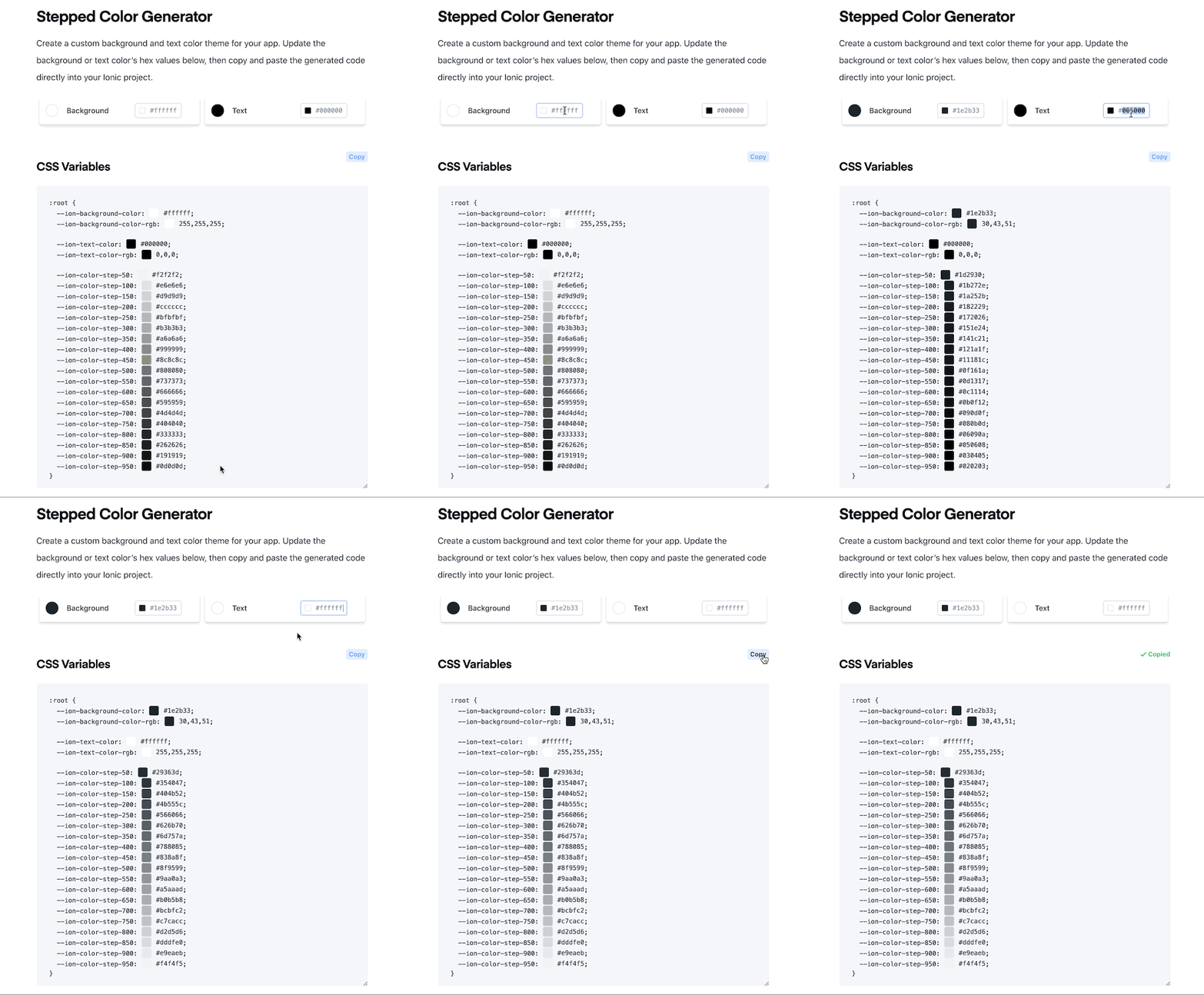
After using the generator, we need to open up the src/theme/variables.scss file to paste the code in. Update the :root selector to add the generated code:
:root {
  --ion-background-color: #1e2b33;
  --ion-background-color-rgb: 30,43,51;

  --ion-text-color: #ffffff;
  --ion-text-color-rgb: 255,255,255;

  --ion-color-step-50: #29363d;
  --ion-color-step-100: #354047;
  --ion-color-step-150: #404b52;
  --ion-color-step-200: #4b555c;
  --ion-color-step-250: #566066;
  --ion-color-step-300: #626b70;
  --ion-color-step-350: #6d757a;
  --ion-color-step-400: #788085;
  --ion-color-step-450: #838a8f;
  --ion-color-step-500: #8f9599;
  --ion-color-step-550: #9aa0a3;
  --ion-color-step-600: #a5aaad;
  --ion-color-step-650: #b0b5b8;
  --ion-color-step-700: #bcbfc2;
  --ion-color-step-750: #c7cacc;
  --ion-color-step-800: #d2d5d6;
  --ion-color-step-850: #dddfe0;
  --ion-color-step-900: #e9eaeb;
  --ion-color-step-950: #f4f4f5;
}
You may notice the background and text variables have extra
-rgbvariables. Ionic Framework uses the background/text colors with an opacity (alpha) in several components. In order for this to work, those properties must also be provided in RGB format without the wrappingrgb().
To read more on this, see the advanced theming documentation.
The stepped colors start at the background color value and mix with the text color value using an increasing percentage. These are used throughout the Ionic Framework components and must be defined, otherwise the app will show incorrect border and text colors, for example, in multiple places.
The app should look pretty good at this point, but we can take it a step further by adding the card background variable set to a stepped color:
:root {
  /* previous variables from the generator */

  --ion-card-background: var(--ion-color-step-50);
}
After doing this, the list in the second card on the first tab is still showing as the background color. We can also modify the item colors. However, since there are items on the second tab which should match the background color, we can modify the items on just the first tab.
Global variables can be set on the root selector, but they can also be set per page. Open up the src/app/tab1/tab1.page.scss and include the following CSS:
:host {
  --ion-item-background: var(--ion-card-background);
}
By setting the items on this page to use the --ion-card-background variable, we can update the main theme and it will automatically update with it.
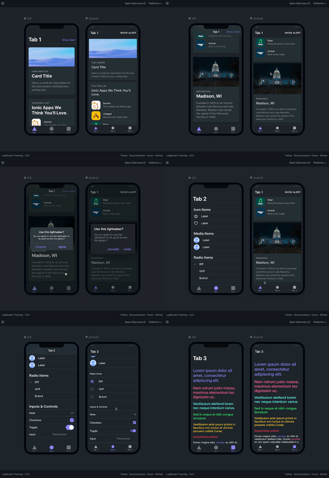
At this point, your app should look like this.
Ionic provides several other application colors if you want to play around with changing specific components globally.
Ionic has nine default colors that are meant to be customized. The primary color is used in several Ionic components, and the other colors can be set on many components using the color property.
Each color is a collection of multiple properties, including a shade and tint. We can use the Color Generator to create a custom palette.
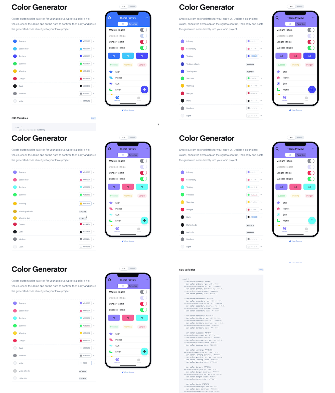
You’re more than welcome to create your own colors here, or you can copy and paste what I generated at the beginning of the :root selector in src/theme/variables.scss:
:root {
  --ion-color-primary: #9a95ff;
  --ion-color-primary-rgb: 154,149,255;
  --ion-color-primary-contrast: #000000;
  --ion-color-primary-contrast-rgb: 0,0,0;
  --ion-color-primary-shade: #8883e0;
  --ion-color-primary-tint: #a4a0ff;

  --ion-color-secondary: #ff7c9f;
  --ion-color-secondary-rgb: 255,124,159;
  --ion-color-secondary-contrast: #000000;
  --ion-color-secondary-contrast-rgb: 0,0,0;
  --ion-color-secondary-shade: #e06d8c;
  --ion-color-secondary-tint: #ff89a9;

  --ion-color-tertiary: #66f2f8;
  --ion-color-tertiary-rgb: 102,242,248;
  --ion-color-tertiary-contrast: #000000;
  --ion-color-tertiary-contrast-rgb: 0,0,0;
  --ion-color-tertiary-shade: #5ad5da;
  --ion-color-tertiary-tint: #75f3f9;

  --ion-color-success: #2fdf75;
  --ion-color-success-rgb: 47,223,117;
  --ion-color-success-contrast: #000000;
  --ion-color-success-contrast-rgb: 0,0,0;
  --ion-color-success-shade: #29c467;
  --ion-color-success-tint: #44e283;

  --ion-color-warning: #ffd534;
  --ion-color-warning-rgb: 255,213,52;
  --ion-color-warning-contrast: #000000;
  --ion-color-warning-contrast-rgb: 0,0,0;
  --ion-color-warning-shade: #e0bb2e;
  --ion-color-warning-tint: #ffd948;

  --ion-color-danger: #ff4961;
  --ion-color-danger-rgb: 255,73,97;
  --ion-color-danger-contrast: #000000;
  --ion-color-danger-contrast-rgb: 0,0,0;
  --ion-color-danger-shade: #e04055;
  --ion-color-danger-tint: #ff5b71;

  --ion-color-dark: #f4f5f8;
  --ion-color-dark-rgb: 244,245,248;
  --ion-color-dark-contrast: #000000;
  --ion-color-dark-contrast-rgb: 0,0,0;
  --ion-color-dark-shade: #d7d8da;
  --ion-color-dark-tint: #f5f6f9;

  --ion-color-medium: #989aa2;
  --ion-color-medium-rgb: 152,154,162;
  --ion-color-medium-contrast: #000000;
  --ion-color-medium-contrast-rgb: 0,0,0;
  --ion-color-medium-shade: #86888f;
  --ion-color-medium-tint: #a2a4ab;

  --ion-color-light: #222428;
  --ion-color-light-rgb: 34,36,40;
  --ion-color-light-contrast: #ffffff;
  --ion-color-light-contrast-rgb: 255,255,255;
  --ion-color-light-shade: #1e2023;
  --ion-color-light-tint: #383a3e;

  /* previous theming variables should be here */
}
Your app will now use a shade of purple for the primary color. You can see the primary color change on the tab button colors. On the first tab, the button in the toolbar on iOS has changed. The second tab shows the color change in many of the input controls. The third tab shows a change in all of the colors, although it is subtle in some cases.
These colors can all be changed to fit the branding of your app, and additional colors can also be added.
Ionic Framework has three different types of components: Light DOM, Shadow DOM, and Scoped components. It’s important to know which one you’re styling to determine how to apply CSS. Each component is listed in the Components documentation.
If the component has a “Shadow” badge, it’s a Shadow DOM component. If it has a “Scoped” badge, it’s a scoped component. Otherwise, if there is no badge, it’s a light DOM component. The image below shows the three different types.

Light DOM
Light DOM components have no encapsulation and do not render any inner elements. When adding a Light DOM component, you can style the component directly using CSS.
Shadow DOM
Shadow DOM is a native browser solution for DOM and style encapsulation of a component. It shields the component from its surrounding environment, preventing styles from leaking in or out of the component. To style internal elements of a Shadow DOM component you must use CSS Custom Properties or CSS Shadow Parts.
Scoped
A component that uses scoped encapsulation will automatically scope its CSS by appending each of the styles with a data attribute at run time. Overriding scoped selectors in CSS requires a higher specificity selector. Scoped components can also be styled using CSS Custom Properties.
Alert is a Scoped component, which means we can customize the host element and its inner elements using CSS and CSS Custom Properties (Variables). All of the CSS Variables that can be styled can be found in the alert documentation.
Scoped components have higher specificity selectors compared to Light DOM and Shadow DOM components. Due to this we have assigned a cssClass upon creation of the alert. The cssClass was passed in with a value of themed-alert in src/app/tab1/tab1.page.ts. We can use this themed-alert class in order to take a higher precedence over the Ionic styles. The same could be achieved by using !important to override the styles but we generally try to avoid using it.
All Ionic Framework overlay components (Alert, Action Sheet, Popover, etc.) are appended to the main ion-app component. Since Angular pages are scoped, we need to style the Alert at a global level, outside of the page we’re viewing it on.
Open the src/global.scss file and add the following CSS to the end:
.themed-alert {
  --backdrop-opacity: .5;
}
This will set the backdrop opacity to be a little less opaque. We can take it a step further by adding a rule that modifies the button color to use the same color as the app text color, instead of the primary color:
/* This will show as #ffffff, or white */
.themed-alert .alert-button {
  color: var(--ion-text-color);
}
At this point your alert should look like this:
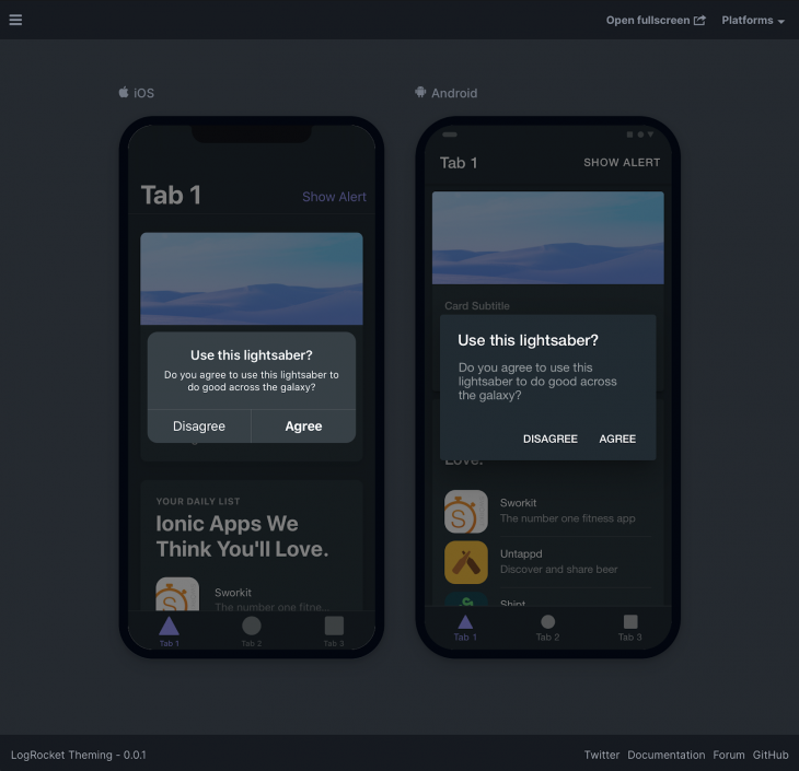
As you can see, you can customize any part of an alert, but it does require inspecting the element to find out which classes you need to style.
Toggle is a Shadow DOM component which exposes CSS Shadow Parts and CSS Variables to be used for styling.
I’m going to be using CSS Shadow Parts to show how to customize a Toggle, but it’s important that this is previewed in a supported browser in order to see the end result properly.
Navigate to Tab 2 and scroll to the bottom to see the toggle. Inside of src/app/tab2/tab2.page.css paste the following CSS at the end:
ion-toggle::part(track) {
  background: var(--ion-color-step-150);
}

ion-toggle.toggle-checked::part(track) {
  background: rgb(var(--ion-color-success-rgb), 0.5);
}

ion-toggle::part(handle) {
  background: #ffffff;
}
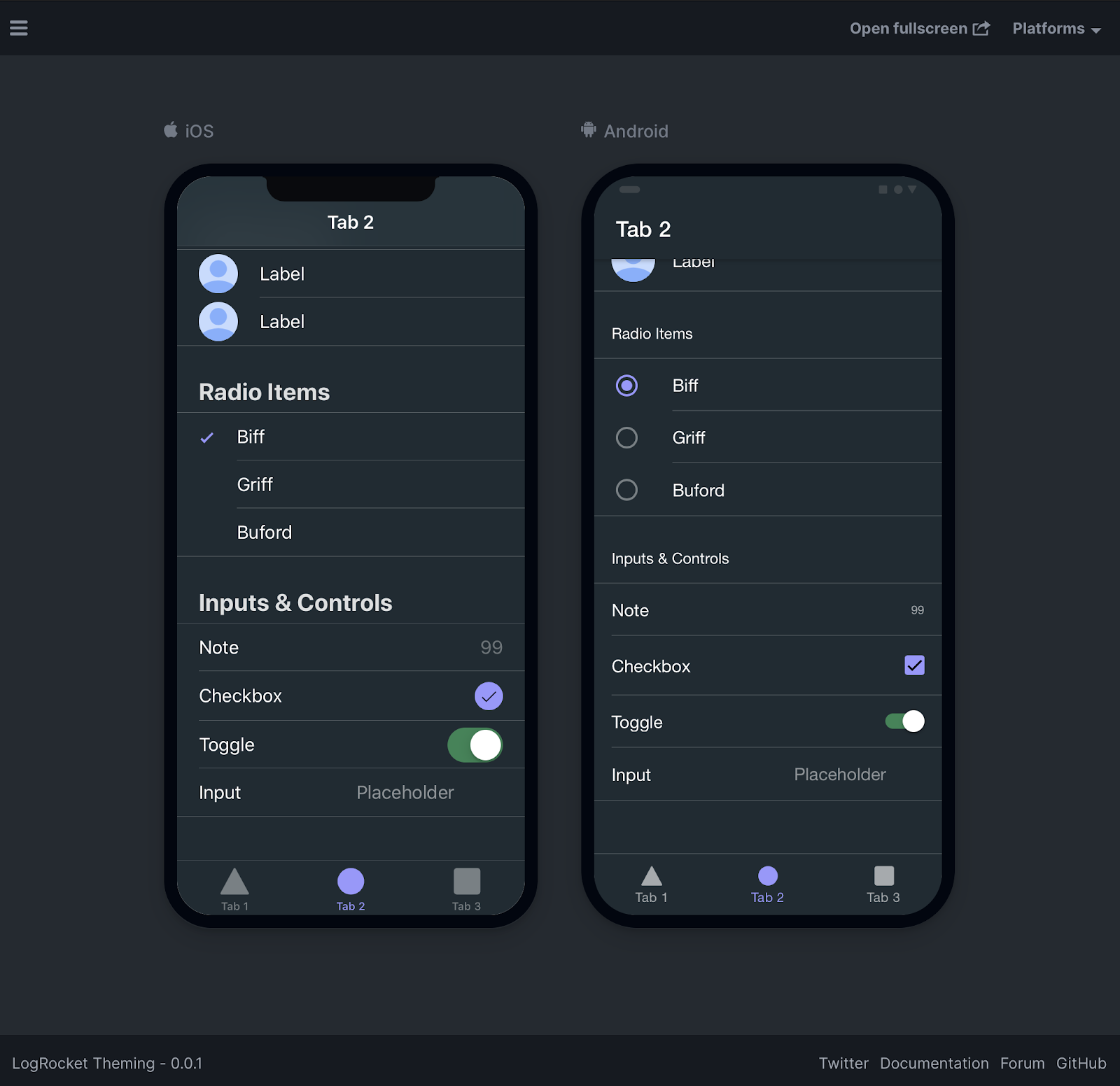
There are a few things happening so let’s break it down. First, we’re updating the background of the toggle track to use a step of the background color, which we defined earlier on in this tutorial. Then, we’re changing the track background when the toggle is checked to use an opaque version of the success color that we also changed earlier. After that we change the handle color to use #ffffff, or white. The first two background values could be hardcoded, but using CSS variables is really nice when you change themes.
We only modified the colors of the Toggle, however, by using CSS Shadow Parts any property of these elements can be changed. We could change the height, width, border-radius and more.
I have a Codepen with more examples of changing the Ionic Framework Toggle using only CSS and CSS Variables.
Here’s how the final Toggle should look:
We have gone over the basics of theming and customizing in Ionic Framework. There is still so much more that you can do! The theme can be changed dynamically by the user by applying the global variables to a class. The components can be customized further to modify their look including their sizes. Some things I recommend after this:
If you have questions about this or would like to show off some themes you’ve designed, please reach out to me on Twitter!
Install LogRocket via npm or script tag. LogRocket.init() must be called client-side, not
server-side
$ npm i --save logrocket

// Code:

import LogRocket from 'logrocket';
LogRocket.init('app/id');
// Add to your HTML:

<script src="https://cdn.lr-ingest.com/LogRocket.min.js"></script>
<script>window.LogRocket && window.LogRocket.init('app/id');</script>

useEffect breaks AI streaming responses in ReactSee why useEffect breaks AI streaming in React, and how moving stream state outside React fixes flicker and stale updates.

A real-world debugging session using Claude to solve a tricky Next.js UI bug, exploring how AI helps, where it struggles, and what actually fixed the issue.

CSS wasn’t built for dynamic UIs. Pretext flips the model by measuring text before rendering, enabling accurate layouts, faster performance, and better control in React apps.

Why do real-time frontends break at scale? Learn how event-driven patterns reduce drift, race conditions, and inconsistent UI state.
Hey there, want to help make our blog better?
Join LogRocket’s Content Advisory Board. You’ll help inform the type of content we create and get access to exclusive meetups, social accreditation, and swag.
Sign up now