A tooltip is a textbox that appears while your cursor hovers over an element in an application and is useful for displaying additional information that a user may need.
Tippy.js is a lightweight, easy-to-use library that provides tooltip solutions, as well as other pop-out style GUI tools. Tippyjs-react is a component of the Tippy library that allows developers to integrate tooltips, popovers, dropdown menus, and other elements in React projects.
This tutorial will show you how to create and position tooltips in a React project using Tippy.
First, make sure you install React 16.8+, Node.js, and either npm or Yarn before getting started. To make the most out of this guide, we recommend that you have some familiarity with:
Install tippyjs-react by running one of the following commands from the command line:
npm i @tippyjs/react
//OR
yarn add @tippyjs/react
Open or create a React project with a class and the elements you want to add Tippy tooltips to.
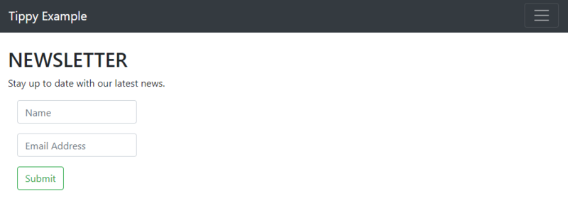
For this tutorial, we’ll use a newsletter request form as an example. Specifically, we’ll focus on adding a tooltip to the form’s Submit button.
Import the Tippy component and core CSS with the following commands:
import Tippy from '@tippyjs/react';
import 'tippy.js/dist/tippy.css';
The tippy.css import statement is optional. It will make the tooltip look polished with little to no additional effort. This is called “Default Tippy.” If you’d rather create and style your own Tippy elements, or “tippies,” from scratch, you can import and use Headless Tippy instead of tippy.css:
import Tippy from '@tippyjs/react/headless';
Here, we will use Default Tippy with tippy.css to create and position a Tippy React tooltip.
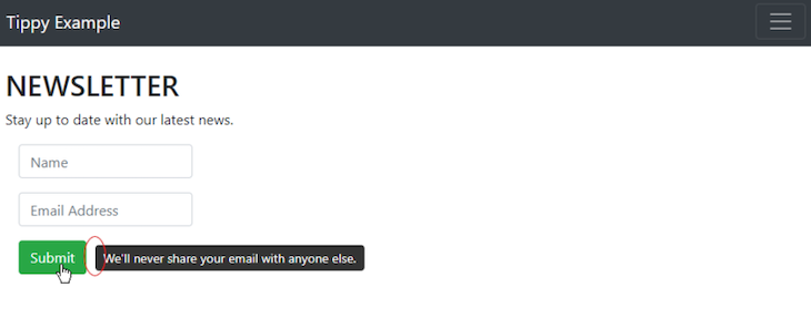
After importing the Tippy component, insert a Tippy wrapper around the element you want to add a tooltip to:
   <Tippy content="We'll never share your email with anyone else.">
   <Button variant="outline-success" >Submit</Button>
   </Tippy>
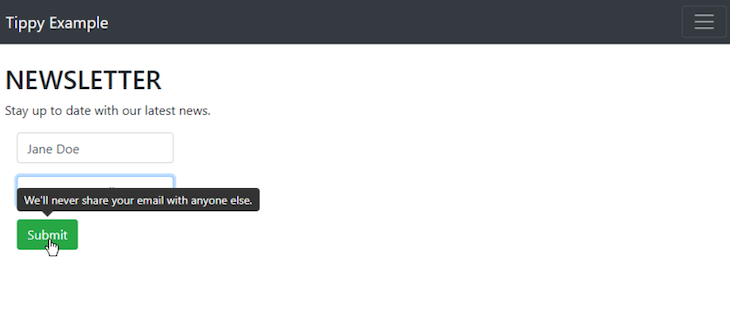
These commands will display a Submit button. Whenever a cursor hovers over the button, a tooltip will appear with the text, “We’ll never share your email with anyone else.”
So far, we have not specified where we want to place the Tippy React tooltip relative to our Submit button. When tooltip placement is not specified, Tippy automatically positions them above elements. If an element is at the top of the page and doesn’t have space above it, Tippy will automatically place the tooltip below the element.
Our current code will display a page element whose tooltip appears above it.
Tippy’s default tooltip placement isn’t always ideal. In most cases, it’s necessary to specify placement to prevent tooltips from covering up important page elements.
Tippy makes it easy to reposition tooltips in a React project. Placement options include:
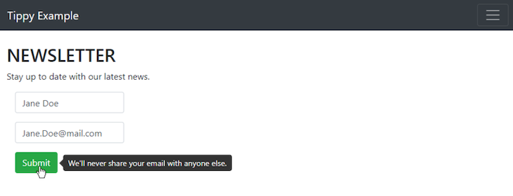
In our example, we want an unobstructed view of the Email field, so let’s move the tooltip to the right of the button element:
  <Tippy placement='right' content="We'll never share your email with anyone else.">
  <Button variant="outline-success" >Submit</Button>
  </Tippy>
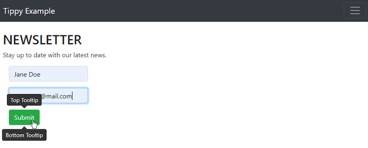
It’s possible to put multiple tippies on a single element by nesting Tippy commands:
  <Tippy placement='top' content="Top Tooltip">
  <Tippy placement='bottom' content="Bottom Tooltip">
  <Button variant="outline-success" >Submit</Button>
  </Tippy>
  </Tippy>
These commands will insert a tooltip that says “Top Tooltip” above the associated element and another tooltip that says “Bottom Tooltip” below the same element.
When inserting multiple Tippy wrappers on a single element, be sure to specify different tooltip placements — otherwise, one tooltip will cover all the others for that element.
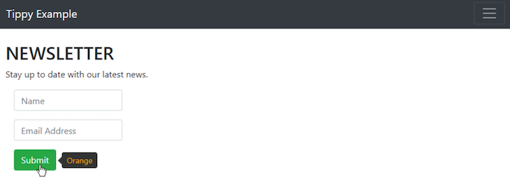
You can add HTML blocks inside Tippy commands to change and stylize the tooltip. For instance, we can add a span tag to change a tooltip’s text color to orange:
  <Tippy placement='right' content={<span style={{color: 'orange'}}>Orange</span>}>
  <Button variant="outline-success" >Submit</Button>
  </Tippy>
To remove the little arrow on the edge of the tooltip that points to the element, set the arrow attribute to false:
  <Tippy placement='right' arrow={false} content="We'll never share your email with anyone else.">
  <Button variant="outline-success" >Submit</Button>
  </Tippy>
You can also add a delay attribute to the Tippy wrapper, creating a time delay between when the cursor hovers over an element and when the tooltip appears. The delay is measured in milliseconds, so setting the delay attribute to 1000 would lead to a one-second delay.
  <Tippy placement='right' delay={1000} content="We'll never share your email with anyone else.">
  <Button variant="outline-success" >Submit</Button>
  </Tippy>
Now you’ve learned the basics of how to create and position Tippy tooltips in a React project, including how to use Tippy’s placement attribute to position a tooltip around an element. You can also add HTML, remove the tooltip’s arrow, or add a time delay in order to customize your tooltips.
The project and written code used in this tutorial can be found on GitHub. The complete project used the react-bootstrap framework and react-dom-router module, but these are not required for the information contained strictly in this article.
To learn more about using Tippy.js with React, check out these excellent resources:
Install LogRocket via npm or script tag. LogRocket.init() must be called client-side, not
server-side
$ npm i --save logrocket

// Code:

import LogRocket from 'logrocket';
LogRocket.init('app/id');
// Add to your HTML:

<script src="https://cdn.lr-ingest.com/LogRocket.min.js"></script>
<script>window.LogRocket && window.LogRocket.init('app/id');</script>

Compare the top AI development tools and models of July 2026. View updated rankings, feature breakdowns, and find the best fit for you.

Learn how to detect unused and ghost dependencies in JavaScript projects using Knip, a project-level linter that keeps your dependency graph accurate.

Learn how Storybook MCP enables AI agents to understand your component library, generate accurate UI, and validate code using documentation, stories, and automated tests.

Debug RSC hydration mismatches in production with Next.js instrumentation, Suspense isolation, HTML diffing, and CI smoke tests.
Hey there, want to help make our blog better?
Join LogRocket’s Content Advisory Board. You’ll help inform the type of content we create and get access to exclusive meetups, social accreditation, and swag.
Sign up now

 Learn more →
