If you’ve blinked at all during the past few years, you’ve likely missed something new in CSS. Its evolution has been mind-blowing. While some features chip away at a reliance on JavaScript for common interactions, others look to update its core concept — the box model.

However, as any language evolves, so do its best practices.
CSS has always had its challenges. If you’ve seen a meme about centering a div, you probably understand. Though some shortcomings were due to developers not respecting the language enough to adequately learn it, others were of CSS itself.
Luckily, we’ve since moved on from the plight of centering elements to a new era of challenges.
Modern CSS has reshaped its box model with new properties and values to support the fluidity our UIs require. But this modernization has also introduced a range of “gotchas” that have inspired a set of defensive CSS best practices, all of which make you feel like you’re learning CSS for the first time all over again.
How can we alleviate this learning curve while ensuring our styles follow the modern best practices? Linting.
In the world of JavaScript, linting is such a requirement that many tools — like Vue CLI and Create React App — include ESLint by default with a new project. While linting in CSS is not quite as ubiquitous as this, there’s a reliable library looking to change that: Stylelint.
In this article, we’ll explore using Stylelint plugins to help us adopt and enforce defensive and logical CSS practices. Jump ahead:
Check out this CodePen collection to interact with the demos we will cover later on.
Stylelint is “a mighty CSS linter that helps you avoid errors and enforce conventions.” In other words, what ESLint is for JavaScript, Stylelint is for CSS — and not only CSS, but also other styling syntaxes like SCSS and Less. Pretty much, if PostCSS can do it, Stylelint can lint it.
By default, Stylelint provides a wealth of rules and options to fit most coding styles. But we all have our own nuanced preferences. In these cases where the default ruleset of Stylelint isn’t enough, there’s a wide ecosystem of plugins to install. And much like ESLint, herein lies the true power of Stylelint.
In this article, we will create a project with Stylelint to show how it can enforce modern CSS best practices and save us all from common mistakes. However, for a more in-depth look at Stylelint, I recommend reading “Level up your CSS linting using Stylelint” by Rob O’Leary.
“Don’t talk about it. Be about it.” ~ Bob Burns
No words I write could showcase the benefits of using Stylelint more than actually using it. So let’s do exactly that.
Let’s create a new project with Stylelint and test out some CSS linting. While we will use npm in this article, use Yarn if you wish. We will be working on this project for the remainder of the article.
Let’s get started by opening a new terminal, creating a new directory, and initializing our new project:
/* Create the project directory */
mkdir stylelint-demo

/* Change directory into the new project */
cd stylelint-demo

/* Use npm to initialize a new project with all default values */
npm init -y
Note that we are using the -y flag with npm init to accept all the default values. Feel free to exclude this flag if you want to customize the project details.
Now, with our project created, we can open it in our code editor and get to work. But right now we only have a package.json file. Before we can lint our CSS, we must first write some. Let’s create an index.css file and paste some suspicious styles:
a {
  grid-template-areas:
    'a a'
    'b b b';
  colr: hsla(20deg, 10% 30%, 5%);
}

a {
  --Foo: 1rem;
}
At a quick glance, this file may not cause any concern, especially when it’s a small part of a larger pull request. But next, we will add Stylelint to see what it thinks:
npm init stylelint
When initializing a Stylelint project this way, it will install both the stylelint and stylelint-config-standard packages. It will also create a base .stylelintrc.json configuration file, which will extend the standard settings.
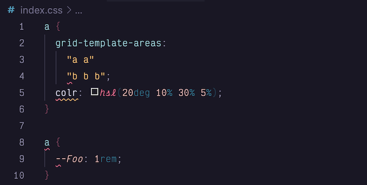
Now, if we return to our index.css file, Stylelint should report several errors:
Note: If Stylelint is not reporting any errors, try running the following:
npx stylelint "**/*.css"
Our file has errors for an invalid amount of grid columns, a mistyped property name, duplicate selectors, and irregular casing. Any of these issues could slip through the cracks of pull requests and testing, but Stylelint can prevent them from becoming bugs.
When we initialized this project, Stylelint installed and used its standard settings. While these settings can prevent a lot of problems, we can extend Stylelint further to enforce the modern best practices of defensive and logical CSS.
In late 2021, Ahmad Shadeed coined the term “Defensive CSS.” Since his original article, the methodology has expanded into a set of best practices for creating content-proof layouts.
As Ahmad describes it, “[Defensive CSS is] a set of CSS practices that designers and developers can use to write CSS that is future-proof, resulting in fewer bugs in user interfaces.”
Let’s explore a few of the many defensive CSS recommendations to see how they can make a product’s UI resilient to its variable content.
When using background images, it’s easy to forget how they will behave on large screens. By default, background images will repeat. As a defensive habit, include a background-repeat property on the container:
.container {
  background-image: url("./some-image.webp");

  /* Defensive CSS: Include background-repeat property */
  background-repeat: no-repeat;
}
Here’s how the result would look with and without defensive CSS:
See the Pen Defensive CSS – Background Repeat by Daniel Yuschick (@DanielYuschick)
on CodePen.
Using custom properties in CSS has become quite common. But what’s not common is linting or pre-defining custom property names.
As a result, there’s no real certainty that a custom property exists at the time it’s used. Because of this, it’s a defensive habit to include fallback values for custom properties:
.container {
  display: grid;

  /* Defensive CSS: Include custom property fallback values */
  gap: var(--grid-spacing-default, 1em);
  background-color: var(--color-secondary, #8b3257);
}
See the result with and without defensive CSS:
See the Pen Defensive CSS – Custom Property Fallbacks by Daniel Yuschick (@DanielYuschick)
on CodePen.
Since CSS Flexbox gained wide support, its most frequent issue concerns items overflowing their container. This is because, by default, flex items do not wrap to a new row when they reach the edge of their container.
To prevent this, and to ensure flex items wrap to new lines as needed, always include a flex-wrap property on every flex container:
.container {
  display: flex;

  /* Defensive CSS: Force flex items to wrap when needed */
  flex-wrap: wrap;
}
Compare how flex containers look with and without defensive CSS:
See the Pen Defensive CSS – Flex Wrapping by Daniel Yuschick (@DanielYuschick)
on CodePen.
It’s not a good practice to combine selectors for multiple vendors. If one selector fails, the entire selector will fail, and none of the styles will be applied. As a defensive habit, split all vendor-prefixed selectors into their own declaration:
/* Defensive CSS: Split vendor-prefixed selectors into own declarations */
::-webkit-input-placeholder {
  color: var(--color-core-secondary);
}

::-moz-placeholder {
  color: var(--color-core-secondary);
}
Here’s the result with and without defensive CSS:
See the Pen Defensive CSS – Vendor Prefix Grouping by Daniel Yuschick (@DanielYuschick)
on CodePen.
The goal of defensive CSS is to ensure UIs are resilient to changing content. However, these four examples are just a fraction of the recommended approaches. It can be overwhelming to keep every best practice in mind.
This is where Stylelint plugins can offload that cognitive burden.
Stylelint and linting in general do so much heavy lifting for us. Without them, we’d be left to remember every detail, property, value, and formatting rule there is. I don’t know about you, but for me, that’s just unrealistic.
Each defensive CSS pattern we try to remember is an additional cognitive load to carry. Luckily, we can extend Stylelint to remember some of these rules for us. To do this, we will install stylelint-plugin-defensive-css.
Let’s return to our original project and add our plugin:
npm i stylelint-plugin-defensive-css --save-dev
When we initially set up the project, Stylelint created a .stylelintrc.json file to manage its settings and rules. Let’s edit this file to add our defensive CSS plugin:
{
  /* Base setup from Stylelint */
  "extends": ["stylelint-config-standard"],

  /* We create the plugins array and add our Defensive CSS plugin */
  "plugins": ["stylelint-plugin-defensive-css"]
}
Now, just updating our settings with the plugin won’t change how Stylelint works. We need to define which rules to enforce. The plugin provides multiple rules, each of which enforces a different defensive CSS best practice.
To get started, we will update .stylelintrc.json again to enable our plugin within a new rules object:
{
  "extends": ["stylelint-config-standard"],
  "plugins": ["stylelint-plugin-defensive-css"],

  /* Create a rules object to customize Stylelint's behavior */
  "rules": {
    "plugin/use-defensive-css": [true, {}]
  }
}
Note that you may need to reload your editor for new settings to take effect. Let’s go ahead and explore each of the rules the plugin provides.
background-repeat ruleBy enabling the background-repeat rule, Stylelint will warn about and prevent background images from unintentionally repeating on larger screens.
To enable this rule, we will update the rules object with the plugin settings.
"rules": {
  "plugin/use-defensive-css": [true, {
    "background-repeat": true
  }]
}
Now, with the rule enabled, we can return to index.css to test it out. If we add the following snippet into our file, we should see our new plugin warning us about not setting a background repeat value:
.container {
  background-image: url("");
}

.wrapper {
  background: url("") no-repeat;
}
After adding this code, the plugin should report an error for .container but not for .wrapper. This is because .container does not declare a background-repeat value, while .wrapper does:

custom-property-fallbacks ruleThe next rule we can enforce is custom property fallbacks. As we explored in the demo earlier, using an undefined property, or mistyping the name, could have pretty dramatic effects in the UI. However, not every error will be so recognizable.
Prevent these errors by enabling the custom-property-fallbacks rule:
"rules": {
   "plugin/use-defensive-css": [true, {
     "background-repeat": true
     "custom-property-fallbacks": true
   }]
}
Now, we can change the .wrapper class to reference a custom property that does not exist to trigger an error:
.wrapper {
  background: var(--hero-bg) no-repeat;
}
Here’s the custom property fallback error as reported by Stylelint:

Given the modern reliance on custom properties in CSS, this rule can become a bit much. However, sometimes we have theme values or global design tokens we can trust to be defined. In these situations, we can change this rule to ignore specific custom property patterns:
"custom-property-fallbacks": [true, { "ignore": ["theme-"] }]
We can extend the custom-property-fallbacks rule with an ignore property. The plugin will convert each string into a regular expression like new RegExp(string) to be matched against each custom property. If the custom property matches, Stylelint will ignore it.
Use this to ignore design tokens, which may have a namespace like theme-, for example:

flex-wrapping ruleDespite flex being a well-supported CSS feature for years, it’s still common for flex items to extend beyond their container when the screen size is too narrow.
By default, flex items will not wrap to a new line. Instead, use the flex-wrapping rule to make flex wrapping a default of your own:
"rules": {
  "plugin/use-defensive-css": [true, {
     "background-repeat": true,
    "custom-property-fallbacks": [true, { "ignore": ["theme-"] }],
     "flex-wrapping": true
  }]
}
We know the drill by now. With the flex-wrapping rule enabled, let’s change our styles again to trigger an error:
.wrapper {
  background: var(--theme-hero-bg) no-repeat;
  display: flex;
}
Stylelint will then report our flex-wrapping error like so:

This plugin expects any flex row to have its flex-wrap property set to either wrap or wrap-reverse. Now, there’s been some debate whether the plugin should accept nowrap, but we’ll cover that further when discussing our real-world experience.
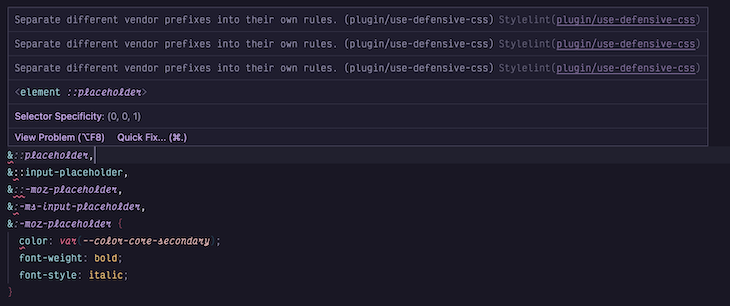
vendor-prefix-grouping ruleWhile the web has evolved to where vendor prefixes feel quite ancient, there are times when we need them, and even more times when we find them in legacy codebases. If we enable the vendor-prefix-grouping rule, Stylelint will flag any rule with multiple vendor-prefixed selectors:
"rules": {
  "plugin/use-defensive-css": [true, {
     "background-repeat": true,
     "custom-property-fallbacks": [true, { "ignore": ["theme-"] }],
     "flex-wrapping": true,
     "vendor-prefix-grouping": true
  }]
}
Now, if we return to the earlier vendor prefix demo, we can see how Stylelint would handle those selectors:
&::placeholder,
&::-webkit-input-placeholder,
&::-moz-placeholder,
&:-ms-input-placeholder,
&:-moz-placeholder {
  color: var(--color-core-secondary);
  font-weight: bold;
  font-style: italic;
}
Here’s Stylelint reporting an error for vendor prefix grouping:
Defensive CSS originated as a set of best practices for creating resilient UIs, but it has grown since its original blog post to become a fair amount to remember. However, with Stylelint, we can enforce some patterns naturally. Developers forget. Linters do not.
While defensive CSS introduced general concepts to follow, logical CSS introduced a slew of new properties, values, and units, as well as an updated box model — all of which Stylelint can remember for us.
Logical and defensive CSS have similar goals. Each strive to make our UIs resilient across a dynamic range of users. Defensive CSS focuses on the variable nature of content, while logical CSS redefines the CSS box model to support a growing intersection of users, devices and cultures.
But that’s just a bunch of words. What does it actually mean in practice?
In 2017, I moved from the USA to Finland. Transitioning into this culture had been buttery smooth. Learning the language, however, has been significantly less smooth. Luckily, many websites I visit here offer an English option. From a design and development standpoint, there’s no major change to the UI. We’re swapping out one set of language strings with another.
But what if I had moved to Israel instead?
There, the websites would no longer be swapping a set of Latin-based text strings for another. Hebrew is not only a distinct set of characters, but read and written from right to left. When it comes to defining our UI and laying out content, the concept of “left” and “right” is different between these two cultures.
This is where logical CSS comes in. It provides a set of properties, values, and units that are no longer tied to physical directions on a screen, but the logical flow of content. With logical CSS, our UIs can support fluid content regardless of its direction or writing mode:
See the Pen Logical CSS – Direction Toggle by Daniel Yuschick (@DanielYuschick)
on CodePen.
If you’d like to dig deeper into logical CSS, check out this guide to CSS logical properties. Otherwise, let’s move on to demonstrating how to use another Stylelint plugin for linting logical CSS.
Again, linting can not only help to enforce best practices, but it can also ease the learning curve of new properties and values. Logical CSS introduces a new paradigm regarding how we think about x- and y- axes and the flow of content. It can be a lot.
We can use Stylelint to find and fix physical CSS and introduce us to logical CSS continuously and gradually. We will install another plugin — stylelint-plugin-logical-css — to lint for logical CSS.
Let’s return to our original project again and add this latest plugin:
npm i stylelint-plugin-logical-css --save-dev
After the plugin is installed, we can return to the .stylelintrc.json settings file and update the plugins array:
{
  /* We add the Logical CSS plugin to our list of Stylelint plugins */
  "plugins": ["stylelint-plugin-logical-css", "stylelint-plugin-defensive-css"]
}
The stylelint-plugin-logical-css plugin exposes a couple different rules to best support the transition to logical CSS. As before, you may need to reload your editor for new settings to take effect. Then, let’s explore the rules we can use with this plugin.
plugin/use-logical-properties-and-values rulePerhaps the biggest learning curve that Logical CSS poses is the sheer amount of new properties and values.
Gone are the physical directions of bottom, left, right, and top. In their place are their logical equivalents of inline and block start and end. Gone are the physical alignment properties, like left and right or x and y. Again, logical CSS replaces them with start and end values.
All of this is a lot to keep in mind when features keep growing and timelines keep shrinking. This is where the plugin/use-logical-properties-and-values rule can be used.
Let’s enable it in our .stylelintrc.json file, and test it out to see how it can speed up the adoption of logical CSS:
"rules": {
  "plugin/use-logical-properties-and-values": [true, {}]
}
Let’s try with a block of CSS to see how the Stylelint responds:
.container {
  max-width: 90ch;
  text-align: left;
}
With this rule enabled, Stylelint will give an error when there are physical properties and/or values. As part of its error message, however, it will provide the logical alternative. It does this to help ease the transition into learning each of the new logical properties and values:

You can find a full list of properties and values the plugin will lint on GitHub.
Of course, if manually updating each error seems a bit cumbersome — and in larger codebases, it certainly can be — we can pair this rule with the --fix flag in Stylelint to automatically fix any errors on save or lint.
What happens, though, if this rule is enabled and somebody runs lint --fix on the entire codebase? Well, the entire codebase and every instance of a physical property in any CSS file will be changed. Not a pull request anybody wants to review.
This is one reason the plugin/use-logical-properties-and-values rule has a couple of different options.
First, we can prevent the previous scenario of changing an entire codebase at once with the disable-auto-fix option:
"rules": {
  "plugin/use-logical-properties-and-values": [true, {
    "disable-auto-fix": true
  }]
}
What this means is, even if Stylelint has its --fix flag enabled, this rule will not autofix. This allows entire codebases to be linted safely, and the conversion to Logical CSS to be gradual.
Gradual adoption of logical CSS is best. Although browsers support most of the spec, they don’t yet support all of it. But we don’t want a codebase of errors on properties we can’t support. For this reason, the plugin/use-logical-properties-and-values rule has an ignore option:
"rules": {
  "plugin/use-logical-properties-and-values": [true, {
    "disable-auto-fix": true,
    "ignore": ["overflow-y", "overflow-x"]
  }]
}
At the time of this writing, the logical equivalents of the physical overflow- properties don’t have great browser support. These are prime examples of properties we don’t want to lint. By adding them to the ignore array, Stylelint will not lint them, allowing our adoption of logical CSS to go hand in hand with the increasing browser support.
While properties and values make up most of the Logical CSS spec, the stylelint-plugin-logical-css plugin has a second rule to cover what remains.
plugin/use-logical-units ruleIn addition to the new properties and values, logical CSS also introduces new logical units.
You may be familiar with viewport units like vh and vw for viewport height and viewport width. We often use these units to size our UI relative to a device.
CSS has introduced other CSS viewport options to provide even greater control, but they all suffer from the same physical limitations. Therefore, each unit has a new logical equivalent.
But first, let’s enable the rule and give it a spin:
"rules": {
  "plugin/use-logical-units": [true, {}]
}
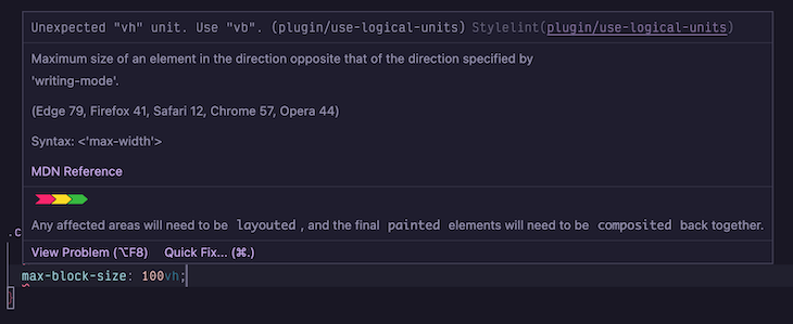
If we lint the following CSS, Stylelint will report errors for the physical units:
.container {
  inline-size: 50vw;
  max-block-size: 100vh;
}
Its error messages will, again, include the logical unit to use instead:
You can find a full list of physical units the plugin will lint on GitHub.
The plugin/use-logical-units rule has the same options as the properties and values rule. We can use Stylelint’s --fix flag to swap out physical units for logical ones, but we can disable this with the disable-auto-fix option.
Like some properties, not all logical units have great browser support yet. We can ignore linting these units with the ignore option and adopt them as browser support improves:
{
  "rules": {
    "plugin/use-logical-properties-and-values": [true, {
      "disable-auto-fix": true,
      "ignore": ["dvh", "dvw"]
    }]
  }
}
In the world of frontend development, it’s easy to greet new features with a sense of skepticism. It’s often warranted. Even in this article we’ve mentioned browser support multiple times.
Now may be a good time to explore how using Stylelint to enforce defensive and logical CSS has looked in a production environment.
During a recent work project, which had already used Stylelint heavily, my team had migrated to logical CSS. This process began with an RFC to ensure the entire team had visibility into the decision, and ended with us linting for logical properties and values.
The logical units rule didn’t offer our particular project much value in the short term. As support for logical units improves, though, we’ll enable it.
The disable-auto-fix option was a must. Without it, and the next pull request would have triggered a GitHub action to fix every CSS file in every frontend project within our monorepo. Not ideal.
We had also used the ignore option to prevent linting physical overflow-x/y properties. The browser support wasn’t what we needed it to be yet for their logical equivalents. Though, we may ignore even more properties in the future, like overscroll-behavior-x/y.
After the successful rollout of logical CSS linting, the project then moved to enforce defensive CSS patterns. However, we found the custom-property-fallbacks rule to be heavy, so we disabled it.
But the other rules had been helpful, particularly flex-wrapping. It’s easy to forget to wrap flex items until they fall outside of their container and distort your UI. This rule, alone, will help the move toward a responsive product.
This rule inspired a discussion, though. The rule will throw an error anytime a flex container does not have a flex-wrap: wrap or flex-wrap: wrap-reverse style set. But what about flex-wrap: nowrap?
Should the plugin trust that if a developer manually defines the container to not wrap, that they know what they’re doing and why? Consider a carousel-like component that displays all of its content in an overflowing row to be scrolled. Should we force this to have a flex wrap value?
What do you think? Should the plugin support the nowrap value as part of its flex-wrapping rule?
The growth of CSS over the past few years has been immense. While it’s never been easy to write well-structured and flexible styles, doing so feels both easier and harder than ever now. There are more features to make styling better, but the learning curve to use them all effectively can be steep.
In this article, we explored how we can use Stylelint to lint our styles and ease the adoption of new patterns and best practices. We discovered how defensive CSS can make our UIs resilient to dynamic and variable content, and how logical CSS can do the same, but for dynamic and variable users.
If we’re familiar with linting our JavaScript, then we’re familiar with the benefits of doing so. As CSS rapidly evolves to become far more complex and powerful than its ever been, there’s no reason to not treat it with the same respect and lint it accordingly.
As web frontends get increasingly complex, resource-greedy features demand more and more from the browser. If you’re interested in monitoring and tracking client-side CPU usage, memory usage, and more for all of your users in production, try LogRocket.

LogRocket lets you replay user sessions, eliminating guesswork around why bugs happen by showing exactly what users experienced. It captures console logs, errors, network requests, and pixel-perfect DOM recordings — compatible with all frameworks.
LogRocket's Galileo AI watches sessions for you, instantly identifying and explaining user struggles with automated monitoring of your entire product experience.
Modernize how you debug web and mobile apps — start monitoring for free.
Hey there, want to help make our blog better?
Join LogRocket’s Content Advisory Board. You’ll help inform the type of content we create and get access to exclusive meetups, social accreditation, and swag.
Sign up now
A breakdown of the wrapper and container CSS classes, how they’re used in real-world code, and when it makes sense to use one over the other.

This guide walks you through creating a web UI for an AI agent that browses, clicks, and extracts info from websites powered by Stagehand and Gemini.

This guide explores how to use Anthropic’s Claude 4 models, including Opus 4 and Sonnet 4, to build AI-powered applications.

Which AI frontend dev tool reigns supreme in July 2025? Check out our power rankings and use our interactive comparison tool to find out.