
Frontend web development increased in complexity over the past few years. It’s quite a challenge to build a scalable and reliable UI system that works on a wide range of devices and a wide range of browsers. Maintenance becomes increasingly difficult as the UI system expands with new components, style variations, new viewport breakpoints, overrides, etc. Without reliable and regular regression testing, bugs are being gradually introduced to the UI, negatively affecting usability, accessibility, presentation, and maintainability. Those bugs are usually noticed on production after the code has been shipped and fixed right after.

Product owners, designers, QA, and other team members usually have some additional feedback on the presentation, UX, SEO, and accessibility after the work on the visual feature has been completed. Those are also often addressed after the code has shipped to production. These scenarios happen more often than you’d think, even to the point that we got used to working this way – gradually fixing, revamping, and improving the UI after shipping the code to production. It seems to be a difficult task to get the UI components right the first time, with all issues and feedback addressed before shipping code to production.
In this article, we’re going to find out how Chromatic can help us out with these issues that have been causing headaches for both the development team and product owners alike.
The Replay is a weekly newsletter for dev and engineering leaders.
Delivered once a week, it's your curated guide to the most important conversations around frontend dev, emerging AI tools, and the state of modern software.
We are doing regression testing to make sure that our code changes do not cause any issues in other places on the project. We can see how this applies to CSS due to its fundamental concepts (inheritance, specificity, and cascade). Depending on how the code is structured, if we modify an element in CSS, we can affect many more DOM elements in unexpected ways. Catching those changes early in the process is difficult because these tests and changes need to be ultimately validated by a human.
For example, let’s say that we are modifying a generic button CSS class. It’s safe to assume that these changes apply to every button on a website. Buttons can appear in various layouts, alongside other elements like inputs and on different backgrounds. How many hours would it take to go through all the buttons and check if the button looks good on every supported browser and resolution?
Due to time or budget constraints, we are usually unable to test those changes reliably. We skip them or just do a quick check only on the components related to the task. That way we are also gradually introducing bugs to our frontend code as they go unnoticed and fixing them only after someone notices them when they appear on a live site.
Before we talk about how Chromatic improves visual regression testing workflow, we have to cover Storybook.
If you are unfamiliar with Storybook or haven’t had a chance to use it, Storybook is a tool for developing, documenting, and testing individual UI components (also known as stories) in an isolated environment, separate from the main project environment. Storybook supports various frontend frameworks like React, Vue, Angular, Svelte, etc.
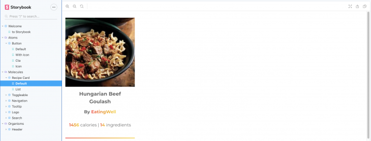
For example, on a complex project, developers can build components and screens (different states and variations) visually with mocked data in Storybook while API endpoints are in development and hook them up when the endpoints are ready. Additionally, Storybook can be used to onboard new developers so they can quickly become familiar with the available components and project structure.
Storybook also supports a wide range of addons that extend the base functionality and provide more options and controls for developers. One of those addons is the docs addon that adds markdown support to Storybook. It provides a dedicated documentation tab for Storybook components that developers can use to describe UI components in more detail than just showing it visually.
Having an overview of individual UI components in an isolated environment is useful, but that still doesn’t solve the main issue with visual regression testing – how do we catch which UI components and screens are affected by a change in CSS? Additionally, product owners, designers, and QA usually don’t have access to Storybook environment out of the box as it is a part of the development environment.
Chromatic is a cloud service for Storybook that aims to bring significant improvements to UI development and testing workflow. Developed by Storybook core maintainers, it includes the following tools and features:
Alongside paid plans, Chromatic offers a free account plan which can be useful for trying Chromatic out in a small scale startup projects and smaller teams. The free account plan includes all core features mentioned above, the only limit being an amount snapshots per month (5,000 snapshots per month) with single browser support (Chrome). The number of component snapshots and range of supported browsers (Firefox and IE 11) increases with paid plans.
First things first, let’s assume that we have a project running with Storybook installed and all of our Storybook components ready to go. I’ll go ahead and use GitHub as my project repository and connect it with Chromatic. In code examples and screenshots, I’m using my open-source React project, Recipe Magic. I’ve set up Storybook with a handful of components on it.
We also assume that the Storybook doesn’t have any build errors. To check that, we need to make sure that the following command doesn’t throw an error:
npm run build-storybook
Now we’re ready to set up Chromatic on our project and ready to publish our Storybook for the whole team to see and review.
First, we have to set up an account on Chromatic using a GitHub, Bitbucket, or GitLab account. I have to give props to Chromatic for not requiring a credit card for free account plan signup.
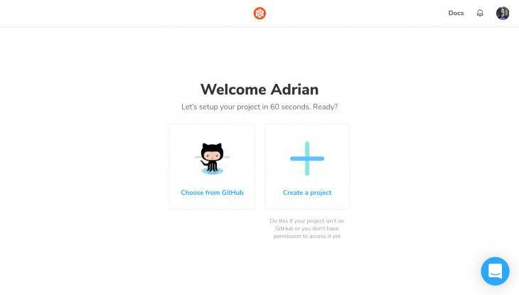
After signing up, we are ready to set up Chromatic in our project:
npm install --save-dev chromatic
Finally, we need to publish the Storybook instance. The following command runs the build command from Storybook, pushes the build to Chromatic cloud service, and takes snapshots of the individual stories:
npx chromatic --project-token=<your-project-token>
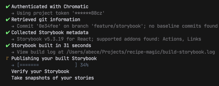
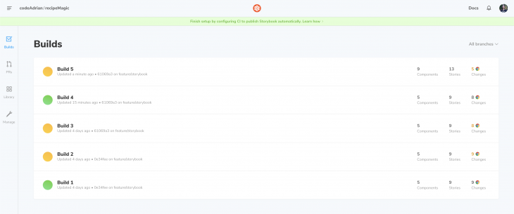
Our Storybook instance is now in sync with Chromatic. We can see the builds and snapshots show up on the Chromatic dashboard.
This command can also be added to the project package.json file to speed up the deployment process:
"scripts": {
  "chromatic": "npx chromatic --project-token="
},
Chromatic publishes a Storybook instance for each published build right out of the box. This allows team members to view individual UI components and test them without the need to set up the project on their machines.
Out of the box, Storybook doesn’t provide functionality for discussion and feedback. Chromatic extends the base Storybook functionality to generate a UI library where each component becomes a hub for discussion and feedback. Users can post comments and tasks that can be marked as resolved as requested changes or bug fixes are being applied.
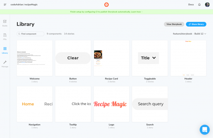
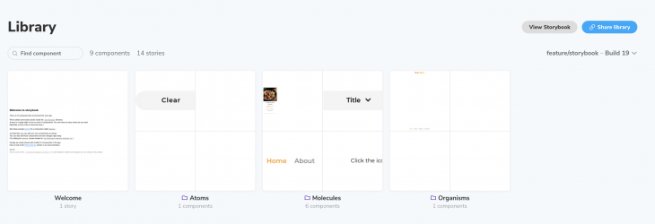
Each component has two main views and one optional view:
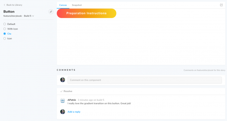
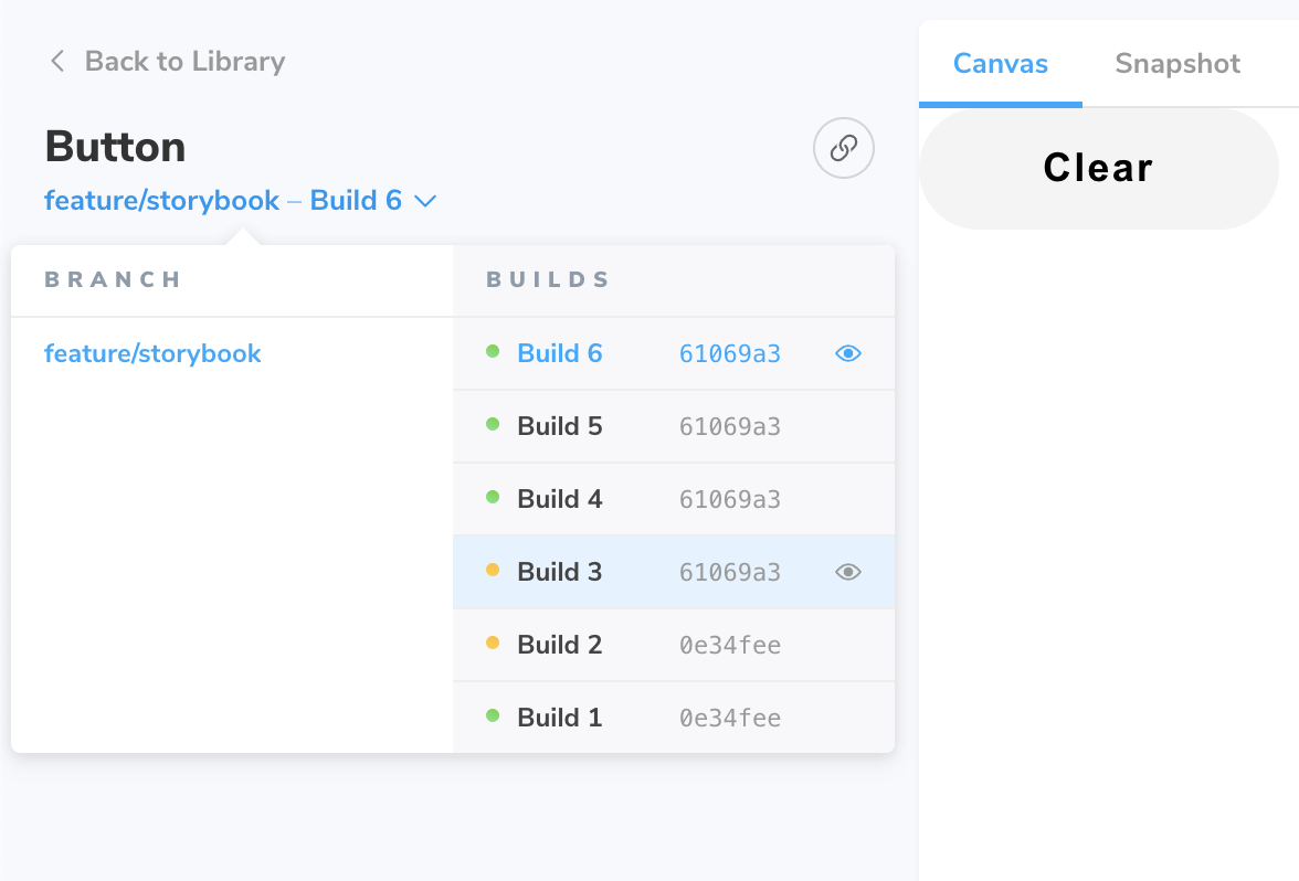
What I found surprisingly useful about the Chromatic UI library is that it allows switching between builds and Git branches on a component level. It allows users to easily switch between various versions of the component and compare changes between different Git branches and builds.
Visual regression testing is a flagship feature in Chromatic. It allows users to compare visual (presentational) changes between each build, review them, and provide feedback. Each new build is always compared to the previously accepted (reviewed) build.
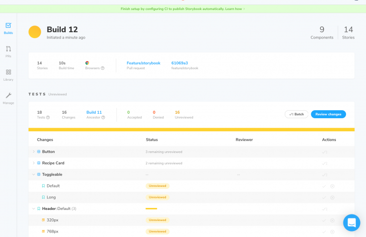
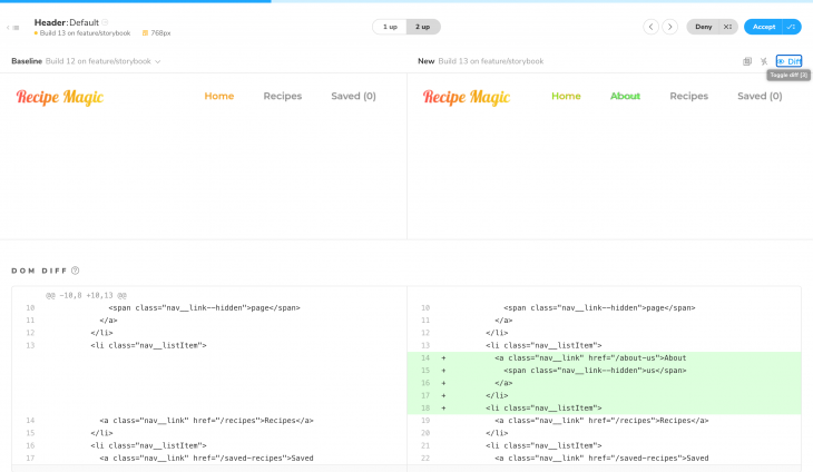
Chromatic generates snapshots (images) of individual components and stories and compares those images to detect changes. It features various diff options for visually comparing changes in stories for each new build.
This comparison screen also displays DOM diff to catch any changes in the markup so the team can address any potential syntax, semantic, accessibility, and SEO issues.
Git and CI integration are a must-have for any testing automation tool that seeks to improve development workflow.
Git support is available out of the box and can be easily enabled from the dashboard and connected to the Git repo. I’ve tested this feature on GitHub and found out that Chromatic only required some additional permissions (depending on the Git platform) to access Pull Request data.
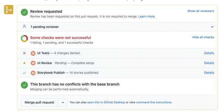
After giving required permissions to Chromatic, pull request status check shows Chromatic UI test and review status.
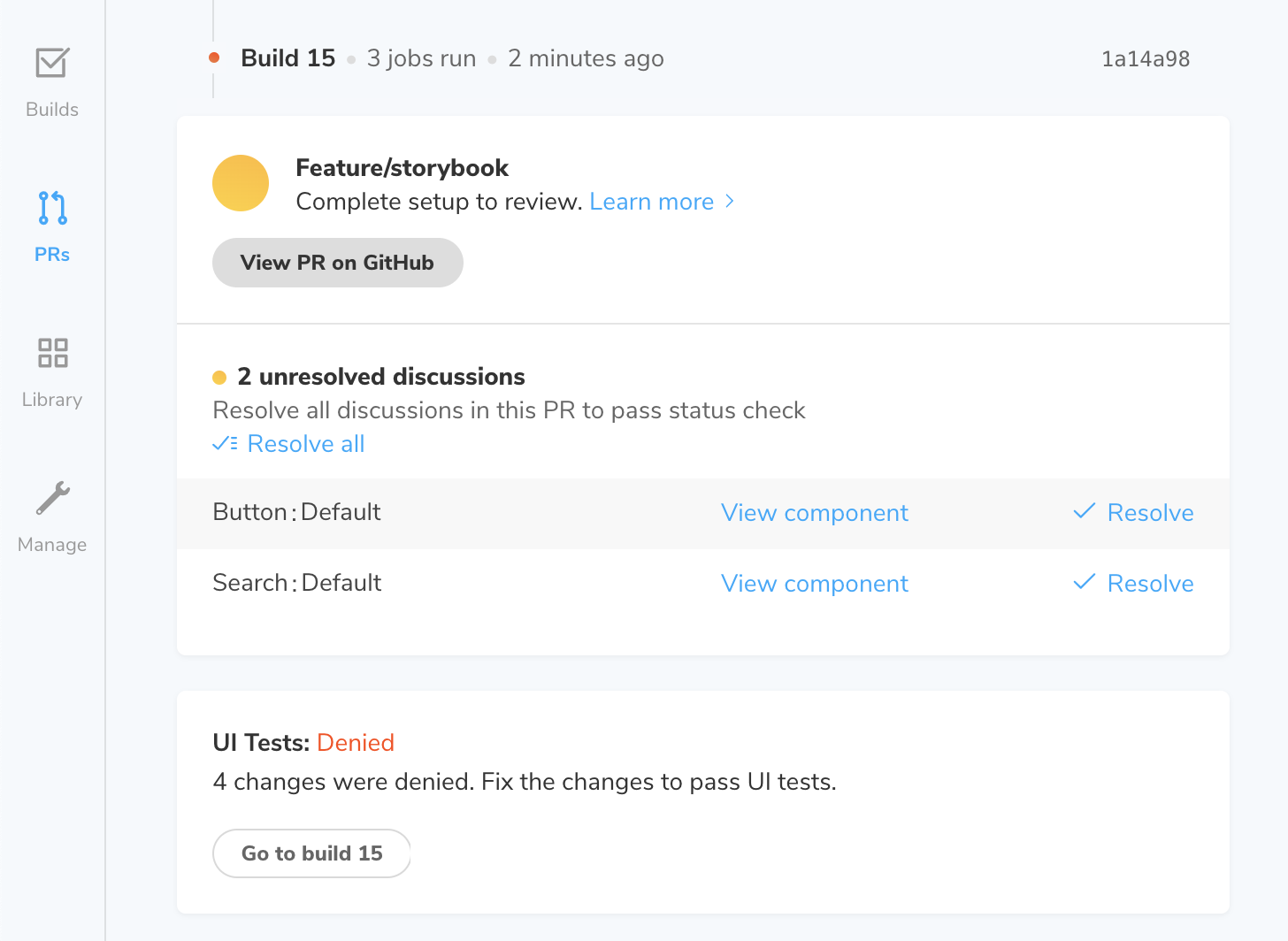
Chromatic provides a useful pull requests overview page where the team can get a detailed overview of the status of UI testing related to each pull request. For example, team members can see reviewed approved UI component changes, declined UI component changes, comments related to the PR build, and issues that are blocking the pull request from being merged.
Chromatic can be easily integrated with several CIs like GitHub Actions, Circle CI, Travis CI, and Jenkins and provides necessary instructions and code snippets in the CI integration documentation.
Let’s go through a simple scenario to see how we can use Chromatic for visual regression testing.
Let’s assume that QA has noticed that buttons with shorter text (“Add”, for example) have a small clickable area and requests button width to be increased. The frontend developer needs to make sure that those buttons are at least 200 pixels wide so that the clickable area is larger.
The developer then adds the following line of code, verifies that the changes show up on those specific buttons, creates a pull request, and publishes the updated Storybook on Chromatic.
button {
    /* ... */
    min-width: 200px;
}
Button UX is improved so that it meets the requirement, so the code is ready for deployment, right? Let’s see what Chromatic says about the change.
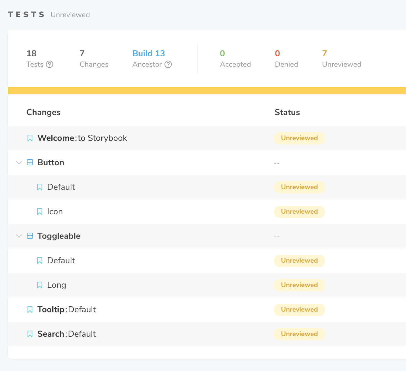
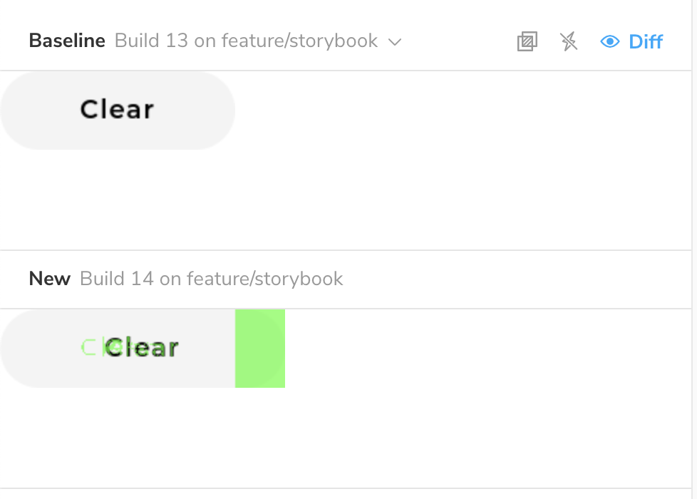
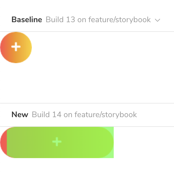
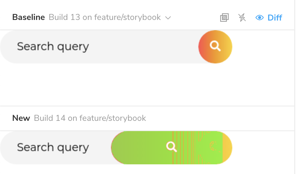
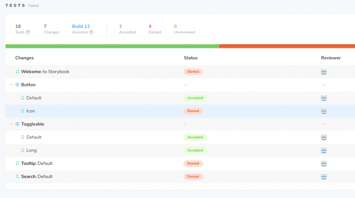
Luckily, this pull request is not merged until someone reviews the changes on Chromatic and approves them. As stated before, scenarios like this often happen on larger scale projects – minor CSS changes can cause regressions, and they often go unnoticed before deploying code to production.
QA can mark component changes that are accepted and which are denied and need fixing. They can also provide detailed feedback on individual components that didn’t pass the regression tests. This feedback helps developers understand the issue, reproduce it, and address it quickly and efficiently.
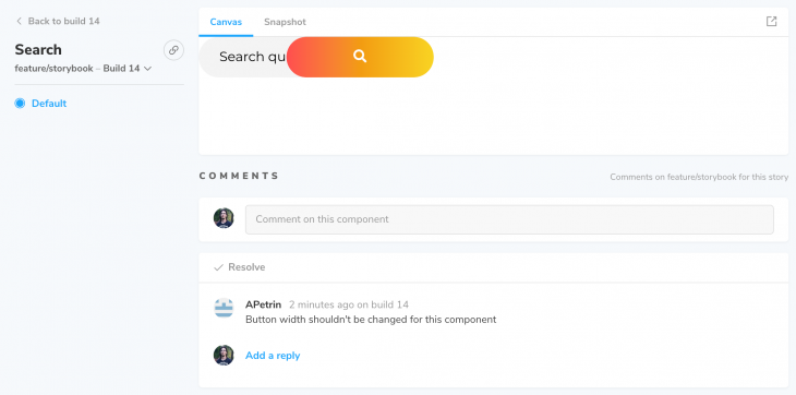
Some complicated issues might require additional screenshots or videos to understand and reproduce them more easily. Unfortunately, feedback input supports only text comments without any media attachment options, so videos and images are added to feedback using links to external file-sharing services.
Chromatic adds several options for Storybook that instruct Chromatic how to generate snapshots, how to load external resources (fonts, images, external CSS files, etc.), how it handles CSS and JavaScript animations, which stories or DOM elements to ignore, etc.
It’s also important to mention, without going into too much detail, that Chromatic supports a wide variety of CLI (command line interface) flags. These flags control how Chromatic behaves and handles Storybook build. We’ve mentioned --exit-zero-on-changes flag, but there are many more CLI options available that are specific to various use cases. If you are interested, I recommend checking out the official Chromatic documentation to find the CLI options that you need. As we’ve seen, Chromatic is easy to set up and works out of the box with the minimum configuration required.
Let’s take a look at the Chromatic options that we can set in the Storybook files.
Storybook supports three configuration scopes:
Chromatic config for Storybook on a global level needs to be set inside a .storybook/preview.js file. We simply need to pass an object containing chromatic property to addParameters Storybook function.
import { addParameters } from '@storybook/react';

addParameters({ chromatic: { /* Chromatic config */ });
To apply Chromatic config to all stories in a single Storybook file, we need to add the chromatic property to parameters object in the default export:
export default {
    /* Storybook config */
    parameters: {
        chromatic: { /* Chromatic config */ },
    }
}

/* Storybook Stories */
We can set the Chromatic config to a specific story in a similar way. We only need to apply the same chromatic property to story property of individual story objects:
/* Storybook Stories */
export const MyStory = () => <Component /* Component props */ />;

MyStory.story = {
    /* Storybook config */
    parameters: {
        chromatic: { /* Chromatic config */ },
    }
};
As discussed in the introduction of this article, we are testing the UI on the various viewport widths. By default, Chromatic takes snapshots on desktop width, but it offers configuration options to take component snapshots at different viewport widths.
parameters: {
    chromatic: { viewports: [320, 768, 1280] }
},
After publishing the configured Storybook on Chromatic, new snapshots show up in the build. Chromatic uses these new snapshots for visual regression testing in the same way as in the previous examples.
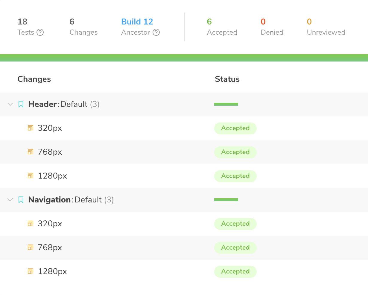
Please note that Chromatic generates a snapshot for each defined viewport width, which can increase the snapshot usage, so keep an eye on your snapshot amount limit.
Some UI elements may have some animations on them – whether they are animations that run only once or repeated, they can affect how Chromatic takes the snapshots and detects changes.
Chromatic pauses all CSS animations on the first animation frame by default. Some UI elements can have an entering animation (fade-in animation, for example). If Chromatic pauses the animation at the starting frame, the DOM element won’t show up in the snapshot, causing Chromatic not to detect any changes in generated component snapshots.
We can instruct Chromatic to pause the animation at the end instead of the beginning. That way, Chromatic will set the current animation frame to the last frame, acting as if the animation has finished and, finally, take a snapshot:
parameters: {
  chromatic: { pauseAnimationAtEnd: true }
}
Even though CSS animations are essential to achieve optimal performance in most browsers, CSS supports only simple animations. What if the UI has a complex animation or if the animation needs to react to user actions? In those cases, one of the options is to use JavaScript.
Chromatic pauseAnimationAtEnd parameter cannot affect JavaScript animations, so we need to use a different approach for them. Adding a simple delay parameter could suffice depending on the use-case. For example, a complex JavaScript fade-in animation that has a duration of 1.5 seconds, we need to set a delay parameter value to a value close to that:
parameters: {
  chromatic: { delay: 1600 }, /* 1600ms = 1.6s */
},
The maximum value for the delay is 15000 milliseconds (15 seconds). It’s recommended not to overuse the delay parameter, so the Chromatic builds are as fast as possible.
The delay parameter can also be used to ensure that all external resources are loaded (images, fonts, external styles). Although, it’s recommended to add those resources to Storybook tests (serve them alongside Storybook) to avoid any issues. For example, a server might have a delayed response, the static resource might get deleted, or the URL might change.
It might be simply impossible to set a fixed delay for a JavaScript animation, for one reason or another. We can also run into some scenarios where some user actions or scenarios cannot be simulated by Chromatic while taking snapshots. In those cases, we can detect if a specific component is running on a Chromatic environment to disable the effects or functionality that prevents Chromatic from reliably taking a snapshot of the UI component.
Chromatic module includes isChromatic function that returns a boolean value depending on if the code is running on a Chromatic environment or not:
import isChromatic from "chromatic/isChromatic";

export const StoryName = () => {
  const isChromaticEnv = isChromatic():

  if(isChromaticEnv) { /* ... */ }

  /* UI Component code */
}
Not all stories inside a Storybook are intended for UI testing and need to be included in Chromatic builds and UI tests. Developers can use a story for testing or showcasing specific transitions or animations, scaffolding pages or skeleton screens, or using it to work on some elements that are not completely finished, etc.
Chromatic offers a parameter that can be used to instruct Chromatic to ignore specific stories or components. That way, Chromatic won’t take a snapshot of the component which will result in reduced snapshot usage and, depending on the case, simpler UI test review:
parameters: {
  chromatic: { disable: true }
}
Chromatic also has an option to ignore specific DOM elements. For example, this parameter could be used to instruct Chromatic to ignore iframe elements, animated GIF images, empty containers with id used to display media loaded by JavaScript from an API (for example, score badge on eCommerce website), etc.
By default Chromatic will ignore DOM and HTML elements that have chromatic-ignore CSS class name or a data-chromatic="ignore" HTML data attribute.
In the following example, Storybook for the header component contains two stories:
Both headers have an enter CSS animation, so we are using pauseAnimationAtEnd to set it to the last frame. The first story has different layouts at three breakpoints (smallest mobile, smallest tablet, and smallest desktop viewport width), and the second story has different layouts at two breakpoints (smallest mobile and smallest tablet viewport width):
/* header.story.js */

import React from 'react';
import { Header } from 'components';

export default {
    title: 'Header',
    component: Header,
    parameters: {
        chromatic: {
          viewports: [320, 768, 1280],
          pauseAnimationAtEnd: true
        }
    }
};

export const Default = () => <Header />;

export const Minimal = () => <Header minimal />;

Minimal.story = {
  parameters: {
    chromatic: { viewports: [320, 768] }
  }
}
Chromatic takes five snapshots of this component (the first component at three viewport and second component at two viewport widths) in total for each build.
Visual regression tests are essential for large and more complex UI codebase. These tests need to ensure that new UI features and components can be safely added, without causing any unexpected issues to the current UI. These tests also need to cover various viewports, browsers, and states that the component can have.
Even though automated tests can be set up for regression testing, it ultimately needs to be validated by a human. Cloud services like Chromatic can make the process easy and fast by showing only relevant changes in the UI.
Chromatic looks like a great addition to the ever-growing UI development toolbox. It certainly brings value to a project by allowing the team to catch regressions early, simplifying and automating UI testing, providing a detailed UI documentation and reference, and providing a central point for gathering feedback on individual UI components for the whole team.
If you’re interested, I would recommend trying it out. A free account is more than suitable for testing the workflow on a smaller project (or a side project) and making a further decision.
Base Web – Visual regression testing
Install LogRocket via npm or script tag. LogRocket.init() must be called client-side, not
server-side
$ npm i --save logrocket

// Code:

import LogRocket from 'logrocket';
LogRocket.init('app/id');
// Add to your HTML:

<script src="https://cdn.lr-ingest.com/LogRocket.min.js"></script>
<script>window.LogRocket && window.LogRocket.init('app/id');</script>

Why the future of DX might come from the web platform itself, not more tools or frameworks.

A hands-on test of Claude Code Review across real PRs, breaking down what it flagged, what slipped through, and how the pipeline actually performs in practice.

CSS art once made frontend feel playful and accessible. Here’s why it faded as the web became more practical and prestige-driven.

Learn how inline props break React.memo, trigger unnecessary re-renders, and hurt React performance — plus how to fix them.
Hey there, want to help make our blog better?
Join LogRocket’s Content Advisory Board. You’ll help inform the type of content we create and get access to exclusive meetups, social accreditation, and swag.
Sign up now