CSS is one of the most common tools developers use to style web applications and make them look nice. However, using plain CSS in a web app with a large codebase can be time-consuming and exhausting.
One helpful solution to this challenge is a CSS-in-JS library called styled-components. This tool allows us to construct and manage our styles in a component-specific manner using JavaScript instead of an external CSS file.
Let’s take a look at an example of how to use styled-components. In this example, we will use styled-components along with TypeScript to style React Router links in an application’s navbar.
Here’s what we’ll cover:
src folderApp.tsx and declaring the routesThe Replay is a weekly newsletter for dev and engineering leaders.
Delivered once a week, it's your curated guide to the most important conversations around frontend dev, emerging AI tools, and the state of modern software.
styled-components is a React and React Native development library. With styled-components, you can use component-level styles in applications that are written using CSS-in-JS.
CSS-in-JS libraries like styled-components allow us to write CSS in JavaScript in a very elegant and reusable way by changing the way CSS styles are applied to React components.
Traditionally, you would manually assign CSS classes to elements within a component. CSS-in-JS libraries instead provide fundamental structures for scoping a CSS style locally to a component. This is done using distinct, auto-generated CSS classes.
styled-components is based on tagged template literals; when styling your components, actual CSS code is written between backticks. This allows developers to reuse their CSS code from one project to the next.
Using styled-components in your React app comes with a lot of benefits. Read through a few examples below.
className errorsIt can be difficult to tell if a className is used elsewhere in your codebase. This is because every bit of styling is tied to a specific component.
Using styled-components provides a unique className for your styles and eliminates the problems associated with className duplications, misspellings, and overlaps.
Using styled-components helps you keep track of which components are rendered on a page and injects only those components’ styles. When combined with code splitting, your users will load the least amount of code possible.
Without having to manually manage dozens of classes, adapting the styling of a component based on its props or a global theme is simple and intuitive.
Typically, you would have to hunt through multiple files to find the styling that affects your component. With styled-components, you can just call out the particular styling you want through props instead of trying to manage tons of classNames.
Unlike traditional CSS, styled-components also allows you to make changes to your style without affecting an unrelated element or the behavior of the DOM. No matter how large your codebase is, styled-components will maintain your styling.
When using styled-components, you can import your styles into other project areas regardless of how large or small your codebase is.
While this is also possible with traditional CSS, it would result in a large, bulky CSS codebase, which can become quite confusing and difficult to navigate.
TypeScript is a free, open source programming language created and maintained by Microsoft. It’s a strict superset of JavaScript with the addition of optional static typing and class-based, object-oriented programming.
Although you can usually use JavaScript to write code for similar tasks, React developers can benefit from TypeScript in several ways.
One such benefit is that our React applications will be more predictable if we use TypeScript to build them. TypeScript can print errors to the terminal at compile time and does not allow for code compilation, which enables us to catch these errors before runtime.
Now that we have an understanding of what we are going to be working with, let’s go ahead and build our project.
To follow along with this project, we should have an understanding of React. We should also know how React Router works. Understanding TypeScript is a plus.
I also recommend using a styled-components extension such as vscode-styled-components, but this is optional. A styled-components extension will enable our editor to recognize our styled-components CSS and not see it as jargon.
To create our React application, we’ll open up our terminal and navigate to the folder where we want to install our project. Run the following code:
npx create-react-app my-app --template typescript
You may see the following error message:
You are running create-react-app 4.0.3, which is behind the latest release (5.0.0).
We no longer support global installation of Create React App
If you see this error message, it is because you installed it globally. To solve this problem, simply run the following commands one after the other:
npm uninstall -g create-react-app
npx clear-npx-cache
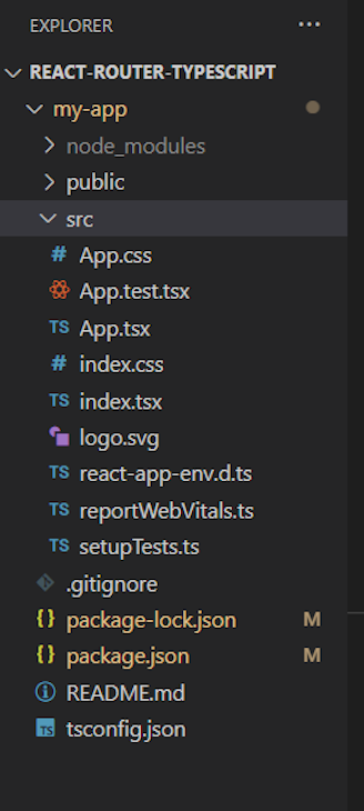
Now you can now rerun the create-react-app code. If you have successfully installed your React with TypeScript app, you should see a structure like this:
Are you with me so far? Let’s keep going.
src folderThe next thing we want to do is delete the unwanted files in our src folder. These files include App.test.tsx, index.css, logo.svg.
We also want to make edits to some of our files. First, delete the contents of the app.css file and write the following instead to get rid of any default margins and padding in our application:
.App {
  text-align: center;
}

body {
  margin: 0;
  padding: 0;
}
Next, delete all the contents of App.tsx except where we import React and export the app. Then, add the following to create a functional component:
export interface AppProps {}

const App: React.FC<AppProps> = (props) => {
  return (
  <div></div>
  )
}

export default App;
Finally, in our index.js, remove import './index.css.
Let’s go ahead and install the packages we’ll be using for this project: react-router-dom and styled-components. First, change the directory to our app:
cd my-app
Next, let’s install the react-router-dom package and the styled components package:
npm install react-router-dom
npm install styled-components
You will then need to run the following to allow styled-components to work with TypeScript:
npm install -D @types/styled-components
Finally, let’s start up our app:
npm start
We’ve got everything set for us to build, so let’s proceed.
Inside our src folder, create a folder called pages. We’ll be creating four pages for our links to navigate to: Home.tsx, About.tsx, Contact.tsx, and Navbar.tsx.
Let’s start with our Home, About, and Contact pages. We will also create a functional component and add some dummy text on each of these pages. The dummy texts will be used for navigation purposes with react-router.
The code for your Home.tsx file should look something like this:
export interface HomePageProps {}

const HomePage: React.FC<HomePageProps> = props => {
    return (
        <div>
        <h1 >Home page</h1>
        <p>
          Lorem ipsum dolor sit, amet consectetur adipisicing elit. Sequi, qui.
          Hic animi distinctio et maiores, ab nostrum at neque. Iusto minus
          perspiciatis vitae unde? In quibusdam nulla perspiciatis laboriosam ex.
        </p>
      </div>
    )
}
export default HomePage
The code for your Contact.tsx file should look something like this:
const ContactPage: React.FC=()=> {
    return (
        <div
        className="container text-center  bg-black"

      >
        <h1 className="heading">Contact us</h1>
        <p>
          Lorem ipsum dolor sit, amet consectetur adipisicing elit. Sequi, qui.
          Hic animi distinctio et maiores, ab nostrum at neque. Iusto minus
          perspiciatis vitae unde? In quibusdam nulla perspiciatis laboriosam ex.
        </p>
      </div>
    )
}
export default ContactPage
The code for your About.tsx file should look something like this:
onst AboutPage: React.FC = () => {
    return (
        <div className="container text-center">
        <h1>About Page</h1>
        <p>
          Lorem ipsum dolor sit amet consectetur adipisicing elit. Sint quasi
          debitis fuga deserunt, placeat qui optio totam perspiciatis error.
          Repudiandae, enim veniam. Dolorum officiis recusandae consequuntur
          veritatis magni aliquam itaque.
        </p>
      </div>
      )
}
export default AboutPage;
We’ll be creating our React navbar shortly. But first, let’s create the styling page for our navbar using styled-components.
Inside our src folder, create a folder called styles and a file named NavStyle. This file will contain styles for our React Router links. In this file, copy and paste the following:
import {Link} from "react-router-dom";
import styled from "styled-components";

export const NavbarContainer= styled.nav
width: 100%;
height:50px;
background-color: purple;
display: flex;
flex-direction: column;
;

 export const NavbarLinkContainer = styled.div
     display: flex;

 export const NavbarLink = styled(Link)
 color:white;
 font-size: x-large;
 font-family: Arial, Helvetica, sans-serif;
 text-decoration: none;
 margin: 10px;
&:hover,
&:focus{
    color: blue;
}
&:active{
    color: red;
};
This code block accomplishes a few different things. First, we imported styled from styled-components. We also imported the link from react-router-dom to let us style the link with styled-components.
It also contains basic styling like setting the display to flex, the color to white, and text-decoration to none. We’ll export each of these styles to our navbar.
Going back to our pages folder, let’s create our navbar file called Navbar.tsx and paste this in:
import React from "react";
import { Link } from "react-router-dom";
import {NavbarContainer,NavbarLinkContainer,NavbarLink} from '../styles/NavStyle';
export interface NavbarProps {}

const Navbar: React.FC<NavbarProps> = (props) => {
    return (
     <NavbarContainer>
        <NavbarLinkContainer>
            <NavbarLink className="nav-link active" to="/home">
              Home
            </NavbarLink>
            <NavbarLink className="nav-link" to="/about">
                About Us
            </NavbarLink>
            <NavbarLink className="nav-link" to="/contact">
                    Contact Us
            </NavbarLink>
            </NavbarLinkContainer>
        </NavbarContainer>
    )
}
export default Navbar;
You may have noticed we used NavbarLink instead of the link component in react-router-dom. NavbarLink is the same link, but with styling already applied. This is because in the previous step, we imported the link to our NavStyle file and gave it some styling.
App.tsx and declaring our routesNow that we have added and styled our links, the last thing we want to do is import them to our App.tsx and declare our routes.
First, let’s import all our pages and routing packages into our App.tsx file:
import { BrowserRouter, Routes,Route } from "react-router-dom"
import AboutPage from "./pages/About";
import HomePage from "./pages/Home";
import ContactPage from "./pages/Contact";
import Navbar from "./pages/Navbar"
Next, let’s declare our routes. Inside return() in our App.tsx file, delete the div we wrote earlier and paste the following instead:
<BrowserRouter>
   <Navbar/>
   <Routes>
    <Route path='/' element={<HomePage/>}/>
    <Route path='home' element={<HomePage/>}/>
    <Route path='about' element={<AboutPage/>}/>
    <Route path='contact' element={<ContactPage/>}/>
   </Routes>
   </BrowserRouter>
For some additional styling, let’s add a hover effect, a focus effect, and also an active effect. The code for the hover, focus, and active selectors is added to our Navstyle.tsx file:
&:hover,
&:focus{
    color: blue;
};
&:active{
    color: red;
};
Then, we paste this code in our NavbarLink; it should look like this:
 export const NavbarLink = styled(Link)`
 color:white;
 font-size: x-large;
 font-family: Arial, Helvetica, sans-serif;
 text-decoration: none;
 margin: 10px;
&:hover,
&:focus{
    color: blue;
};
&:active{
    color: red;
};
@media(max-width: 700px) {
        display: none;
}
 `
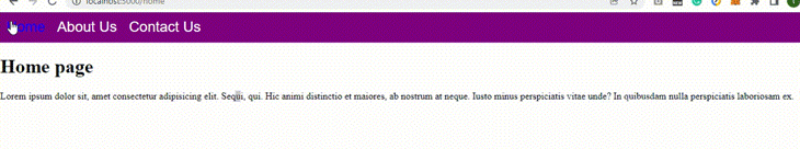
We can now check out our results in the browser:
You can get the full code in my GitHub repository.
Let’s take our project one step further, by adding a hamburger menu to our navbar to make it more responsive.
The hamburger menu will be the default view for mobile, but our standard navigation will remain the default view for desktop. A hamburger menu takes up less space than a standard navbar, resulting in a cleaner webpage.
First we’ll import all of the stylings from our Navstyle.tsx into our Navbar.tsx so we don’t have to go back and forth.
import {NavbarContainer,NavbarLinkContainer,NavbarLink,ButtonLink,ExtendedNavbar,NavbarLinkExtended} from '../styles/NavStyle';
Our next task is to make a button called ButtonLink that displays an expanded menu list when clicked. ButtonLink replaces all of the links. Add the following code to our Navstyle.tsx file:
export const ButtonLink = styled("button")`
    width: 70px;
    height: 50px;
    background: none;
    border: none;
    color: white;
    font-size: 45px;
    cursor: pointer;
`
Here, we’re is giving the ButtonLink a width of 70px, height of 50px, no background, no border, and white text with a font``-``size of 45px. We also specify that the cursor should be a pointer.
Now, let’s add the ButtonLink we just created to our Navbar.tsx, right after the NavbarLink closing link for our contact us.
<ButtonLink>≡</ButtonLink>
Notice we named the ButtonLink Unicode. The Unicode will represent our hamburger button.
Next, let’s add functionality so that when our screen gets smaller, the links will disappear, showing only our hamburger menu. To do that, let’s add a media query to our ButtonLink styles in our Navstyles.tsx:
 @media(min-width: 700px) {
        display: none;
What we’re trying to achieve with the media query is that whenever the screen width is greater than 700px, the hamburger menu will not display.
Now, let’s also add a media query to our NavbarLink:
@media(max-width: 700px) {
        display: none;
}
This media query quite the opposite, saying that the navbar links should not be displayed is the max``-``width is 700px.
Next, we want to make the hamburger menu functional so that the link appears when we click the button. To do that, we’ll need the React usestate, useEffect, and useLocation Hooks. We’ll use useState to represent the state of the button, while the useEffect and useLocation Hooks will update the state whenever it changes.
Let’s import the Hooks:
import { useState, useEffect,} from "react";
import { useLocation } from "react-router-dom";
First, let’s set our useLocation inside our us``eE``ffect to update our state whenever our URL path changes:
const location = useLocation();
  useEffect(() => {
    setExtendNavbar(false);
  }, [location]);
Next, we’ll create a state with the name extendNavbar:
const [extendNavbar, setExtendNavbar] = useState(false)
This is just representing the state of the button:
<ButtonLink onClick={()=>{
setExtendNavbar((curr)=>!curr);
}}>{extendNavbar ? <>✕</>: <>≡</>}</ButtonLink>
<
Here we‘re doing the following:
onC``lick function. This means that whenever we click on a button, we want to set our extendNavbar state to be equal to the opposite of its current state. In other words, if it’s open, we set it to close and vice versaButtonLink code. The onClick event shows that when our button state changes, the Unicode changes as wellNext, we want to alter the height of our NavbarContainer to fit in the extended container when we click on the button. We can do this by adding props to styled-components, but first, we’ll need to define our prototype:
type NavbarProps= {
    extend:boolean;
}
Then, we can alter the NavbarContainer in our Navstyle.tsx file:
export const NavbarContainer= styled("nav")<NavbarProps>`
width: 100%;
height:${(props)=>(props.extend? "100vh": "60px")};
background-color: purple;
display: flex;
flex-direction: column;

@media(min-width:700px){
    height: 60px;
}
`;
Now, let’s set the property in our navbarContainer to be equal to the e``xtendNavbar state.
<NavbarContainer extend={extendNavbar}>
We also want to create and style our hamburger nav menu, ExtendedNavbar, and our hamburger links, navbarlinkextended.
For the ExtendedNavbar:
export const ExtendedNavbar = styled("div")`
    display: flex;
    flex-direction: column;
    align-items: center;
    @media (min-width:700px){
        display: none;
}
`
With the media query in our ExtendedNavbar, the hamburger menu won’t display unless its width is less than 700px
For the NavbarLinkextended:
export const NavbarLinkExtended= styled(Link)`
  color:white;
  font-size: x-large;
  font-family: Arial, Helvetica, sans-serif;
  text-decoration: none;
  margin: 10px;
 &:hover,
&:focus{
    color: blue;
};
&:active{
    color: red;
};
  `
Next, we need to bring in our ExtendedNavbar. We also want it to include our links and display only when we click the link.
To achieve this, add the following code right after the N``avb``a``rLinkContainer closing tag:
{extendNavbar ? <>✕</> : <>≡</>}
</ButtonLink>
</NavbarLinkContainer>
{extendNavbar && (
<ExtendedNavbar>
<NavbarLinkExtended className="nav-link active" to="/home">
Home
</NavbarLinkExtended>
<NavbarLinkExtended className="nav-link" to="/about">
About Us
</NavbarLinkExtended>
<NavbarLinkExtended className="nav-link" to="/contact">
Contact Us
</NavbarLinkExtended>
</ExtendedNavbar>
)}
What we are doing here is displaying our our ExtendedNavbar only when the link is clicked. So, once we click our toggle button, our ExtendedNavbar displays; when we click it again, it disappears.
We’re done!
If you have questions, here’s the full code to the Navbar.tsx file:
import React from "react";
import { useState, useEffect } from "react";
import { useLocation } from "react-router-dom";
import {
NavbarContainer,
NavbarLinkContainer,
NavbarLink,
ButtonLink,
ExtendedNavbar,
NavbarLinkExtended,
} from "../styles/NavStyle";
const Navbar: React.FC = () => {
// ..
const location = useLocation();
useEffect(() => {
setExtendNavbar(false);
}, [location]);
// ..
const [extendNavbar, setExtendNavbar] = useState(false);
return (
<NavbarContainer extend={extendNavbar}>
<NavbarLinkContainer>
<NavbarLink className="nav-link active" to="/home">
Home
</NavbarLink>
<NavbarLink className="nav-link" to="/about">
About Us
</NavbarLink>
<NavbarLink className="nav-link" to="/contact">
Contact Us
</NavbarLink>
<ButtonLink
onClick={() => {
setExtendNavbar((curr) => !curr);
}}
>
{extendNavbar ? <>✕</> : <>≡</>}
</ButtonLink>
</NavbarLinkContainer>
{extendNavbar && (
<ExtendedNavbar>
<NavbarLinkExtended className="nav-link active" to="/home">
Home
</NavbarLinkExtended>
<NavbarLinkExtended className="nav-link" to="/about">
About Us
</NavbarLinkExtended>
<NavbarLinkExtended className="nav-link" to="/contact">
Contact Us
</NavbarLinkExtended>
</ExtendedNavbar>
)}
</NavbarContainer>
);
};
export default Navbar;
And, here’s the here’s the full code to the Navstyle.tsx file:
import { Link } from "react-router-dom";
import styled from "styled-components";
type NavbarProps = {
  extend: boolean;
};
export const NavbarContainer = styled("nav")<NavbarProps>`
  width: 100%;
  height: ${(props) => (props.extend ? "100vh" : "60px")};
  background-color: purple;
  display: flex;
  flex-direction: column;
  @media (min-width: 700px) {
    height: 60px;
  }
`;
export const NavbarLinkContainer = styled("div")`
  display: flex;
`;
export const NavbarLink = styled(Link)`
  color: white;
  font-size: x-large;
  font-family: Arial, Helvetica, sans-serif;
  text-decoration: none;
  margin: 10px;
  &:hover,
  &:focus {
    color: blue;
  }
  &:active {
    color: red;
  }
  @media (max-width: 700px) {
    display: none;
  }
`;
export const NavbarLinkExtended = styled(Link)`
  color: white;
  font-size: x-large;
  font-family: Arial, Helvetica, sans-serif;
  text-decoration: none;
  margin: 10px;
  &:hover,
  &:focus {
    color: blue;
  }
  &:active {
    color: red;
  }
`;
export const ButtonLink = styled("button")`
  width: 70px;
  height: 50px;
  background: none;
  border: none;
  color: white;
  font-size: 45px;
  cursor: pointer;
  @media (min-width: 700px) {
    display: none;
  }
`;
export const ExtendedNavbar = styled("div")`
  display: flex;
  flex-direction: column;
  align-items: center;
  @media (min-width: 700px) {
    display: none;
  }
`;
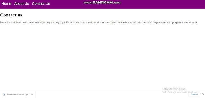
Let’s check out the final result in our browser:
You can get the code for this fully responsive navbar in my GitHub repository.
Let’s recap what we discussed.
We introduced styled-components and discussed the benefits of using this library. We also looked at why using TypeScript with React gives us an edge. We used our knowledge of both styled-components and TypeScript to style React Router links, and we also made the navbar responsive by creating a hamburger menu for the mobile view.
That was fun! Please share if you found this helpful!
Install LogRocket via npm or script tag. LogRocket.init() must be called client-side, not
server-side
$ npm i --save logrocket

// Code:

import LogRocket from 'logrocket';
LogRocket.init('app/id');
// Add to your HTML:

<script src="https://cdn.lr-ingest.com/LogRocket.min.js"></script>
<script>window.LogRocket && window.LogRocket.init('app/id');</script>

Learn how Bloom filters reduce database lookups for username availability checks while preserving correctness at scale.

Learn how to test Nuxt apps with Vitest, @nuxt/test-utils, runtime mocks, server route mocks, and Playwright e2e tests.

I had four weeks to build a complete app from scratch using AI tools like OpenCode and Claude Opus: here’s how it went.

Learn how to build a reusable Vue 3 table engine that powers tables, cards, and lists with shared sorting and pagination logic.
Would you be interested in joining LogRocket's developer community?
Join LogRocket’s Content Advisory Board. You’ll help inform the type of content we create and get access to exclusive meetups, social accreditation, and swag.
Sign up now

 Learn more →
