BoxShadow
Google’s Material Design guidelines have become the signature look for many modern websites and apps. Material Design supports experiences that mimic real-world objects, so light and shadows are important aspects of any app development process that follows these guidelines.
An object can reflect light or, if it obscures the light source, it can cast a shadow. Shadows can indicate depth, the direction of movement, and surface edges.
Adding shadows to elements in an app can aid with user identification of the elements, communicate interactivity, and help elements stand out and be easier to locate.
In this tutorial, we’ll demonstrate how to apply shadows to Flutter apps using the BoxShadow class. We’ll also look at a couple of special use cases: applying a shadow to only one side of a box and applying an inner shadow.
The Replay is a weekly newsletter for dev and engineering leaders.
Delivered once a week, it's your curated guide to the most important conversations around frontend dev, emerging AI tools, and the state of modern software.
BoxShadow classThe Flutter BoxShadow class is used to create and style a shadow cast by a box. The box could be a frame around an image or message, or it could be a button or modal. The BoxShadow class must be implemented inside a BoxDecoration widget.
The shadow implies its elevation relative to other surfaces and the direction of light hitting the surface. The shadow also takes on the shape of the box. BoxShadow takes several properties, including:
color: adds color to the shadow; the default is blackspreadRadius; establishes how large of a span the BoxShadow widget should inflate the boxblurRadius: adds blur to the shadowblurStyle: defines style to use on the blur; the default is BlurStyle.normaloffset: creates x and y offsetsNow, let’s take a look at how to implement these properties to cast shadows to an element in a demo app.
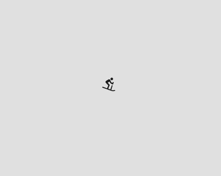
For this tutorial, we’ll add a BoxShadow to the app below. The app consists of a centered Container widget with an Icon widget.
The BoxDecoration widget has a boxShadow property which expects a list of BoxShadow.
...
Scaffold(
  backgroundColor: Colors.grey.shade300,
  body: Center(
    child: Container(
      height: 100,
      width: 150,
      child: const Icon(Icons.downhill_skiing),
      decoration: BoxDecoration(
        color: Colors.grey.shade300,
        boxShadow: [],
      ),
    ),
  ),
)
First let’s add a BoxShadow to our list:
 BoxDecoration(
  color: Colors.grey.shade300, // this is the container's color
  boxShadow: [
    BoxShadow(), // no shadow color set, defaults to black
  ]
)
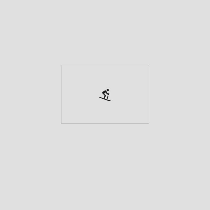
The BoxShadow is added below the Container. To illustrate this, we’ll give our Container a transparent color. In this example, the shadow is painted in the default color (black) in the shape of our box as shown:
 BoxDecoration(
  color: Colors.transparent,
  boxShadow: [
    BoxShadow(), // no shadow color set, defaults to black
  ]
)

To add a color to the shadow, we’ll make use of the color property. We’ll add a grey shadow to our app.
color: Colors.grey.shade600
The default spreadRadius is zero. Positive values increase the size of the shadow while negative values decrease the size.
We’ll give our Container a spreadRadius of one, as shown below:
boxShadow: [
  BoxShadow(
    color: Colors.grey.shade600,
    spreadRadius: 1,
  )
]
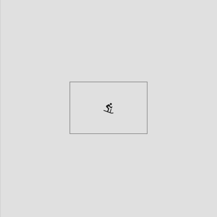
The default blurRadius is zero which creates a sharp shadow. It only takes positive values. The higher the radius value, the more blurred the shadow will be, and the further out the shadow will spread.
We’ll give our Container a blurRadius of 15.
boxShadow: [
  BoxShadow(
    color: Colors.grey.shade600,
    spreadRadius: 1,
    blurRadius: 15
  )
]

To change the style of the blur, we update the blurStyle property. The property takes in a BlurStyle enum which paints shadows based on the selected value.
The available styles include:
BlurStyle.normal: paints a blur that appears hazy on both the inside and the outside; this is the default BlurStyle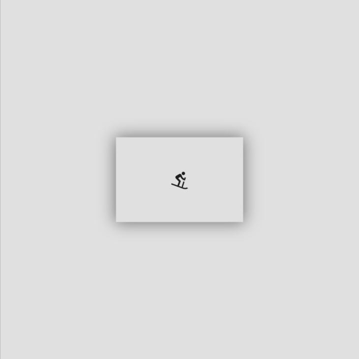
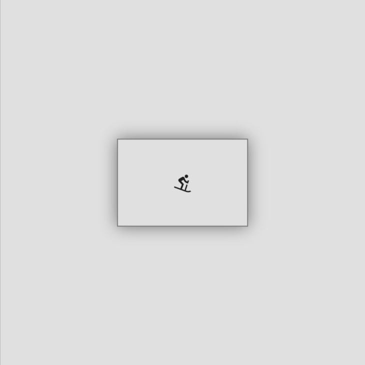
BlurStyle.solid: paints a solid blur on the inside and a hazy blur on the outside:
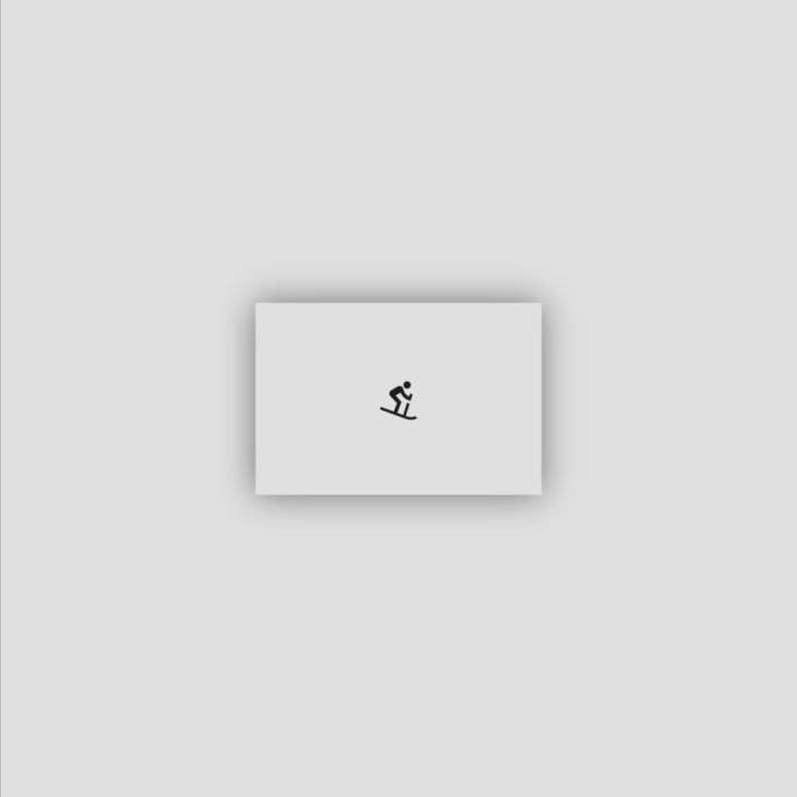
BlurStyle.outer: paints a hazy blur on the outside and nothing on the inside:
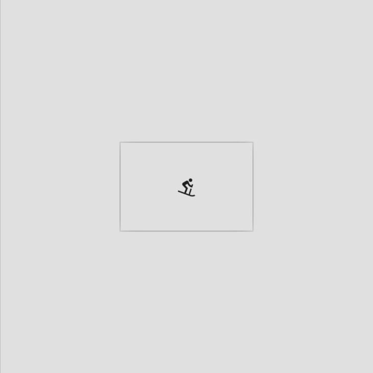
BlurStyle.inner: paints a hazy blur on the inside and nothing on the outside:
In this tutorial, we’ll use the default blur style, BlurStyle.normal.
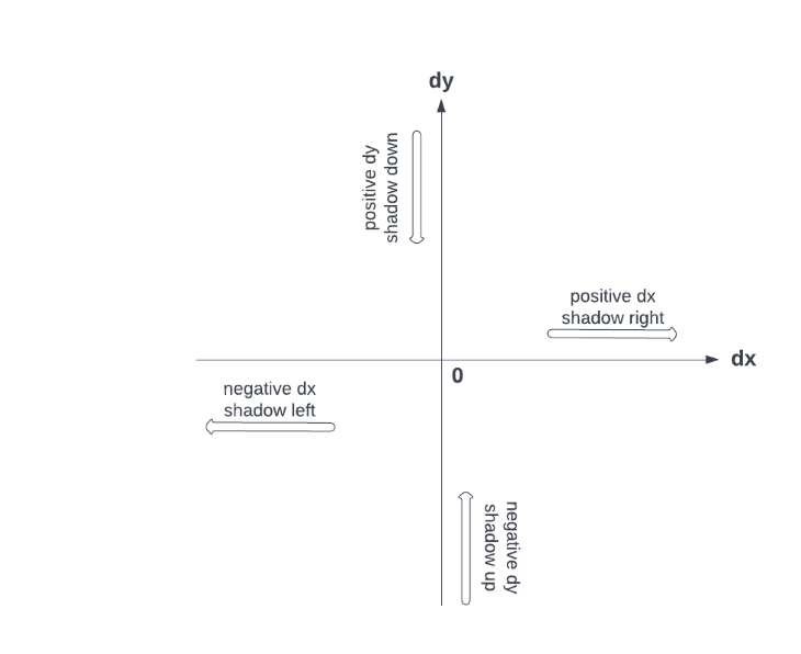
To add an offset, we use the Offset class which takes in x and y values: Offset(dx, dy). It accepts both negative and positive values. The default offset is Offset.zero.
To offset the shadow horizontally, the dx value is changed. A positive offset moves the shadow to the right of the box, while a negative offset moves the shadow to the left of the box.
To offset the shadow vertically, the dy value is changed. A negative offset moves the shadow above the box, while a positive offset moves the shadow below the box.
If both the dx and dy offset values are set to zero, the shadow is centered behind the box.
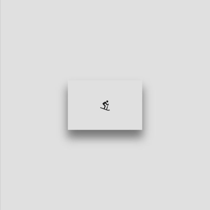
We’ll give our container a dx offset of zero and a dy offset of 15. This will move our shadow down.
boxShadow: [
  BoxShadow(
    color: Colors.grey.shade600,
    spreadRadius: 1,
    blurRadius: 15,
    offset: const Offset(0, 15)
  )
]
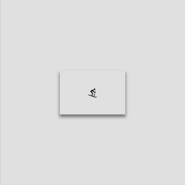
To scale a shadow, we can use the scale method. This method returns a new box shadow with its offset, blurRadius, and spreadRadius scaled by the given factor.
boxShadow: [
  BoxShadow(
    color: Colors.grey.shade600,
    spreadRadius: 1,
    blurRadius: 15,
    offset: const Offset(0, 15),
  ).scale(4)
]
Now that we understand how to use the various BoxShadow properties, we can enhance the styling of our Flutter app elements.
BoxShadow to one side of a containerThe BoxDecoration’s boxShadow property takes a list of shadows. This list can be used to shift shadows to the desired sides of a box.
To apply a shadow to only one side of a box, we need to shift or hide the shadows on all the remaining sides. This can be accomplished by adding a list of shadows with varying offsets.
We can add a box shadow to the bottom of our Container using the following steps:
Step 1: Hide the top shadow
To hide the top shadow, we need to set our dy offset value to a positive number greater than our blur radius. This moves the shadow down, hiding it behind the Container.
boxShadow: [
  BoxShadow(
    color: Colors.grey.shade600,
    spreadRadius: 1,
    blurRadius: 5,
    offset: const Offset(0, 5),
  )
]
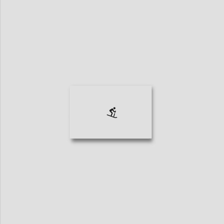
Step 2: Hide the left shadow
If we add a new BoxShadow to our list, we can use its offset to hide the left shadow. This new shadow will need to have the same color as our Container.
In addition, we’ll need to set the dx value to a negative value greater than or equal to the blur radius of the first shadow. This moves the new shadow to the left, hiding the initial left shadow.
boxShadow: [
  BoxShadow(
    color: Colors.grey.shade600,
    spreadRadius: 1,
    blurRadius: 5,
    offset: const Offset(0, 5),
  ),
  BoxShadow(
    color: Colors.grey.shade300,
    offset: const Offset(-5,0),
  )
]
Step 3: Hide the right shadow
If we add a new BoxShadow to our list, we can use its offset to hide the right shadow. Just like the process from Step 2, this new shadow needs to have the same color as our Container.
We’ll need to set the dx value to a positive value greater than or equal to the blur radius of the first shadow. This moves the new shadow to the right, hiding the initial right shadow.
boxShadow: [
  BoxShadow(
    color: Colors.grey.shade600,
    spreadRadius: 1,
    blurRadius: 5,
    offset: const Offset(0, 5),
  ),
  BoxShadow(
    color: Colors.grey.shade300,
    offset: const Offset(-5,0),
  ),
  BoxShadow(
    color: Colors.grey.shade300,
    offset: const Offset(5,0),
  )
]
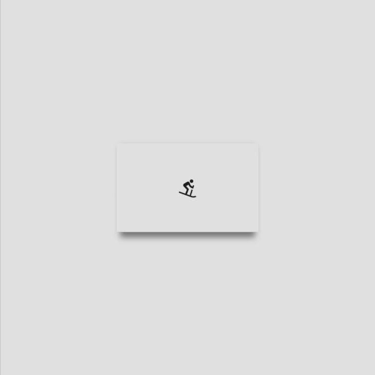
With these three steps, we have managed to visually show the shadow on the bottom of our Container.
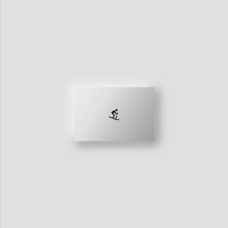
BoxShadow for an inner shadow effectWe can apply inner shadows to a Container by tweaking the shadows and adding a linear gradient.
This is a two-step process.
Step 1: Add two shadows of different colors
For this example, we’ll add two shadows, one white and one grey, and offset them opposite to each other:
boxShadow: [
  BoxShadow(
    color: Colors.grey.shade600,
    spreadRadius: 1,
    blurRadius: 15,
    offset: const Offset(5, 5),
  ),
  const BoxShadow(
    color: Colors.white,
    offset: Offset(-5,-5),
    blurRadius: 15,
    spreadRadius: 1
  ) ,
],
Step 2: Add a linear gradient
We’ll use the BoxDecoration‘s gradient property to create a linear gradient:
BoxDecoration(
...
  boxShadow: [
    BoxShadow(
      color: Colors.grey.shade600,
      spreadRadius: 1,
      blurRadius: 15,
      offset: const Offset(5, 5),
    ),
    const BoxShadow(
      color: Colors.white,
      offset: Offset(-5,-5),
      blurRadius: 15,
      spreadRadius: 1
    ) ,
  ],
  gradient: LinearGradient(
    begin: Alignment.topLeft,
    end: Alignment.bottomRight,
    colors: [
      Colors.grey.shade200,
      Colors.grey.shade300,
      Colors.grey.shade400,
      Colors.grey.shade500,
    ],
  ),
)
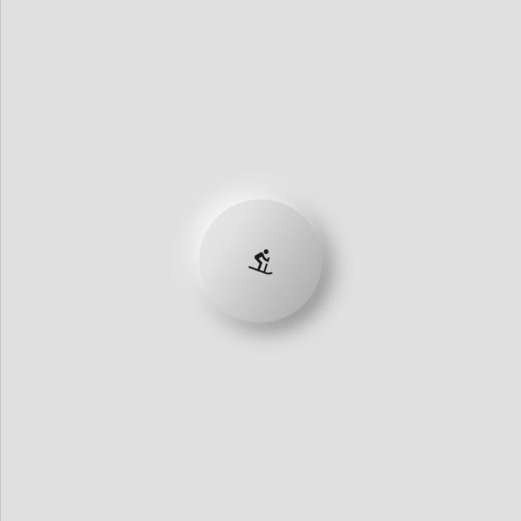
The shadow takes the shape of the Container when its shape is changed.
In this tutorial, we covered how to apply box shadows to a container in a Flutter app. We showed how to adjust the color, spread radius, blur radius, blur style and offset of the shadow. We also demonstrated how to add shadows to just one side of a container and how to create an inner shadow effect.
All the code in this article is available on GitHub. I hope you enjoyed this tutorial!
Install LogRocket via npm or script tag. LogRocket.init() must be called client-side, not
server-side
$ npm i --save logrocket

// Code:

import LogRocket from 'logrocket';
LogRocket.init('app/id');
// Add to your HTML:

<script src="https://cdn.lr-ingest.com/LogRocket.min.js"></script>
<script>window.LogRocket && window.LogRocket.init('app/id');</script>

Learn how Vite+ unifies Vite, Vitest, Oxlint, Oxfmt, Rolldown, and Node.js management in one CLI.

AI companies are buying developer tools as coding agents turn runtimes, package managers, and linters into strategic infrastructure.

Learn how AI-assisted development governance uses rules, agents, hooks, and protocols to help AI coding tools produce safer, more consistent code.

A step-by-step guide to building your first MCP server using Node.js, covering core concepts, tool design, and upgrading from file storage to MySQL.
Would you be interested in joining LogRocket's developer community?
Join LogRocket’s Content Advisory Board. You’ll help inform the type of content we create and get access to exclusive meetups, social accreditation, and swag.
Sign up now