Microinteractions are part of our everyday interactions across devices and apps. They are moments that produce immediate feedback for the user, creating a sense of direct engagement.

If the user experience is smooth, these small interactions might go unnoticed since they are so embedded in the interaction with the product. Though small, these details can have a huge influence on the overall experience of a product.
If you want your user to feel like they have an impact when they interact with your app, microinteractions are key.
Microinteractions are events that revolve around one main task. For example, a specific action like pressing a button will trigger a small change, giving the user feedback according to the context. Since the user expects feedback, the right kind can help a person clearly see the result of their actions.
Microinteractions can also give users immediate status updates, keeping them informed and connected with the experience (e.g., a loading page). Microinteractions can make an experience more engaging, satisfying, intuitive, and can even help communicate a brand’s identity.
Though microinteractions are small moments that we usually pay little attention to, each of these moments adds up to create our overall experience of a product. They can make our experience more intuitive and personal, and make it easier and more fun to navigate through an app.
If ill-considered, though, these actions can make the user frustrated or annoyed as their experience becomes one of tolerating rather than enjoying. In other words, microinteractions can be the difference between a generic or unpleasant experience and an amazing one.
Thinking about what the microinteractions should accomplish will drive what type of interactions they will be. Microinteractions can help achieve the following objectives:
Considering microinteractions in UX design is essential to showing care for the user. Paying attention to small moments is important since it can affect the way a person feels about an app subconsciously. A smooth and positive experience navigating through an app, for example, can improve someone’s emotional relationship with it.
When a person enjoys a product, this personal connection might influence them to keep coming back, whereas if the experience was distracting and inconsiderate of the user, this could negatively affect the brand experience. One small aspect of a product can influence whether a person has a positive or negative predisposition to the product and can be a critical part of building a relationship with it.
In his 2013 book Microinteractions: Designing with Details, Dan Saffer describes microinteractions as a series of small interactions that can be found when interacting with any product.
Saffer outlines a model for designing micronteractions that begins by breaking them down into four parts — each of them to be considered when designing the details of a user’s experience. The four components include the trigger, the rules, feedback, and loops and modes.

A trigger is the action that begins a microinteraction. Triggers can be broken down into two types: a user-initiated trigger, and a system-initiated trigger.
A user-initiated trigger is when a person intentionally interacts with the product. For example, this could include pressing a button, voice activation, a clap, or a wave of a hand.
A system-initiated trigger happens when certain conditions are met. These happen automatically; for example, a notification sent out when an email is received or a warning when your battery is low.
Rules define what happens in response to a trigger. The series of interactions following the trigger will follow certain parameters — these control what happens next and in which order.
The user will see a small change in response to their action, signaling that it has been acknowledged. It will communicate to a user; for example, it can notify them of an error or verify a successful action.
Feedback can be audio, visual, or haptic (e.g., a notification sound for texts, a pop-up heard when liking a photo, or a phone vibrating when switched to silent mode).
A loop determines whether an interaction repeats or changes over time (i.e., how long the microinteraction will last). For example, this could be a notification reminding you of your daily screen time. When a mode is changed, it means that actions might be different under these conditions. For example, when a phone is on do-not-disturb more, notifications would be delivered differently.
When considering the whole user journey, you might benefit from providing immediate feedback in certain areas. Keeping users informed can make an experience more intuitive and engaging rather than frustrating and annoying.
Enticing someone’s interest through well-thought-out nudges could encourage them to click send or buy an item. It could also signal a feeling of achievement that keeps the user coming back.


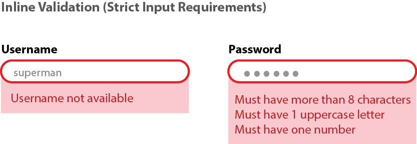
When typing in a password for a site, a microinteraction could notify a user if their password is weak or strong and which requirements have been met. When entering data into an online form and certain sections were missed, a well-designed microinteraction should inform the user which sections they missed clearly so they do not waste time trying to find their mistakes.
Since everyone makes mistakes, a microinteraction can give users the chance to easily undo prior actions (e.g., a like button can easily be pressed again to reverse the action).

A visually engaging loading screen can help take the boredom out of waiting. An animation showing loading progress could be entertaining and reassuring to a user. It will also keep the user informed about the progress; being aware of what is going on will help the user stay on the app instead of closing it in frustration.
There are several ways to communicate with the user and keep them in the loop regarding what is going on with the product/app. Below are several specific examples of microinteractions along with their function and how they influence user experience.

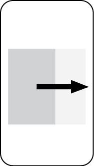
Swipes can be used to get new information or move to a new page, and they can also save space on mobile devices by using gestures instead of buttons. This can make interaction smooth, fun, and even addictive.

Animations make even the simplest processes interesting — for example, informing the user of progress on a loading screen. Color, shape, size, texture, placement, and texture can all vary depending on the goal of the feedback.
 Scrollbars show a user where they are on a page and how much they have left to see.

When dragging to refresh a page, pull-to-refresh can add a moment of anticipation and excitement.

Notifications let someone know when their post has been liked, when a download is complete, or when to do a task.
There are many tools available today in the changing landscape of UX design. To choose the right one to design microinteractions, several things need to be kept in mind. These include the context and requirements of the project, different working styles, and prior expertise.
To design microinteractions, there are tools available for both mobile and web. Each has strengths for specific microinteraction tasks.
Tools like Framer and CSS animation offer extra control over physics-based properties like friction and elasticity. They allow for customization of the size, transparency, and color of the widgets.
Though using these coding tools can help create tailored solutions, it can take longer to learn how to use them and this might not be necessary for certain microinteractions.
Visual tools allow you to create high-fidelity interactions quickly. Though they allow for less technically tailored solutions, these tools work well for people with strong visual communication skills but a lack of coding knowledge.
Tools like Marvel and Invision are also good for collaborative ideation as they can capture external feedback, improving the iteration process.
Microinteractions should not be looked at as additions, but rather essential parts of great design, and should thus be thought about right at the beginning of any design process.
These interactions should first of all be functional, but also entertaining — not annoying or distracting. Even for small details of the design, iterating and rethinking experiences are essential to finding what works.
When designing microinteractions, it is important to imagine being in the user’s shoes to find what is appropriate for the specific context. Research is crucial at the beginning and throughout the design process to develop a clear understanding of the specific needs of the user.

The right user testing tools will inform design decisions by identifying pain points and areas for improvement. Designers should question the way people use certain elements of a design, as well as their emotional experience with it and how it fits into their lifestyle and identity.
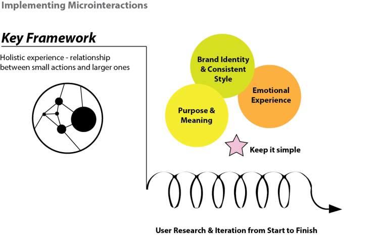
Small moments of interaction can have an impact that influences the user’s view of the entire product. They can therefore be a part of communicating the identity and values of a brand. A consistent style allows the user to have a smooth experience through all areas of the product, and creating this consistent style should reflect the brand image by considering the emotions and values you’ll incorporate into the experience.
When designing a product, even small improvements can make the whole interaction process more enjoyable and can be an opportunity to create a personal experience that makes users feel connected to the product.
Like other aspects of design, microinteractions should be purposeful and meaningful. To make sure that microinteractions add value to a product, keep them simple, including only what is necessary and no extra distractions.
When done well, the user does not have to think about these interactions; they become intuitive. This creates a habit loop of a routine response to a cue and the reward that comes from that action.
Consider the relationship between these small actions and the larger ones in order to create a holistic experience. This includes keeping the big picture in mind to ensure that different parts work well together instead of being a fragmented experience.
Microinteractions are part of our everyday interactions across devices and apps. They are moments that create a sense of direct engagement for the user by producing immediate feedback. Microinteractions can be used for a call to action, data input and error prevention, and informing or entertainment. Each of these small interactions adds up to create our overall experience of a product, and considering the goal of the interaction and the value it will bring is essential to creating a design that shows care for the user.
The four components to keep in mind when designing microinteractions (as noted by Dan Saffer) are:
And remember: microinteractions should be purposeful and meaningful. Keeping the big picture in mind can ensure that separate parts communicate consistent values to create a holistic experience. These small moments can make an experience personal and enjoyable, and can take an experience from being ordinary to amazing.
LogRocket's Galileo AI watches sessions and understands user feedback for you, automating the most time-intensive parts of your job and giving you more time to focus on great design.
See how design choices, interactions, and issues affect your users — get a demo of LogRocket today.

Zero UI works well for screenless, voice-first experiences, but most digital products still require visual interaction. Here’s why multimodal UX offers a more scalable foundation for the future of design.

Multimodal UX goes beyond designing for screens. Learn how context-aware systems, progressive modality, failover modes, and accessibility-first design create better digital product experiences.

Learn how context-aware mode prioritization and seamless transitions improve multimodal UX and reduce mode confusion.

Research is becoming more democratized, product cycles are accelerating, and AI is transforming synthesis and ResearchOps. Here are the three trends shaping UX research in 2026.