
In this guide, we will explore building a data analysis dashboard using Deno and Jupyter Notebook. Recently, the Deno team announced compatibility with Jupyter Notebook, allowing users to leverage the power and flexibility of Deno for their data analysis workflows by using Deno as a kernel within their Jupyter Notebook.

The Replay is a weekly newsletter for dev and engineering leaders.
Delivered once a week, it's your curated guide to the most important conversations around frontend dev, emerging AI tools, and the state of modern software.
Deno is a modern JavaScript runtime for server-side and client-side applications. Even though you can still run pure JavaScript, Deno provides built-in support for TypeScript.
Deno uses strict type checking by default, as the TypeScript development team recommends, leading to a more type-safe environment. The main theme behind Deno is to provide a more secure runtime environment and a module system with explicit dependencies.
Jupyter Notebook is a tool to help you visualize and analyze data interactively and collaboratively. You don’t need to run code from a console, and you can run the code directly within the notebook cells, making it easier to visualize, experiment, and iterate on data analysis tasks.
This integration opens up new possibilities for data scientists and analysts, giving them access to Deno’s modern JavaScript runtime and its extensive module ecosystem that can import existing npm packages.
Jupyter Notebook has become the go-to tool for data scientists to explore and understand data.
These notebooks provide a convenient way to combine code, execute it, and show visualizations and explanatory text in a single document. This combination makes it easier to use Jupyter Notebook as a collaboration tool among data scientists, allowing for knowledge sharing and reproducibility in data analysis workflows.
Jupyter Notebook supports multiple languages, including Python, R, Rust, Julia, and Deno. This wide language support makes it easy for data scientists to work with the suitable programming language of their choice, depending on the nature of their data analysis tasks and preferred tools. One of the main goals behind using a notebook is to iterate quickly and use interactive computing effectively for data exploration and analysis.
Interactive computing allows data scientists to execute code and iterate on it directly without the hassle of using command lines or traditional code execution environments. Compared to executing code via a terminal or debugger, testing code and iterating on data analysis tasks in Jupyter Notebook is exceptionally easier.
The benefit of using Deno is that you can access modern JavaScript libraries available within the Node and npm ecosystem. There are already a lot of powerful libraries for data science and data visualization in npm, and you can plug and play these libraries in your Deno-powered Jupyter Notebook.
Here are a few examples of popular data science libraries in Deno that you‘ll interact with in this article:
With a foundational understanding of Deno and Jupyter Notebook established, let’s delve into how to set up your environment to start building robust data analysis dashboards.
To prepare your environment, you must install both Deno and Jupyter. Assuming you’re using macOS/Linux, you can install Deno using the following command:
curl -fsSL https://deno.land/x/install/install.sh | sh
Next, ensure you have Python 3.x and pip installed. Jupyter Notebook is written in Python, so you will need pip to install it by running the following command:
pip install jupyterlab notebook
Test run your local Notebook server by executing:
jupyter notebook
The command above will run a Jupyter Notebook local server:
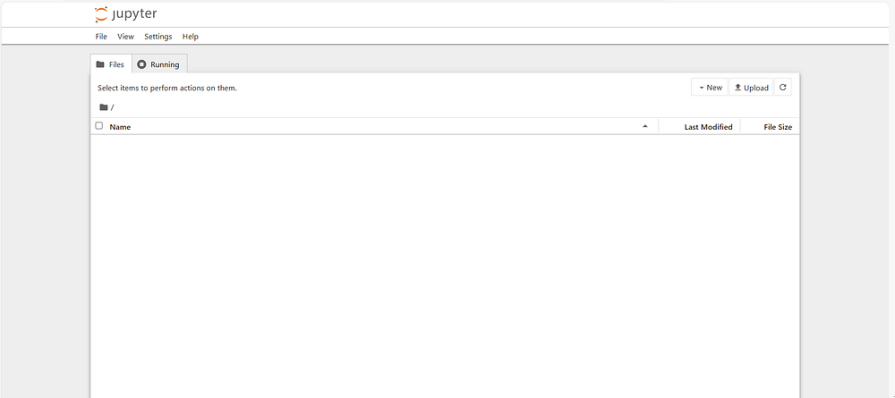
If everything is set up correctly, you should see the Jupyter Notebook interface launching in your browser on http://localhost:8888/.
To use Deno in your notebook, you must have the Deno kernel installed. First, you can test run your Deno kernel by running the following command:
deno jupyter --unstable
If the kernel is already installed, you should receive a return message:
Otherwise, if you haven’t installed the kernel yet, run the following:
deno jupyter --unstable --install
The above command will ensure you have installed the most recent Deno kernel for your local Jupyter Notebook.
N.B., while the Deno kernel is already shipped with the most recent version, it is still marked as unstable. This means that there may be some bugs or issues that could arise while using the Deno kernel in Jupyter Notebook.
Once you have Deno and Jupyter Notebook configured, you can start building your data analysis dashboard.
To help you understand how the new Deno kernel works, it’s better if we do a basic data visualization exercise using Jupyter Notebook and Deno.
You will build a financial data dashboard that analyzes your income and expenses. This dashboard will provide visualizations and insights into your financial data, helping you understand your expenses over time and make informed financial decisions. It will also allow you to track your net income and identify trends.
Here is a sample dataset of what the data would look like:
Date,Income,Expenses,NetIncome,BudgetIncome,ActualIncome,BudgetExpenses,ActualExpenses,Salaries,R&D,Marketing,Utilities,Rent,Equipment,Software,Hardware,Consulting,Office Supplies,DiffIncome,DiffExpenses
2022-01-01,281,218,63,284,281,221,218,41,24,45,43,22,35,2,2,2,2,3,3
2022-01-02,328,244,84,323,328,240,244,46,45,34,35,31,37,1,4,8,3,-5,-4
2022-01-03,266,223,43,269,266,222,223,31,49,38,30,22,40,2,6,1,4,3,-1
2022-01-04,287,226,61,279,287,229,226,43,47,31,48,21,26,5,1,3,1,-8,3
2022-01-05,307,214,93,309,307,217,214,48,37,40,23,34,20,1,3,4,4,2,3
The dataset for the dashboard is publicly available here.
In addition to D3.js, Observable Plot, and Polars, mentioned above, you‘ll also use the following packages for this exercise:
You’ll use Skia Canvas to create a canvas for rendering the data visualizations, display to render the plot on the canvas, D3 for data visualization, Observable Plot for creating interactive plots, and Polars to load the data into DataFrames.
You can start by importing the necessary libraries and modules in your Jupyter Notebook to build the financial data dashboard. Begin by importing the nodejs-polars library and the display module:
import pl from "npm:nodejs-polars";
import { display } from "https://deno.land/x/[email protected]/mod.ts";
Once you import the required libraries, you can start fetching the sample dataset:
let response = await fetch(
  "https://gist.githubusercontent.com/agustinustheo/195f32a4a6c68c493056c883d959ca35/raw/c7363d8b916ab00a2d1747adb89fca120da29f42/mock_financial_data.csv",
);

let data = await response.text();

let df = pl.readCSV(data, { sep: "," });

await display(df.sample(10));
Integrating different types of visualizations, such as line charts, bar charts, and pie charts, to effectively showcase your financial data trends and patterns over time.
To start visualizing your data, you can use the D3.js library. Import it with the skia_canvas module to create a canvas to render the chart:
import * as d3 from "npm:d3";
import { createCanvas } from "https://deno.land/x/skia_canvas/mod.ts";
Once you have imported the necessary libraries, you can build your data visualization using D3. You will build a simple pie chart to track the percentage of expenses. Get the tail end of the data using df.tail(1).toRecords()[0] and then print the results:
const lastDataPoint = df.tail(1).toRecords()[0];
console.log(lastDataPoint);
Next, create the sample data by selecting the necessary columns from the DataFrame and converting them into a format suitable for a pie chart:
let categories = ['Salaries', 'R&D', 'Marketing', 'Utilities', 'Rent', 'Equipment', 'Software', 'Hardware', 'Consulting', 'Office Supplies'];

// Sample data
const sampleData1 = [];
for(let i = 0; i < categories.length; i++) {
    const category = categories[i];
    sampleData1.push({
        category,
        amount: lastDataPoint[category],
    });
}
Now you can create a canvas and use D3 to render the pie chart. Here’s an example of how you can achieve this:
const width = 500;
const height = 500;
const radius = Math.min(width, height) / 2;

// Create a pie function
const pie = d3.pie().value(d => d.amount);

// Create an arc generator for the slices
const arc = d3.arc()
    .innerRadius(0)
    .outerRadius(radius);

// Create an arc generator for the labels
const labelArc = d3.arc()
    .innerRadius(radius - 40) // Adjust to position the labels
    .outerRadius(radius - 40);

// Create the canvas
const canvas = createCanvas(width, height);
const ctx = canvas.getContext("2d");

// Translate to center the pie chart
ctx.translate(width / 2, height / 2);

// Draw the pie chart
pie(sampleData1).forEach((d, i) => {
    // Draw the slice
    ctx.beginPath();
    arc.context(ctx)(d);
    ctx.fillStyle = d3.schemeCategory10[i % 10];
    ctx.fill();

    // Draw the label
    ctx.fillStyle = "#000"; // Label color
    ctx.textAlign = "center";
    ctx.textBaseline = "middle";

    const centroid = labelArc.centroid(d);
    ctx.fillText(d.data.category, centroid[0], centroid[1]);
});

// Display the canvas
await display(canvas);
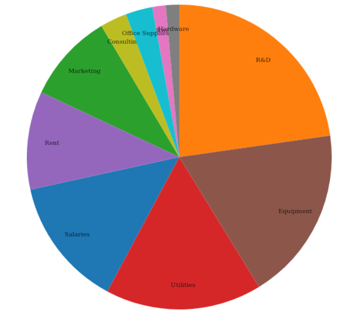
In the code snippet above, we visualized the percentage distribution of your expenses in a simple pie chart. This is just one example of how you can use D3 to visualize your data in Jupyter Notebook.
To further enhance the data visualization capabilities in Jupyter Notebook, consider using Observable Plot. Compared to D3, it has a significantly lower learning curve — you don’t need to write custom functions to render visuals. You can use Plot and define the type of chart you want to start rendering.
Start by importing the necessary dependencies, initializing your document canvas, and defining the records you want to show:
import * as Plot from "npm:@observablehq/plot";
import { DOMParser, SVGElement } from "npm:linkedom";
const document = new DOMParser().parseFromString(
  `<!DOCTYPE html><html lang="en"></html>`,
  "text/html",
);

let records = df.tail(40).toRecords();
The @observablehq/plot library doesn’t rely on skia_canvas to render the charts. In the example above, we are using a regular HTML document.
Now, you will make a line chart for your net income. It will appear as though the net income has no significant trend, but rest assured, it’s expected — the data is randomized:
let convertedArray = records.map(item => {
    return {
        NetIncome: item.NetIncome,
        Date: new Date(item.Date)
    };
});

await display(
  Plot.plot({
    x: { type: "band" },
    y: { grid: true },
    marks: [
      Plot.line(convertedArray, {x: "Date", y: "NetIncome"}),
    ],
    document,
  }),
);
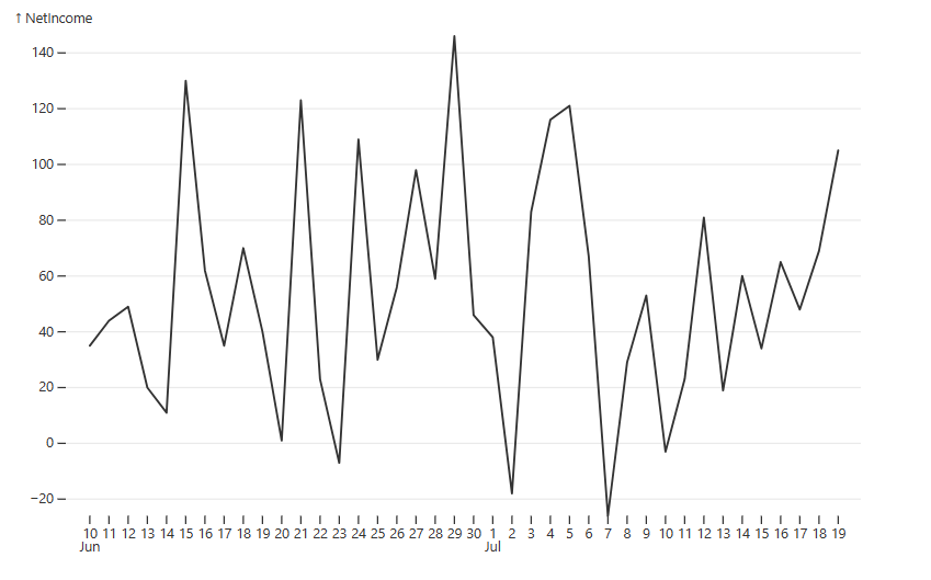
Judging by how the line chart looks, @observablehq/plot gives you a more refined template compared with D3, where you have to do things from scratch.
Now, let’s continue visualizing the expenses. Remember the pie chart? Let’s make a stacked bar chart showing the expenses over some time with a clear visual of what kind of expenses account for the most spend:
let sampleData2 = [];
for (let i = 0; i < records.length; i++) {
  const currentRecord = records[i];
  for (let x = 0; x < categories.length; x++) {
    const currentCategory = categories[x];
    sampleData2.push({
      date: new Date(currentRecord["Date"]),
      category: currentCategory,
      count: currentRecord[currentCategory],
    });
  }
}

await display(
  Plot.plot({
    x: { type: "band" },
    y: { grid: true },
    marks: [
      Plot.barY(sampleData2, { x: "date", y: "count", fill: "category" }),
      Plot.ruleY([0]),
    ],
    color: { legend: true },
    document,
  }),
);
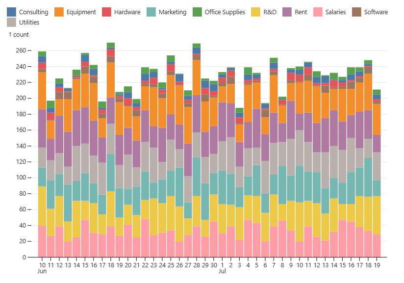
In the code snippets above, the @observablehq/plot library creates two visualizations: a line chart for net income and a stacked bar chart for expenses over time. Both charts are created using the Plot.plot function.
You‘ve finished creating the financial dashboard using Jupyter Notebook and Deno!
You have effectively utilized D3 and Observable Plot to create advanced visualizations of your financial data in Jupyter Notebook using Deno. By incorporating D3, you could create a simple and clear visualization of your expenses in the form of a pie chart.
Additionally, you used Observable Plot to generate a line chart for net income and a stacked bar chart illustrating expenses over time. This library provides a more refined template with minimal effort, making it perfect for rapid iterations and prototyping.
In addition to our example above, where we created a financial dashboard, this section will cover some other case studies demonstrating how to use Deno with Jupyter Notebook for data analysis and dashboard design.
You can make statistical models to predict future trends or analyze data patterns using Jupyter Notebook and Deno. Jupyter Notebook is very popular in machine learning, mainly used in tandem with Python to create interactive notebooks for training models and experiments with different algorithms.
The only difference here is that Deno uses TypeScript and does not offer the same number of open source data science libraries as Python. While Deno benefits greatly from being cross-compatible with npm, it still isn’t as robust with respect to ML libraries.
However, you can still utilize libraries such as Polar and scikitjs in Deno to perform statistical modeling tasks, and its integration with Jupyter Notebook makes it a powerful tool for building a statistical model dashboard.
Data cleaning and transformation are common tasks in data analysis, and the combination of Jupyter Notebook and Deno can streamline the process. Jupyter Notebooks provides an interactive environment where you can write and execute code for data cleaning and transformation using Deno.
Using the aforementioned libraries for processing data, along with Deno’s built-in modules such as fs, you can easily read, manipulate, and transform data in Jupyter Notebook using Deno.
Most of the code within this guide is used for data processing. Data engineers benefit from using Jupyter Notebook because it gives them a quick and easy environment to perform data cleaning and transformation, allowing them to iterate faster.
Jupyter Notebook is a platform that facilitates interactive, collaborative data visualization and analysis. It is possible to execute code directly within notebook cells, eliminating the requirement for a console, which accelerates task iteration.
Together with Deno, Jupyter Notebook can simplify data analysis activities like data transformation and cleansing. With this integration, data scientists and analysts now have access to Deno’s modern, secure JavaScript runtime and vast module ecosystem, allowing them to import existing npm packages.
To learn more about using Jupyter Notebook with Deno for data analysis and building dashboards, you can refer to the following resources:
Here are some notable packages for data analysis with Jupyter Notebooks and Deno:
Leveraging the potential of Deno in conjunction with Jupyter Notebook will undoubtedly enhance your data analysis practices and open up further opportunities for advanced visualization and modeling quickly and more efficiently.
Install LogRocket via npm or script tag. LogRocket.init() must be called client-side, not
server-side
$ npm i --save logrocket

// Code:

import LogRocket from 'logrocket';
LogRocket.init('app/id');
// Add to your HTML:

<script src="https://cdn.lr-ingest.com/LogRocket.min.js"></script>
<script>window.LogRocket && window.LogRocket.init('app/id');</script>
When should you move API logic out of Next.js? Learn when Route Handlers stop scaling and how ElysiaJS helps.

Explore how Dokploy streamlines app deployment with Docker, automated builds, and simpler infrastructure compared to traditional CI/CD workflows.
A side-by-side look at Astro and Next.js for content-heavy sites, breaking down performance, JavaScript payload, and when each framework actually makes sense.
AI-generated tests can speed up React testing, but they also create hidden risks. Here’s what broke in a real app.re
Would you be interested in joining LogRocket's developer community?
Join LogRocket’s Content Advisory Board. You’ll help inform the type of content we create and get access to exclusive meetups, social accreditation, and swag.
Sign up now