Editor’s note: This article was last updated on 14 April 2023 to include additional information about props.

Mobile app developers typically use common GUI elements like buttons, lists, input boxes, and text regions within app screens. However, we sometimes need to use more complex GUI elements, like calendars, timetables, and agenda views.
React Native offers several built-in components for adding primary GUI elements. But, we’ll either have to build more complex GUI components from scratch with built-in core elements or reuse pre-implemented components from third-party libraries.
The React Native Calendars library offers pre-implemented, customizable components for adding calendars to your React Native application. In this tutorial, we’ll learn how to use these calendar components to create a customizable, shareable calendar that can display date-based data and capture date values from the user. We’ll also review several alternative packages for creating customizable calendars in React Native. Let’s get started!
Jump ahead:
Agenda component for advanced use casesIn older React Native versions, we could find DatePickerAndroid and DatePickerIOS, two built-in native components for adding date pickers on Android and iOS. These components rendered platform-specific calendar GUI elements for selecting a date. For example, DatePickerAndroid displayed the Android system calendar dialog, and DatePickerIOS rendered the scrollable native iOS date picker. However, at the time of writing, the React Native team has marked these components as deprecated in the official documentation.
As an alternative option, you could build your own calendar component with View and other atomic building blocks, but that’s undoubtedly a time-consuming activity for a modern fixed-budget app.
Using a calendar library is usually the best approach because it pre-implements common calendar UI features in a customizable way. Moreover, some calendar libraries offer additional components and features, like date range selectors, agenda views, etc.
Based on GitHub stars and npm downloads at the time of writing, the React Native Calendars library is one of the most popular and full-featured libraries among all of the available React Native community calendar packages. Also, as a recommended library in the React Native Directory, React Native Calendars also benefits from more popularity among React Native developers.
React Native Calendars offers the following features to add customizable and high-quality calendar components.
React Native Calendars offers various components for creating calendars, agenda views, and timelines. Below are the popular ones for creating calendars:
Calendar: Renders a Calendar component with built-in month navigation supportCalendarList: A modern and stylish component that renders a semi-infinite, scrollable calendar listAgenda: A complex calendar component that helps developers implement timetables, appointment tables, and date schedulersWhen selecting a React Native library, it’s crucial to consider cross-platform support. With official support for both Android and iOS platforms, the React Native Calendars package offers a consistent look and feel with primary React Native components, like Text, TouchableOpacity, etc., that look nearly the same on both operating systems. Because it doesn’t contain native code, React Native Calendars works on Expo Go.
Each library component exposes several props to customize the particular component’s behavior and features. For example, by providing a theme object, React Native Calendars lets you customize the calendar component’s fonts and colors. You can also mark individual dates and date ranges with built-in customizable indicators and custom shapes.
By overriding stylesheet definitions, you can achieve advanced styling customizations. So, if you use your own theme for your app, using the existing theme colors is easy. React Native Calendars also lets you attach callbacks for various events, so you can build a customized, modern date picker.
Now that we have an overview of the React Native Calendars package, let’s use it practically by testing its features in a React Native application. To continue with the tutorial, you can use the following code examples directly in an existing app or create a new experimental app.
To get started with a new project, run the following command:
npx react-native init CalendarsExample
cd CalendarsExample
Next, run the app to make sure that everything is working fine:
npx react-native run-android
# --- or ---
npx react-native run-ios
Install React Native Calendars by running the following command:
npm install react-native-calendars
# --- or ---
yarn install react-native-calendars
Let’s start with the Calendar component and explore its customization options and features in depth.
The Calendar component lets you render a traditional calendar element that supports month navigation. There are no mandatory props here. To create a calendar with the default setup, use the component without props in App.js:
import React from 'react';
import {
  SafeAreaView,
  ScrollView,
  StyleSheet,
  View,
} from 'react-native';
import { Calendar } from 'react-native-calendars';

function App() {
  return (
    <SafeAreaView style={styles.container}>
      <Calendar />
    </SafeAreaView>
  );
};

const styles = StyleSheet.create({
  container: {
    flex: 1,
    justifyContent: 'center'
  },
});

export default App;
The code above will render a Calendar component with the default features and styles, as shown in the preview below:
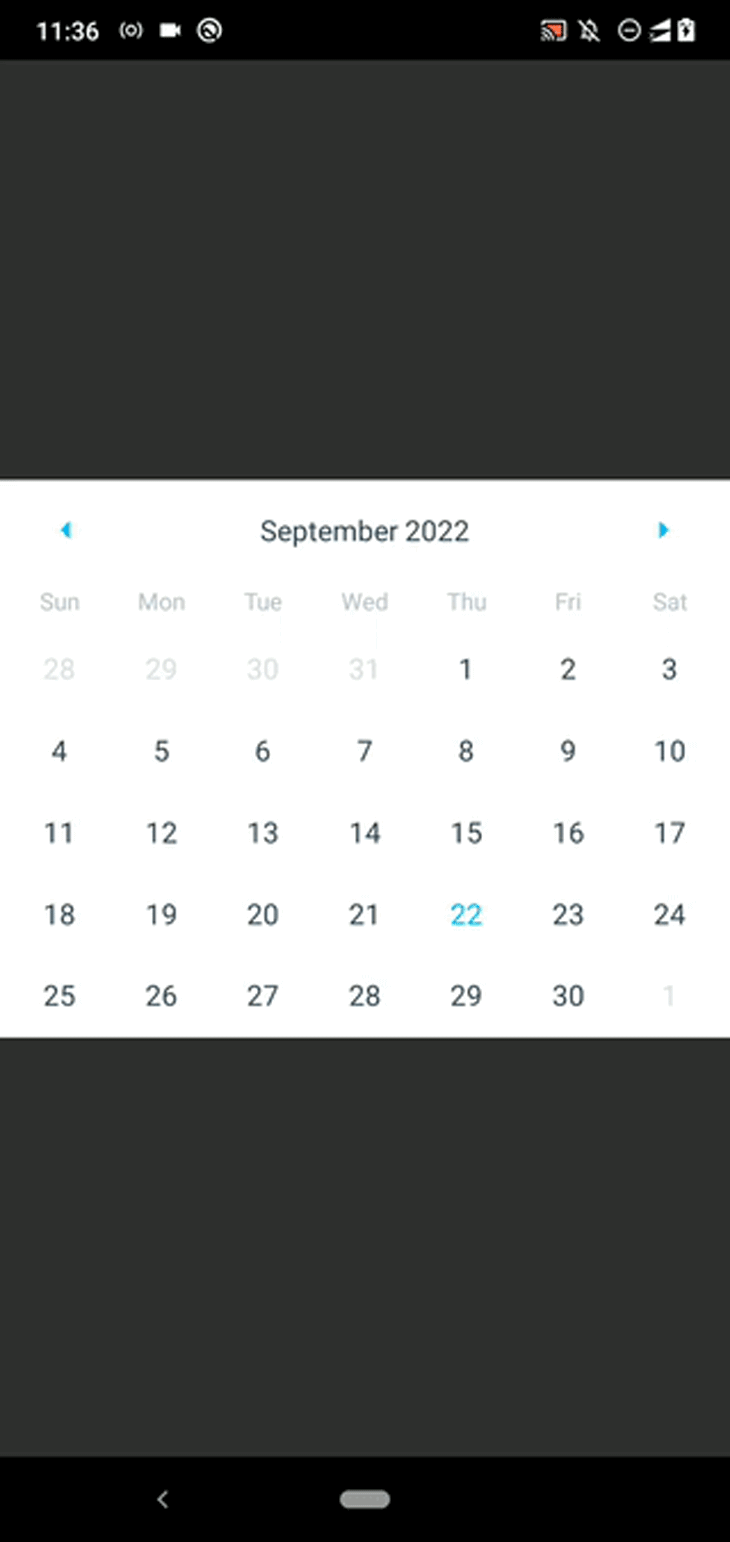
Keep in mind that selecting a date won’t render a highlighted background style, which everyone expects as a built-in feature ; we’ll have to write some code for that ourselves later.
The Calendar component is interactive, so users can perform actions by pressing the month navigation arrows and day elements.
React Native Calendars exposes several props to attach callbacks for these crucial user actions. Check out the following sample callback implementations:
<Calendar
  onDayPress={(day) => console.log('onDayPress', day) }
  onDayLongPress={(day) => console.log('onDayLongPress', day) }
  onMonthChange={(date) => console.log('onMonthChange', date) }
  onPressArrowLeft={(goToPreviousMonth) => {
    console.log('onPressArrowLeft'); goToPreviousMonth();
  }}
  onPressArrowRight={(goToNextMonth) => {
    console.log('onPressArrowRight'); goToNextMonth();
  }}
/>
Handlers are executed on the following inputs:
onDayPress: The user taps a specific day elementonDayLongPress: The user long presses a day elementonMonthChange: The calendar month changesonPressArrowLeft: The user clicks the left-side month navigation arrowonPressArrowRight: The user clicks the right-side month navigation arrowRun the code snippet above, inspect the code, modify it, and become familiar with all the callbacks. For example, you can get the user-pressed date as follows:
onDayPress={(day) => console.log('Selected date: ', day.dateString) }
You can experiment with all the other callbacks by attaching function implementations.
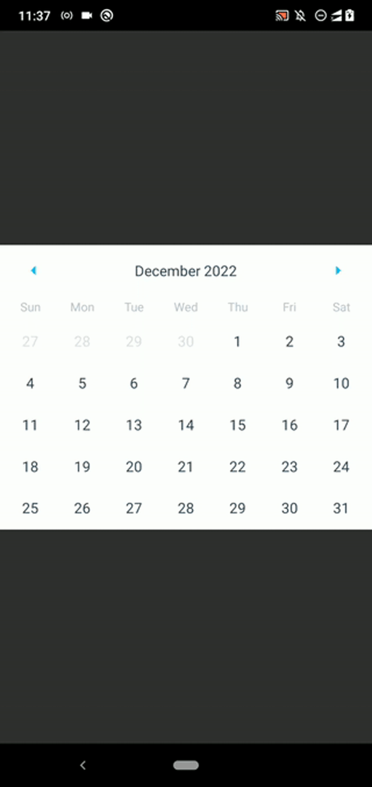
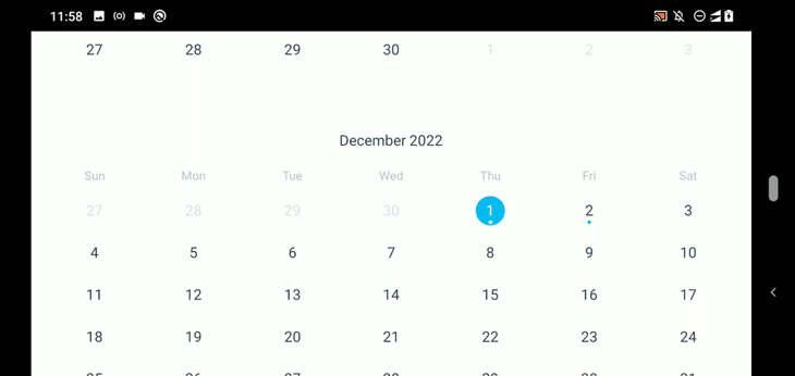
In some scenarios, using a default calendar with callback implementations is not enough to satisfy app specifications. Sometimes, we need to set the initially selected month as well as the minimum and maximum end dates.
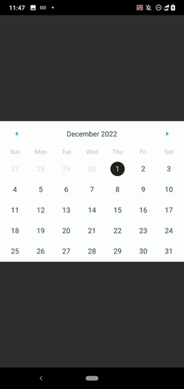
The Calendar component offers props to set initial, min, and max dates. Let’s assume that you need to make a calendar component that initially shows December 2022 and only lets you select a day between the 1st of December 2022 and the 30th of January 2023. The code snippet below satisfies this specification:
<Calendar
  initialDate="2022-12-01"
  minDate="2022-12-01"
  maxDate="2023-01-30"
  disableAllTouchEventsForDisabledDays={true}
/>
The disableAllTouchEventsForDisabledDays boolean prop helps us disable touch feedback for disabled date elements. Run the code snippet above and compare the result with the specification above:
Calendar component reusableIf you need to use the calendar in several places, creating a reusable component is undoubtedly a good practice:
import React from 'react';
import {
  SafeAreaView,
  ScrollView,
  StyleSheet,
  View,
} from 'react-native';
import { Calendar } from 'react-native-calendars';

function CustomCalendar(props) {
  return (
    <Calendar
      initialDate="2022-12-01"
      minDate="2022-12-01"
      maxDate="2023-01-30"
      disableAllTouchEventsForDisabledDays={true}
      {...props}
    />
  );
}

function App() {
  return (
    <SafeAreaView style={styles.container}>
      <CustomCalendar onDayPress={(day) => console.log(`Date pressed: ${day.dateString}`)} />
    </SafeAreaView>
  );
};

const styles = StyleSheet.create({
  container: {
    flex: 1,
    justifyContent: 'center',
  },
});

export default App;
The CustomCalendar component above uses custom initial, min, and max dates. For further customizations, it accepts all supported Calendar props. Later in the article, we’ll discuss how to develop a reusable date picker component. Then, you can learn more about creating shareable calendars.
The Calendar component offers built-in framework components like View, TouchableOpacity, and Text. Unlike the platform-specific, native date picker component in Android and iOS, the Calendar component offers numerous props for extensive UI customizations.
For example, you can disable the left and right arrows with the disableLeftArrow and disableRightArrow boolean props in the previous CustomCalendar implementation:
function CustomCalendar(props) {
  return (
    <Calendar
      initialDate="2022-12-01"
      minDate="2022-12-01"
      maxDate="2022-12-31"
      disableAllTouchEventsForDisabledDays={true}
      disableArrowLeft={true}
      disableArrowRight={true}
      {...props}
    />
  );
}
Now, you’ll only see December 2022 because month-by-month navigation is not possible:
Hiding both arrows is possible using the hideArrows boolean prop:
function CustomCalendar(props) {
  return (
    <Calendar
      initialDate="2022-12-01"
      minDate="2022-12-01"
      maxDate="2022-12-31"
      disableAllTouchEventsForDisabledDays={true}
      hideArrows={true}
      {...props}
    />
  );
}
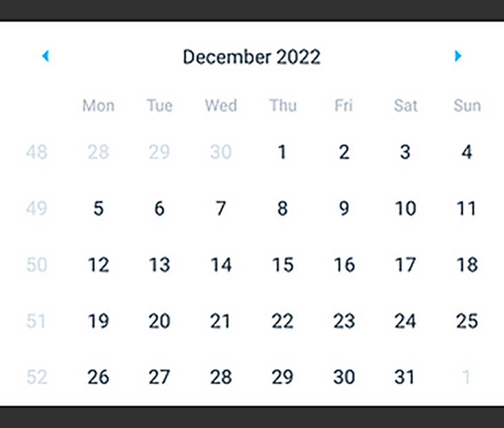
By default, week rows start with Sunday. With the following props, you can start every week row with Monday and show week numbers on the calendar:
firstDay={1}
showWeekNumbers={true}
Check out the following preview:
Using a custom month format is also possible with the dateFormat prop. For example, the following setup will render month strings like Dec/2020:
monthFormat="MMM/yyyy"
I recommend browsing the official documentation and identifying all of the supported calendar props that help in customizing the calendar UI.
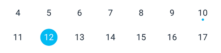
If you look at a physical paper calendar, you’ll probably see several day boxes that are marked with background colors or symbols to indicate special days or national holidays. To mark day elements in the Calendar component, you can use the markedDates prop.
Let’s learn how to mark individual days first! Use the following code for CustomCalendar:
function CustomCalendar(props) {
  const marked = {
    '2022-12-10': { marked: true },
    '2022-12-12': { selected: true }
  };
  return (
    <Calendar
      initialDate="2022-12-01"
      minDate="2022-12-01"
      maxDate="2022-12-31"
      disableAllTouchEventsForDisabledDays={true}
      markedDates={marked}
      {...props}
    />
  );
}
If the marked boolean prop is set to true, the component will render a dot on a specific day; if the selected boolean prop is set to true, the component will render a filled circle around the particular day element:
You can customize the indicators and shapes above as follows:
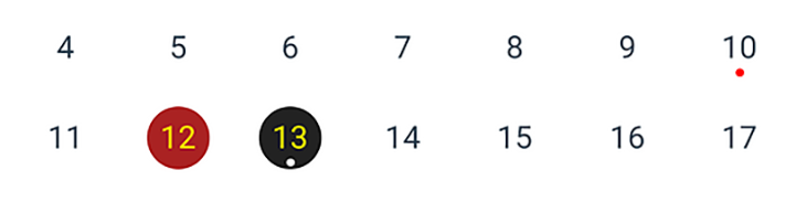
const marked = {
    '2022-12-10': { marked: true, dotColor: 'red' },
    '2022-12-12': { selected: true, selectedColor: '#aa2222', selectedTextColor: 'yellow' },
    '2022-12-13': {
      marked: true,
      selected: true,
      selectedColor: '#222222',
      selectedTextColor: 'yellow',
      dotColor: 'white'
    }
  };
Once you use the definition above for marked, you’ll see the following result:
The markedDates prop helps us to mark the currently pressed day element with a simple implementation. We can store the current date in the component state and update the markedDates object accordingly, as shown in the code below:
import React, { useState, useMemo } from 'react';
import {
  SafeAreaView,
  ScrollView,
  StyleSheet,
  View,
} from 'react-native';
import { Calendar } from 'react-native-calendars';

function CustomCalendar(props) {
  const initDate = '2022-12-01';
  const [selected, setSelected] = useState(initDate);
  const marked = useMemo(() => ({
    [selected]: {
      selected: true,
      selectedColor: '#222222',
      selectedTextColor: 'yellow',
    }
  }), [selected]);
  return (
    <Calendar
      initialDate={initDate}
      markedDates={marked}
      onDayPress={(day) => {
        setSelected(day.dateString);
        props.onDaySelect && props.onDaySelect(day);
      }}
      {...props}
    />
  );
}

function App() {
  return (
    <SafeAreaView style={styles.container}>
      <CustomCalendar onDaySelect={(day) => console.log(`Date selected: ${day.dateString}`)}/>
    </SafeAreaView>
  );
};

const styles = StyleSheet.create({
  container: {
    flex: 1,
    justifyContent: 'center',
  },
});

export default App;
In the code above, we memoized the marked object using the useMemo Hook and recompute it only if selected is changed for performance optimization. The example below shows how the code above implements the selectable day elements:
The marked boolean element renders a circle shape with several pre-included styles, but React Native Calendars is flexible enough to offer the customStyles prop for defining the shape style. When you press a day element, the following code snippet renders a green rectangle:
function CustomCalendar(props) {
  const initDate = '2022-12-01';
  const [selected, setSelected] = useState(initDate);
  const marked = useMemo(() => ({
    [selected]: {
      customStyles: {
        container: {
          backgroundColor: 'green',
          borderRadius: 0,
        },
        text: {
          color: 'white',
        }
      }
    }
  }), [selected]);
  return (
    <Calendar
      initialDate="2022-12-01"
      markingType="custom"
      markedDates={marked}
      onDayPress={(day) => {
        setSelected(day.dateString);
        props.onDaySelect && props.onDaySelect(day);
      }}
      {...props}
    />
  );
}
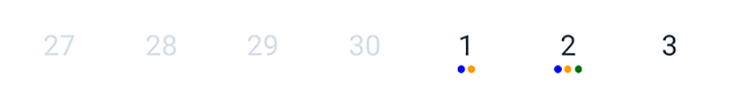
In the code above, we used markingType="custom" to turn on the custom markers feature. The multi-dot marking type lets us add multiple dot indicators into day elements, as if to indicate events on a particular day, as shown in the following code:
import React from 'react';
import {
  SafeAreaView,
  ScrollView,
  StyleSheet,
  View,
} from 'react-native';
import { Calendar } from 'react-native-calendars';

function App() {
  const running = {key: 'running', color: 'blue'};
  const cycling = {key: 'cycling', color: 'green'};
  const walking = {key: 'walking', color: 'orange'};
  const marked = {
    '2022-12-01': {
      dots: [running, walking]
    },
    '2022-12-02': {
      dots: [running, walking, cycling]
    }
  };
  return (
    <SafeAreaView style={styles.container}>
      <Calendar
        initialDate="2022-12-01"
        markingType="multi-dot"
        markedDates={marked}
      />
    </SafeAreaView>
  );
};

const styles = StyleSheet.create({
  container: {
    flex: 1,
    justifyContent: 'center',
  },
});

export default App;
The code above generates a calendar component with multiple dot indicators in day elements:
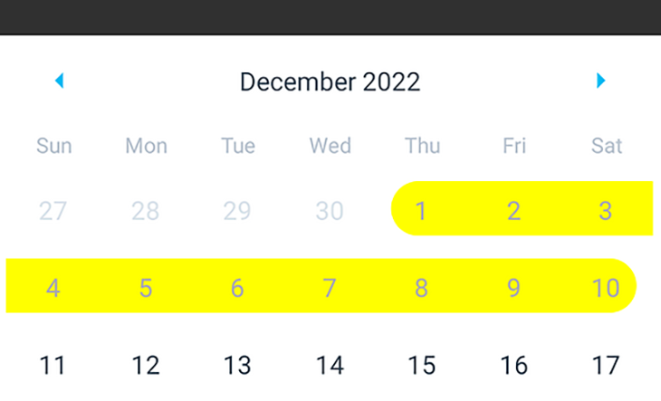
We can implement a date range marking style ourselves with customStyles, but React Native Calendars boosts productivity by offering a built-in date range marking feature. For example, you can mark the first ten days of December 2022 as follows:
function App() {
  const getMarked = () => {
    let marked = {};
    for(let i = 1; i <= 10; i++) {
      let day = i.toString().padStart(2, '0');
      marked[`2022-12-${day}`] = {
        startingDay: i == 1,
        endingDay: i == 10,
        color: 'yellow',
        textColor: '#aaa',
        disabled: true,
      };
    }
    return marked;
  };

  return (
    <SafeAreaView style={styles.container}>
      <Calendar
        initialDate="2022-12-01"
        markingType="period"
        markedDates={getMarked()}
      />
    </SafeAreaView>
  );
};
We use the getMarked function to generate a ten-day-long period. The period start and end edge styling will change according to the startingDay and endingDay booleans. Once you run the code snippet above, you’ll see the following result:
You can also build a date range selector component with this period marking feature. You can see a sample implementation in my GitHub repository. React Native Calendars offers a built-in multi-period-marking feature, too:
function App() {
  const getMarked = () => {
    let marked = {};
    for(let i = 1; i <= 10; i++) {
      let day = i.toString().padStart(2, '0');
      let periods = [
        {
          startingDay: i == 1,
          endingDay: i == 10,
          color: 'teal',
        },
        (i >= 2 && i <= 6) && {
          startingDay: i == 2,
          endingDay: i == 6,
          color: 'orange',
        }
      ];
      marked[`2022-12-${day}`] = {
        periods
      };
    }
    return marked;
  };
  return (
    <SafeAreaView style={styles.container}>
      <Calendar
        initialDate="2022-12-01"
        markingType="multi-period"
        markedDates={getMarked()}
      />
    </SafeAreaView>
  );
};
The above App component implementation renders two date period lines between the first and the tenth of December 2022:
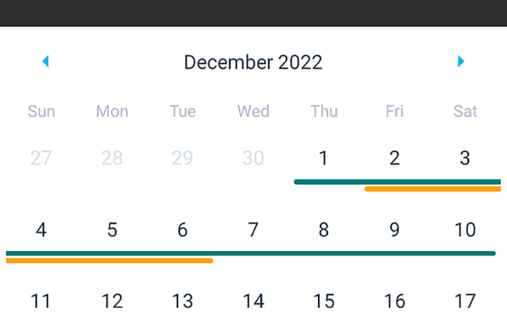
Want to display a quick summary of a few bookings in a calendar? Try the multi-period marking type.
So far, we already know how to do basic UI customizations; we changed the first weekday, disabled and hid the month navigation arrows, and changed the month format. But, what if we need to change the day element, header, weekday name colors, and fonts?
As mentioned in the highlighted features section, React Native Calendars lets you change the look and feel by passing a custom theme object. If you feel that using a custom theme object is limiting, you can directly override the Calendar component’s stylesheet definitions. You can also customize the Calendar component’s container styles.
In the following example, we customize the calendar’s look and feel via the theme prop and the calendar container’s styles via the style prop:
<Calendar
  initialDate="2022-12-01"
  style={{
    borderRadius: 5,
    margin: 12,
    elevation: 5,
    borderWidth: 4,
    borderColor: 'rgba(100, 100, 100, 0.2)'
  }}
  theme={{
    calendarBackground: '#222',
    dayTextColor: '#fff',
    textDisabledColor: '#444',
    monthTextColor: '#888'
  }}
/>
The code snippet above applies a dark color scheme to the calendar via the theme prop and adds some styling enhancements for the calendar container via the style prop:
The theme prop offers a way to customize text styles and colors. But sometimes, we need to add advanced customizations using styling definitions. In these scenarios, you can override stylesheet definitions. For example, you can override the calendar header style as follows:
theme={{
  'stylesheet.calendar.header': {
    headerContainer: {
      flexDirection: 'row',
      backgroundColor: '#eee',
      borderRadius: 12
    },
  }
}}
Look at your style.ts files by browsing the source code and identifying all the style definitions that you can override via theme. Check the end of a particular style.ts file to find the stylesheet identifier, for example, style.calendar.header.
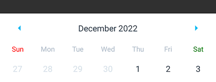
We can use stylesheet-overriding in the theme prop to apply different styles for weekend day headers. For example, we can use green for Saturday headers and red for Sunday headers with the following theme object:
theme={{
  'stylesheet.calendar.header': {
    dayTextAtIndex0: {
      color: 'red'
    },
    dayTextAtIndex6: {
      color: 'green'
    }
  }
}}
Below is the preview for the setup above:
Using two different colors for weekend day headers is also a good UI improvement. But, React Native Calendars doesn’t support customizing indexed day element styling, which we used to customize day headers via the theme prop. So, we have to style weekend day numbers with markedDates until the maintainers and contributors implement this pull request.
Modern mobile apps often use swipe events more than traditional taps. For example, most popular social media apps load more posts when the user swipes up , not when the user taps a button.
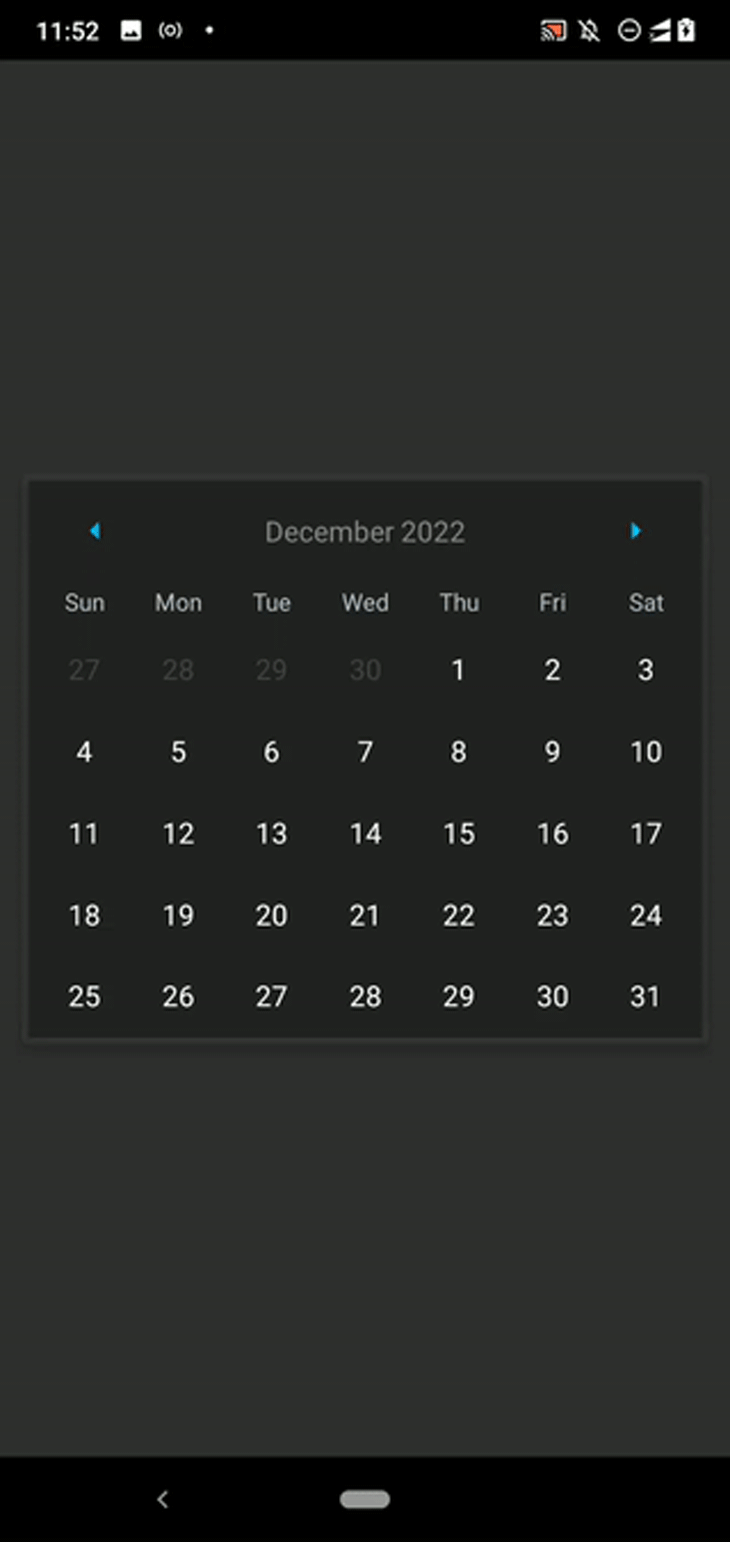
The Calendar component is designed to navigate with arrows and show one month at a time, but you can use the CalendarList component to create a modern infinite scroll-like calendar component:
import React from 'react';
import {
  SafeAreaView,
  ScrollView,
  StyleSheet,
  View,
} from 'react-native';
import { CalendarList } from 'react-native-calendars';

function App() {
  return (
    <SafeAreaView style={styles.container}>
      <CalendarList/>
    </SafeAreaView>
  );
};

const styles = StyleSheet.create({
  container: {
    flex: 1,
    justifyContent: 'center',
  },
});

export default App;
Now, you’ll see a scrollable calendar:
The Calendar component is minimal, traditional, and generic, so consider selecting CalendarList only if the screen is calendar-oriented, for example, it is displayed within a Modal and users need to see multiple months at a time. The CalendarList component accepts all Calendar props and some additional props.
Agenda component for advanced use casesIn some scenarios, we need to implement agenda views in our React Native apps. The Calendar and CalendarList components support adding multi-period markers via the markedDates prop, but the calendar component doesn’t have enough space to add a title and a description for each marker line. So, implementing an agenda view with the Calendar or CalendarList component is not a good decision.
The Agenda component lets you create agenda views by displaying records for each day in a second view that is opened after tapping a day element. Run the following code to display a sample agenda view:
import React from 'react';
import {
  SafeAreaView,
  ScrollView,
  StyleSheet,
  Text,
  TouchableOpacity,
} from 'react-native';
import { Agenda } from 'react-native-calendars';

function App() {
  return (
    <SafeAreaView style={styles.container}>
      <Agenda
        selected="2022-12-01"
        items={{
          '2022-12-01': [{name: 'Cycling'}, {name: 'Walking'}, {name: 'Running'}],
          '2022-12-02': [{name: 'Writing'}]
        }}
        renderItem={(item, isFirst) => (
          <TouchableOpacity style={styles.item}>
            <Text style={styles.itemText}>{item.name}</Text>
          </TouchableOpacity>
        )}
      />
    </SafeAreaView>
  );
};

const styles = StyleSheet.create({
  container: {
    flex: 1,
    justifyContent: 'center'
  },
  item: {
    backgroundColor: 'white',
    flex: 1,
    borderRadius: 5,
    padding: 10,
    marginRight: 10,
    marginTop: 17,
  },
  itemText: {
    color: '#888',
    fontSize: 16,
  }
});

export default App;
We used the Agenda component by providing day items via the items prop. You can use the renderItem callback to design a GUI for each day item. You can check the Agenda component’s other callbacks and supported props in the official documentation.
Once you run the code above, you’ll see the following minimal agenda view:
For demonstration purposes, we hardcoded several day items, but you can also use a remote web server to fetch data for your agenda view in production apps.
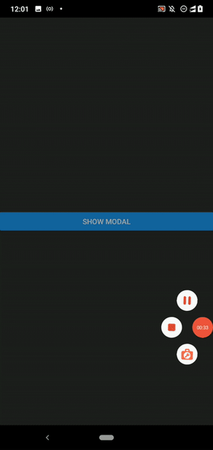
There are two key ways to render any GUI element in a mobile app: rendering on an app screen surface or rendering in a popup. I’ve demonstrated all the above calendar component customizations directly on an app screen. If you use a calendar component as a user input element, showing it in a popup saves the current app screen’s space and improves overall usability.
Consider the following code:
import React, { useState } from 'react';
import {
  SafeAreaView,
  ScrollView,
  StyleSheet,
  View,
  Modal,
  Button,
} from 'react-native';
import { Calendar } from 'react-native-calendars';

function DatePicker({visible, onDateSelected}) {
  return (
    <Modal visible={visible} transparent={true} animationType="fade">
      <View style={styles.overlay}>
        <Calendar onDayPress={onDateSelected}/>
      </View>
    </Modal>
  );
}

function App() {
  const [modalVisible, setModalVisible] = useState(false);
  return (
    <SafeAreaView style={styles.container}>
      <Button title="Show Modal" onPress={() => setModalVisible(true)}/>
      <DatePicker
        visible={modalVisible}
        onDateSelected={() => setModalVisible(false)}/>
    </SafeAreaView>
  );
};

const styles = StyleSheet.create({
  container: {
    flex: 1,
    justifyContent: 'center'
  },
  overlay: {
    flex: 1,
    justifyContent: 'center',
    padding: 40,
    backgroundColor: 'rgba(100, 100, 100, 0.6)',
  },
});

export default App;
We created the reusable DatePicker component and showed a calendar component within a Modal. Once you tap the button, the modal will appear with an overlay and a calendar component, as shown in the following preview:
In this tutorial, we discussed three popular components that React Native Calendars offers: Calendar, CalendarList, and Agenda.
We mainly focused on the Calendar component because it lets you create customizable and shareable calendar components in your React Native apps, but the library offers the following additional components:
WeekCalendar: A week calendar componentTimeline: A timeline component implementation that displays ordered events per day based on start and end timesExpandableCalendar: A special calendar component that the user can collapse into a week calendar and expand into a month calendarAgendaList: An agenda list component that you can integrate with the ExpandableCalendar componentCalendarProvider: Calendar context provider for integrating ExpandableCalendar and AgendaList componentsYou can check out all the officially supported components from the official documentation. There are a few undocumented components, but you can check them out in the source code.
Like any other popular package, there are alternatives to the React Native Calendars library. However, these alternatives aren’t so competitive compared to the React Native Calendars package.
The reasons for this include:
react-native-calendarHowever, it’s worth learning about the alternatives because they may become popular in the future and may offer unique features for your requirements. So, check out the following alternative libraries:
react-native-calendario: A minimal, modern, scrollable calendar component that supports built-in range selection, date marking, and extensive style customizationreact-native-calendar-strip: A modern and customizable calendar component that displays days in one rowreact-native-calendar-picker: A date picker component that supports extensive style customizationThe React Native Calendars library offers features for almost every scenario where you need a calendar. But, we also mentioned a few alternative libraries that offer some unique features. Additionally, the developer community will likely open source more modern React Native libraries into the npm registry in the future.
We undoubtedly want to select the most suitable calendar library for our project from all the available libraries. Before choosing a calendar UI library, you should consider the following factors.
Do you need a platform-specific date and time picker or a platform-agnostic calendar component? React Native Date Picker renders platform-specific date and time pickers, and the other libraries mentioned above construct cross-platform calendar UIs.
You should make sure that your selected calendar library offers all of the features you need. From the features perspective, React Native Calendars undoubtedly wins, but nonetheless, an alternative library might offer a unique feature that you want in your project. For example, react-native-calendario supports built-in date range selection and weekend container style customization.
Popularity usually increases for stable, fully-featured, and actively-maintained packages, so you may want to consider npm downloads and GitHub stars when choosing a third-party library.
A good, established library typically has a separate documentation website for developers to check API references, sample code snippets, and tutorials. In addition, a library’s maintainers and users communicate regarding GitHub issues. It’s helpful to select a calendar library that comes with well-organized, up-to-date documentation and active, friendly developer support.
It’s good practice to ensure that your preferred calendar library doesn’t increase the app’s bundle size too much. Fortunately, all of the libraries listed in this article don’t affect the final bundle size considerably compared to the React Native framework size.
Compare the calendar’s behavior or visibility with other parts of your app and make sure that you have the same UI practices. If not, verify that your preferred calendar library supports customizing themes, i.e., changing colors, date formats, etc.
React Native Date Picker excels at these factors, but if you need a platform-specific time and date picker, a pre-developed lightweight date picker, or a pre-developed lightweight date range picker, you may have to consider other alternatives.
In this article, we’ve learned how to create shareable, customizable calendars with the React Native Calendars library.
Code reusability boosts your whole team’s productivity and improves software quality, so if you repeat the same calendar props with the same values in multiple places, you should always strive to define a shareable calendar component.
You should also consider your app’s UI/UX factors by using a matching color theme for the Calendar component and other UI elements. The React Native Calendars library offers the Calendar component as the main component, but you should review CalendarList, Agenda, and others before selecting one for your project.
I hope you enjoyed this article, and be sure to leave a comment if you have any questions. Happy coding!

LogRocket's Galileo AI watches sessions for you and and surfaces the technical and usability issues holding back your React Native apps.
LogRocket also helps you increase conversion rates and product usage by showing you exactly how users are interacting with your app. LogRocket's product analytics features surface the reasons why users don't complete a particular flow or don't adopt a new feature.
Start proactively monitoring your React Native apps — try LogRocket for free.

AI tools generate working React code fast, but miss race conditions, empty states, debouncing, and accessibility. Here’s how to catch bugs before production.

Learn how to use Gemini CLI subagents to delegate frontend, backend, testing, and docs tasks to specialized agents with guardrails and clear ownership.

Learn how next-browser gives AI agents runtime context for debugging Next.js apps, including React props, hydration, PPR, forms, and performance.

Build dynamic LLM routing in Next.js with OpenRouter, TanStack AI, task classification, model fallbacks, and cost-aware routing.
Hey there, want to help make our blog better?
Join LogRocket’s Content Advisory Board. You’ll help inform the type of content we create and get access to exclusive meetups, social accreditation, and swag.
Sign up now

 Learn more →
