Alert boxes are an intrinsic component of the web, and their utility varies with their use cases. They are used for displaying messages, warnings, alerts, and confirmation consents.

With an alert dialog, a user often gets the button options to agree, disagree, and cancel. Sometimes alerts are also used to record a user’s input, but that is platform dependent.
In this article, we will learn how to create a custom alert dialog in React Native to suit the needs of your project.
React Native provides an Alert API, which can be used to display native alert dialogs on Android and iOS. But there are limitations with the native alert dialogs.
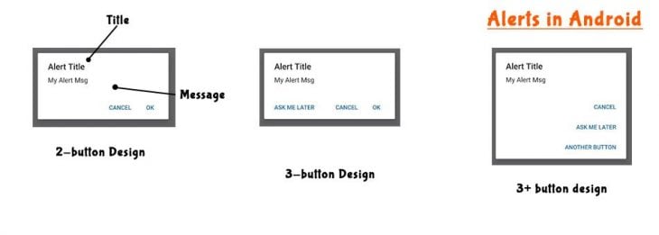
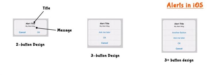
For instance, on Android we can’t show more than three buttons, and no option is provided to capture users’ inputs. Although iOS allows us to have many buttons and lets users input the data, we still can’t show images, charts, or have any kind of customization except text.
To deal with these limitations, we need to create custom alert dialogs. A custom alert dialog can act like a modal and can support components.
Before customizing any native component, we should have clear understanding of its architecture and event handling.
For example, a button holds multiple properties like label and bulginess. A button also holds events like press, hold, release, hover, and so on. When we customize it, we need to consider all these properties. Otherwise, we will lose the look, feel, and functionality.
A native alert box has following properties:
onPress — Function to call on the press of a button. Both Android and iOS support thisonDismiss — Function to call when an alert is closed. Only Android supports thisWe need to consider all these properties while customizing the Alert box.
Let’s see how the native Alert looks and the placement of different elements on it. Both Android and iOS Alerts are different in look and feel:
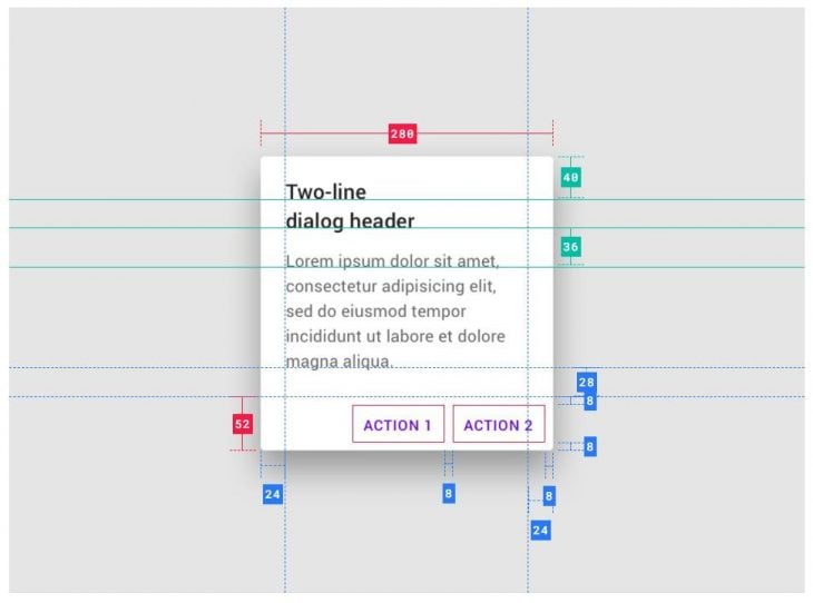
According to Material design concepts, the typography and colors of Android alert dialogs are as follows:
| Element | Category | Attribute | Value |
| Container | Max Width Border Radius Background Color |
280 2 #FAFAFA |
|
| Title Text | On Surface | Color Opacity Font Weight Size Case |
#000000 100% Bold 22 Sentence Case |
| Supporting text | On Surface | Color Opacity Font Weight Size Case |
#000000 100% Regular 15 Sentence Case |
| Button Text | Primary | Color Opacity Font Weight Size Case |
#387ef5 100% 500 16 Uppercase |
| Scrim | On Surface | Color Opacity |
#232F34 32% |
Other properties like height, width, padding, margin, etc. are as follows:
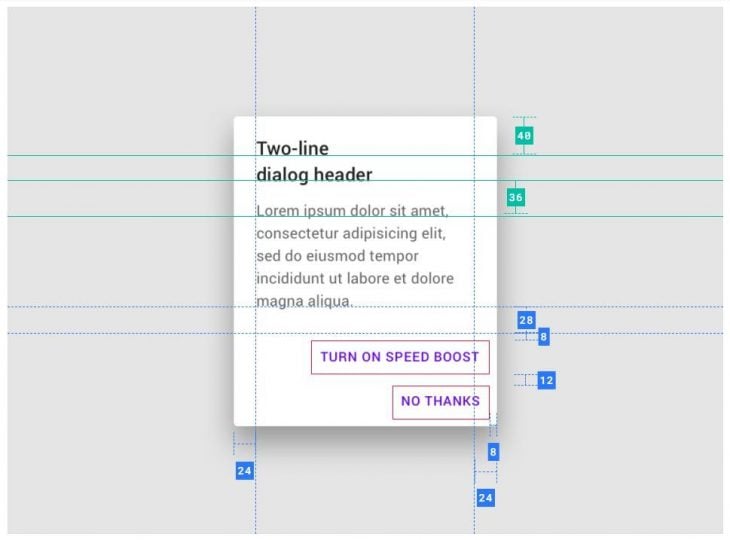
For small button actions:
For long button actions:
Other properties include:
Elevation — 24dp
Position — center
Minimum margin from sides — 48dp
Similarly, for iOS we have the following specifications:
| Element | Category | Attribute | Value |
| Container | Surface | Border-Radius Max Width Background Color z-index |
13px 270px #f8f8f8 10 |
| Title Text | On Surface | Color Padding Margin Top Align Font Size Case |
#000000 12px 16px 7px 8px Center 600 17px Sentence Case |
| Supporting text | On Surface | Color Align Padding Font Size Case |
#000000 Center 0px 16px 21px Regular 13 Sentence Case |
| Button Container | Common Properties Ok Button Single Row Multi Buttons – Common – Non Ok Buttons |
Margin Right Min Height Border Top Font Size Color Line Height Font Weight Min Width Border Right |
-0.55px 44px 0.55px solid #dbdbdf 17px #387ef5 20px 700 50% 0.55px solid #dbdbdf |
| Scrim | On Surface | Color Opacity |
#000000 30% |
This information is collected from the Ionic AlertController documentation.
There are few libraries on GitHub that allow you to create custom alert boxes. Some of them are react-native-awesome-alerts, react-native-dialog, and react-native-modal. You can try these libraries, but in this article, we are going to customize the alert box without them.
Alert and Modal are semantically the same things with a difference in complexity and usability.
Alert dialogs were created to display short messages in the simplest way possible, and that’s why they are limited in their functionality.
On the other hand, modals are used for complex displays. They require us to define the whole content by ourselves. By default, they provide event listeners like a back button handler.
Let’s first check out the things that we will customize. We should remember that alerts are used to display important messages. This could be errors, warnings, or notifications. They are not meant for showing images or filling forms. For that, you should use modals.
In Alert, we will customize:
Since React Native calls native Alert components of Android and iOS, it doesn’t provide a direct method to customize them. Alerts are fixed components with defined purpose and hence non-customizable in Android and iOS. Android developers use the Dialog class for that.
In our case, we are going to use the Modal API of React Native. The advantages of using this API are:
The React Native Modal API provides a container that gets displayed above its enclosing View. A Boolean prop visible is passed to the Modal component to show or hide it. There are other props, but we are not concerned with them because they are not useful for an Alert.
This is the way in which the Modal works:
import React, { useState } from 'react';
import { Modal, Text, Pressable, View } from 'react-native';

const App = () => {
  const [modalVisible, setModalVisible] = useState(false);
  return (
    <View>
      <Modal
        animationType="fade"
        transparent={true}
        visible={modalVisible}
        onRequestClose={() => {
          setModalVisible(!modalVisible);
        }}
      >
        <View>
          /**
          * Anything here will display on Modal.
          * We need to create background overlay and Alert box.
          */
        </View>
      </Modal>

      <View>
        /**
        * Main App content. This will get hidden when modal opens up
        */
      </View>
    </View>
  );
};

export default App;
modalVisible is the state variable used to show or hide the Modal. You may either keep the modal on a single page or enclose your whole app in its parent View. It’s better to use a store and state management library like Redux because it will help you to change the modalVisible variable from anywhere in an app.
AlertFirst of all, we will need an event to change the value of modalVisible. In our code, we will use a button. On the press of this button, modalVisible will become true and a Modal will display. To create the button, we will use the Pressable component:
import React, { useState } from 'react';
import { Modal, Text, Pressable, View } from 'react-native';

const App = () => {
  const [modalVisible, setModalVisible] = useState(false);
  return (
    <View>
      <Modal
        animationType="fade"
        transparent={true}
        visible={modalVisible}
        onRequestClose={() => {
          setModalVisible(!modalVisible);
        }}
      >
        <View>
          /**
          * Anything here will display on Modal.
          * We need to create background overlay and Alert box.
          */
        </View>
      </Modal>

      <View>
        <Pressable
          style={[styles.button, styles.buttonOpen]}
          onPress={() => setModalVisible(true)}
        >
          <Text style={styles.textStyle}>Show Modal</Text>
        </Pressable>
      </View>
    </View>
  );
};

const styles = StyleSheet.create({
  centeredView: {
    flex: 1,
    justifyContent: "center",
    alignItems: "center",
    marginTop: 22
  },

  button: {
    borderRadius: 20,
    padding: 10,
    elevation: 2
  },
  buttonOpen: {
    backgroundColor: "#F194FF",
  },
  textStyle: {
    color: "white",
    fontWeight: "bold",
    textAlign: "center"
  },

});

export default App;
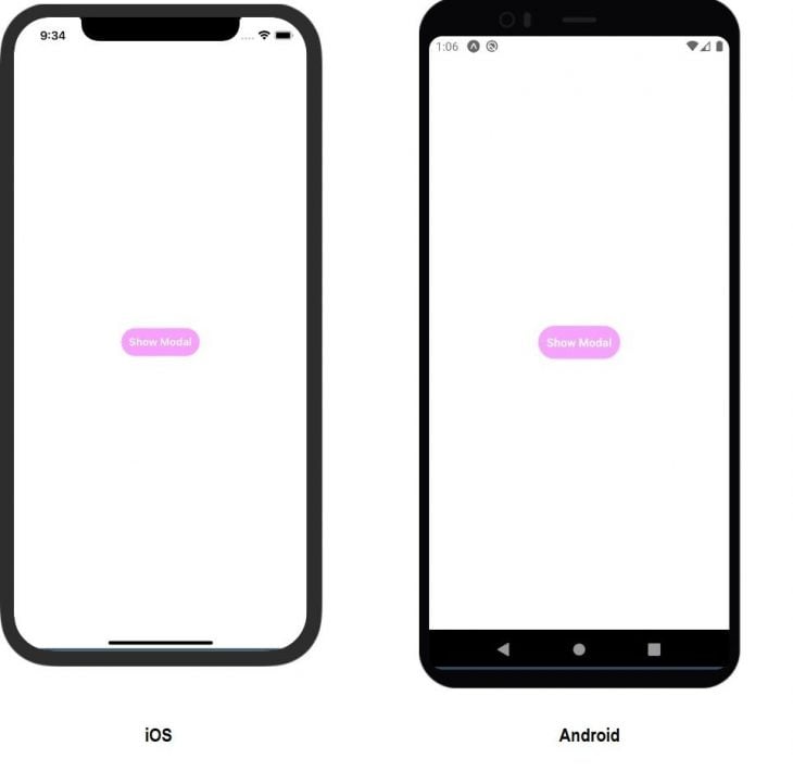
In this code, we have added some styling to improve the look and feel of the button and other parts of the app. Currently, it will show a button. Tapping this button will open the modal. The rendered output will look like this:
The next step is to create modal UI. But first, we need to define a way to differentiate between the default UI of both operating systems. iOS has a different view than Android. To recognize the OS, React Native provides the Platform API.
Let’s start by creating the backdrop. As we discussed in the UI and architecture section, background color and opacity on Android are #232F34 and 0.32 respectively. For iOS, these values are #000000 and 0.3 respectively:
import React, { useState } from 'react';
import { Modal, Text, Pressable, View, Platform } from 'react-native';

const App = () => {
  const [modalVisible, setModalVisible] = useState(false);
  return (
    <View>
      <Modal
        animationType="fade"
        transparent={true}
        visible={modalVisible}
        onRequestClose={() => {
          setModalVisible(!modalVisible);
        }}
      >
        <Pressable style={[Platform.OS === "ios" ? styles.iOSBackdrop : styles.androidBackdrop, styles.backdrop]} onPress={() => setModalVisible(false)} />
        <View>
          /**
          * Anything here will display on Modal.
          * We need to create background overlay and Alert box.
          */
        </View>
      </Modal>

      <View>
        <Pressable
          style={[styles.button, styles.buttonOpen]}
          onPress={() => setModalVisible(true)}
        >
          <Text style={styles.textStyle}>Show Modal</Text>
        </Pressable>
      </View>
    </View>
  );
};

const styles = StyleSheet.create({
  centeredView: {
    flex: 1,
    justifyContent: "center",
    alignItems: "center",
    marginTop: 22
  },

  button: {
    borderRadius: 20,
    padding: 10,
    elevation: 2
  },
  buttonOpen: {
    backgroundColor: "#F194FF",
  },
  textStyle: {
    color: "white",
    fontWeight: "bold",
    textAlign: "center"
  },

  iOSBackdrop: {
    backgroundColor: "#000000",
    opacity: 0.3
  },
  androidBackdrop: {
    backgroundColor: "#232f34",
    opacity: 0.32
  },
  backdrop: {
    position: 'absolute',
    top: 0,
    left: 0,
    right: 0,
    bottom: 0,
  }
});

export default App;
The rendered output will look like this:
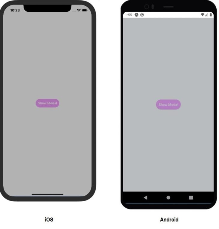
Note that we used the Pressable component to create the backdrop. This is because we wanted to add the functionality of closing the modal on pressing the backdrop.
Next we will create an alert dialog over this backdrop. But first, we should put the Modal into a separate component. This will help in calling our custom Alert with different styling:
import React, { useState } from "react";
import { Alert, Modal, StyleSheet, Text, Pressable, View, Platform } from "react-native";
const CustomAlert = (props) => {
  return (
    <Modal
        animationType="fade"
        transparent={true}
        visible={props.modalVisible}
        onRequestClose={() => {
          props.setModalVisible(false);
        }}
      >
        <Pressable style={[Platform.OS === "ios" ? styles.iOSBackdrop : styles.androidBackdrop, styles.backdrop]} onPress={() => props.setModalVisible(false)} />
        <View>

        </View>
      </Modal>
  )
}
const App = () => {
  const [modalVisible, setModalVisible] = useState(false);

  return (
    <View style={styles.centeredView}>
      <CustomAlert modalVisible={modalVisible} setModalVisible={setModalVisible} />
      <View>
        <Pressable
          style={[styles.button, styles.buttonOpen]}
          onPress={() => setModalVisible(true)}
        >
          <Text style={styles.textStyle}>Show Modal</Text>
        </Pressable>
      </View>
    </View>
  );
};
const styles = StyleSheet.create({
  centeredView: {
    flex: 1,
    justifyContent: "center",
    alignItems: "center",
    marginTop: 22
  },

  button: {
    borderRadius: 20,
    padding: 10,
    elevation: 2
  },
  buttonOpen: {
    backgroundColor: "#F194FF",
  },
  textStyle: {
    color: "white",
    fontWeight: "bold",
    textAlign: "center"
  },

  iOSBackdrop: {
    backgroundColor: "#000000",
    opacity: 0.3
  },
  androidBackdrop: {
    backgroundColor: "#232f34",
    opacity: 0.32
  },
  backdrop: {
    position: 'absolute',
    top: 0,
    left: 0,
    right: 0,
    bottom: 0,
  }
});
export default App;
We have created a different component with the name CustomAlert and placed our Modal in it.
The modalVisible state is maintained at App.js, but remember that the better approach is to use a central store management library like Redux. Redux will make the modalVisible state accessible to all the components throughout the app and there won’t be the need to pass modalVisible as props.
It’s time to set the default values for Modal. These values will design the box similar to the native alert box for Android and iOS.
We already defined all the values in the UI and architecture section. Let’s start with Android.
The default values are:
| Style Property | Value |
| Box Background Color Max Width Margin Elevation Border Radius |
Transparent 280 48 24 2 |
| Title Margin Color Font Size Font Weight |
24 #000000 22 bold |
| Message Margin Left Margin Right Margin Bottom Color Font Size Font Weight |
24 24 24 #000000 15 Normal |
| Button Group Margin |
0 0 8 24 |
| Button Margin Top Margin Right Padding Color Font Size Font Weight Text Transform Background Color |
12 8 10 #387ef5 16 500 uppercase transparent |
These default values are defined in the CustomAlert component. These are used in the cases where a user does not provide values.
Different props for the CustomAlert component are:
| Prop | Values | Use | |
| modalVisible | true|false | Required | To display/hide modal |
| setModalVisible | function | Required | To change the value of modalVisible |
| title | String | Optional | Set the title of Alert box |
| message | String | Optional | Set the message |
| android |
{
    container: {
        backgroundColor: String
    },
    title: {
        color: String,
        fontFamily: String,
        fontSize: Number,
        fontWeight: String,
    },
    message: {
        color: String,
        fontFamily: String,
        fontSize: Number,
        fontWeight: String
    },
}
|
All fields optional | Set the styling of Alert box, title and message for Android app |
| ios |
{
    container: {
        backgroundColor: String
    },
    title: {
        color: String,
        fontFamily: String,
        fontSize: Number,
        fontWeight: String,
    },
    message: {
        color: String,
        fontFamily: String,
        fontSize: Number,
        fontWeight: String
    },
}
|
All fields optional | Set the styling of Alert box, title and message for iOS app |
| buttons |
[
  {
      text: String,
      func: Function,
      styles: {
        color: String,
        fontSize: Number,
        fontWeight: String,
        fontFamily: String,
        textTransform: String,
        backgroundColor: String
      }
  }
]
|
All fields optional | Set the properties for buttons. There are few points:
|
Check out this code to understand how CustomAlert is defining defaults:
const CustomAlert = (props) => {

  const [androidDefaults, setAndroidDefaults] = useState({
    container: {
      backgroundColor: (props.android && props.android.container && props.android.container.backgroundColor) || '#FAFAFA',
    },
    title: {
      color: (props.android && props.android.title && props.android.title.color) || '#000000',
      fontFamily: (props.android && props.android.title && props.android.title.fontFamily) || 'initial',
      fontSize: (props.android && props.android.title && props.android.title.fontSize) || 22,
      fontWeight: (props.android && props.android.title && props.android.title.fontWeight) || 'bold',
    },
    message: {
      color: (props.android && props.android.message && props.android.message.color) || '#000000',
      fontFamily: (props.android && props.android.message && props.android.message.fontFamily) || 'initial',
      fontSize: (props.android && props.android.message && props.android.message.fontSize) || 15,
      fontWeight: (props.android && props.android.message && props.android.message.fontWeight) || 'normal',
    },
    button: {
      color: '#387ef5',
      fontFamily: 'initial',
      fontSize: 16,
      fontWeight: '500',
      textTransform: 'uppercase',
      backgroundColor: 'transparent',
    },
  });

  return (
    <Modal
        animationType="fade"
        transparent={true}
        visible={props.modalVisible}
        onRequestClose={() => {
          props.setModalVisible(false);
        }}
      >
        <Pressable style={[Platform.OS === "ios" ? styles.iOSBackdrop : styles.androidBackdrop, styles.backdrop]} onPress={() => props.setModalVisible(false)} />
        <View style={styles.alertBox}>
        {
          Platform.OS === "ios" ?
          null
          :
          <View style={[styles.androidAlertBox, androidDefaults.container]}>
            <Text style={[styles.androidTitle, androidDefaults.title]}>{props.title || 'Message'}</Text>
            <Text style={[styles.androidMessage, androidDefaults.message]}>{props.message || ''}</Text>
          </View>
        }
        </View>


      </Modal>
  )
}
Some styling is for the layout, and that’s why we are not providing the option to change them. These are declared in the StyleSheet object:
const styles = StyleSheet.create({
  centeredView: {
    flex: 1,
    justifyContent: "center",
    alignItems: "center",
    marginTop: 22
  },

  button: {
    borderRadius: 20,
    padding: 10,
    elevation: 2
  },
  buttonOpen: {
    backgroundColor: "#F194FF",
  },
  textStyle: {
    color: "white",
    fontWeight: "bold",
    textAlign: "center"
  },

  iOSBackdrop: {
    backgroundColor: "#000000",
    opacity: 0.3
  },
  androidBackdrop: {
    backgroundColor: "#232f34",
    opacity: 0.4
  },
  backdrop: {
    position: 'absolute',
    top: 0,
    left: 0,
    bottom: 0,
    right: 0
  },
  alertBox: {
    flex: 1,
    justifyContent: 'center',
    alignItems: 'center'
  },
  androidAlertBox: {
    maxWidth: 280,
    width: '100%',
    margin: 48,
    elevation: 24,
    borderRadius: 2,
  },
  androidTitle: {
    margin: 24,
  },
  androidMessage: {
    marginLeft: 24,
    marginRight: 24,
    marginBottom: 24,
  },
  androidButtonGroup: {
    marginTop: 0,
    marginRight: 0,
    marginBottom: 8,
    marginLeft: 24,
  },
  androidButton: {
    marginTop: 12,
    marginRight: 8,
  },
  androidButtonInner: {
    padding: 10,

  }
});
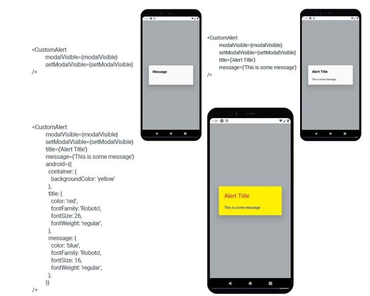
If we run this using different settings, we get the following outputs:
Time to add the buttons to the alert dialog. There are few Android specifications:
To fulfill all these conditions, we decided to declare a separate component for a button group. Let’s call it AndroidButtonBox. Check out the code:
const AndroidButtonBox = () => {
    const [buttonLayoutHorizontal, setButtonLayoutHorizontal] = useState(1);
    const buttonProps = props.buttons && props.buttons.length > 0 ? props.buttons : [{}]

    return (
      <View style={[styles.androidButtonGroup, {
        flexDirection: buttonLayoutHorizontal === 1 ? "row" : "column",
      }]} onLayout={(e) => {
        if(e.nativeEvent.layout.height > 60)
          setButtonLayoutHorizontal(0);
      }}>
        {
          buttonProps.map((item, index) => {
              if(index > 2) return null;
              const alignSelfProperty = buttonProps.length > 2 && index === 0 && buttonLayoutHorizontal === 1 ?  'flex-start' : 'flex-end';
              let defaultButtonText = 'OK'
              if(buttonProps.length > 2){
                if(index === 0)
                  defaultButtonText = 'ASK ME LATER'
                else if(index === 1)
                  defaultButtonText = 'CANCEL';
              } else if (buttonProps.length === 2 && index === 0)
                defaultButtonText = 'CANCEL';
              return (
                <View style={[styles.androidButton, index === 0 && buttonLayoutHorizontal === 1 ? {flex: 1} : {}]}>
                  <Pressable onPress={() => {
                    props.setModalVisible(false)
                    if(item.func && typeof(item.func) === 'function')
                      item.func();
                  }} style={[{
                    alignSelf: alignSelfProperty,

                  }]}>
                    <View style={[styles.androidButtonInner, {backgroundColor: (item.styles && item.styles.backgroundColor) || androidDefaults.button.backgroundColor}]}>
                      <Text
                        style={{
                          color: (item.styles && item.styles.color) || androidDefaults.button.color,
                          fontFamily: (item.styles && item.styles.fontFamily) || androidDefaults.button.fontFamily,
                          fontSize: (item.styles && item.styles.fontSize) || androidDefaults.button.fontSize,
                          fontWeight: (item.styles && item.styles.fontWeight) || androidDefaults.button.fontWeight,
                          textTransform: (item.styles && item.styles.textTransform) || androidDefaults.button.textTransform,
                        }}
                      >{item.text || defaultButtonText}</Text>
                    </View>
                  </Pressable>
                </View>
              )
            })

        }
      </View>
    );
  }
In this code, we have declared a state variable, buttonLayoutHorizontal. This will be used to change the button group layout from columns to rows. If all buttons are short, then they will be displayed in a single row.
The onLayout event is used to determine if there is need to change this state variable. Then, we run a loop over the buttons array provided through props and create buttons with proper styling.
The entire code (for Android) will look like this:
import React, { useState } from "react";
import { Alert, Modal, StyleSheet, Text, Pressable, View, Platform } from "react-native";
const CustomAlert = (props) => {

  const [androidDefaults, setAndroidDefaults] = useState({
    container: {
      backgroundColor: (props.android && props.android.container && props.android.container.backgroundColor) || '#FAFAFA',
    },
    title: {
      color: (props.android && props.android.title && props.android.title.color) || '#000000',
      fontFamily: (props.android && props.android.title && props.android.title.fontFamily) || 'initial',
      fontSize: (props.android && props.android.title && props.android.title.fontSize) || 22,
      fontWeight: (props.android && props.android.title && props.android.title.fontWeight) || 'bold',
    },
    message: {
      color: (props.android && props.android.message && props.android.message.color) || '#000000',
      fontFamily: (props.android && props.android.message && props.android.message.fontFamily) || 'initial',
      fontSize: (props.android && props.android.message && props.android.message.fontSize) || 15,
      fontWeight: (props.android && props.android.message && props.android.message.fontWeight) || 'normal',
    },
    button: {
      color: '#387ef5',
      fontFamily: 'initial',
      fontSize: 16,
      fontWeight: '500',
      textTransform: 'uppercase',
      backgroundColor: 'transparent',
    },
  });
  const AndroidButtonBox = () => {
    const [buttonLayoutHorizontal, setButtonLayoutHorizontal] = useState(1);
    const buttonProps = props.buttons && props.buttons.length > 0 ? props.buttons : [{}]

    return (
      <View style={[styles.androidButtonGroup, {
        flexDirection: buttonLayoutHorizontal === 1 ? "row" : "column",
      }]} onLayout={(e) => {
        if(e.nativeEvent.layout.height > 60)
          setButtonLayoutHorizontal(0);
      }}>
        {
          buttonProps.map((item, index) => {
              if(index > 2) return null;
              const alignSelfProperty = buttonProps.length > 2 && index === 0 && buttonLayoutHorizontal === 1 ?  'flex-start' : 'flex-end';
              let defaultButtonText = 'OK'
              if(buttonProps.length > 2){
                if(index === 0)
                  defaultButtonText = 'ASK ME LATER'
                else if(index === 1)
                  defaultButtonText = 'CANCEL';
              } else if (buttonProps.length === 2 && index === 0)
                defaultButtonText = 'CANCEL';
              return (
                <View style={[styles.androidButton, index === 0 && buttonLayoutHorizontal === 1 ? {flex: 1} : {}]}>
                  <Pressable onPress={() => {
                    props.setModalVisible(false)
                    if(item.func && typeof(item.func) === 'function')
                      item.func();
                  }} style={[{
                    alignSelf: alignSelfProperty,

                  }]}>
                    <View style={[styles.androidButtonInner, {backgroundColor: (item.styles && item.styles.backgroundColor) || androidDefaults.button.backgroundColor}]}>
                      <Text
                        style={{
                          color: (item.styles && item.styles.color) || androidDefaults.button.color,
                          fontFamily: (item.styles && item.styles.fontFamily) || androidDefaults.button.fontFamily,
                          fontSize: (item.styles && item.styles.fontSize) || androidDefaults.button.fontSize,
                          fontWeight: (item.styles && item.styles.fontWeight) || androidDefaults.button.fontWeight,
                          textTransform: (item.styles && item.styles.textTransform) || androidDefaults.button.textTransform,
                        }}
                      >{item.text || defaultButtonText}</Text>
                    </View>
                  </Pressable>
                </View>
              )
            })

        }
      </View>
    );
  }
  return (
    <Modal
        animationType="fade"
        transparent={true}
        visible={props.modalVisible}
        onRequestClose={() => {
          props.setModalVisible(false);
        }}
      >
        <Pressable style={[Platform.OS === "ios" ? styles.iOSBackdrop : styles.androidBackdrop, styles.backdrop]} onPress={() => props.setModalVisible(false)} />
        <View style={styles.alertBox}>
        {
          Platform.OS === "ios" ?
          null
          :
          <View style={[styles.androidAlertBox, androidDefaults.container]}>
            <Text style={[styles.androidTitle, androidDefaults.title]}>{props.title || 'Message'}</Text>
            <Text style={[styles.androidMessage, androidDefaults.message]}>{props.message || ''}</Text>
            <AndroidButtonBox />
          </View>
        }
        </View>


      </Modal>
  )
}
const App = () => {
  const [modalVisible, setModalVisible] = useState(false);

  return (
    <View style={styles.centeredView}>
      <CustomAlert
          modalVisible={modalVisible}
          setModalVisible={setModalVisible}
          title={'Alert Title'}
          message={'This is some message'}
          android={{
            container: {
              backgroundColor: 'yellow'
            },
            title: {
              color: 'red',
              fontFamily: 'Roboto',
              fontSize: 26,
              fontWeight: 'regular',
            },
            message: {
              color: 'blue',
              fontFamily: 'Roboto',
              fontSize: 16,
              fontWeight: 'regular',
            },
          }}
          buttons={[{
            text: 'no'
          },{
            text: 'Yes',
            func: () => {console.log('Yes Pressed')},
            styles: {
              color: '#FFFFFF',
              fontSize: 18,
              fontWeight: 'bold',
              fontFamily: 'Roboto',
              textTransform: 'none',
              backgroundColor: '#000000'
            }
          }]}
      />
      <View>
        <Pressable
          style={[styles.button, styles.buttonOpen]}
          onPress={() => setModalVisible(true)}
        >
          <Text style={styles.textStyle}>Show Modal</Text>
        </Pressable>
      </View>
    </View>
  );
};
const styles = StyleSheet.create({
  centeredView: {
    flex: 1,
    justifyContent: "center",
    alignItems: "center",
    marginTop: 22
  },

  button: {
    borderRadius: 20,
    padding: 10,
    elevation: 2
  },
  buttonOpen: {
    backgroundColor: "#F194FF",
  },
  textStyle: {
    color: "white",
    fontWeight: "bold",
    textAlign: "center"
  },

  iOSBackdrop: {
    backgroundColor: "#000000",
    opacity: 0.3
  },
  androidBackdrop: {
    backgroundColor: "#232f34",
    opacity: 0.4
  },
  backdrop: {
    position: 'absolute',
    top: 0,
    left: 0,
    bottom: 0,
    right: 0
  },
  alertBox: {
    flex: 1,
    justifyContent: 'center',
    alignItems: 'center'
  },
  androidAlertBox: {
    maxWidth: 280,
    width: '100%',
    margin: 48,
    elevation: 24,
    borderRadius: 2,
  },
  androidTitle: {
    margin: 24,
  },
  androidMessage: {
    marginLeft: 24,
    marginRight: 24,
    marginBottom: 24,
  },
  androidButtonGroup: {
    marginTop: 0,
    marginRight: 0,
    marginBottom: 8,
    marginLeft: 24,
  },
  androidButton: {
    marginTop: 12,
    marginRight: 8,
  },
  androidButtonInner: {
    padding: 10,

  }
});
export default App;
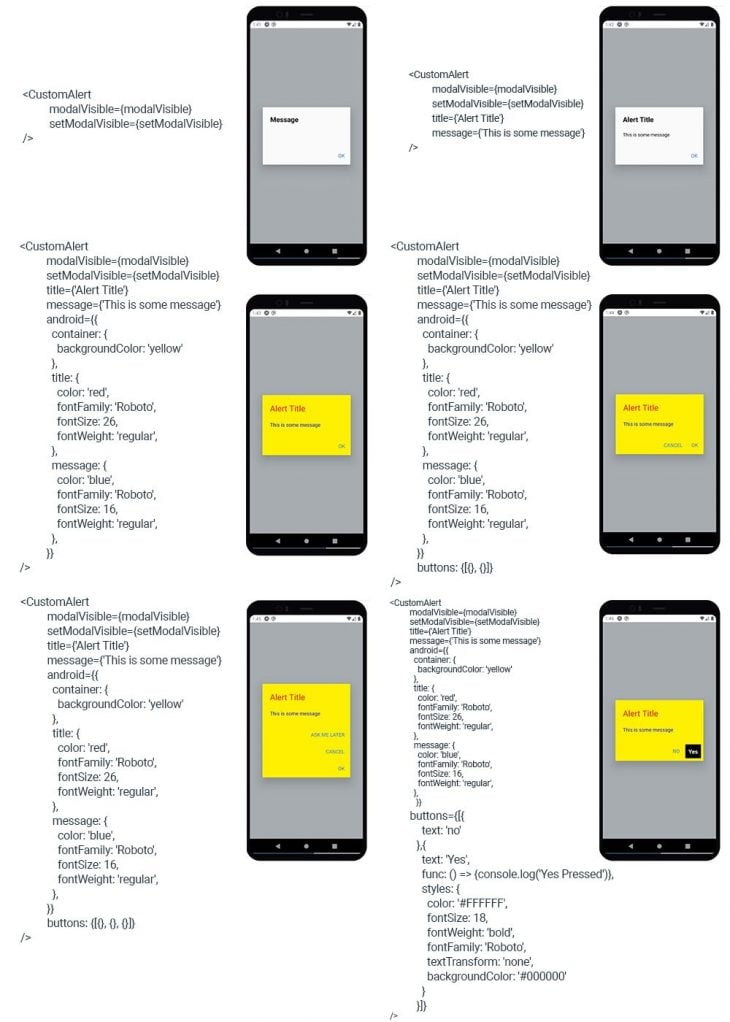
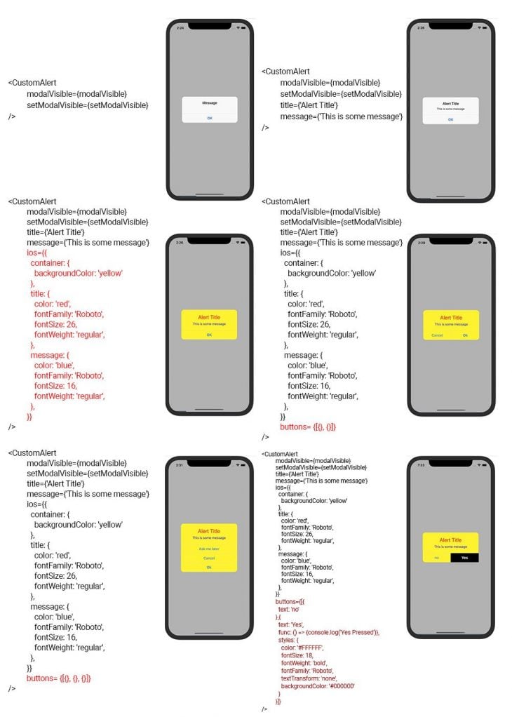
The rendered output for different values of CustomAlert are:
The code for an iOS alert box will be similar to Android with changes in styling.
In iOS, all the entities like the title, message, and buttons are center aligned. There can be any number of buttons. The complete code for an iOS and Android CustomAlert box is:
import React, { useState } from "react";
import { Alert, Modal, StyleSheet, Text, Pressable, View, Platform } from "react-native";
const CustomAlert = (props) => {

  const [androidDefaults, setAndroidDefaults] = useState({
    container: {
      backgroundColor: (props.android && props.android.container && props.android.container.backgroundColor) || '#FAFAFA',
    },
    title: {
      color: (props.android && props.android.title && props.android.title.color) || '#000000',
      fontFamily: (props.android && props.android.title && props.android.title.fontFamily) || 'initial',
      fontSize: (props.android && props.android.title && props.android.title.fontSize) || 22,
      fontWeight: (props.android && props.android.title && props.android.title.fontWeight) || 'bold',
    },
    message: {
      color: (props.android && props.android.message && props.android.message.color) || '#000000',
      fontFamily: (props.android && props.android.message && props.android.message.fontFamily) || 'initial',
      fontSize: (props.android && props.android.message && props.android.message.fontSize) || 15,
      fontWeight: (props.android && props.android.message && props.android.message.fontWeight) || 'normal',
    },
    button: {
      color: '#387ef5',
      fontFamily: 'initial',
      fontSize: 16,
      fontWeight: '500',
      textTransform: 'uppercase',
      backgroundColor: 'transparent',
    },
  });
  const [iOSDefaults, setIOSDefaults] = useState({
    container: {
      backgroundColor: (props.ios && props.ios.container && props.ios.container.backgroundColor) || '#F8F8F8',
    },
    title: {
      color: (props.ios && props.ios.title && props.ios.title.color) || '#000000',
      fontFamily: (props.ios && props.ios.title && props.ios.title.fontFamily) || 'initial',
      fontSize: (props.ios && props.ios.title && props.ios.title.fontSize) || 17,
      fontWeight: (props.ios && props.ios.title && props.ios.title.fontWeight) || '600',
    },
    message: {
      color: (props.ios && props.ios.message && props.ios.message.color) || '#000000',
      fontFamily: (props.ios && props.ios.message && props.ios.message.fontFamily) || 'initial',
      fontSize: (props.ios && props.ios.message && props.ios.message.fontSize) || 13,
      fontWeight: (props.ios && props.ios.message && props.ios.message.fontWeight) || 'normal',
    },
    button: {
      color: '#387ef5',
      fontFamily: 'initial',
      fontSize: 17,
      fontWeight: '500',
      textTransform: 'none',
      backgroundColor: 'transparent',
    },
  });
  const AndroidButtonBox = () => {
    const [buttonLayoutHorizontal, setButtonLayoutHorizontal] = useState(1);
    const buttonProps = props.buttons && props.buttons.length > 0 ? props.buttons : [{}]

    return (
      <View style={[styles.androidButtonGroup, {
        flexDirection: buttonLayoutHorizontal === 1 ? "row" : "column",
      }]} onLayout={(e) => {
        if(e.nativeEvent.layout.height > 60)
          setButtonLayoutHorizontal(0);
      }}>
        {
          buttonProps.map((item, index) => {
              if(index > 2) return null;
              const alignSelfProperty = buttonProps.length > 2 && index === 0 && buttonLayoutHorizontal === 1 ?  'flex-start' : 'flex-end';
              let defaultButtonText = 'OK'
              if(buttonProps.length > 2){
                if(index === 0)
                  defaultButtonText = 'ASK ME LATER'
                else if(index === 1)
                  defaultButtonText = 'CANCEL';
              } else if (buttonProps.length === 2 && index === 0)
                defaultButtonText = 'CANCEL';
              return (
                <View style={[styles.androidButton, index === 0 && buttonLayoutHorizontal === 1 ? {flex: 1} : {}]}>
                  <Pressable onPress={() => {
                    props.setModalVisible(false)
                    if(item.func && typeof(item.func) === 'function')
                      item.func();
                  }} style={[{
                    alignSelf: alignSelfProperty,

                  }]}>
                    <View style={[styles.androidButtonInner, {backgroundColor: (item.styles && item.styles.backgroundColor) || androidDefaults.button.backgroundColor}]}>
                      <Text
                        style={{
                          color: (item.styles && item.styles.color) || androidDefaults.button.color,
                          fontFamily: (item.styles && item.styles.fontFamily) || androidDefaults.button.fontFamily,
                          fontSize: (item.styles && item.styles.fontSize) || androidDefaults.button.fontSize,
                          fontWeight: (item.styles && item.styles.fontWeight) || androidDefaults.button.fontWeight,
                          textTransform: (item.styles && item.styles.textTransform) || androidDefaults.button.textTransform,
                        }}
                      >{item.text || defaultButtonText}</Text>
                    </View>
                  </Pressable>
                </View>
              )
            })

        }
      </View>
    );
  }
  const IOSButtonBox = () => {
    const buttonProps = props.buttons && props.buttons.length > 0 ? props.buttons : [{}]
    const [buttonLayoutHorizontal, setButtonLayoutHorizontal] = useState(buttonProps.length === 2 ? 1 : 0);


    return (
      <View style={[styles.iOSButtonGroup, {
        flexDirection: buttonLayoutHorizontal === 1 ? "row" : "column",
      }]} onLayout={(e) => {
        if(e.nativeEvent.layout.height > 60)
          setButtonLayoutHorizontal(0);
      }}>
        {
          buttonProps.map((item, index) => {
              let defaultButtonText = 'OK'
              if(buttonProps.length > 2){
                if(index === 0)
                  defaultButtonText = 'ASK ME LATER'
                else if(index === 1)
                  defaultButtonText = 'CANCEL';
              } else if (buttonProps.length === 2 && index === 0)
                defaultButtonText = 'CANCEL';
              const singleButtonWrapperStyle = {}
              let singleButtonWeight = iOSDefaults.button.fontWeight;
              if(index === buttonProps.length - 1){
                  singleButtonWeight = '700';
              }
              if(buttonLayoutHorizontal === 1){
                singleButtonWrapperStyle.minWidth = '50%';
                if(index === 0){
                  singleButtonWrapperStyle.borderStyle = 'solid';
                  singleButtonWrapperStyle.borderRightWidth = 0.55;
                  singleButtonWrapperStyle.borderRightColor = '#dbdbdf';
                }

              }
              return (
                <View style={[styles.iOSButton, singleButtonWrapperStyle]}>
                  <Pressable onPress={() => {
                    props.setModalVisible(false)
                    if(item.func && typeof(item.func) === 'function')
                      item.func();
                  }}>
                    <View style={[styles.iOSButtonInner, {backgroundColor: (item.styles && item.styles.backgroundColor) || iOSDefaults.button.backgroundColor}]}>
                      <Text
                        style={{
                          color: (item.styles && item.styles.color) || iOSDefaults.button.color,
                          fontFamily: (item.styles && item.styles.fontFamily) || iOSDefaults.button.fontFamily,
                          fontSize: (item.styles && item.styles.fontSize) || iOSDefaults.button.fontSize,
                          fontWeight: (item.styles && item.styles.fontWeight) || singleButtonWeight,
                          textTransform: (item.styles && item.styles.textTransform) || iOSDefaults.button.textTransform,
                          textAlign: 'center'
                        }}
                      >{item.text || defaultButtonText}</Text>
                    </View>
                  </Pressable>
                </View>
              )
            })

        }
      </View>
    );
  }
  return (
    <Modal
        animationType="fade"
        transparent={true}
        visible={props.modalVisible}
        onRequestClose={() => {
          props.setModalVisible(false);
        }}
      >
        <Pressable style={[Platform.OS === "ios" ? styles.iOSBackdrop : styles.androidBackdrop, styles.backdrop]} onPress={() => props.setModalVisible(false)} />
        <View style={styles.alertBox}>
        {
          Platform.OS === "ios" ?
          <View style={[styles.iOSAlertBox, iOSDefaults.container]}>
            <Text style={[styles.iOSTitle, iOSDefaults.title]}>{props.title || 'Message'}</Text>
            <Text style={[styles.iOSMessage, iOSDefaults.message]}>{props.message || ''}</Text>
            <IOSButtonBox />
          </View>
          :
          <View style={[styles.androidAlertBox, androidDefaults.container]}>
            <Text style={[styles.androidTitle, androidDefaults.title]}>{props.title || 'Message'}</Text>
            <Text style={[styles.androidMessage, androidDefaults.message]}>{props.message || ''}</Text>
            <AndroidButtonBox />
          </View>
        }
        </View>


      </Modal>
  )
}
const App = () => {
  const [modalVisible, setModalVisible] = useState(false);

  return (
    <View style={styles.centeredView}>
      <CustomAlert
          modalVisible={modalVisible}
          setModalVisible={setModalVisible}
          title={'Alert Title'}
          message={'This is some message'}
          android={{
            container: {
              backgroundColor: 'yellow'
            },
            title: {
              color: 'red',
              fontFamily: 'Roboto',
              fontSize: 26,
              fontWeight: 'regular',
            },
            message: {
              color: 'blue',
              fontFamily: 'Roboto',
              fontSize: 16,
              fontWeight: 'regular',
            },
          }}
          ios={{
            container: {
              backgroundColor: 'yellow'
            },
            title: {
              color: 'red',
              fontFamily: 'Roboto',
              fontSize: 26,
              fontWeight: 'regular',
            },
            message: {
              color: 'blue',
              fontFamily: 'Roboto',
              fontSize: 16,
              fontWeight: 'regular',
            },
          }}
          buttons={[{
            text: 'no'
          },{
            text: 'Yes',
            func: () => {console.log('Yes Pressed')},
            styles: {
              color: '#FFFFFF',
              fontSize: 18,
              fontWeight: 'bold',
              fontFamily: 'Roboto',
              textTransform: 'none',
              backgroundColor: '#000000'
            }
          }]}
      />
      <View>
        <Pressable
          style={[styles.button, styles.buttonOpen]}
          onPress={() => setModalVisible(true)}
        >
          <Text style={styles.textStyle}>Show Modal</Text>
        </Pressable>
      </View>
    </View>
  );
};
const styles = StyleSheet.create({
  centeredView: {
    flex: 1,
    justifyContent: "center",
    alignItems: "center",
    marginTop: 22
  },

  button: {
    borderRadius: 20,
    padding: 10,
    elevation: 2
  },
  buttonOpen: {
    backgroundColor: "#F194FF",
  },
  textStyle: {
    color: "white",
    fontWeight: "bold",
    textAlign: "center"
  },

  iOSBackdrop: {
    backgroundColor: "#000000",
    opacity: 0.3
  },
  androidBackdrop: {
    backgroundColor: "#232f34",
    opacity: 0.4
  },
  backdrop: {
    position: 'absolute',
    top: 0,
    left: 0,
    bottom: 0,
    right: 0
  },
  alertBox: {
    flex: 1,
    justifyContent: 'center',
    alignItems: 'center'
  },
  androidAlertBox: {
    maxWidth: 280,
    width: '100%',
    margin: 48,
    elevation: 24,
    borderRadius: 2,
  },
  androidTitle: {
    margin: 24,
  },
  androidMessage: {
    marginLeft: 24,
    marginRight: 24,
    marginBottom: 24,
  },
  androidButtonGroup: {
    marginTop: 0,
    marginRight: 0,
    marginBottom: 8,
    marginLeft: 24,
  },
  androidButton: {
    marginTop: 12,
    marginRight: 8,
  },
  androidButtonInner: {
    padding: 10,

  },

  iOSAlertBox: {
    maxWidth: 270,
    width: '100%',
    zIndex: 10,
    borderRadius: 13,
  },
  iOSTitle: {
    paddingTop: 12,
    paddingRight: 16,
    paddingBottom: 7,
    paddingLeft: 16,
    marginTop: 8,
    textAlign: "center",
  },
  iOSMessage: {
    paddingTop: 0,
    paddingRight: 16,
    paddingBottom: 21,
    paddingLeft: 16,
    textAlign: "center"
  },
  iOSButtonGroup: {
    marginRight: -0.55
  },
  iOSButton: {

    borderTopColor: '#dbdbdf',
    borderTopWidth: 0.55,
    borderStyle: 'solid',
  },
  iOSButtonInner: {
    minHeight: 44,
    justifyContent: 'center'
  }
});
export default App;
The rendered output for different CustomAlert values are:
In this article, we learned about alert dialogs in both Android and iOS. We also saw the difference between their UI, specifications, and properties.
These alert dialogs have a defined purpose and they should not be overused. Use them only when the message is unavoidable for users, because they block the UI.
There are a lot of scope of enhancements in our custom alert. You can change the paddings, margins, add background images, icons, SVG, etc. If you try this code in your projects, then please let me know how it worked through comments. Thank you.

LogRocket's Galileo AI watches sessions for you and and surfaces the technical and usability issues holding back your React Native apps.
LogRocket also helps you increase conversion rates and product usage by showing you exactly how users are interacting with your app. LogRocket's product analytics features surface the reasons why users don't complete a particular flow or don't adopt a new feature.
Start proactively monitoring your React Native apps — try LogRocket for free.
Would you be interested in joining LogRocket's developer community?
Join LogRocket’s Content Advisory Board. You’ll help inform the type of content we create and get access to exclusive meetups, social accreditation, and swag.
Sign up now
Discover how to use Gemini CLI, Google’s new open-source AI agent that brings Gemini directly to your terminal.

This article explores several proven patterns for writing safer, cleaner, and more readable code in React and TypeScript.

A breakdown of the wrapper and container CSS classes, how they’re used in real-world code, and when it makes sense to use one over the other.

This guide walks you through creating a web UI for an AI agent that browses, clicks, and extracts info from websites powered by Stagehand and Gemini.

 Learn more →
