
Editor’s note: This article was last updated on 7 July 2023 to remove outdated CSS grid generators and add popular ones like Visual Grid Generator and LayoutMaster.

Grids, grids, grids. There are so many things we can do with them. However, they require us to remember many properties.
If you are like me and you always have to resort to Google when using grids, the tricks we’ll cover in this guide will make your life as a developer much easier. We’ll cover the top eight CSS grid generators and compare them based on criteria such as ease of use, UI, and versatility.
Jump ahead:
The Replay is a weekly newsletter for dev and engineering leaders.
Delivered once a week, it's your curated guide to the most important conversations around frontend dev, emerging AI tools, and the state of modern software.
A grid generator is a website you can use to generate a grid in a few clicks. But why should you care about them? In my case, I use them quite often when I want to design the layout of my websites or a complex responsive structure inside an interface. Grids are great because they help you achieve a lot with just a few CSS lines, which saves a lot of time.
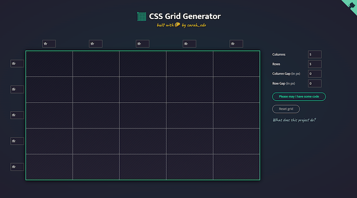
I put CSS Grid Generator first on my list because I use it the most. It is an open source project designed by Sarah Drasner. The code of the project is available here if you want to contribute.
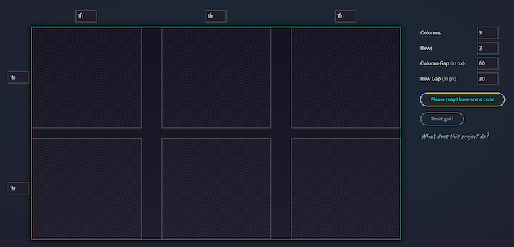
To give you an example, I recently needed to generate a simple grid with two rows and three columns. I didn’t remember how to set a specific size for the row gap and the column gap. With CSS Grid Generator, I was able to easily create the structure I wanted and move on to more complex tasks:
.parent {
  display: grid;
  grid-template-columns: repeat(3, 1fr);
  grid-template-rows: repeat(2, 1fr);
  grid-column-gap: 60px;
  grid-row-gap: 30px;
}
The final grid looked like this:
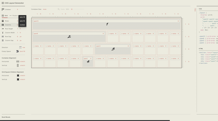
I could have put CSS Layout Generator first on the list. If you are looking to generate complicated grids all the time, this is probably the one you should bookmark. Developed by Braid Design System, CSS Layout Generator offers a wide range of options that will solve most grid headaches.
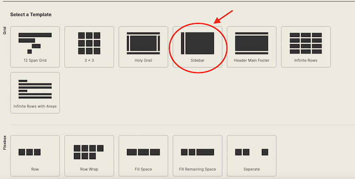
In my daily work, I often use CSS Layout Generator templates because they conveniently allow you to choose between a structure with a sidebar and container or a header, main, and footer:
<section class="layout">
  <!-- The left sidebar where you can put your navigation items etc. -->
  <div class="sidebar">1</div>

  <!-- The main content of your website -->
  <div class="body">2</div>
</section>

<style>
.layout {
  width: 1366px;
  height: 768px;
  display: grid;
  /* This is the most important part where we define the size of our sidebar and body  */
  grid:
    "sidebar body" 1fr
    / auto 1fr;
  gap: 8px;
}

.sidebar {
  grid-area: sidebar;
}

.body {
  grid-area: body;
}
</style>
The Sidebar option looks like this:
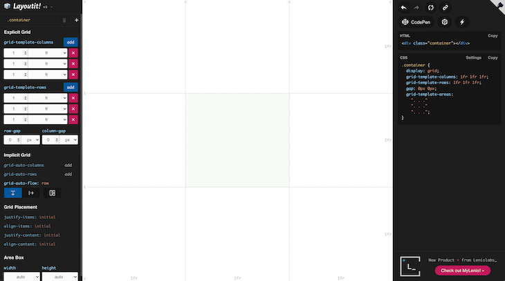
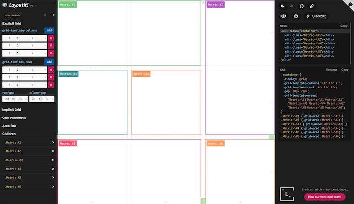
Grid LayoutIt was developed by Leniolabs and is another grid generator that comes with many options. The code is available publicly on GitHub if you are interested in contributing.
Recently, a customer asked me to design an interface to display important metrics about his product (somewhat similar to Geckoboard). The layout he wanted was very precise but, thanks to LayoutIt, I generated the code in a few seconds:
<div class="container">
  <div class="metric-1"></div>
  <div class="metric-2"></div>
  <div class="metrics-3"></div>
  <div class="metric-4"></div>
  <div class="metric-5"></div>
  <div class="metric-6"></div>
</div>

<style>
.container {
  display: grid;
  grid-template-columns: 1fr 1fr 1fr;
  grid-template-rows: 1fr 1fr 1fr;
  gap: 20px 20px;
  grid-auto-flow: row;
  grid-template-areas:
    "metric-1 metric-1 metric-2"
    "metrics-3 metric-4 metric-2"
    "metric-5 metric-5 metric-6";
}
.metric-1 {
  grid-area: metric-1;
}
.metric-2 {
  grid-area: metric-2;
}
.metrics-3 {
  grid-area: metrics-3;
}
.metric-4 {
  grid-area: metric-4;
}
.metric-5 {
  grid-area: metric-5;
}
.metric-6 {
  grid-area: metric-6;
}
</style>
The resulting layout looked like this:
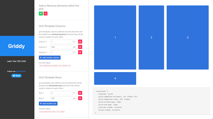
In my past experience, I spent a lot of time using Griddy. It is a little less easy to use than the CSS grid made by Sarah Drasner, but it offers more options. For example, it allows you to easily generate a four-column grid with three rows:
.container {
  display: grid;
  grid-template-columns: 1fr 300px 1fr 1fr;
  grid-template-rows: 2fr 100px 1fr;
  grid-column-gap: 10px
  grid-row-gap: 20px
  justify-items: stretch
  align-items: stretch
}
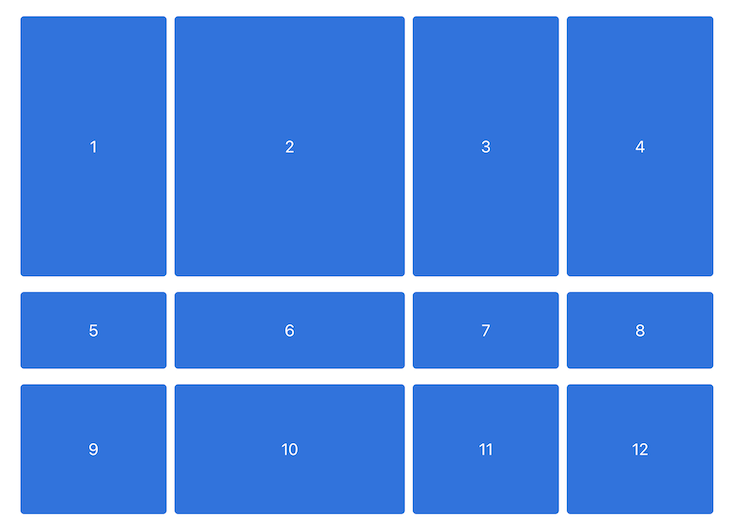
The resulting layout looks like this:
minmax() function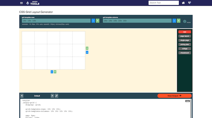
Angry Tools CSS Grid is another great CSS grid generator. It can be handy, though probably less user-friendly than the other tools highlighted in this guide.
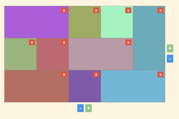
Angry Tools CSS Grid is also useful when generating galleries. By clicking on the squares, you can define their sizes and their directions, horizontally or vertically:
<div class="angry-grid">
  <div id="item-0">Item 0</div>
  <div id="item-1">Item 1</div>
  <div id="item-2">Item 2</div>
  <div id="item-3">Item 3</div>
  <div id="item-4">Item 4</div>
  <div id="item-5">Item 5</div>
  <div id="item-6">Item 6</div>
  <div id="item-7">Item 7</div>
  <div id="item-8">Item 8</div>
  <div id="item-9">Item 9</div>
</div>

<style>
.angry-grid {
  display: grid;
  /* Our grid will be displayed using 3 rows */
  grid-template-rows: 1fr 1fr 1fr;
  /* Our grid will be displayed using 4 columns */
  grid-template-columns: 1fr 1fr 1fr 1fr 1fr;
  /* You can define a gap between your columns and your rows if you need to */
  gap: 0px;
  height: 100%;
}

/* This grid item will start at row 1 and column 4 and end at row 2 and column 5 */
#item-0 {
  background-color: #8bf7ba;
  grid-row-start: 1;
  grid-column-start: 4;
  grid-row-end: 2;
  grid-column-end: 5;
}

/* This grid item will start at row 2 and column 3 and end at row 3 and column 5 */
#item-1 {
  background-color: #bf9aa7;
  grid-row-start: 2;
  grid-column-start: 3;
  grid-row-end: 3;
  grid-column-end: 5;
}

/* This grid item will start at row 2 and column 2 and end at row 3 and column 3 */
#item-2 {
  background-color: #c7656e;
  grid-row-start: 2;
  grid-column-start: 2;
  grid-row-end: 3;
  grid-column-end: 3;
}

/* This grid item will start at row 1 and column 1 and end at row 2 and column 3 */
#item-3 {
  background-color: #b659df;
  grid-row-start: 1;
  grid-column-start: 1;
  grid-row-end: 2;
  grid-column-end: 3;
}

/* This grid item will start at row 3 and column 1 and end at row 4 and column 3 */
#item-4 {
  background-color: #be6b5e;
  grid-row-start: 3;
  grid-column-start: 1;
  grid-row-end: 4;
  grid-column-end: 3;
}

/* This grid item will start at row 3 and column 4 and end at row 4 and column 6 */
#item-5 {
  background-color: #5bb9d7;
  grid-row-start: 3;
  grid-column-start: 4;
  grid-row-end: 4;
  grid-column-end: 6;
}

/* This grid item will start at row 1 and column 5 and end at row 3 and column 6 */
#item-6 {
  background-color: #56adba;
  grid-row-start: 1;
  grid-column-start: 5;
  grid-row-end: 3;
  grid-column-end: 6;
}

/* This grid item will start at row 1 and column 3 and end at row 2 and column 4 */
#item-7 {
  background-color: #9cab58;
  grid-row-start: 1;
  grid-column-start: 3;
  grid-row-end: 2;
  grid-column-end: 4;
}

/* This grid item will start at row 3 and column 3 and end at row 4 and column 4 */
#item-8 {
  background-color: #8558ad;
  grid-row-start: 3;
  grid-column-start: 3;
  grid-row-end: 4;
  grid-column-end: 4;
}

/* This grid item will start at row 2 and column 1 and end at row 3 and column 2 */
#item-9 {
  background-color: #96b576;
  grid-row-start: 2;
  grid-column-start: 1;
  grid-row-end: 3;
  grid-column-end: 2;
}
</style>
The resulting gallery looks like this:
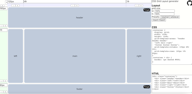
Vue Grid Generator is yet another great grid generator. I like this one in particular because it has buttons at various parts of the website that can be used to customize the grid. You can find the source code on GitHub. It also has a great UI that isn’t intimidating to work with.
Here’s a sample UI created using Vue Grid Generator:
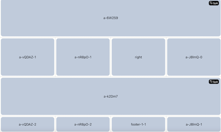
The code for this layout is as follows:
<style>
.container {
  display: grid;
  width: 100%;
  height: 100%;
  grid-template-areas: "a-6W259 a-6W259 a-6W259 a-6W259"
  "a-vQDAZ-1 a-nR8pO-1 right a-J8lmQ-0"
  "a-k2Dm7 a-k2Dm7 a-k2Dm7 a-k2Dm7"
  "a-vQDAZ-2 a-nR8pO-2 footer-1-1 a-J8lmQ-1";
  grid-template-columns: 1fr 1fr 1fr 1fr;
  grid-template-rows: 1fr 1fr 1fr 80px;
}
.container > div {
  border: 1px dashed #888;
}

.a-6W259 {
  grid-area: a-6W259;
}
.a-vQDAZ-1 {
  grid-area: a-vQDAZ-1;
}
.a-nR8pO-1 {
  grid-area: a-nR8pO-1;
}
.right {
  grid-area: right;
}
.a-J8lmQ-0 {
  grid-area: a-J8lmQ-0;
}
.a-k2Dm7 {
  grid-area: a-k2Dm7;
}
.a-vQDAZ-2 {
  grid-area: a-vQDAZ-2;
}
.a-nR8pO-2 {
  grid-area: a-nR8pO-2;
}
.footer-1-1 {
  grid-area: footer-1-1;
}
.a-J8lmQ-1 {
  grid-area: a-J8lmQ-1;
}
</style>
<div class="container">
  <div class="a-6W259">a-6W259</div>
  <div class="a-vQDAZ-1">a-vQDAZ-1</div>
  <div class="a-nR8pO-1">a-nR8pO-1</div>
  <div class="right">right</div>
  <div class="a-J8lmQ-0">a-J8lmQ-0</div>
  <div class="a-k2Dm7">a-k2Dm7</div>
  <div class="a-vQDAZ-2">a-vQDAZ-2</div>
  <div class="a-nR8pO-2">a-nR8pO-2</div>
  <div class="footer-1-1">footer-1-1</div>
  <div class="a-J8lmQ-1">a-J8lmQ-1</div>
</div>
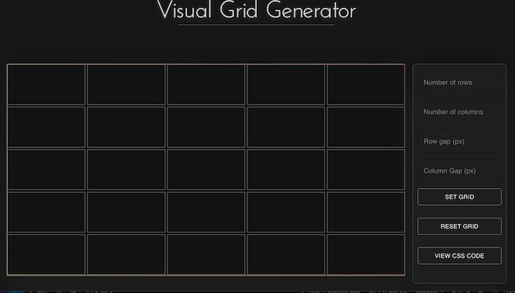
Visual Grid Generator is the next grid generator on our list. It was created by Andreas, and the source code is available on GitHub. This generator has a clean and friendly UI. It’s also easy to understand and, therefore, suitable for beginners:
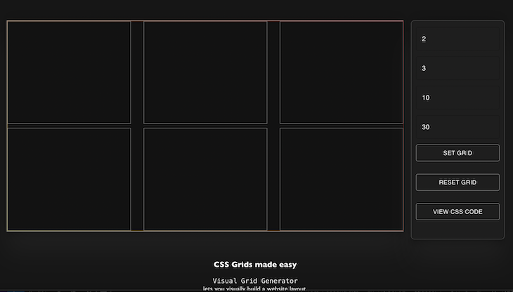
Here’s the resulting CSS for this layout:
.parentElement {
display: grid;
grid-template-rows: 1fr 1fr;
grid-template-columns: 1fr 1fr 1fr;
grid-row-gap: 10px;
grid-column-gap: 30px;
}
LayoutMaster is the last CSS grid generator on our list, as it is the least user-friendly tool highlighted in this guide. The source code can be found on GitHub.
The initial landing page for LayoutMaster is blank, which might throw off visitors. However, by right-clicking on the squares using a mouse, you can easily create new grids and manipulate their sizes with a mouse drag feature, either horizontally or vertically.
Here’s a sample UI created with LayoutMaster:
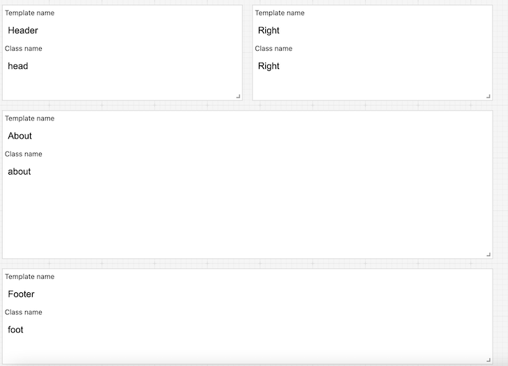
And here’s the resulting CSS:
.container {
  grid-template-areas: "Header Right ."
                 "Header Right ."
                 "About About ."
                 "About About ."
                 "About About ."
                 "Footer Footer ."
                 "Footer Footer .";
  grid-template-rows: 100px 100px 100px 100px 100px 100px 100px;
  grid-template-columns: 1fr 1fr 1fr;
  grid-gap: 10px;
}

.head {
  grid-area: Header;
}
.Right {
  grid-area: Right;
}
.about {
  grid-area: About;
}
.foot {
  grid-area: Footer;
}
| Grid Tools | Ease of use | UI | Versatility | Pre-defined template |
|---|---|---|---|---|
| CSS Grid Generator | Great | Great | Average | No |
| CSS Layout Generator | Average | Great | Great | Yes |
| Grid LayoutIt | Great | Great | Great | No |
| Griddy | Great | Average | Average | No |
| Angry Tools CSS Grid | Average | Poor | Average | Yes |
| Vue Grid Generator | Great | Average | Great | No |
| Visual Grid Generator | Great | Great | Average | No |
| LayoutMaster | Average | Poor | Poor | No |
CSS grid generators are great to use when you aren’t familiar with CSS properties. But, as you become a more advanced developer, you may find that a quick cheat sheet is probably handier.
If it can help you, here is the one I have made for myself:
| CSS properties | Description |
|---|---|
gap |
Sets the gap size between the rows and columns. It is a shorthand for the following properties: row-gap and column-gap |
row-gap |
Specifies the gap between the grid rows |
column-gap |
Specifies the gap between the columns |
grid |
A shorthand property for: grid-template-rows, grid-template-columns, grid-template-areas, grid-auto-rows, grid-auto-columns, grid-auto-flow |
grid-area |
Specifies a grid item’s size and location in a grid layout and is a shorthand property for the following properties: grid-row-start, grid-column-start, grid-row-end, grid-column-end |
grid-auto-columns |
Sets the size for the columns in a grid container |
grid-auto-flow |
Controls how auto-placed items get inserted in the grid |
grid-auto-rows |
Sets the size for the rows in a grid container |
grid-column |
Specifies a grid item’s size and location in a grid layout and is a shorthand property for the following properties: grid-column-start, grid-column-end |
grid-column-end |
Defines how many columns an item will span or on which column-line the item will end |
grid-column-gap |
Defines the size of the gap between the columns in a grid layout |
grid-column-start |
Defines on which column-line the item will start |
grid-gap |
Defines the size of the gap between the rows and columns in a grid layout and is a shorthand property for the following properties: grid-row-gap, grid-column-gap |
grid-row |
Specifies a grid item’s size and location in a grid layout and is a shorthand property for the following properties: grid-row-start, grid-row-end |
grid-row-end |
Defines how many rows an item will span or on which row-line the item will end |
grid-row-gap |
Defines the size of the gap between the rows in a grid layout |
grid-row-start |
Defines on which row-line the item will start |
grid-template |
A shorthand property for the following properties: grid-template-rows, grid-template-columns, grid-template-areas |
grid-template-areas |
Specifies areas within the grid layout |
grid-template-columns |
Specifies the number (and the widths) of columns in a grid layout |
grid-template-rows |
Specifies the number (and the heights) of the rows in a grid layout |
I hope this quick comparison of the best CSS grid generators helps you bookmark your favorite one.
A critical piece of advice I have for dealing with CSS grids is to take your time. These generators are a great option because they can help you get the layouts you need step by step and avoid relying on more complicated solutions.
I am also happy to read your comments and Twitter messages. 😉 And in case you are curious about my work or my other articles, you can find that here.
Thank you for reading!
As web frontends get increasingly complex, resource-greedy features demand more and more from the browser. If you’re interested in monitoring and tracking client-side CPU usage, memory usage, and more for all of your users in production, try LogRocket.

LogRocket lets you replay user sessions, eliminating guesswork around why bugs happen by showing exactly what users experienced. It captures console logs, errors, network requests, and pixel-perfect DOM recordings — compatible with all frameworks.
LogRocket's Galileo AI watches sessions for you, instantly identifying and explaining user struggles with automated monitoring of your entire product experience.
Modernize how you debug web and mobile apps — start monitoring for free.

useEffect breaks AI streaming responses in ReactSee why useEffect breaks AI streaming in React, and how moving stream state outside React fixes flicker and stale updates.

A real-world debugging session using Claude to solve a tricky Next.js UI bug, exploring how AI helps, where it struggles, and what actually fixed the issue.

CSS wasn’t built for dynamic UIs. Pretext flips the model by measuring text before rendering, enabling accurate layouts, faster performance, and better control in React apps.

Why do real-time frontends break at scale? Learn how event-driven patterns reduce drift, race conditions, and inconsistent UI state.
Hey there, want to help make our blog better?
Join LogRocket’s Content Advisory Board. You’ll help inform the type of content we create and get access to exclusive meetups, social accreditation, and swag.
Sign up now