Accessibility is an important part of web development, enabling individuals with disabilities to have access to the content and web apps that are necessary for day-to-day tasks. In particular, making applications accessible using ARIA standards helps individuals with disabilities to leverage things like screen readers.

In this article, we’ll walk through how to build a Solid UI with Kobalte, a toolkit for building accessible apps with Solid. To follow along with the code examples, feel free to clone my sample repo on GitHub. Let’s get started!
Jump ahead:
The Replay is a weekly newsletter for dev and engineering leaders.
Delivered once a week, it's your curated guide to the most important conversations around frontend dev, emerging AI tools, and the state of modern software.
Solid is a library that helps you build reactive and performant frontend applications. Solid utilizes a concept called signals, which help to preserve reactivity in the application:
import {createSignal} from "solid-js"

const [value, setValue] = createSignal("value");
Signals in Solid are very similar to the useState Hook that we see in React. Solid also tracks data side effects using createEffect, which is similar to the useEffect Hook in React:
// originally copied from https://www.solidjs.com/docs/latest/api#createeffect
const [a, setA] = createSignal(initialValue);

// effect that depends on signal `a`
createEffect(() => doSideEffect(a()));
Solid supports stores, which centralize state management in your application:
// originally copied from https://www.solidjs.com/docs/latest/api#createstore
import { createStore } from "solid-js/store";
import type { StoreNode, Store, SetStoreFunction } from "solid-js/store";

function createStore<T extends StoreNode>(
  state: T | Store<T>
): [get: Store<T>, set: SetStoreFunction<T>];
type Store<T> = T;  // conceptually readonly, but not typed as such
Putting it all together, you can build components with Solid functions in a very similar way to how you would in a React application:
import { createSignal, onCleanup } from "solid-js";

function Counter() {
  const [count, setCount] = createSignal(0);
  const timer = setInterval(() => setCount(count() + 1), 1000);
    onCleanup(() => clearInterval(timer));

  return <div>Count: {count()}</div>;
}
To add Kobalte to a Solid project, you can use the following simple npm install:
npm install @kobalte/core
Kobalte provides a set of components that follow the WAI-ARIA Authoring Practices, so the components you build with Kobalte are accessible by default. Kobalte components are composable and give you access to each component’s granular parts. The code below shows a TextField:
import { TextField } from "@kobalte/core";
import "./style.css";
function App() {
  return (
    <TextField.Root class="text-field">
      <TextField.Label class="text-field__label">Favorite fruit</TextField.Label>
      <TextField.Input class="text-field__input" />
    </TextField.Root>
  );
}
Here, the TextField.Root is the basis for the component, but you also have TextField.Label and TextField.Input, which you can use to access properties and styles.
Kobalte comes without styling, so you can either directly apply Vanilla CSS or use a supported framework like Tailwind CSS. To learn more, check out the documentation on the Kobalte website. With Kobalte, there is a large number of components that you can choose from. In the next few sections, I’ll explain what they look like and show how you can either change your existing components or start fresh with Kobalte.
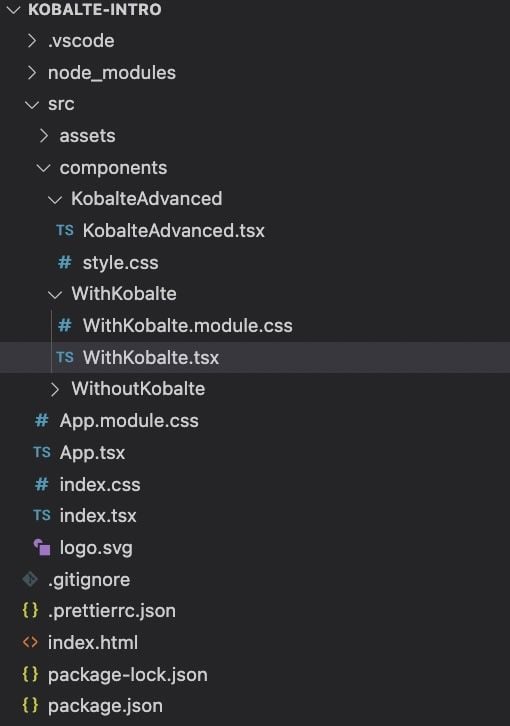
If you cloned my sample repo, then you’ll see a very simple Solid application:

Notice there are three pages in the application. WithoutKobalte.tsx is a page that has a basic to-do application with just an input field and values. WithKobalte.tsx is a page that has the same application as WithoutKobalte.tsx but with Kobalte components. Finally, KobalteAdvanced.tsx is a page that showcases more Kobalte components with styles.
For our first Kobalte component, let’s look at the input and button elements in the WithoutKobalte.tsx page:
<input
    type="text"
    ref={input}
    placeholder="What do you have to do today?"
    name="todo"
></input>
<button
    onClick={() => {
        addTodoItem(input);
    }}
>
    Add Todo
</button>
The input and button elements are pretty simple and consistent with what you’d expect in a normal web application. We have a placeholder, a value defined for the input, and an onClick event set for the button. If you look at the same components in WithKobalte.tsx, you’ll see that we now have access to the granular pieces of these elements:
<TextField.Root
    value={input()}
    onValueChange={setInput}
    validationState={
        input() !== 'something' ? 'invalid' : 'valid'
    }
>
    <TextField.Label />
    <TextField.Input
        placeholder="What do you have to do today?"
        name="todo"
    />
    <TextField.Description>
        You can have a description appear like this
    </TextField.Description>
    <TextField.ErrorMessage class={styles.error}>
        If you type anything other than "something" the error
        shows
    </TextField.ErrorMessage>
</TextField.Root>
<Button.Root
    class={styles.kobalteButton}
    onClick={() => {
        addTodoItem();
    }}
>
    Add Todo
</Button.Root>
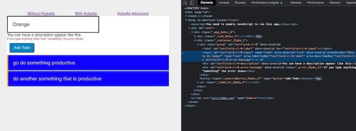
You’ll notice that the TextField in particular has elements for Description, ErrorMessage, Label, and Input. Additionally, when you run the application, you’ll notice the presence of the ARIA attributes on the Kobalte components versus the standard web components.
The image below shows the WithoutKobalte.tsx page:

While the image below shows the WithKobalte.tsx page:

With the ARIA attributes all set up for you, your life as a developer is much easier. Furthermore, the granularity of the components makes development and maintenance easier.
Now that we’re familiar with some basics of Kobalte, we can briefly go over some of the more advanced components. In KobalteAdvanced.tsx, we have the following components: Progress Bar, Hover Card, Popover, and Tabs.
All of these components are both granular and composable, just like the TextField that we saw earlier. Below is the ProgressBar code:
  <section>
      <h2>Progress Bar</h2>
      <Progress.Root value={80} class="progress">
          <div class="progress__label-container">
              <Progress.Label class="progress__label">
                  Loading...
              </Progress.Label>
              <Progress.ValueLabel class="progress__value-label" />
          </div>
          <Progress.Track class="progress__track">
              <Progress.Fill class="progress__fill" />
          </Progress.Track>
      </Progress.Root>
  </section>
Notice that in this case, I’m using custom CSS classes. You could just as easily integrate with a CSS framework. Below is the HoverCard component:
<section>
<h2>Hover Card (move mouse over to see it)</h2>
<HoverCard.Root>
<HoverCard.Trigger
class="hovercard__trigger"
href="https://twitter.com/mlfabien"
target="_blank"
>
@MLFabien
</HoverCard.Trigger>
<HoverCard.Portal>
<HoverCard.Content class="hovercard__content">
<HoverCard.Arrow />
<img
src="https://pbs.twimg.com/profile_images/1509139491671445507/pzWYjlYN_400x400.jpg"
alt="Fabien MARIE-LOUISE"
class="hovercard__avatar"
/>
<h2 class="hovercard__title">
Fabien MARIE-LOUISE
</h2>
<p class="hovercard__description">
Developer and UI Design enthusiast. Building UI
related stuffs for @solid_js
</p>
</HoverCard.Content>
</HoverCard.Portal>
</HoverCard.Root>
</section>
The Popover component is similar; you could easily install this popover component into your frontend. Often times, libraries don’t have a popover component specifically, so you’d have to create one yourself. This is definitely another advantage of using Kobalte:
<section>
    <h2>Popover (click open to see it)</h2>
    <Popover.Root>
        <Popover.Trigger class="popover__trigger">
            Open
        </Popover.Trigger>
        <Popover.Portal>
            <Popover.Content class="popover__content">
                <Popover.Arrow />
                <div class="popover__header">
                    <Popover.Title class="popover__title">
                        About Kobalte
                    </Popover.Title>
                    <Popover.CloseButton class="popover__close-button">
                        X
                    </Popover.CloseButton>
                </div>
                <Popover.Description class="popover__description">
                    A UI toolkit for building accessible web apps
                    and design systems with SolidJS.
                </Popover.Description>
            </Popover.Content>
        </Popover.Portal>
    </Popover.Root>
</section>
Finally, the Tabs component is very similar to what you would see in other frontend libraries. Again, the composition capabilities make it great to use in any app:
<section>
    <h2>Tabs</h2>
    <Tabs.Root aria-label="Main navigation" class="tabs">
        <Tabs.List class="tabs__list">
            <Tabs.Trigger class="tabs__trigger" value="profile">
                Profile
            </Tabs.Trigger>
            <Tabs.Trigger class="tabs__trigger" value="dashboard">
                Dashboard
            </Tabs.Trigger>
            <Tabs.Trigger class="tabs__trigger" value="settings">
                Settings
            </Tabs.Trigger>
            <Tabs.Trigger class="tabs__trigger" value="contact">
                Contact
            </Tabs.Trigger>
            <Tabs.Indicator class="tabs__indicator" />
        </Tabs.List>
        <Tabs.Content class="tabs__content" value="profile">
            Profile details
        </Tabs.Content>
        <Tabs.Content class="tabs__content" value="dashboard">
            Dashboard details
        </Tabs.Content>
        <Tabs.Content class="tabs__content" value="settings">
            Settings details
        </Tabs.Content>
        <Tabs.Content class="tabs__content" value="contact">
            Contact details
        </Tabs.Content>
    </Tabs.Root>
</section>
In this article, we explored getting started with Kobalte by running through a few examples. I demonstrated how to create your first component, and then we covered some more advanced use cases. Kobalte is simple to integrate into your Solid applications, and building applications is even easier when the ARIA Standards are already set up for you. I recommend checking out my sample repo, as well as the Kobalte docs.
Thanks for reading! Follow my writing on rhythmandbinary.com and Twitter at @AndrewEvans0102.
There’s no doubt that frontends are getting more complex. As you add new JavaScript libraries and other dependencies to your app, you’ll need more visibility to ensure your users don’t run into unknown issues.
LogRocket is a frontend application monitoring solution that lets you replay JavaScript errors as if they happened in your own browser so you can react to bugs more effectively.

LogRocket works perfectly with any app, regardless of framework, and has plugins to log additional context from Redux, Vuex, and @ngrx/store. Instead of guessing why problems happen, you can aggregate and report on what state your application was in when an issue occurred. LogRocket also monitors your app’s performance, reporting metrics like client CPU load, client memory usage, and more.
Build confidently — start monitoring for free.

Learn how Vite+ unifies Vite, Vitest, Oxlint, Oxfmt, Rolldown, and Node.js management in one CLI.

AI companies are buying developer tools as coding agents turn runtimes, package managers, and linters into strategic infrastructure.

Learn how AI-assisted development governance uses rules, agents, hooks, and protocols to help AI coding tools produce safer, more consistent code.

A step-by-step guide to building your first MCP server using Node.js, covering core concepts, tool design, and upgrading from file storage to MySQL.
Would you be interested in joining LogRocket's developer community?
Join LogRocket’s Content Advisory Board. You’ll help inform the type of content we create and get access to exclusive meetups, social accreditation, and swag.
Sign up now