Progress clocks re useful for tracking progress against a task or goal. They are simple and intuitive when used with pen and paper; this article will bring them to the web with HTML and CSS.
In the tutorial portion of this article, we’ll build an eight-segment progress clock. We’ll make updates to our project process tracker design for usability and inclusivity.
Jump ahead:
Semantically, a progress clock is no different from a gauge or a progress tracking bar. It’s a representation of how much progress you’ve made toward a particular goal. However, progress bars are usually a visual element updated by code, whereas a progress clock is generally an interactive control updated by the user.
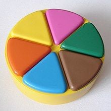
Visually, a progress clock is a circle divided into segments, which get filled in as progress is made. The board game Trivial Pursuit uses a progress clock model for the playing pieces; players physically fill in segments as they progress through the game.
You may have also seen the progress clock model used in video games. For example, in Super Mario 64, Mario’s “Health Meter” is famously expressed as a progress clock, with segments filling in as the character gains “health”.
Several tabletop role-playing games also use progress clocks as a simple mechanic to either track progress or manage dramatic tension.
Progress clocks are very good for visually communicating progress “at a glance” as long as the number of segments is small. I generally find that more than 12 segments can be confusing. In fact, 12 segments is probably only acceptable if you’re leaning into the “clock” part of the metaphor.
A common exercise for designers or developers is breaking down projects into tasks and track progress against them, so there’s no shortage of readily available tools for this effort. In fact, building a to-do list application is often one of the first projects that many web developers build.
The key functionality that a progress clock provides is the ability for the user to interactively set the amount of progress. This tells us a few things about the types of scenarios where a progress clock is most useful.
Simple tasks like “feeding the cat” typically don’t need a progress update. They’re either done or not done. This type of task is a good candidate for a common checkbox.
Complex tasks that can be broken down into simple tasks don’t need to be interactively updated by the user. With this type of task, you can measure progress by calculating the percentage of completed subtasks. Most issue trackers have this functionality built in!
Complex tasks where progress can be objectively measured don’t need to be interactively updated by the user either. For example, my exercise tracker automatically calculates how much progress I’ve made toward my fitness goals. Similarly, my budgeting software can calculate my progress toward my savings goals.
What does this tell us? It suggests that progress clocks are best suited for situations where we need to track our progress, but can’t automatically calculate the amount that is completed or can’t easily break down the project into a set of simpler tasks.
We don’t require great precision for our progress clocks. Since each clock has a relatively small number of segments, we’re only getting a rough approximation of our progress. This implies that progress clocks are best used for tasks where progress is somewhat abstract or subjective.
For projects requiring a large number of segments, a range control (<input type="range" />) may be more appropriate. This is still an imprecise method, but it can accommodate a much larger range of values than a progress clock without becoming difficult to use.
For projects requiring more precision, we can use a numeric control (<input type="number" />) with the appropriate minimum, maximum, and step values.
For projects with an automatically calculated or read-only presentation, the standard <progress> or <meter> elements may be more appropriate
In my own experience, progress clocks are most suitable for creative tasks, like “writing an article” or those that are difficult to measure, like “performing a root cause analysis”.
For these types of tasks, we’d have to rely on human expertise and judgment to get a sense of progress.
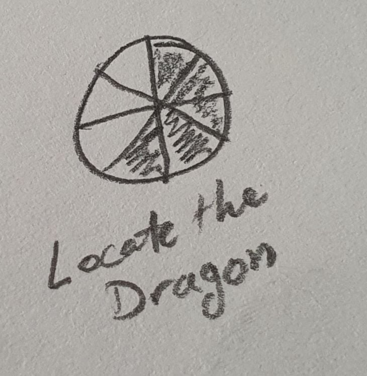
Progress clocks are also useful for tasks with a small number of steps that advance in unpredictable or sporadic ways. That makes them very useful for games, where randomness may play a part in moving the player toward (or away from) their goal.
Each progress clock segment needs to be individually focusable and selectable. Since we’re selecting only one of a small number of segments, radio buttons are a good choice for the underlying markup.
By using radio buttons, our component will already be equipped with all the behavior we need. It also means that our control remains functional (if ugly). In other words, you can still update your progress in situations where the CSS fails to load.
For this article, I’ve chosen to build an eight-segment progress clock. This size is a good default; as an even number it allows us to easily show “half completed”. Also, you can advance by two segments at a time to substitute for a four-segment clock.
I’ll also provide the general formula to enable you to build progress clocks with any number of segments.
Here’s our starting markup:
<fieldset class="clock-frame">
    <legend>Sample Progress Clock</legend>
    <div class="clock" data-segments="8">
        <input type="radio" name="progress-clock" value="8" id="segment-8" /><label for="segment-8">8/8</label>
        <input type="radio" name="progress-clock" value="7" id="segment-7" /><label for="segment-7">7/8</label>
        <input type="radio" name="progress-clock" value="6" id="segment-6" /><label for="segment-6">6/8</label>
        <input type="radio" name="progress-clock" value="5" id="segment-5" /><label for="segment-5">5/8</label>
        <input type="radio" name="progress-clock" value="4" id="segment-4" /><label for="segment-4">4/8</label>
        <input type="radio" name="progress-clock" value="3" id="segment-3" /><label for="segment-3">3/8</label>
        <input type="radio" name="progress-clock" value="2" id="segment-2" /><label for="segment-2">2/8</label>
        <input type="radio" name="progress-clock" value="1" id="segment-1" /><label for="segment-1">1/8</label>
    </div>
</fieldset>
Here, we use a fieldset to group the radio button controls together. The legend will act as a label for the group, which is helpful as we intend for the group to look like a single control.
Some screen readers will read the legend out when entering the fieldset, along with the label of the first input. For example, NVDA will announce “Sample Progress Clock, 8/8”. Other screen readers will read the legend out for every control in the fieldset.
Our initial CSS is a simple reset that gets rid of the standard radio button appearance, hides the labels, and gives the clock itself a temporary background while we work on the overall control.
.clock { background-color: darkcyan; }
.clock label { display: none; }
.clock input { appearance: none; }
We’ll begin creating the real layout by drawing the inputs ourselves. We start by making the boxes the same size. The cursor: pointer rule makes it more obvious to a user that the boxes are clickable. We indicate the checked input with a different background color.
.clock input {
  appearance: none;
  display:inline-block;
  box-sizing: border-box;
  font-size:inherit;
  margin: 0;
  width: 2em;
  height: 2em;
  background-color: #eee;
  border: 1px solid #ccc;
  cursor: pointer;
}
.clock input:checked {
  background-color: #222;
}
Now, we’re going to position the boxes as pie slices; this is where the number of segments becomes important.
To accomplish this, we’re going to position all the input boxes so they are in the same spot, then use the CSS transform property to rotate the boxes individually into position.
Because absolute positioning will take the boxes out of flow, we need to give the containing div an explicit width and height. If we fail to do this, the boxes would shrink to zero and we’d see nothing. You can see why having the temporary background color is helpful at this point, as it allows us to notice this kind of error.
In the future, when we can use attr() to read the value attribute, we’ll be able to use calc() to automatically determine the rotate and skew values.
.clock { --segment-size: calc(360deg / attr(data-segments integer)); }
.clock input {
    transform:
        rotate(calc(var(--segment-size) * (attr(value integer) - 1)))
        skewY(calc(var(--segment-size) - 90deg));
}
At present, we’ll have to calculate the transform ourselves. But, the formula is pretty simple.
The segment size is obtained by dividing 360deg (a full circle) by the number of segments. For an eight-segment clock, each segment would be 45deg. For a six-segment clock, each segment would be 60deg.
The skew is the same for all segments — it’s our segment size less 90deg. For our eight-segment clock, that’s -45deg. For a six-segment clock, that would be -30deg.
The rotation for each segment is:
segment size * (segment number – 1)
So the rotation of the fourth segment of an eight-segment clock may be calculated as follows:
45deg * (4 - 1) = 135deg
However, I have our values running in reverse order, from highest to lowest, for reasons that will soon become clear. So, we’re going to subtract 360deg, which will give us a rotation of -225deg.
.clock {
    position: relative;
    background-color:darkcyan;
    width:4em;
    height:4em;
}
.clock input {
  appearance: none;
  display:inline-block;
  box-sizing: border-box;
  font-size:inherit;
  margin: 0;
  width: 2em;
  height: 2em;
  background-color: #eee;
  border: 1px solid #ccc;
  cursor: pointer;
  position: absolute;
  left:2em;
  bottom:2em;
  top:auto;
  transform-origin:0 2em;
}

.clock input[value="8"]
{ transform: rotate(-45deg) skewY(-45deg); }
.clock input[value="7"]
{ transform: rotate(-90deg) skewY(-45deg); }
.clock input[value="6"]
{ transform: rotate(-135deg) skewY(-45deg); }
.clock input[value="5"]
{ transform: rotate(-180deg) skewY(-45deg); }
.clock input[value="4"]
{ transform: rotate(-225deg) skewY(-45deg); }
.clock input[value="3"]
{ transform: rotate(-270deg) skewY(-45deg); }
.clock input[value="2"]
{ transform: rotate(-315deg) skewY(-45deg); }
.clock input[value="1"]
{transform: rotate(0deg) skewY(-45deg);  }
At this point, we have something resembling a rosette star overflowing our container. The hardest step is behind us now, we just need to clean up and fix up a few accessibility issues.
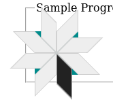
Turning the star into a circle is easy, we just give the container a border radius of 50 percent and hide any overflow. Finally, we add a border to the circle.
.clock {
    position:relative;
    width:4em;
    height:4em;
    overflow:hidden;
    border:medium solid #666;
    border-radius:50%;
}
Now, we have one last rule that gives us that visual sense of progress, the whole point of this exercise.
Thanks to our initial choice of ordering the values from highest to lowest, we can use the below sibling selector to provide the visual illusion of all lesser values being selected.
.clock input:checked,
.clock input:checked ~ input {
  background-color: #222;
}
While our progress clock has all the unique features and behavior we intended, it has some shortcomings that we’ll need to address before using it on an actual website. In addition, we should go through a usability checklist to ensure our design is inclusive.
Our first real usability issue is the lack of a zero value. Without a zero value, we can’t reflect “no progress has been made”, we can’t easily fix a mistake in which we accidentally mark progress on the wrong task, and we don’t have a default value for a newly created progress clock.
There’s no obvious place to put the zero value in the clock itself, but we can take advantage of our radio button semantics!
We can put the zero value outside the clock, but have it treated as part of the same set of inputs as the normal segments.
<fieldset class="clock-frame">
    <legend>Sample Progress Clock</legend>
    <p class="zero-progress"><label><input type="radio" name="progress-clock" value="0" checked="checked" class="visually-hidden" />Clear</label></p>
    <div class="clock" data-segments="8">
        <input type="radio" name="progress-clock" value="8" id="segment-8" /><label for="segment-8">8/8</label>
        <input type="radio" name="progress-clock" value="7" id="segment-7" /><label for="segment-7">7/8</label>
        <input type="radio" name="progress-clock" value="6" id="segment-6" /><label for="segment-6">6/8</label>
        <input type="radio" name="progress-clock" value="5" id="segment-5" /><label for="segment-5">5/8</label>
        <input type="radio" name="progress-clock" value="4" id="segment-4" /><label for="segment-4">4/8</label>
        <input type="radio" name="progress-clock" value="3" id="segment-3" /><label for="segment-3">3/8</label>
        <input type="radio" name="progress-clock" value="2" id="segment-2" /><label for="segment-2">2/8</label>
        <input type="radio" name="progress-clock" value="1" id="segment-1" /><label for="segment-1">1/8</label>
    </div>
</fieldset>
We can style this to look like a button that clears the progress clock, and everything works as you might expect. Well, almost everything as you’ll notice in the next section.
One piece of functionality that we haven’t restored is a focus indicator. This is especially important for keyboard users, as they can tab into our radio button group but get no visual feedback about their navigation.
We can make the clock itself appear to be a single control by using the :focus-within pseudo-class. We’ll change the border color and add an outline, which is very similar to the default radio button behavior in my browser. However, we also need to indicate which input actually has the focus. Here we do that by changing the segment color.
These changes make it possible for a keyboard user to interact with our progress clock just as if they were using a set of radio buttons, including using the arrow keys to change the selected segment in a familiar and intuitive way.
Except, as you will see if you experiment, for one unexpected bit of behavior.
The zero value appears to be a separate button control, but it is actually part of the radio group. So when tabbing, either the progress clock or the button gains focus, and the other appears to be not selectable. However, using the arrow keys immediately reveals the connection between the button and the clock.
I don’t have a good solution for this. Replacing the zero value radio button with an actual button could lead to more intuitive behavior at the cost of semantics. Usability testing is probably warranted to figure out which approach is best.
.clock:focus-within {
    border: medium solid blue;
    outline: medium solid rgb(112, 179, 255);
    outline-offset: 2px;
}
.clock input:focus {
    background-color: rgb(0, 119, 255);
}
fieldset presentationThe fieldset is clearly the correct semantic choice for grouping our radio buttons together, but we can definitely improve upon the default presentation.
Controlling the positioning of the legend used to be a bit difficult. Luckily, we can take advantage of a flex context to position the legend wherever we like.
We float the legend to detach it from the fieldset border, then turn the fieldset into a flex container. Because float does not take flex items out of flow, we can now treat the legend as a standard flex item and control its positioning that way. In this case, we use the order property to place it below the clock itself so that it appears to be a label for the clock.
.clock-frame {
    display: inline-flex;
    flex-direction: column;
    border-radius: 2%;
    position: relative;
    justify-content: center;
    width: fit-content;
    padding: 1em;
    gap: 1em;
}
.clock-frame legend {
    float:left;
    order: 3;
}
The terms “fine” and “coarse” come from the pointer media query, where we distinguish between fine, high precision input methods (like a mouse or stylus) and coarse, low accuracy input methods (like a video game controller or smart TV remote).
It can be hard to ensure selection of the correct segment with a coarse pointer. However, there are three approaches that will make this easier, Your choice of approach will depend on what works best for your design.
The first approach we can take to make selection with a coarse pointer easier is to make the clock larger. Because everything is expressed in ems, we can simply bump up the font-size of the clock, and everything will scale accordingly. This approach also can be used to create a larger active area for touch interfaces.
.clock {
  font-size: xx-large;
}
A second approach is to add a hover style that can provide visual feedback for supported user input mechanisms (for example, a mouse or stylus). This provides a user with confidence regarding their segment choice as they make their selection.
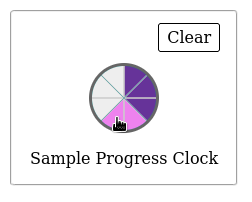
In this example, I’ve used two colors on hover – one for unselected values, and a second for selected values. I believe this makes it clearer whether we will be increasing or decreasing the value, but you should conduct user testing to determine if this is true!
.clock input:hover {
    background-color: violet;
}
.clock input:hover ~ input {
    background-color: violet;
}
.clock input:checked:hover,
.clock input:checked:hover ~input,
.clock input:checked ~ input:hover,
.clock input:checked ~ input:hover ~ input,
.clock input:hover ~ input:checked,
.clock input:hover ~ input:checked ~ input {
    background-color: rebeccapurple;
}
A third approach to make selection with a coarse pointer easier is to change from a circular progress clock to a horizontal (or vertical) progress tracker.
Common examples of this type of tracker are star ratings (e.g., three out of five stars), fundraising thermometers, and gaming health bars (such as the one in Legend of Zelda). The key advantage to this format is that the individual values are easier to select with a low-accuracy pointer.
For this example, I’m just going to add an extra class so that we can easily toggle the track appearance on and off with JavaScript. In an actual design, I’d wrap these styles inside a media query to control when a clock gets presented as a track.
.clock.track {
    background-color:transparent;
    width: auto;
    height:auto;
    overflow: auto;
    border:none;
    margin: 0 0 0 auto;
    border-radius: 0;
    display: flex;
    flex-direction: row-reverse;
    gap: 0.25em;
}
.clock.track input {
    transform: none;
    position: static;
}
In this article, we’ve explored how to build a progress clock with CSS. Now, we can put everything we’ve discussed into a final working sample.
See the Pen
Progress Clock by John C Barstow (@jbowtie)
on CodePen.
I’ve added some buttons that will enable you experiment with the font size and switch between the progress clock and progress bar forms.
As web frontends get increasingly complex, resource-greedy features demand more and more from the browser. If you’re interested in monitoring and tracking client-side CPU usage, memory usage, and more for all of your users in production, try LogRocket.

LogRocket lets you replay user sessions, eliminating guesswork around why bugs happen by showing exactly what users experienced. It captures console logs, errors, network requests, and pixel-perfect DOM recordings — compatible with all frameworks.
LogRocket's Galileo AI watches sessions for you, instantly identifying and explaining user struggles with automated monitoring of your entire product experience.
Modernize how you debug web and mobile apps — start monitoring for free.
Would you be interested in joining LogRocket's developer community?
Join LogRocket’s Content Advisory Board. You’ll help inform the type of content we create and get access to exclusive meetups, social accreditation, and swag.
Sign up now
A breakdown of the wrapper and container CSS classes, how they’re used in real-world code, and when it makes sense to use one over the other.

This guide walks you through creating a web UI for an AI agent that browses, clicks, and extracts info from websites powered by Stagehand and Gemini.

This guide explores how to use Anthropic’s Claude 4 models, including Opus 4 and Sonnet 4, to build AI-powered applications.

Which AI frontend dev tool reigns supreme in July 2025? Check out our power rankings and use our interactive comparison tool to find out.