Data has always been easier to perceive visually. Data visualization allows us to see tendencies over periods of time, allows us to compare different datasets, and makes it easier to see the totals, highlights, lows, and so on.

One of the most common ways to visualize data in software is through analytics panels. We see them in most backend systems to display the visitor engagement data, user activity metrics, server stats, and other metrics.
In this article, we will build an analytics dashboard in Svelte. We will focus on how to create the components, separate the data from the code, and implement the logic.
For reference, here is the source code for the final project.
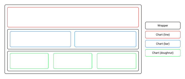
We will create a server statistics dashboard that will display statistics via three different types of charts. There will be one line chart, two bar charts, and three doughnut charts.
The line chart will display the visitor stats across six months. The bar charts will display the most visited pages, as well as top referrers that bring traffic to the site. Finally, the doughnut charts will display user OS, browser, and device usages.
The layout of the analytics dashboard is shown in the wireframe below:
To scaffold a new Svelte project, we will use degit. Open up your terminal and run the following command: npx degit sveltejs/template svelte-analytics.
After, change your working directory to the newly created folder by running cd svelte-analytics. Then install all the necessary dependencies for the Svelte project to work by running the command npm install.
Now run npm run dev in your terminal and navigate to http://localhost:8080 in your browser. You should be presented with a Svelte project preview that looks like this:

We will also install the external npm library Chart.js, which will help us create modern-looking and interactive charts. Run npm install chart.js and wait while the terminal finishes installing the package.
Normally, the data would be fetched from the database. Because we will focus on how to create the analytics components themselves, we will create sample data in a separate file and then import it where necessary.
Navigate to the src folder and create a new file called data.js inside. Next, make sure to include the following code in it:
const colors = ["tomato", "gold", "lime green"];

export const visits = {
  title: "Unique visitors",
  type: "line",
  backgroundColor: colors[0],
  labels: ["January", "February", "March", "April", "May", "June"],
  data: [275, 254, 261, 279, 262, 268]
};

export const pages = {
  title: "Top pages",
  type: "bar",
  backgroundColor: colors[0],
  labels: ["/gallery", "/blog", "/about", "/pricing", "/contact"],
  data: [220, 176, 132, 88, 44]
};

export const referrers = {
  title: "Top referrers",
  type: "bar",
  backgroundColor: colors[0],
  labels: ["google", "twitter", "facebook", "linkedin", "dev.to"],
  data: [23, 14, 6, 5, 2]
};

export const os = {
  title: "OS usage",
  type: "doughnut",
  backgroundColor: colors,
  labels: ["Win", "MacOS", "Linux"],
  data: [400, 100, 200]
};

export const browsers = {
  title: "Browser usage",
  type: "doughnut",
  backgroundColor: colors,
  labels: ["Chrome", "Firefox", "Safari"],
  data: [240, 100, 60]
};

export const devices = {
  title: "Device usage",
  type: "doughnut",
  backgroundColor: colors,
  labels: ["Phone", "Desktop"],
  data: [220, 260]
};
We first created a colors array that will define the background color for the charts. We used predefined HTML color names “tomato”, “gold”, and “lime green”, but you can adjust them to any custom color palettes you want for your specific project.
Then, we created a separate object for each chart consisting of the title, type, background color, labels, and data of the chart. We used export statements for each variable so we can later import them into the main file App.svelte and pass them in as props.
To create a chart component that will visualize our data, create a new folder called components in the project root and make a new file called Chart.svelte inside it. Now, add the following code in the newly created file:
<script>
    import Chart from "chart.js/auto";
    import { onMount } from "svelte";

    let ctx;
    let chartCanvas;

    export let type;
    export let labels;
    export let data;
    export let title;
    export let backgroundColor;
    export let showLegends = false;

    onMount(async () => {
      ctx = chartCanvas.getContext("2d");
      const chart = new Chart(ctx, {
        type,
        data: {
          labels,
          datasets: [
            {
              backgroundColor,
              data
            }
          ]
        },
        options: {
          plugins: {
            title: {
              display: true,
              text: title
            },
            legend: {
              display: showLegends,
              position: "bottom"
            }
          }
        }
      });
    });
</script>

<canvas bind:this={chartCanvas}></canvas>
We first imported the Chart component from the Chart.js library. Then we imported the built-in onMount function from Svelte, which runs after the component is first rendered to the DOM.
Then, we created context and canvas variables (ctx and chartCanvas) for the chart itself and created variables for the values that we will need to pass in when we import the Chart component in the main App.svelte file.
Finally, inside the onMount functions, we created type, data, and options parameters that will be used to construct all of the charts. To render the Chart component to the screen, we bound chartCanvas to the canvas element.
Now let’s put the data and chart components together. Navigate to the src folder and open App.js. Add the following code to it:
<script>
import Chart from "../components/Chart.svelte";
import { visits, pages, referrers, os, browsers, devices } from "./data.js";
</script>
<main>
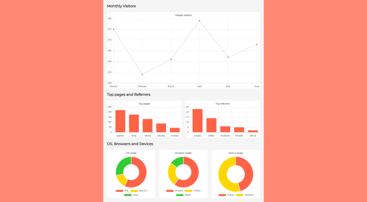
<h3>Monthly Visitors</h3>
<section>
<Chart {...visits}/>
</section>
<h3>Top pages and Referrers</h3>
<div id="pages">
<section>
<Chart {...pages}/>
</section>
<section>
<Chart {...referrers}/>
</section>
</div>
<h3>OS, Browsers and Devices</h3>
<div id="devices">
<section>
<Chart {...os} showLegends={true}/>
</section>
<section>
<Chart {...browsers} showLegends={true}/>
</section>
<section>
<Chart {...devices} showLegends={true}/>
</section>
</div>
</main>
We first imported the Chart component and all the data objects we created earlier. Because we used export statements for each object variable, it was easy to import everything in a single line.
Next, we used a main wrapper around the entire app, created the h3 titles for the dashboard sections, and used grid layout wrappers for pages and devices sections, which will include two and three charts, respectively.
We then included all the planned Chart components. Notice we wrapped each Chart component inside a section tag. This is because Chart.js needs a parent element to define the width and adjust for responsiveness when viewed on different screen widths.
Finally, we used a JavaScript spread syntax to pass in the required props for the Chart components. For the last three charts, we will also display the legends, so an additional prop was added that enabled that option.
Now let’s add some stylesheet rules to our app so the elements are being displayed as expected. While still on the App.svelte file, add the following code under the previously written Script tags and HTML:
<style>
  @import url("https://fonts.googleapis.com/css2?family=Montserrat&display=swap");

  :global(*) {
    margin: 0;
    padding: 0;
  }

  :global(body) {
    background-color: rgb(255, 137, 116);
    font-family: "Montserrat", sans-serif;
  }

  main {
    max-width: 800px;
    min-height: 100vh;
    margin: 0 auto;
    padding: 0 20px;
    background-color: rgb(245, 245, 245);
  }

  h3 {
    padding: 20px 0;
  }

  section {
    min-width: 100%;
    background-color: white;
    border-radius: 10px;
  }

  #pages {
    display: grid;
    grid-template-columns: repeat(2, 1fr);
    gap: 20px;
  }

  #devices {
    display: grid;
    grid-template-columns: repeat(3, 1fr);
    gap: 20px;
    padding-bottom: 20px;
  }

  @media only screen and (max-width: 560px) {
    #pages,
    #devices {
      grid-template-columns: 1fr;
    }
  }
</style>
First, we imported the Montserrat font and set it to be used throughout the entire app. We also used reset rules for the padding and margin, so the dashboard looks the same on the different browsers. We set the background color of the page to be orange.
For the dashboard itself, we set the width to never exceed 800px and centered it in the viewport. We also used some padding and set the background color to be light gray.
We set some top and bottom padding for the section titles, as well as defined the width, background color, and border-radius for the sections themselves.
For the wrappers that will include multiple charts, we set the layout to be grid and use the grid-template-columns, that divide the available width of the main wrapper into two or three columns with equal width, with a 20px gap between them.
Finally, we created a CSS media rule for both grid wrappers. If the screen width is 560px or smaller, the grid layout for pages and devices switches to one column, meaning all the included charts are shown directly below each other.
The last thing left to do is test the app. Check if the development server is still running. If it is not, run npm run dev again and visit the http://localhost:8080 in your browser. You should now be presented with the final dashboard, which looks like this:
In this tutorial, we learned how to create reusable chart components. During the process of creating the analytics dashboard, we learned to separate the data from the code and how to import, export, and pass in the type, data, and options for the charts.
Feel free to adapt and use this template in your own projects. Also, if you want, you can move the data to the database and implement the backend so the data gets updated when the project is being used.
Hopefully, you gained some knowledge and from now on you will feel more comfortable implementing dashboards while working with Svelte.
Install LogRocket via npm or script tag. LogRocket.init() must be called client-side, not
server-side
$ npm i --save logrocket

// Code:

import LogRocket from 'logrocket';
LogRocket.init('app/id');
// Add to your HTML:

<script src="https://cdn.lr-ingest.com/LogRocket.min.js"></script>
<script>window.LogRocket && window.LogRocket.init('app/id');</script>
Hey there, want to help make our blog better?
Join LogRocket’s Content Advisory Board. You’ll help inform the type of content we create and get access to exclusive meetups, social accreditation, and swag.
Sign up now
Get to know RxJS features, benefits, and more to help you understand what it is, how it works, and why you should use it.

Explore how to effectively break down a monolithic application into microservices using feature flags and Flagsmith.

Native dialog and popover elements have their own well-defined roles in modern-day frontend web development. Dialog elements are known to […]

LlamaIndex provides tools for ingesting, processing, and implementing complex query workflows that combine data access with LLM prompting.

 Learn more →
