
The Replay is a weekly newsletter for dev and engineering leaders.
Delivered once a week, it's your curated guide to the most important conversations around frontend dev, emerging AI tools, and the state of modern software.
Svelte is an open source JavaScript component framework for building web applications. Svelte takes a different approach than all the existing web frameworks like React, Angular, and Vue, which follow declarative, state-driven code.

The Svelte bundle size is significantly smaller than most frameworks because it doesn’t have any dependencies (only dev dependencies are available in the package.js file). Due to these features, Svelte has become the most loved, dreaded, and wanted web framework in 2021.
Due to this popularity, devs have introduced several awesome UI component frameworks/libraries like Svelte Material UI, Smelt, Svelte Materialify and Sveltestrap.
But what would it be like to build your own Svelte component library? Fortunately, there are several templates that you could start with, like the official template provided by Svelte and Svelte 3 Component Template, which are considered the go-to for building your own component library.
However, these templates are highly opinionated, and you may not be able to see the underlying tools and techniques required to build the component library itself. In this article, we are going to learn how to build a component library on our own using Svelte’s new SvelteKit.
SvelteKit can be considered the successor to Sapper or NextJS for Svelte. It is packed with tons of cool features, like server side rendering, routing, and code splitting.
SvelteKit uses Vite under the hood, which is quite surprising, as Sapper and most tools are developed using Snowpack. Vite 2 is framework-agnostic and designed with SSR at its core.
SvelteKit is still in beta, but it’s very stable, and there are many projects in production using this framework.
For this project, we will use a skeleton project as the base for our library.
Let’s initialize the project using SvelteKit. You will need to execute the following command and select the options given by the Svelte:

It’s time to integrate Storybook, an open source tool for building UI components and pages in isolation. It streamlines UI development and testing, which is ideal for our component library development. It allows us to build components without worrying about the configurations or development server in SvelteKit.
In your SvelteKit project root, execute the following command. This will identify and generate the necessary configurations for Svelte:
npx sb init
You may face some issues when setting up Storybook with a SvelteKit project. Storybook will throw an error when you start the server, like so:

This issue is thrown due to the property of the “type”:”module” under the package.json file, which means we cannot use ESM-required syntax.
To overcome this, you can make a small tweak in the Storybook configuration files. Simply change the extension of your Svelte Storybook configuration files from .js to .jcs and inside the main.cjs file, make sure you comment out the svelteOptions property, which consists of a require command.
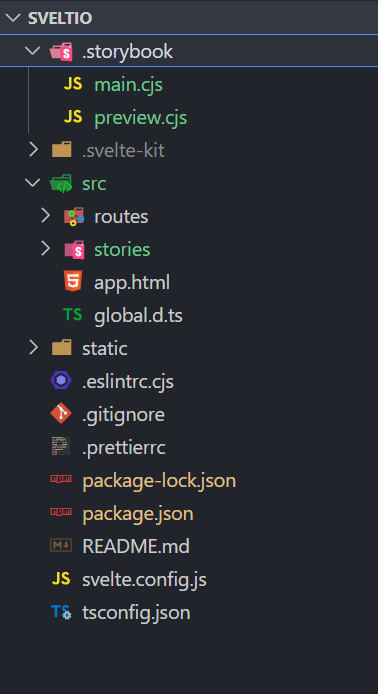
After making the above tweaks, you can run the command below to start the Storybook server:
npm run storybook
This command will open up a new tab in the browser that loads the Storybook app for our SvelteKit project.
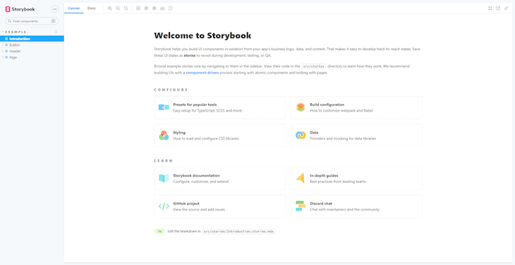
Consider the factors below before building components, as they will help us follow the proper guidelines.
The word “props” is common to all major frameworks and libraries like Vue and React. Props pass data to child components or enable component communication.
$$slots usageEven though props allow you to reuse components by passing data, it will bring a strict parent-child relationship. This means its HTML content will always control the child, and the parent is only capable of passing different values, so components can’t be composed together with props.
This is where slots come in handy. Slots maintain reusability while allowing the parent component to control the content of the child, including the HTML elements inside it. By adding <slots/> tags, you can pass down HTML or markdown from the parents, not just the values.
When building components, avoid nested and global CSS because they will not be scoped, which means they will leak through to all child components.
When building components, make sure you add or handle the proper events. You will have to use a Svelte API called createEventDispatcher, which can be useful when dispatching events.
Let’s create some components for our library. First, remove the default story folder generated by Storybook, and create a stories file under the src directory.
Next, we will focus on the project structure. Create a directory called lib under the src directory. This lib directory is a special directory for SvelteKit because it will allow us to use a special notation called $lib. $lib can be used to alias the src/lib directory and helps us to access components and utility modules without using relative paths like ../../../../ .
Now let’s create our button component under the lib directory called Button.svelte:
<script>
  import { createEventDispatcher } from 'svelte';

  export let primary = false;
  export let size = 'medium';
  export let label = '';

  const dispatch = createEventDispatcher();
   /**
   * Button click handler
   */
   function onClick(event) {
    dispatch('click', event);
  }
</script>

<button
  type="button"
  class={['sveltio-button', `sveltio-button--${size}`,
   `sveltio-button--${primary?'primary':'secondary'}`].join(' ')
   }
  on:click={onClick}>
  {label}
</button>

<style>
.sveltio-button {
    font-family: 'Nunito Sans', 'Helvetica Neue', Helvetica, Arial, sans-serif;
    font-weight: 700;
    border: 0;
    border-radius: 3px;
    cursor: pointer;
    display: inline-block;
    line-height: 1;
}
.sveltio-button--primary {
    color: #1b116e;
    background-color: #6bedb5;
}
.sveltio-button--secondary {
    color: #ffffff;
    background-color: #1b116e;
    box-shadow: rgba(0, 0, 0, 0.15) 0px 0px 0px 1px inset;
}
.sveltio-button--small {
    font-size: 12px;
    padding: 10px 16px;
}
.sveltio-button--medium {
    font-size: 14px;
    padding: 11px 20px;
}
.sveltio-button--large {
    font-size: 16px;
    padding: 12px 24px;
}

.sveltio-button--primary :hover {
    color: #1b116e;
    background-color: #55bd90;
}

.sveltio-button--primary :active {
    color: #1b116e;
    background-color: #55bd90;
    border: solid 2px #1b116e;
}

.sveltio-button--primary :disabled {
    color: #1b116e;
    opacity: 0.5;
    background-color: #6bedb5;
}

.sveltio-button--secondary :hover {
    color: #1b116e;
    background-color: #55bd90;
}

.sveltio-button--secondary :active {
    color: #1b116e;
    background-color: #6bedb5;
    border: solid 2px #1b116e;
}

.sveltio-button--secondary :disabled {
    color: #ffffff;
    opacity: 0.5;
    background-color: #1b116e;
}

</style>
Notice that we have added styles in the same file under the <style> tags.
Now let’s create a stories file for our Button component called Button.stories.svelte:
  <script>
    import { Meta, Template, Story } from "@storybook/addon-svelte-csf";
    import Button from "./Button.svelte";
  </script>


  <Meta
    title="Sveltio/Button"
    component={Button}
    argTypes={{
      label: { control: "text" },
      primary: { control: "boolean" },
      backgroundColor: { control: "color" },
      size: {
        control: { type: "select", options: ["small", "medium", "large"] },
      },
      onClick: { action: "onClick" },
    }}
  />


  <Template let:args>
    <Button {...args} on:click={args.onClick} />
  </Template>


  <Story
    name="Primary"
    args={{
      primary: true,
      label: "Button",
    }}
  />


  <Story
    name="Secondary"
    args={{
      label: "Button",
    }}
  />
  <Story
    name="Large"
    args={{
      size: "large",
      label: "Button",
    }}
  />


  <Story
    name="Small"
    args={{
      size: "small",
      label: "Button",
    }}
  />
Notice that we have created several templates for our button component by passing several arguments to the templates.
Now in the Storybook window, you will be able to see a button.
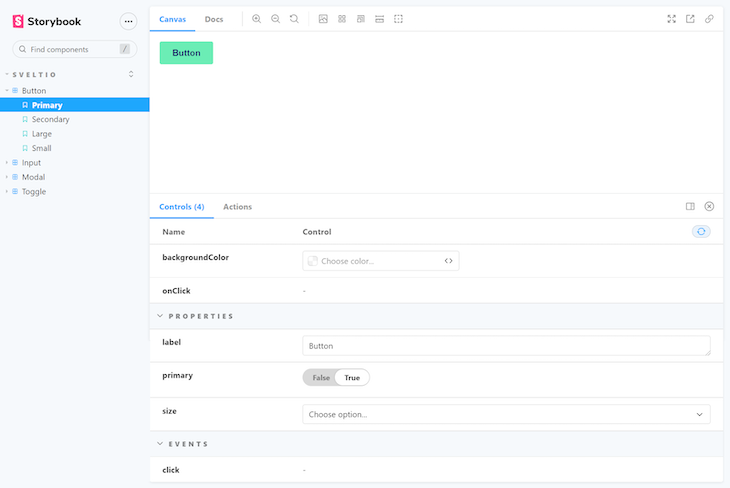
You can switch from the primary button to the secondary button from the controllers provided below. You can also clearly view the types of events that are available for this custom component from the Actions logs.
Now let’s create a toggle component. Start by creating the Toggle.svelte and Toggle.stories.svelte file:
Toggle.svelte:
<script>
    export let label = '';
    export let isToggled = false;
    export let style = '';
</script>

<label {style} class="sveltio-toggle-label">
    <input type="checkbox" class="sveltio-input" bind:checked={isToggled} />
    <div class="sveltio-toggle" />
    {label}
</label>

<style>
    .sveltio-toggle-label {
    --width: 40px;
    --height: calc(var(--width) / 2);
    --radius: calc(var(--height) / 2);
    display: flex;
}

.sveltio-toggle {
    position: relative;
    width: var(--width);
    height: var(--height);
    border-radius: var(--radius);
    border: solid 1px #c2c2c3;
    transition: background-color 0.3s ease;
    margin-right: 5px;
    background-color: var(--toggleBackgroundColor, #c2c2c3);
}

.sveltio-toggle::after {
    content: '';
    position: absolute;
    top: -1px;
    left: -1px;
    height: var(--height);
    width: var(--height);
    border-radius: var(--radius);
    background-color: var(--toggleButtonColor, #ffffff);
    box-shadow: 2px 4px 6px rgba(0, 0, 0, 0.3);
    transition: transform 0.3s ease;
}
.sveltio-input {
    display: none;
}

.sveltio-input:checked + .toggle {
    background-color: var(--toggleCheckedBackgroundColor, #1b116e);
}

.sveltio-input:checked + .toggle::after {
    transform: translate3d(100%, 0, 0);
}

</style>
Toggle.stories.svelte:
<script>
    import { Meta, Template, Story } from "@storybook/addon-svelte-csf";
    import Toggle from "./Toggle.svelte";
  </script>


  <Meta
    title="Sveltio/Toggle"
    component={Toggle}
    argTypes={{
      label: { control: "text" },
      primary: { control: "boolean" },
      backgroundColor: { control: "color" },
      size: {
        control: { type: "select", options: ["small", "medium", "large"] },
      },
      onClick: { action: "onClick" },
    }}
  />


  <Template let:args>
    <Toggle {...args} on:click={args.onClick} />
  </Template>


  <Story
    name="Labeled"
    args={{
      primary: true,
      label: "Check me",
    }}
  />


  <Story
    name="Blank"
    args={{
      label: "",
    }}
  />
Now let’s see how this component will be rendered in Storybook. This story consists of Two templates called Labeled and Blank, and will render two instances of the same component with different props or arguments.
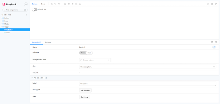
Finally, we will create an input field component with styling that shows pleasing colors for each state for the input.
Write the following in your Input.svelte file:
<script>
    import { createEventDispatcher } from 'svelte';

    export let placeholder = '';
    export let label = '';
    export let disabled = false;


    export let state = "active";


    const dispatch = createEventDispatcher();

     /**
     * input change handler
     */
     function onChange(event) {
      dispatch('click', event);
    }
</script>

<label >

    {#if label}
        <span class="sveltio-input-label">{label}</span>
    {/if}


    <input
    disabled={disabled}
    type="text"
    class={['sveltio-input',`sveltio-input--${state}`].join(' ')}
    placeholder={placeholder}
    >
</label>

<style>
    .sveltio-input {
    font-family: 'Nunito Sans', 'Helvetica Neue', Helvetica, Arial, sans-serif;
    font-weight: 700;
    min-height: 25px;
    margin: 2px;
    border-radius: 3px;
    border: solid 2px #353637;
    background-color: #ffffff;
}

.sveltio-input ::focus {
    border: solid 2px #1b116e;
}

.sveltio-input--success {
    border: solid 2px #067d68;
}

.sveltio-input--error {
    border: solid 2px #a9150b;
}

.sveltio-input--disabled {
    color: #e4e3ea;
    border: solid 2px #e4e3ea;
}

.sveltio-input ::-webkit-input-placeholder {
    color: red;
}

.sveltio-input-label {
    font-family: 'Nunito Sans', 'Helvetica Neue', Helvetica, Arial, sans-serif;
    font-weight: 700;
}

</style>
Now, because we have created the input component with its styling, let’s see how we can write stories for these components and how it renders. Here, we will pass in some arguments like backgroundColor and state.
Input.stories.svelte:
<script>
    import { Meta, Template, Story } from "@storybook/addon-svelte-csf";
    import Input from "./Input.svelte";
  </script>


  <Meta
    title="Sveltio/Input"
    component={Input}
    argTypes={{
      backgroundColor: { control: "color" },
      state: {
        control: { type: "select", options: ["active","success", "error"] },
      },
      onChange: { action: "onChange" },
      disabled:{ control: "boolean" }
    }}
  />


  <Template let:args>
    <Input {...args} on:change={args.onChange} />
  </Template>


  <Story
    name="Active"
    args={{
      placeholder: "Text Input Active",
      state:"active"
    }}
  />


  <Story
    name="Success"
    args={{
      placeholder: "Text Input Success",
      state: "success",
    }}
  />
  <Story
    name="Error"
    args={{
      placeholder: "Text Input Error",
      state: "error"
    }}
  />


  <Story
    name="Disabled"
    args={{
      state: "disabled",
      disabled:true
    }}
  />
In a similar manner, you can create other web components and create stories for other components to continue building your component library. You can find the whole code for the components we built through this link.
One of the most critical aspects of developing web applications is running and maintaining tests for our components. With Svelte, the process of running tests is similar to what we get with React, Vue, or Angular.
There are several tools to write and run tests like Mocha, Karma, Jasmine, and Jest. For this project, we will be using Jest as our test runner. However, even Jest falls slightly short, because we need to render our component and check how it’s behaving after executing actions on them.
For this purpose, we will be using a tool called Testing Library. This tool helps us write tests as if a real user is working on the elements, and also supports all the major frontend frameworks and libraries.
We will also use an additional plugin with Testing Library called user-event, which allows us to mimic user events, like typing inside an input or clicking on a button. We will also use a plugin called jest-dom, which extends the DOM-related matching capabilities of Jest, which we require because we are dealing with web components.
Now let’s install these libraries as dev dependencies in our project like so:
npm install --save-dev jest babel-jest svelte-jester @testing-library/svelte @testing-library/user-event @testing-library/jest-dom @testing-library/dom
Now, let’s add some configuration files to the root of our project. Starting with the Jest.config.cjs file which holds the configurations for Jest and a .babelrc with some presets for converting the files to ES2015 JavaScript.
Jest.config.cjs:
module.exports = {
    transform: {
        "^.+\\.js$": "babel-jest",
        "^.+\\.svelte$": "svelte-jester"
    },
    moduleFileExtensions: ['js', 'svelte'],
    moduleNameMapper: {
        '^\\$lib(.*)$': '<rootDir>/src/lib$1',
        '^\\$app(.*)$': [
            '<rootDir>/.svelte-kit/dev/runtime/app$1',
            '<rootDir>/.svelte-kit/build/runtime/app$1'
        ]
    },
    setupFilesAfterEnv: ["@testing-library/jest-dom/extend-expect"],
    testEnvironment: "jsdom"
};
.babelrc:
{
    "presets": [["@babel/preset-env", {"targets": {"node": "current"}}]]
}
The above test will check if the text is available in the button and do some assertions.
Let’s add another test for the Input file we have created. Let’s call this Input.test.js under the test directory:
import '@testing-library/jest-dom';
import Input from '$lib/Input/Input.svelte';
import { render } from '@testing-library/svelte';

describe('Input component', () => {
    it('Input Has Placeholder', () => {
        const { getByPlaceholderText } = render(Input, { placeholder: 'Hello Sveltio' });
        expect(getByPlaceholderText('Hello Sveltio')).toBeInTheDocument();
    });
});
The above test will check if the input field consists of the placeholder we pass as a prop.
Before we run these tests, we will add a small attribute called “test”:”jest” under scripts to the package.json file.
Now all you have to do is run the following command in the project root:
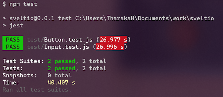
With this, you can maintain unit tests that will improve the quality of your components.
Now it’s time to publish your project to the world! There are several tools that can be used to export your components as a package, but we will be using a cool feature that comes built in to SvelteKit. First, add this attribute to the package.json file:
"package": "svelte-kit package"
Now all you have to do is run the following from the root of the project:
npm run package
If you didn’t initialize a TypeScript SvelteKit project, you will need to install a dependency called
svelte2tsx, which converts the Svelte component source into TSX.
This command will take all the files that are under the src/lib folder and make them available as a package. This command generates a new directory called package at the root of your project, and inside this, you will notice that there is a new package.json file. This file consists of an attribute called exports, which consists of all the paths or entry points to the individual components that we have developed.
Enter the following code into the package.json file under the package directory:
{
  "name": "sveltio",
  "version": "0.0.1",
  "devDependencies": {
   //some dependencies
  },
  "type": "module",
  "dependencies": {},
  "exports": {
    "./package.json": "./package.json",
    "./Button.svelte": "./Button/Button.svelte",
    "./Input.svelte": "./Input/Input.svelte",
    "./Modal.svelte": "./Modal/Modal.svelte",
    "./Toggle.svelte": "./Toggle/Toggle.svelte"
  }
}
If your library consists of files like src/lib/index.js or src/lib/index.svelte, it will be treated as the package root. This makes it much easier to use the components of our library as ES module imports.
For example, if you had an src/lib/Button.svelte component and an src/lib/index.js module that re-exported it, a consumer of your library could do either of the following:
import { Button } from 'your-library';
or
import Button from 'your-library/Button.svelte';
Now that we have created a package using SvelteKit, it’s time to publish it as an npm module. All you need to do is to execute the following command from the root of the project:
npm publish ./package
The above command will publish the package we have created using SvelteKit. Make sure that the package name and package version combination don’t exist already; if so, the package will not be published on npm.
You can see why SvelteKit deserves more attention in the developer community. SvelteKit has fantastic features packed in, and creating packages is quite easy. With tools like Storybook and Jest, creating a component in isolation and maintaining tests for components is simple and efficient. For more information, please go through the SvelteKit documentation.

AI companies are buying developer tools as coding agents turn runtimes, package managers, and linters into strategic infrastructure.

Learn how AI-assisted development governance uses rules, agents, hooks, and protocols to help AI coding tools produce safer, more consistent code.

A step-by-step guide to building your first MCP server using Node.js, covering core concepts, tool design, and upgrading from file storage to MySQL.

Using security headers in your Next.js apps is a highly effective way to secure websites from common security threats.
Hey there, want to help make our blog better?
Join LogRocket’s Content Advisory Board. You’ll help inform the type of content we create and get access to exclusive meetups, social accreditation, and swag.
Sign up now