
The Replay is a weekly newsletter for dev and engineering leaders.
Delivered once a week, it's your curated guide to the most important conversations around frontend dev, emerging AI tools, and the state of modern software.
People interact with signs every day, in real life and on the internet. From arrows and traffic lights, to hashtags and progress bars, we have grown accustomed to the meanings of many symbols, and have thus become prime subjects in the study of semiotics.

In this article, we will explore the theory behind semiotics and how we can use the study of signs and symbols to inform our web design in an accessible and engaging way that will improve user experience.
Simply put, semiotics is the study of anything that stands for anything else – symbols, signs, you name it. While the term itself originated in the 17th century, it wasn’t until the late 19th century that Ferdinand de Saussure — academic of linguistics and language systems — began to establish semiotics as a theory.
According to Saussure’s semiotics lectures, a sign is composed of two parts:
Here’s an example:
You’re driving down the street. You see a large, red pentagon. You stop.
In this scenario, “stop” is the message to be communicated, i.e., the signified, while the sign itself is the signifier that represents this message.
During the period of Saussure’s work, American philosopher Charles Sanders Peirce was also investigating signs and sign systems. Peirce formulated a theory of the individual sign and its classifications that he also called semiotics.
According to Peirce, there are three classifications of signs:
Peirce also believed that a sign can never have an entirely fixed meaning, becomes signs can be repurposed and reinvented. Take, for example, the number sign: #. At one point in time, this symbol merely represented a number. Now, many people around the world see it as a “hashtag,” with its days of being known as the “pound key” long behind it.
With the basics of semiotics covered, in the following sections we will learn more about how understanding symbols and signs can help us improve our web design and ultimate user experience.
Some signs used on the web today are borrowed from their real life look-alike, while others were invented, and their meanings learned over time.
In the table below, we will explain some of the most common signs on the web based on Peirce’s sign classifications. Note, we will not include icons in our analysis because icons are merely graphics that represent exactly what they appear as, as explained above. Although signs found on websites are popularly called “icons,” these signs would actually fall under Peirce’s symbol classification.
| Sign | Description | Peirce Classification |
 |
The sign itself is a house, which on its own could be used as a direct icon. However, in web browsers, this symbol leads to whatever the user has configured as the browser home page. | Index |
 |
On its own, this image is simply a magnifying glass icon. For most search engines, however, this symbol indicates a closer look at a subject by showing where a user can submit a query and return results. | Index |
| By default, if you are using a computer and mouse to browse the web, when you mouse-over a link it will turn to an image of a human hand with the second finger pointing towards the link. This is an indication that you can click the link to go to the resource. In the real world, this is similar to pointing at something or someone with the mindset of “That’s it” or “There they are”. | Index | |
 |
The sign of the most used social media platform on the internet on the Web ー Facebook. | Symbol |
 |
The decorative sign of Instagram might indicate to an observing user that the primary aim of the application or website is camera related, specifically, the smartphone phone camera. However, there would be no logical meaning between the sign and Instagram itself without users being accustomed to the connection between the two. | Symbol |
 |
The blue bird of Twitter would simply be a bird without the learned connection between the Twitter platform and its logo. | Symbol |
When you take a broader look at signs on the web, you will find that different signs serve different functions. For our purposes, we’ve classified these functions into four groups:
These classes of signs allow you to perform a specific action anywhere you find them on a webpage. Examples include:
As the name implies, when you interact with these signs, they can aid your navigation either from one page to another or within a single page. These signs include:
These are signs that attempt to imitate human facial and body expression. The most modern example is emojis (although many of us remember the days of “colon-close-parenthesis” and “colon-open-parenthesis”).
These signs represent or stand for a process, organization, company, or application. Examples are:
It’s important to understand that signs on the web work because you get used to them and begin to understand their meanings without even knowing it. The next time you see a sign that you’ve seen before – albeit in a different shape, size, or angle – your subconscious has already prepared you to know what it means.
In some cases, a sign alone cannot tell the user the full story of what the sign is trying to communicate. Color theory dictates how color should be combined with signs to convey a message that the user will interpret correctly.
If we return to the stop sign example from earlier, you’ll recall that we recognized the stop sign not only because it is pentagon-shaped and says STOP on it, but also because the sign itself is red. In many cultures, red symbolizes danger. Therefore, when we see a red stop sign, we slow down to avoid risk.
On many websites, developers follow this same logic, using red in a user profile settings to denote a “danger zone”, where any action performed in that section might have irreversible consequences. For example, the button to delete an account is often red because a user is in danger of shutting down their account entirely if they delete it.
Similarly, green is a color often associated with success or “go.” If you’ve ever used a web application that allows you to save some settings associated with your user account, upon successful save, you may see a green checkmark. You might also notice yellow or orange colors used when something is still in draft mode, as these colors (like with a stoplight) indicate slow or incomplete progress.
There are many more examples to take note of, but the next time you find yourself performing an operation on a page, try and observe whether the website is using a combination of color and signs to communicate with you.
In previous paragraphs you learned about web applications using signs to communicate with their users. Now, you will learn how internet top websites implemented these signs (if necessary, along with color) on their user interface to communicate and interact with their users. The websites we will analyze are listed below.
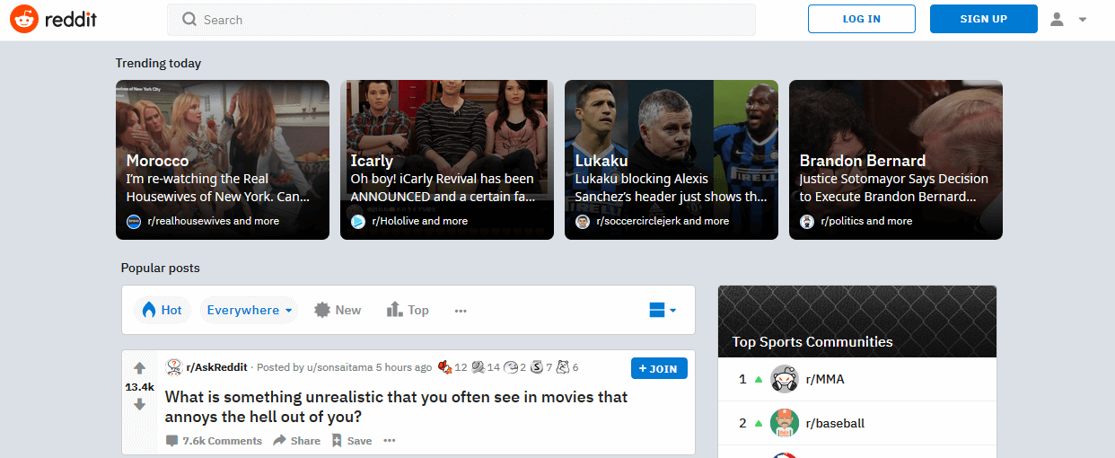
As the self-proclaimed “front page of the internet,” Reddit has its own set of signs and symbols that you have to know. This is part of its brand DNA.
For some of these signs, Reddit developers have put names beside them that best describe their functions, like “Hot,” “New,” and “Top” posts:
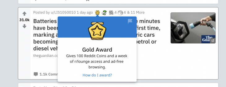
For others, users must interact with the signs with a pointing device like a mouse, and a tooltip will appear below them that states their name and a description (ex: Gold Award):
In the top-right corner of Reddit, you’ll find a sign made up of a rounded shape on a half-circle shape with an arrow sign beside it pointing downwards. This is not unique to Reddit; this is the common web symbol for “user profile:”

Reddit also uses the classic “deactivate account” index and colors: a trash bin icon with the words “deactivate account” in red.” This signifies to the user that “there is danger when you click this button, your account will be trashed.”

Most of Twitter’s functionality is hidden behind an authenticated system therefore, you’ll have to log in in order to use the application.
As with Reddit, there are many signs within Twitter that are unique to the Twitter user experience. What does the bell symbol mean? Or the White bird feather and the plus sign on a blue background? What about the bookmark sign?
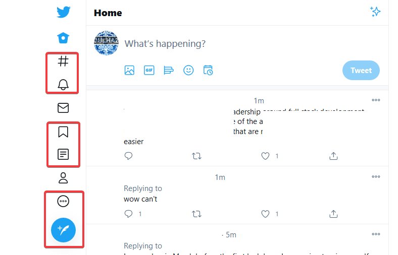
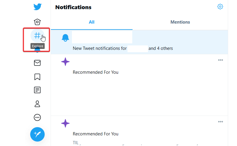
Luckily, Twitter provides explanations for each sign when the user hovers over the symbol:
For writing and submitting a tweet, Twitter also uses signs to symbolize post customizations for users, including: images, GIFs, polls, emojis, and post time:

For tweets that have already been posted, users can select the ellipses in the top-right corner to open up a new menu of options. Although the ellipses are not unique to Twitter, the menu of options is, as you can see in the image below:
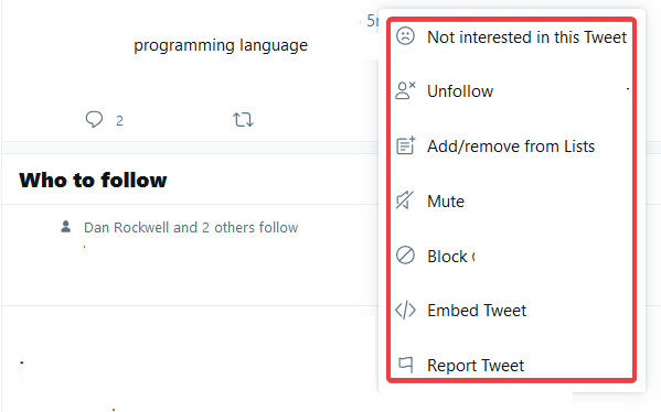
Each menu option has a sign that attempts to show a connection between the sign and the setting name, e.g. the sad face emoji indicating you are not interested in the tweet or the user icon with an “X” indicating that you would like to unfollow the user account.
In general, the developers at Twitter have done a good job of pairing text with straightforward signs that, even without the words, would still carry a relatively clear meaning, including an indication of what will happen if you click on it.
Like Twitter, Instagram uses signs that become available after the user logs into their account. Unlike Twitter, Instagram is fairly conservative with its use of signs and symbols.
The first set of signs are located in the top-right corner of the interface, and they are similar to what you’ve seen during the analysis of Reddit and Twitter. The only “new” signs are those that look like a folded paper plane and a compass pointer in a circle:

On Instagram, the paper plane structure leads to an interface for sending messages to other Instagram users; the compass pointer is for exploring Instagram.
Similar to Twitter, there is an ellipses at the top-right of each post, which, when you click it, reveals additional settings for the post:

Finally, each Instagram post has simple wireframe signs that allow users to “like” a post, comment on a post, share a post, or bookmark a post:

To keep its interface simple and engaging, Instagram only uses a handful of signs, and very few idiosyncratic symbols, to guide users through its interface.
The web is used by everyone, and therefore it can be beneficial to design your websites to accommodate as many users as possible irrespective of their cultural background, region, or language. This process is called internationalization or i18n.
Most of the signs we’ve discussed so far are quite popular on the web, as evident on the websites that we analyzed. Despite this, that are some signs that are interpreted differently depending on what part of the world you are in.
For example, the right check mark that we discussed earlier means OK or correct in most countries, but in Japan, it means that something is incorrect. Therefore, in Japanese markets, the check marks should be converted to circles which means correct. The adaptation is part of a process known as localization or l10n.
Of course, this is just one example of many. If you find yourself designing or using signs for a website that is meant for an international audience, you should consider the signs from a global perspective and try to use an internationally recognized sign.
Throughout this article, you’ve learned about semiotics and how popular websites use signs to communicate with their users. In the spirit of accessible design, here are my top four recommendations for using signs and symbols in your web projects:
Keep it simple. If there is a popular way of representing something that is going to be easy for your users to understand, then you don’t need to reinvent the wheel.
A clear example is the way most sites represent a “user profile” or “user account,” as we saw in our Reddit example. When users see this half circle with a little head circle on top, their brain subconsciously processes that this is where they can either create or update their account.
Another example is the sign for bookmarking tweets on Twitter, the same sign is used for saving a post on Instagram. The sign is the same and performs the same function on both sites ー saving something for future purposes ー although they are named differently on both sites.
By the same token, avoid using popular signs for non-popular representations. For example, you shouldn’t use a trash can icon to represent creating a new post.
The magnifying glass sign is used in a web form that allows a user to search through a database. Imagine for a second that someone used the home sign in the search bar instead. That’s a big “no.”
User experience is better when the user knows what to expect, therefore you should stick to familiar placement – magnifying glass in the search bar, home button in the top left, user account in the top right, etc.
Even if the sign still means the same thing – the home button still means home, even in the search bar, or the user account still means account, even if it’s buried at the bottom of the page – when it comes to signs on your webpage, placement matters.
In our analysis, Reddit is the best example of what to do if you want to create signs that are totally unique to you. If you make it, you better explain it.
When you create a sign and your user doesn’t understand it, they are more likely to have a bad experience or leave your page entirely. There are two ways to prevent this from happening:
In both scenarios, you’ll want to use text to explain what the sign means and what the user can do with it. As we learned in this article, if you explain the sign upfront, then your users will begin to internalize its meaning the more they return to your site.
There are lots of icon libraries out there that allow you to use signs on your website. Pick the best one suited for your project. My recommendation is Fontawesome. Don’t forget: signs are usually called icons in today’s web (sorry, Peirce!).
In this article, you have learned that when semiotics is applied to web design in a straightforward and accessible way, you can create an intuitive experience for your website users that will make them more likely to engage with your site in the future.
For more information on semiotics, symbols, and communicating with users throughout nonverbal design, check out some of the resources below:
Install LogRocket via npm or script tag. LogRocket.init() must be called client-side, not
server-side
$ npm i --save logrocket

// Code:

import LogRocket from 'logrocket';
LogRocket.init('app/id');
// Add to your HTML:

<script src="https://cdn.lr-ingest.com/LogRocket.min.js"></script>
<script>window.LogRocket && window.LogRocket.init('app/id');</script>

Learn how inline props break React.memo, trigger unnecessary re-renders, and hurt React performance — plus how to fix them.

This article showcases a curated list of open source mobile applications for Flutter that will make your development learning journey faster.

Discover what’s new in The Replay, LogRocket’s newsletter for dev and engineering leaders, in the April 1st issue.

This post walks through a complete six-step image optimization strategy for React apps, demonstrating how the right combination of compression, CDN delivery, modern formats, and caching can slash LCP from 8.8 seconds to just 1.22 seconds.
Would you be interested in joining LogRocket's developer community?
Join LogRocket’s Content Advisory Board. You’ll help inform the type of content we create and get access to exclusive meetups, social accreditation, and swag.
Sign up now